weekly Ian's 52 for 2015: Week 16 - Experiment

Messages
8,336
Name
Ian
Edit My Images
No
Week 16 - Experiment

Week 0: Pylon Pattern

I'm not 100% sure how this is going to work out. I've had lots of ideas for challenging myself (Attempting an alliteration challenge would be bad), but I know my limitations when it comes to things like this and I'll be lucky to just complete it so my only real "rule" is that I need to be happy with my end result each week.

So, week 0 is "Pattern". I'm going to try and put up a contact sheet for each week as I've recently discovered "n" in Lightroom and the ability to refine my images down to just the "decent" shots.


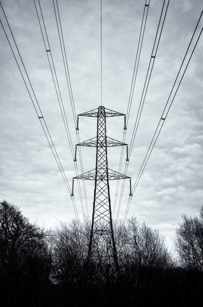
I really like the sheep face. It's my favourite by far, but it's a massive crop that only really works on a computer screen (the Fuji 23mm resolves amazing detail). The chicken feet would have worked better with more snow and less melting, but hey ho, it was worth a try. Of the other two landscapes, the Pylon fits pattern best, and is my preferred shot. I've deliberately silhouetted the bushes and such in the foreground to leave the pylon as the central object of interest. The clouds add a gentle pattern across the back with the power cables adding strong leading lines. The post processing is overall a brooding effect with vignetting and a bit of cloud burning. Gone for a blue/Selenium tint in the final B&W treatment. I'm pleased there's no crop here and the image was taken with my 23mm prime. I'm getting far more confident in using primes now, especially the 23mm (35 equiv) and 35mm (50mm equiv). Would use as an iPhone background which is a good sign for me.

Week 0: Pylon Pattern
by Harlequin565, on Flickr
 
Last edited:
Week 0: Pylon Pattern
the Pylon fits pattern best
I must admit that I am actually drawn to the ploughed field from the set.
I like the nice rough textures :)
 
Great practice image Ian :D I quite like the chicken feet concept, but your chosen image works brilliantly too (y)
 
I like the contact sheet - great idea. I too am drawn to the footprints in the snow. The pylon shot is great though. Very well framed.
 
Hi, good start and I do like the pylon take. The hight contrast works for me as does the detail in the clouds.

Just to add, the first few weeks of the TP52 can be mental, trying to comment on 80+ submissions can be very taxing. What I intend to do is for the first few weeks comment on what I consider to be the best submission for the previous month. Once numbers dwindle, which they unfortunately will, I'll comment on more. Of course, I would not expect you to comment on all my submissions (y)

Cheers.
 
Thanks for all the comments everyone. I know it's not a proper contact sheet, but the principle of "narrowing down to the best" is something I want to concentrate on in the coming year.
 
If you're in Library mode, you can shift-click multiple images to select them, and press "n" to go into Survey mode. This shows just those images and as you click the "x" to get rid, the images are shuffled to fill the screen.

I've just had a massive clearout of my images cutting down from thousands of images a year to hundreds. I'd do a portrait session with Mrs T and end up with 50 frames for example. Old Ian would thin that down to about 20 by deleting blurred, badly composed, shut eyes etc. New Ian whittles it down to between 1 & 5.

I've documented the process on my blog if you're interested in further reading (clicky linky). Parts 1 & 2 are done, with part 3 - which covers the survey mode - going up in the new year.
 
I like the pylon - a very strong image. I also really like the bird's footprints. I think I'd have cropped the partial one on the lhs -but I'm no expert
 
Hi Ian, welcome and well done on four week 0 shots (that's just greedy!)

I too am a big fan of the ploughed field and it's nice to see the furrows going across rather than the stereotypical leading lines away from the viewer... However, your selected shot is the pylon so I'm commenting on that. Nice symmetry to composition and apart from perhaps having a tiny bit too much treeline in for me (that's just a personal view I have) I think it's super. Nice detail on the patterns in the clouds and obviously strong lines and patterns emanating from the pylon itself. Good shot and suits B&W.

Nice!
 
Lovely shot Ian.
Great lines from the cables giving some stunning perspective, nice detail in the sky and it works brilliantly in B&W.

Brilliant start to the project !!!

FWIW the chicken feet would have been my second choice, but you're right - it could have done with a bit more snow to make it really work.
 
Hey Ian - feels a bit like a shot from an old sci-fi horror film, killer pylons or something [emoji33] great perspective and well framed!
 
Pylon shot is defo the best of the 4! I feel the previous commenters Sci Fi Horror thing going on!!!

Great start!

Mark
 
Pylon works for me too. The leading lines really work and the dull sky contrasts nicely. My fave is the ploughed field though :clap::clap: I love it!
 
Love the pylon image. plenty of detail and contrast. ploughed field image as too much field for me. Personally I think a pano shot would look better in other words less field. But that is just my preference. Each to his own. Chicken feet I like, as you say more snow would have been better. But we have to go with what mother nature throws at us.
 
HI Ian & welcome to the madhouse that is the 52's :wave:

I was quite liking the chicken feet image :) However the Pylon shot works really well , good detail in the sky , nice lead in lines with the cables but not quite 100% symmetry ( which irks my OCD - sorry) & mono suits it well (y)
 
Nice simple yet effective start to your challenge (y)
Good Luck for your 2015 52 challenge.
 
Welcome to 2015 52s and well done on submitting 4 great practice shots! With 68 starters for the year, I don’t think any of us have a chance of commenting on every entry every week, but I hope to keep popping in to each thread at least once in a while. Good luck with the rest of the year.
 
Week 1: Bliss

I've set myself up with the challenge of trying to get the photography done by Wednesday so that I can have a couple of days to look through other submissions before Friday. It also means that I don't rush anything out the door over the weekend. I'm avoiding TP threads until I've done my own interpretation of the theme to avoid getting other people's brilliant ideas stuck in my head.

Here's the contact sheet..

Week 1: Contact Sheet
by Harlequin565, on Flickr

I started out by looking the word up in the dictionary. Always helps me focus on a theme. The key things I took away were "serene joy" and "spiritual happiness". My first shot of a clean chicken house just wasn't going to work despite many serene chickens glad for their bi-weekly clean. The house is small, and very badly lit as well as dusty and hopelessly un-photogenic. Trying to get a chicken in there would have been an exercise in futility. The WASD keys were next as I get a LOT of peace and joy from gaming. That idea though was just not working despite different angles of shooting the keyboard. Sat at my desk though, I spotted my brew, and to be honest, a nice cuppa really can be bliss. The background for shots 3 & 4 on the contact sheet was poor, so I recomposed for 5, 6, 7 & 8, positioning the desk lamp and my electric cigarette to try and get different angles and lighting.
Then I thought about modelling and how that's something from my youth that I've recently started messing about with again. The concentration required for modelling and painting can create an almost zen state of relaxation for me, which could be described as bliss. The IL-2 and the Spit MkXVI took me quite a while to construct and are my favourite flying machines in War Thunder, so I tried to shoot them. They're small though (1:72) and I don't have a macro lens so the 23mm was struggling. Lazy lighting and backgrounds weren't helping.
By the next day I'd been thinking about my cuppa and how I just wanted something simple and plain. The amount of times I'd ended up actually drinking the brew before taking my photos was unbelievable!

So "Bliss" for me this week is a simple brew. B&W conversion with a touch of colour added after the fact.

Week 1: Bliss
by Harlequin565, on Flickr

It's the simplicity of it that works for me. And maybe that's something I should carry forward. No electric cigarette needed, no fancy lighting, no macro lens. Perhaps a less "decorated" cup might have worked better, but this is my cup. It's not my most proud photographic moment, but I've added it to my desktop wallpaper folder so I'll see it again once this 52 is over and that's the very minimum I want from each weekly shot. The only other candidates were something creative done with slippers and a photo of our stupid cat by the fire. The ideas were there, but the time and energy to actually make them happen wasn't. I blame it on "1st week back" syndrome. Let's see what happens in week 2.
 
That's quite a work rate you have there Ian what with the contact sheet and write up (y)

I feel you have chosen wisely on your final submission. The B&W conversion works well with the subject, I particularly like the processing. The top right is a little bright for me but if that's your creative choice then that's obviously a matter of choice/taste.

It all made for an interesting read Ian, good work
 
I'f agree with Ian, well chosen submission. Works for me, the gritty B&W works well as does the composition. Has a Blair Witch Project feel to it.

Cheers.
 
You know I can't help really liking the contact sheet as a submission. Whether or not it would entirely fit the theme I'm not sure, but if I assume all the objects make up bliss for you then I'm all for it. 'Fraid the cup doesn't do much for me on it's own though.
 
Thanks all for your comments.

The top right is a little bright for me but if that's your creative choice then that's obviously a matter of choice/taste.

If I'm honest, I didn't pay it too much attention. Noted for next time. Check levels. It's not hard...

I'f agree with Ian, well chosen submission. Works for me, the gritty B&W works well as does the composition. Has a Blair Witch Project feel to it.

As for the chosen shot, love the gritty PP you have done, good choice :)

Gritty.... Hmmm... Thinking about it now, Gritty doesn't really go with Bliss. I had a "flat" B&W version which I think I should have tried instead. note to self - stick to the theme, even with pp.

You know I can't help really liking the contact sheet as a submission. Whether or not it would entirely fit the theme I'm not sure, but if I assume all the objects make up bliss for you then I'm all for it. 'Fraid the cup doesn't do much for me on it's own though.

Thanks Martin. I agree. I think contact sheets are their own form of art. I really enjoyed printing them out in the darkroom and it's something that never got done when I was sending film off for prints. Lightroom does a pretty good job of presenting them.
 
Ian... that is impressive. I love the fact you've gone to that effort to show us your thought process evolving and a full contact sheet of previous shots (including SOOC of your chosen one). It's brilliant and really adds to the challenge - hopefully for you - but certainly for us.

Onto your final image, it's good to see that apart from the very strong conversion, it's surprisingly close to SOOC in terms of lighting etc. I really like the contrast which has been added and also the grain/film effect - it really does look as if it's been shot like on a fast B&W emulsion.

Great job, fantastic thought process and a well executed capture/processing at the end of it. Something you should be proud of: I'd be happy to have that image in my desktop images selection (y)
 
Nice shots there Ian, I like your brew shot most, can't beat a nice cuppa ! :)

Agreed!

Ian... that is impressive. I love the fact you've gone to that effort to show us your thought process evolving and a full contact sheet of previous shots (including SOOC of your chosen one). It's brilliant and really adds to the challenge - hopefully for you - but certainly for us.

Onto your final image, it's good to see that apart from the very strong conversion, it's surprisingly close to SOOC in terms of lighting etc. I really like the contrast which has been added and also the grain/film effect - it really does look as if it's been shot like on a fast B&W emulsion.

Great job, fantastic thought process and a well executed capture/processing at the end of it. Something you should be proud of: I'd be happy to have that image in my desktop images selection (y)

Thanks Paul. For me, it really helps to work through the whole process of creating that "final image". Self-critique is vitally important for me considering how many shots I usually take and showing a contact sheet and talking through the elimination process help me work things out. Other people's opinions are also good because they may spot things I don't, and those observations help me improve which is what I'm trying to achieve here.
I'm a huge fan of grainy B&W films with those 3200 ISO films being among my favourites.
 
Not the idea of bliss for me, can't stand tea or coffee, the image on the other hand definitely works, love the conversion and processing. Big thumbs up.
 
I like that Ian. I like it because it is intriguing, creative and arty. When I first saw it on the other thread for a second I thought I saw a shiny ball!!

This will hopefully inspire me to submit something a little ... erm ... different in future.
 
I really like this Ian, difficult to make a cuppa look atmospheric, but that it does. Can almost smell it.

Karl
 
Hi Ian

Brilliant idea of the contact sheet, may have to pinch this if I may?
Like the choice of the mug and processing even if its more gritty than you originally intended.
Guess the important thing is that you like it and are happy with it, then any positive feedback from us is the icing on the cake! Well, that's my philosophy anyway!!
:)
 
HI Ian

contact sheet....is that for film shots ? Sorry to show my ignorance but I haven't really heard of them before ? Terrific work rate & flow there , interesting to see someone else's thought process for the challenge so thanks for sharing that (y)

As for the shot itself....you can't beat a good cuppa , I'd have it by intravenous drip if I could :)
 
Thanks for the comments folks...

Brilliant idea of the contact sheet, may have to pinch this if I may?
Guess the important thing is that you like it and are happy with it, then any positive feedback from us is the icing on the cake!

Thanks Hazel, the contact sheet isn't an original idea... Film people have been doing it for years. I think it's an excellent practice, so pinch away :)

I think I'm looking for people's views on the images. I've a thick skin and am happy to accept that not everyone likes my shots. Positive or constructive feedback is always welcomed. Other people help me see my own work differently which is a huge benefit.

contact sheet....is that for film shots ? Sorry to show my ignorance but I haven't really heard of them before ?

Hi Lynne,

Yep - contact sheets are a "film thing" that basically put mini versions of all the prints from the film reel onto an a4 sheet. Google can describe it better, or you could delve into the film subforum here. They're awfully nice people. Adobe Lightroom has a function called "Survey" (select multiple images in the Library mode and press "n") which allows you to display a selection of images in a similar manner, but on a computer screen. I go through it in more detail on my blog here if you're really intersted, but the tl;dr version is that I can shortlist my absolute best shots from lots, down to 1 or 2. My personal challenge for 2015 is to be far more ruthless with my photos and actually delete stuff rather than have lots of photos I'll never look at again. Self-critique is a huge part of that.
 
Hi, like the idea with the contact sheet, it's good to see how you are evolving the idea, don't think I would be brave enough for that
Pattern, great symmetry in the pylon pic I can see why you went for it though I quite like the sheep as-well
Bliss, agree its the simplicity that works we are all guilty sometimes of overthinking things but that works really well with the PP you have chosen
look forward to seeing some more of your work (y)
 
Back
Top