weekly Karl12347 52's 2013 - Time and Letter Added

Messages
513
Name
Karl
Edit My Images
Yes
Hi there everyone, here is the start of my 52 week challenge for 2013. Hopefully I will last longer than last year. Think I only made it to week 5 last time but looking to make more of an effort this time.

Week 1 : Sin
Week 2 : Season
Week 3 : Gravity
Week 4 : Wild
Week 5 : Space
Week 6 : Work
Week 7 : TBC
Week 8 :Time
Week 9 :TBC
Week 10 :Letter
Week 11 :
Week 12 :
Week 13 :
Week 14 :
Week 15 :
Week 16 :
Week 17 :
Week 18 :
Week 19 :
Week 20 :
Week 21 :
Week 22 :
Week 23 :
Week 24 :
Week 25 :
Week 26 :
Week 27 :
Week 28 :
Week 29 :
Week 30 :
Week 31 :
Week 32 :
Week 33 :
Week 34 :
Week 35 :
Week 36 :
Week 37 :
Week 38 :
Week 39 :
Week 40 :
Week 41 :
Week 42 :
Week 43 :
Week 44 :
Week 45 :
Week 46 :
Week 47 :
Week 48 :
Week 49 :
Week 50 :
Week 51 :
Week 52 :

Sin:

Every year my wife gets a box of Ferrero Rocher chocolates for Christmas and although we like them, we always think of them as a pretty big Sin to eat them all. Thoughts and critique welcome. The shot was taken with my 35mm f2.5 with hot shoe flash bounced off the ceiling on half power.

Week 1 - Sin by Karl Forster, on Flickr
 
Last edited:
Hi Karl...welcome back to the 52's madhouse.....good to hear you're in it for the long haul this year :)

Chocolate again .......great lighting , well laid out ,no hotspots that I can see...simple but effective (y) not so sure about the foremost one though....possibly a little more DOF to bring the 2nd front row in to focus as well might work ?

Good start mister...see you in week 2 (y)
 
blondie606 said:
Hi Karl...welcome back to the 52's madhouse.....good to hear you're in it for the long haul this year :)

Chocolate again .......great lighting , well laid out ,no hotspots that I can see...simple but effective (y) not so sure about the foremost one though....possibly a little more DOF to bring the 2nd front row in to focus as well might work ?

Good start mister...see you in week 2 (y)

Thanks Lynne, see what you mean about the second row being in focus. Don't want to play the reshot card quite this early so this will have to do for now.

Thank for the the rest of the feedback on the lighting etc.

Now to get round to commenting on other peoples attempts...
 
Beautiful shot Karl - technically really good.

I'm getting a slight tip to the right, but apart from that - spot on!

Second time I've felt a lean to the right this morning, and its not my monitor as I download them and pop them up against a grid to double check myself :LOL:
 
Nice one Karl; love the tones :)

My only crit would be that I think it needs to be either perfectly symmetrical, or not symmetrical at all, when in fact it's very very nearly there but not quite. However, that may just be me :)
 
good to get off the ground can't add anything than what has already been said
 
Thank you all for you positive comments.
I am looking forward to the next theme to be announced. Just got my new external flash and wireless trigger. Fancy doing something adventurous that I have not had he equipment to do in the past.
 
Hi Karl...welcome back to the 52's madhouse.....good to hear you're in it for the long haul this year :)

Chocolate again .......great lighting , well laid out ,no hotspots that I can see...simple but effective (y) not so sure about the foremost one though....possibly a little more DOF to bring the 2nd front row in to focus as well might work ?

Good start mister...see you in week 2 (y)

Bit lazy, but this.

Nice symmetry and WB looks fine. Any left :D
 
Kerioak said:
Nice colours, I think I would prefer to see the second and a bit of the third row in focus so that it is not so central in the frame = have you managed to eat them all before Monday?

Thanks for the feedback, might use this as one of my reshot cards later in the year. All the chocolates are gone fom my house and already thinking about healthy eating and gong for a run as sad as it sounds.
 
Week 2 - Season

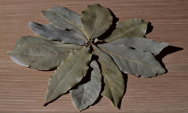
Wanted to do something a little different this week but in the end went along the food season route. These are bay leaves used to season stews etc.

Tried to make the shot a little different by arranging the leaves.

Lit from the side with off camera flash in manual mode. Comments and critique welcome as always.


Week 2 - Season by Karl Forster, on Flickr
 
'ello, I'm partial to a good leaf photograph myself.

Good layout and nice depth. I do feel that these work better when all is in focus, as yours is, because there is no focal point. The side lighting has brough some texture to the leaves. Did you have any other light source (window light or ceiling light?)

I'd like to see a bit more pop in the greens, cropped tad close IMO and I'm undecided on the shadows :thinking:. I have spent hours light painting leaves :wacky: or using multiple flashes to remove any shadows. Still undecided which I prefer.

Good show.
 
:wave: Hi Karl

difficult subject to make interesting....now't like making life hard for youself :LOL: I quite like the layout & the shadow makes it seem more real bu adding a bit of depth , color is fairly true to life ( just been & checked my bay leaves :wacky:) ) so think you've made the best of what you had :)

Crop as per Andy , just a smidge too tight top n bottom
 
posiview said:
'ello, I'm partial to a good leaf photograph myself.

Good layout and nice depth. I do feel that these work better when all is in focus, as yours is, because there is no focal point. The side lighting has brough some texture to the leaves. Did you have any other light source (window light or ceiling light?)

I'd like to see a bit more pop in the greens, cropped tad close IMO and I'm undecided on the shadows :thinking:. I have spent hours light painting leaves :wacky: or using multiple flashes to remove any shadows. Still undecided which I prefer.

Good show.

Thanks for the feedback, there were some normal room lamps but the detail in the leaves were a bit bland without the flash. Know what you mean about the shadows, you either like it or you hate it.
 
Although the lighting seems a little harsh to me, I like it
I like the quite neutral colours personally

Wonder if it would have been any better taking directly from above, rather than the angle you have it at?
 
the layout is good and the colour of the leaves is also good but the BG is not really helping and i would have perhaps bounced he flash to take some of the shadow away
 
Now't wrong with that, Bay leaves are a little dull though so a little bit of extra saturation wouldn't hurt none. (y)
 
nice idea and arrangement.. I'd agree that perhaps taken from directly above would work too?
 
all works really well for me. lovely darks BG and plenty of light on the hand, and the frozen (in time not temperature) water cascading off is great.

you've chopped the hand above the wrist - which is the correct place to do it (in this instance) and there's plenty room below.

another inch to the left might benefit - but great as it is! (y)
 
Great shot for me, neat BG and really brings out the sharpness of the water, almost looks like icicles on your finger ends.

My only personal niggle is the slight shadow on your thumb. :0)
 
Fabulous shot and detail Karl, no further crit from me!
 
overbez said:
all works really well for me. lovely darks BG and plenty of light on the hand, and the frozen (in time not temperature) water cascading off is great.

you've chopped the hand above the wrist - which is the correct place to do it (in this instance) and there's plenty room below.

another inch to the left might benefit - but great as it is! (y)

Allie said:
Great shot for me, neat BG and really brings out the sharpness of the water, almost looks like icicles on your finger ends.

My only personal niggle is the slight shadow on your thumb. :0)

Mad Hatter said:
Fabulous shot and detail Karl, no further crit from me!

Thanks for the feedback. The shadow on the thumb couldn't be helped really. The flash needed to be that angle to stop the light from spilling onto the background and freeze the water. A bigger sink and higher tap would have helped the shot a lot.
 
i like this shot, as said before love the background and frozen water.
 
Week 3 - Wild

This week I am using a shot taken previously of a wild cat that came up close during our visit to beamish museum in Durham.
I was rather happy with this shot however the only issue I had with the shot is the ears are cut off as it would not stay still long enough for me to get he shot.


Beamish cat by Karl Forster, on Flickr
 
nice shot, agree regarding ears, but is the bottom half a bit blurry? DoF?? but like it anyway
 
I get what everyone is saying about the ears but I disagree

I think it's fine as is, in terms of composition the eyes seem to be just in the right place and draw you in like the cat is trying to hypnotise you!
Lovely DoF too. I like it!
 
Back
Top