You are using an out of date browser. It may not display this or other websites correctly.
You should upgrade or use an alternative browser.
You should upgrade or use an alternative browser.
weekly LancsLee's 52s for 2018 - Another catch up - Week 11 - Wet
- Thread starter LancsLee
- Start date
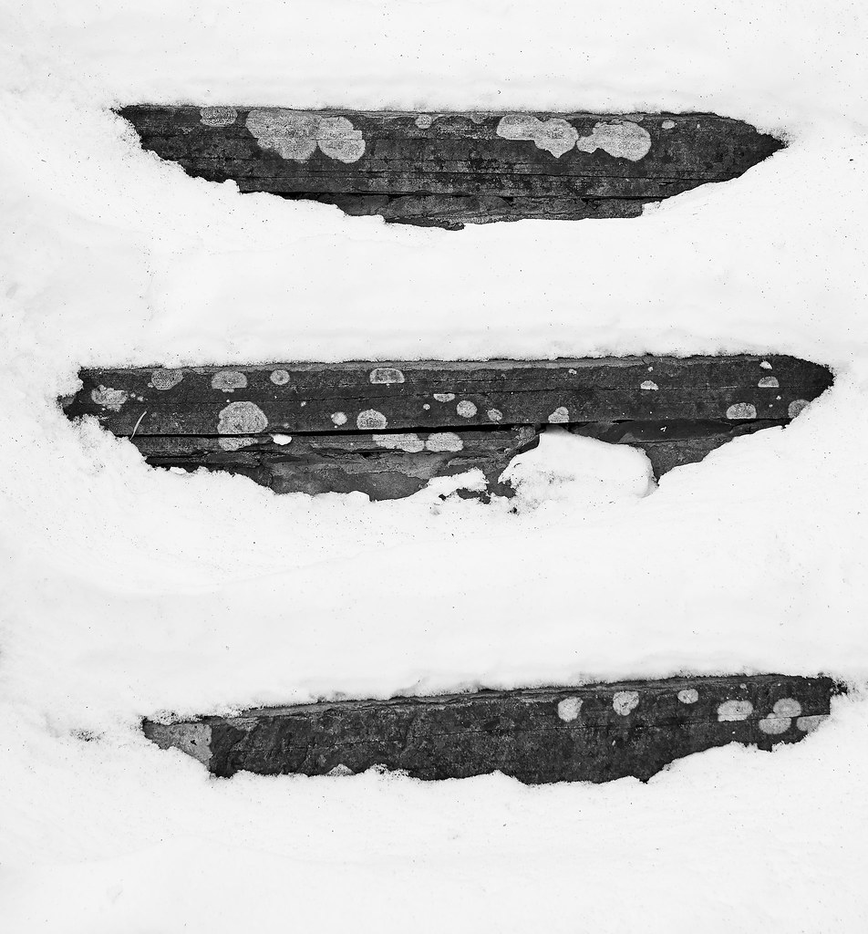
Week 8 - Thick. Been a frustrating week either sitting on a number of trains, or being confined to indoors. So this week's effort is a bit cliched; we're quite snowbound in this little area of the Pennines and this reflects the local stone of the area covered with a decently thick covering of snow.
 DSC07066 1 by Lee Turner, on Flickr
 DSC07066 1 by Lee Turner, on Flickr
Thanks guys for the comments.
Allan, here's the original shot and, as you can see, in this area even the lichen is grey! Looks more like spilled paint.
 DSC07066 2 by Lee Turner, on Flickr
I do like a B+W but Its crying out for colour to be honest, there is some Lichen on the steps would like to have seen that little bit of colour
Allan, here's the original shot and, as you can see, in this area even the lichen is grey! Looks more like spilled paint.
 DSC07066 2 by Lee Turner, on Flickr
- Messages
- 9,095
- Name
- Mandy
- Edit My Images
- Yes
Thick - the mono works well for me as well, but i also like the colour version of the original image, so well done for being able to get a shot in a bad week for weather.
- Messages
- 4,640
- Name
- Pete
- Edit My Images
- Yes
Thanks Tim. Yep, I'll have another go as this was a rush job. Time was not in abundance.....
Tim
Two themes in one?
I like the original 3 step Thick. but detail has been lost on the B&W conversion.
Pete
Colour for me! Are they steps, of the natural sort in a rockface?
No, they are actually someone's steps up to their back garden.
Week 9 catch up - Abundance of wealth.
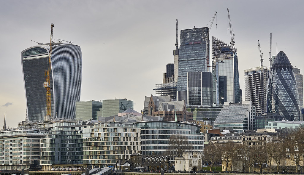
Had lots of ideas for this one, but unfortunately the rubbish weather and lack of time kiboshed most of them. Took this one the other night on a gloomy evening. Coming back home to East Lancashire from Central London every week, I really notice the disparity in wealth and investment in infrastructure etc. I'm sure it's the same for a lot of the UK. The City of London typifies this gap.
 DSC07118 by Lee Turner, on Flickr
Had lots of ideas for this one, but unfortunately the rubbish weather and lack of time kiboshed most of them. Took this one the other night on a gloomy evening. Coming back home to East Lancashire from Central London every week, I really notice the disparity in wealth and investment in infrastructure etc. I'm sure it's the same for a lot of the UK. The City of London typifies this gap.
 DSC07118 by Lee Turner, on Flickr
Week 10 - Heavy restoration
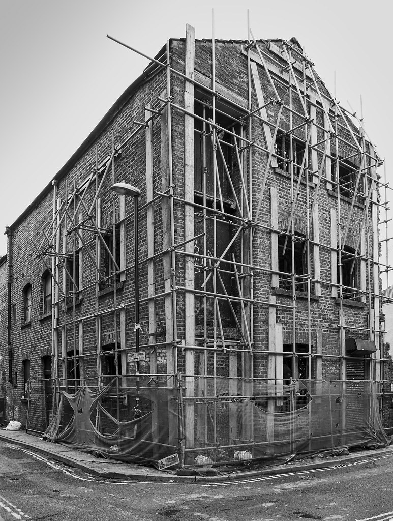
Came across this old building under heavy restoration, or maybe it's just being propped up, in the Northern Quarter of Manchester the other day. The sky was its usual 'meh', so I converted the image to mono. Even after correcting the verticals it appears that the scaffolding is all over the place when compared to the building.
 DSC07090 by Lee Turner, on Flickr
Came across this old building under heavy restoration, or maybe it's just being propped up, in the Northern Quarter of Manchester the other day. The sky was its usual 'meh', so I converted the image to mono. Even after correcting the verticals it appears that the scaffolding is all over the place when compared to the building.
 DSC07090 by Lee Turner, on Flickr
- Messages
- 1,075
- Name
- Georgina
- Edit My Images
- Yes
Looks like an abundance of cranes as well. So still lots of money being spent I like the colours they all seem to tone well together including the sky. I guess it because it's being reflected in all that glass!
That looks like some vary dodgy scaffolding! The mono works well making it look even more abandoned
That looks like some vary dodgy scaffolding! The mono works well making it look even more abandoned
- Messages
- 4,640
- Name
- Pete
- Edit My Images
- Yes
2 nice images Lee.
Abundance - colours and contrast make the Image.
Heavy - nice tones, plenty to look at.Well spotted.
Pete
Abundance - colours and contrast make the Image.
Heavy - nice tones, plenty to look at.Well spotted.
Pete
- Messages
- 656
- Name
- Jon
- Edit My Images
- Yes
Catching up....seems I've somehow missed all your shots, so here goes.....
Gate-I prefer the uncropped version, works well
People-bit busy for me, but works for the theme.
Stark-I really like this, though I prefer the mono version
Over-A bit too grainy for my tastes, but it works
Age-I prefer the second one, mainly as it has more contrast
Sharp- a good sharp shot of sharp claws. I'm not so keen on the oof cloth in the foreground, the second crop works better imo
Guard-A nice abstarct imege, but a bit difficult to identify if you don't know what you are looking at. I really like the mono one taken with the Hasselblad, though again, it's a bit difficult to work out what it is.
Thick-I prefer the colour version. On theme. I took a very similar shot myself a few years ago.
Abundance-I feel it could do with a bit more contrast, and it's a shame the river is hidden.
Heavy-I agree, the framing is a bit tight, and again, I would have gone for more contrast. On theme again though.
- Messages
- 5,432
- Name
- Andrea
- Edit My Images
- Yes
Two good images for the themes, Lee. The wealth is clearly evident in the first one, with all the shiny new buildings and more clearly being built, while your second one shows a building in clear need of some TLC and this one works well in B&W to accentuate the lines and textures 
LC2
Negan
- Messages
- 10,451
- Name
- Tim
- Edit My Images
- Yes
Hi Lee,
Abundance - For that angle you must be somewhere near Tower Bridge? Works for the theme, but with the uninspiring light, had you considered waiting until dusk to capture the lights? (May not have been possible)
Heavy - I think a good choice to go B&W. I think everyone has been fighting the light this year.
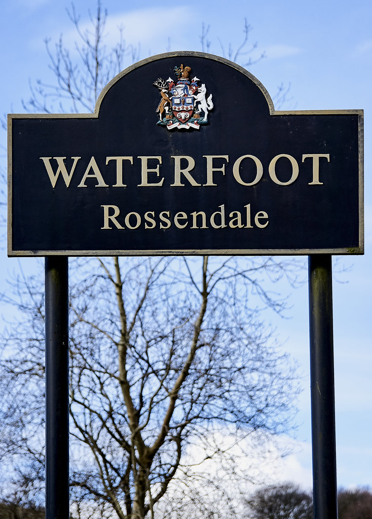
Time to catch up again. Thank goodness the financial year end is now out of the way. Bit of a shoehorn this one, but the ground is usually as wet as the village name.
Week 11 - Wet
 Waterfoot by Lee Turner, on Flickr
Week 11 - Wet
 Waterfoot by Lee Turner, on Flickr
Last edited:
- Messages
- 662
- Name
- John
- Edit My Images
- Yes
Well spotted Lee. and bang on for the theme
- Messages
- 9,095
- Name
- Mandy
- Edit My Images
- Yes
Abundance - works for me, plenty going on in the image to keep me interested. And i think you're not wrong it seems everywhere i look in the uk there is a stark contrast between poor parts of the UK and parts that are better off.
Heavy - another cracking image, and good choice of processing suits the image.
Wet - bright sharp image for a little bit of a shoehorn, but nonetheless well done for the mini catch up.
Heavy - another cracking image, and good choice of processing suits the image.
Wet - bright sharp image for a little bit of a shoehorn, but nonetheless well done for the mini catch up.

