weekly Martin's 2018 52 Challenge

Hi Martin,

Wet - I wouldn't have guessed snow. I was thinking sparkler but puzzled by the light source. Interesting :)
Juxtaposition - It didn't jump out as juxtaposition without the explanation, but I can see your thinking and that's a mad amount of instructions!!!

Light source is a street lamp -- it's just outside my bedroom window.
 
Heavy - i love the bike shot perfect colour, composition the lighter shot made me giggle and put a smile on my face.
Wet - fits the theme and i like the abstracty feel.
Juxtaposition - wow thats some list of instructions, no doubt in every language possible. I think the little coffee maker is cute being so small, tho i do feel the colour could be tweaked in the image.
 
Oval

Didn't like this subject as I couldn't get rugby balls and eggs out of my cliche'd head. So I've gone for the top of an eye-spray bottle lit with a torch against a background of the front of my guitar amplifier..

Oval (1 of 1) by gorgon703, on Flickr
 
It's quite abstract, but I like it! Nice colours (y)
 
It's quite abstract, but I like it! Nice colours (y)


Well this is cool. Like the colours. The repetition in both the lid and the amp is great.

The colours grew on me. The background is actually a Lightroom effect

Looks quite abstract, and taking shots of circles at an angle was one of my thoughts too.
I quite like the pairing of the blue and green and the lighting is very effective.

As I said in my post above, the theme just kept putting eggs and rugby balls in my head so I went with offset circles instead. I think it kinda works the more I look at it. I can imagine a huge version of this taken on medium format and printed 6 foot high and projected on a wall in a gallery -- my dreams often exceed reality! :crying:
 
It's quite abstract, but I like it! Nice colours (y)


Well this is cool. Like the colours. The repetition in both the lid and the amp is great.

The colours grew on me. The background is actually a Lightroom effect

Looks quite abstract, and taking shots of circles at an angle was one of my thoughts too.
I quite like the pairing of the blue and green and the lighting is very effective.

As I said in my post above, the theme just kept putting eggs and rugby balls in my head so I went with offset circles instead. I think it kinda works the more I look at it. I can imagine a huge version of this taken on medium format and printed 6 foot high and hung on a wall in a gallery -- my dreams often exceed reality! :crying:
 
Juxtaposition - I had to read the explanation to get it, but now that I have I get your thinking, Did you manage to fold them back up the right way.
Oval - Very abstract, the colours work well together
 
Did you manage to fold them back up the right way.

I did. I put them in my right hand and used my left hand to squash them very flat then used my right hand again to throw them in the bin.
 
I do too, very vibrant. Whats the Amp ?

It's a Yamaha THR10 practice amp. Loud enough for the bedroom, a load of effects and programmable from a PC; nice piece of kit.
 
Nice shot for oval Martin, I like the colours and it just looks cool
 
Thanks for all your comments. Strange about the opinions on the 'not-straight' eyelets as I quite like that fact, but then I have worn odd socks for the last twelve years (and you can see them because I wear shorts all the time) and that drives some people nuts.
 
Last edited:
I think it works rather well. Nice, clean and simple
 
Unattractive. I realise I should have aligned the compass dial with the South Pole for greater effect but time has moved on and it's a new category now.

Unattractive (1 of 1) by gorgon703, on Flickr
 
Surely if the needle is unattractive it is in the right orientation, if you see what I mean? Good and different idea for the theme I think
 
Straight - No problem with the eyelets being offset, in fact I think it might look unnatural if they were perfectly level.
Good strong image there, great textures and plenty of relief ensuring it does merge into one.

Unattractive - D'oh, that took me a few seconds. Very clever. Chris is right, aligning the needle would have been wrong.
I like this :)
 
Unattractive

I think it's a great idea, I think you've thought it out well.
 
Straight - lots of textures there, good shot
Unattractive - I had to think about that but now that I have got it that works really well I like it. (I had even thought of trying to do something with magnets I should have got it quicker)
 
Last edited:
Nice catch-up, Martin, and I really like your image for Shadow. The blues and whites go together well and your composition works well, with the curve of the handrail and the criss-cross shadows going from foreground to background (y)

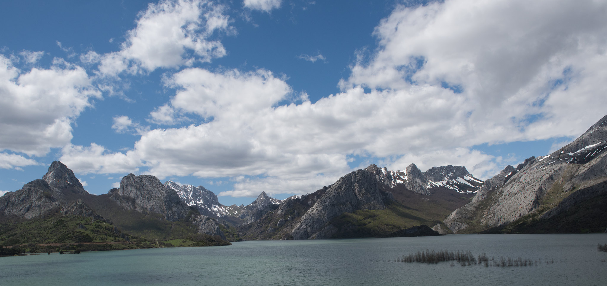
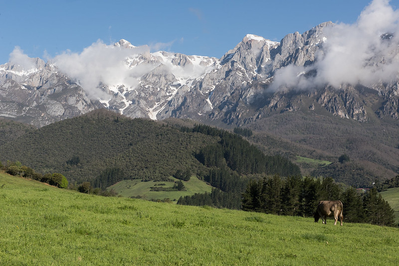
Those are two lovely scenes for Beautiful too, and hard to choose between them. I think if the water had been smoother and there had been reflections I would have opted for #1, but the grass, the hills and the cow in #2 balance nicely under the impressive mountains and clouds in #2 so that's my pick!

Edit: I've just noticed there's a spot on the sensor (top left of #3) so time to get the cleaning gear out :D


Thanks for your comments and yes, you are right, there is a mark in there as many of my other pictures have it. I'll have a good look at the sensor tomorrow, cheers.
 
all three are great shots....love Shadow.

Beaut1 needs some levelling tho...

Beaut2 is a corker, love the details in the mountains.
 
Back
Top