- Messages
- 1,408
- Name
- Elaine
- Edit My Images
- Yes
What more can I add? Super cute lambs, lovely pose well spotted and right on theme. What's not to like?
Linked... AWwww carbon copies nice spring time picture
Awweweee Bless... I was talking about pics of spring lambs earlier, lovely cute faces you have captured there
Awwww just so cute, lovely image.
Linked - nice calm relaxing feel to the shot . Good comp and colour. Pity about that bit of litter, might have attempted to clone out.
Also a very topical shot given BBC2 progs all this week about lambing in Scotland - quite fascinating for me
Nothing wrong with that at all.. Perfectly matched pose, well composed and nice light for you too.
Works a treat.
OOooo, lunch
Well spotted, nice low angle and good detail in the fur. Feels a little tight for me...but I can see that a wider shot might also cause issues.
Cheers.
Linked - A nice image good detail well lit
....... great minds n'all that

well spotted mercurius, also linked to spring
Mint sause anyone
Lovely capture it almost looks posed
HI M
Swirl....very retro 60's type fele to it....like it as an abstract & the square crop works nicely
Lonked.....awww...who couldn't like that.....super focus , nice n sharp
Linked - great shot and well spotted.
Linked bit tight in the frame as has been mentioned but well done for spotting them
Thanks all for looking and commenting.They look cute.....and they posed beautifully for youwell done to catch the shot.
Hi, very steppy indeed could do with a CCW rotation though
Hi,
Very worn much used steps, fits the theme fine, I agree with Alan about the rotation or a crop on the right hand side
Oooohhhh! I love steps with character and this one had it in buckets. Yeah, slight rotation. I'd like to see it even lower and perhaps a little brighter.
Cheers.
Linked - As said this is a cute photo. I agree with Posiview about maybe having a wider crop
Step - Rotation has been mentioned. Exposure has been handled well on this one. It looks easy to get this wrong given the amount of white (ok magnolia-ish) in the picture.
Interestingly I'd like to know whats through the doorway.
Good leading lines just drag my eyes to that doorway.
Step - tons of character in this image, I like it agree with the comments mentioned about a slight rotation.
lovely worn steps there - could work with a slightly wider view depending on whats around, nice lines to draw you up to the door at the top.
 IMG_0474_01 by carthurjohn, on Flickr
Well spotted. Pity it wasn't a nice red chair that stood out
Cheers.
Hi agree with Andy to an extent pity the chair wasn't a different colour to stand out more, unlike Andy I have no preference for the colour
Echoing the comments above, nice spot!
Hi,
Narure really does seem to have taken over there
certainly different to what I have seen posted for nature
Well spotted I will echo every one else's comments.
Thanks Lynne. Seems sharper than the lens on my SLR!HI M
bloomin good shot for a camera phone ! Well spotted for the theme , I like that the chair is a natural color as well
Step - Agree with Allan that CCW needed. Good subject and pov. Nice to see no straight lines in the steps. Good lighting and colour
Nature - well spotted but for me the shot does not have a focal point - I ma not sure whether I should be searching out the chair or studying the nature or both or the disconnect between the chair and the natural surroundings.
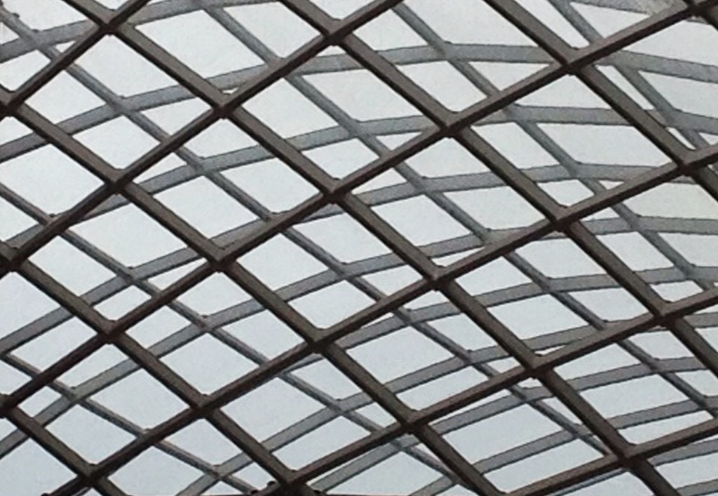
 Mono by carthurjohn, on Flickr
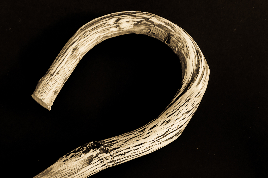
 Twisted by carthurjohn, on Flickr
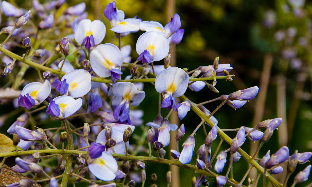
 Fresh by carthurjohn, on Flickr
Thanks.Hi there,
don't like your mono very much, love the twisty stick, and very pretty fresh flowers
Yes mono was a crop of a zoomed in iPhone pic.I don't mine mono. Nice detail but looks slightly OOF. Or maybe it was a crop.
Twist, on theme, but lacks a bit of oomph. Not sure what. Maybe a different angle :thinking
Fresh, good detail and on theme, but a little flat and a bit busy.
Cheers.
I agree about mono, but then I saw what you used to take the photo with and I understand why it looks like that - it's confusing as it looks either OOF slightly, or noisy.
Love your twisted image, that's a lovely little stick there and has good texture, which I think you have captured.
Agree with Andy regarding Fresh, but a good idea.
Well done for keeping up with the challenge though, when life's busy, it ain't easy.
Thanks Alan for your encouragement!Mono - abstract and works for the theme but agree that oof or/and very noisy
twisted - captured a lot of detail and the lighting is very good with some shadow. Probably would have twisted it a bit more CW so that it a appears from left hand bottom corner.
Fresh - on theme and good colours. Would prob be better with just one sprig
Well done on keeping going.
Thanks. FYI the stick is a 'katsouna' (Cretan Shepherd's crook) thought you'd appreciate that as a fellow Greekophile!Mono doesn't really do anything for me but I love the detail and colours of your twisted stick and those flowers make a great image for Fresh.
Thanks Susie.Hi there ....I like the mono one ... I tend to like abstract looking shots, I can't work out what it is !
The twisty stick is lovely, super detail against the black background.
Fresh, a bright crisp image ... spot on for the theme.
Cheers Mandy.
Thanks for the suggestions Lynne.HI M
Mono....as per Andy really , has potential but looks like wither a heavy crop or just a bit oof ?
Shape....now that's more like it....well lit , plenty of detail & a fab black bg which compliments nicelyI'd maybe crop more off the rhs & extend the canvas to the lhs ...clone out a couple if stray bright bits that I've just spotted as well
Fresh....bright , looks sharp , good colors but maybe a little more focus on one flower head rather than the whole stemful ?
 Action by carthurjohn, on Flickr
 Action by carthurjohn, on Flickr
 Action by carthurjohn, on Flickr
 , agree with Andy about possibly a closer crop