weekly NickD's Photo52 Challenge - 2013 - Completed!

Hi Nick :wave: apologies for visiting sooner but I've had a crazy year!

Firstly many congratulations on your twins 'diagnosis', such a great way of describing it! Your life will enter a whole world of craziness that cannot be explained but really will be worth it!

I love your power shot, being REALLY picky the detail in the moon is lost, but that's irrelevant as the contrast against the aircraft and the black background more than make up for it :clap:

Vertical reshoot, I haven't seen the original so can't compare, I like this. Yes the tree seems to dominate a bit too much space but I soon look past that and up the building. Definitely get a sense of height here.

Sweet, shoehorn yes, but my son has that bike so always going to win with me (y)

Solitude, I wouldn't have got the theme without the description. I like the grain and the B&W.

Live is very clever, the viewer is drawn through the glasses of the person holding the camera, through the camera to the statue :clap:

Apologies for not looking at more shots but it's taken me this long to get here already :bonk:
 
Hi

Nice catch up, vertical works really well as does cut a simple image I know but nicely composed and good detail and colour
 
Hi Nick :wave:

Congrats on the twins......& you think you're short of time now :eek:

Live.....very clever take on the theme & it works well ....nuff said :clap:

Sweet...it's got bikes in it so you've won me already (y) good to see young'un is taking after you at that tender age

Cut....like this a lot....good focus , fab black bg & a nice angle....might be tempted to either clone the handle out totally or put a little more light on it to define it more ?

Reshoot of vertical......can't recall your original shot but I'm rather liking this version , the tree's don't distract me , the act more like frame , good detail in the sky...yeah , good stuff mister :clap:

Solitude I wouldn't have got without the words & never having done that sport I'll take your word for it....do kinda like the graininess though (y)
 
Hi Nick, congrats on the twins! Sorry not popped in for a while.

solitude, very different subject, with your description it fits the theme very well, pp suits it.
sweet, lovely shot, know shoehorn needed there!
vertical, works well, I like the inclusion of the tree too.
cut, on theme and nice dof. I like the hint of colour on the blade.
live, great take on the theme!
 
Cuts nice, beautifully simple... love the hint of the handle receding away into the depth and the dark.

Live works too - perfect use of DOF and composition. (y)
 
Hi Nick :wave: apologies for visiting sooner but I've had a crazy year!

Firstly many congratulations on your twins 'diagnosis', such a great way of describing it! Your life will enter a whole world of craziness that cannot be explained but really will be worth it!

I love your power shot, being REALLY picky the detail in the moon is lost, but that's irrelevant as the contrast against the aircraft and the black background more than make up for it :clap:

Vertical reshoot, I haven't seen the original so can't compare, I like this. Yes the tree seems to dominate a bit too much space but I soon look past that and up the building. Definitely get a sense of height here.

Sweet, shoehorn yes, but my son has that bike so always going to win with me (y)

Solitude, I wouldn't have got the theme without the description. I like the grain and the B&W.

Live is very clever, the viewer is drawn through the glasses of the person holding the camera, through the camera to the statue :clap:

Apologies for not looking at more shots but it's taken me this long to get here already :bonk:

Thanks!

I'd love to have managed more detail in the Moon, but it was a bit of a panic. I'm resolved to having another crack at it... If it happened once it can happen again!

The grain in Solitude is just one of those things, all Kendo events seem to happen in appallingly lit halls. The B&W conversion came as an attempt to cover my sloppy attempts at removing a spectator by the elbow at the left of the frame.

Hi

Nice catch up, vertical works really well as does cut a simple image I know but nicely composed and good detail and colour

Cheers!

Cut was a bit of a desperate one, but I'm ok with how it turned out. I always preferred this version of vertical too, it's actually my workplace, and I really like it from some angles.

Hi Nick :wave:

Congrats on the twins......& you think you're short of time now :eek:

Live.....very clever take on the theme & it works well ....nuff said :clap:

Sweet...it's got bikes in it so you've won me already (y) good to see young'un is taking after you at that tender age

Cut....like this a lot....good focus , fab black bg & a nice angle....might be tempted to either clone the handle out totally or put a little more light on it to define it more ?

Reshoot of vertical......can't recall your original shot but I'm rather liking this version , the tree's don't distract me , the act more like frame , good detail in the sky...yeah , good stuff mister :clap:

Solitude I wouldn't have got without the words & never having done that sport I'll take your word for it....do kinda like the graininess though (y)

Thanks!

Yup, time is going to be hard to come by next year, carrying the camera around will be tough too.

The same day I took Sweet a camera crew filmed the boy zooming up and down, and he was on an clip about the Ace this Monday on BBC1s 'Inside Out' programme. My little star!

With Cut, the shot as is was pretty much without the handle, but I rescued what little detail there was as I felt it gave it a bit more in terms of composition.

Hi Nick, congrats on the twins! Sorry not popped in for a while.

solitude, very different subject, with your description it fits the theme very well, pp suits it.
sweet, lovely shot, know shoehorn needed there!
vertical, works well, I like the inclusion of the tree too.
cut, on theme and nice dof. I like the hint of colour on the blade.
live, great take on the theme!

Cheers!

I'm quite happy with Live, it's the first time for the last few weeks that I've actually had a proper idea, and followed it through!

Cuts nice, beautifully simple... love the hint of the handle receding away into the depth and the dark.

Live works too - perfect use of DOF and composition. (y)

Thanks!

As above, I kinda rescued the handle in PP, as it was practically invisible. I thought it looked a bit lost without it.
 
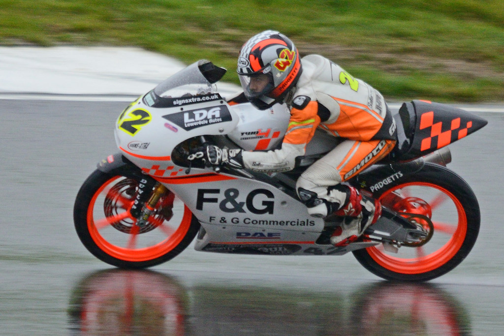
Week 42 - Reflection.

Not the best quality image, 500mm in poor light and rain, also, I'd not reset my shutter speed from the Supersport 600s, so the slower bike shots came with less movement that I'd like. Hard to believe they raced in those conditions, if there are reflections on the track it's always going to be carnage (and it was!).


Looking for Grip
by NickD71, on Flickr

Week 43 - Melt.

Hey, it's not great, but it's topical!

I had nothing for this theme, and the few things I tried didn't work, so it's a bit of a 'post and be damned' lunge. The candle ties it to the theme, just.


Happy Halloween
by NickD71, on Flickr

Thanks for looking! :)
 
Hi Nick, reflection is a little soft for me, sorry to be negative.

but I really like melt, it's a classic silhouette, I can't see it but I know what it is! - the flame adds something to the mouth. Great idea to link the theme to the season. (y)
 
Hi
As you say not the best image for reflection, would have liked to see more of a reflection too
Melt works as well as anyone else's to be honest it was a difficult theme
 
Hi Nick, reflection is a little soft for me, sorry to be negative.

but I really like melt, it's a classic silhouette, I can't see it but I know what it is! - the flame adds something to the mouth. Great idea to link the theme to the season. (y)

Cheers!

I have no problem with negative, and you're absolutely right, it's generally not a great shot at all. It made it in by virtue of the reflective track, and by the fact that I had no time to look for anything else. Hands up!
For an opportunistic shot, I'm quite happy with how melt worked out. It's a simple, obvious image, but it's alright.

Hi
As you say not the best image for reflection, would have liked to see more of a reflection too
Melt works as well as anyone else's to be honest it was a difficult theme

Cheers!

More reflection would have helped, but I cropped it along the line of the grass, there was no more.
Melt was a tough theme all round. No idea what I'd have done if the idea hadn't occurred to me while carving the pumpkin.

Hi, Nick, time restraints....Sweet is my favourite. Has a really great feel to it and his expression is great :)

Thanks!

Totally understand what it's like to have no time, thanks for popping in at all.
I like sweet too, a bit of a shoehorn, but I would, it has my two favourite things in it. Anything I take with the boy in it is pleasing to me. It was only his arrival that made me pick up a camera in the first place.

Hi Nick

you've pointed out the negatives in your Reflection shot but I do like the reflection that you got ....

Melt...cracking focus on the candle ,very seasonal & a nice warm glow ....

Cheers!

I fell lucky there, pumpkins with candles in seem to have naturally pleasing colours!

Hi Nick :)

Reflection - Would prefer more prominence on the reflection myself, what you have caught is good

Melt - Very apt !!! great focus on the candle and the orange glow is great, nice one :)

Thanks!

Both were pretty desperate lunges to be honest, I'm happy with melt considering.
 
Don't be too hard on yourself Nick, I think melt really works (y)
The face filling the frame, with the square crop brings it all together.
 
I'm liking the pumkin shot a lot, the orange and the deep blacks working well, bit more black around it all maybe?? Even just a border might help. But great focus and DOF.

Reflection.... as Brian said, a tad soft, and a bit tight - not making the most of the reflection. But you know this... so onwards and upwards.(y)
 
Don't be too hard on yourself Nick, I think melt really works (y)
The face filling the frame, with the square crop brings it all together.

Thanks!

For a pretty thin week it'll do for me.

I'm liking the pumkin shot a lot, the orange and the deep blacks working well, bit more black around it all maybe?? Even just a border might help. But great focus and DOF.

Reflection.... as Brian said, a tad soft, and a bit tight - not making the most of the reflection. But you know this... so onwards and upwards.(y)

Cheers!

I've never played with borders, to be honest I'm not even sure if PSE has them, as I've never looked... Maybe I should.

I must remember to take a large selection of high quality single malts to the end of project meet for Nick.

Probably best not to start altering quotes... who knows where it will end? :p
 
Hi
Can only echo what has been said excellent
I dont think anything more needed
 
Hi Nick

Solitude - like the comp and the atmosphere created with the grainy b&w. Blurry b/g figures add to the sense of solitude

Sweet- spot on. Good colour, detail and eye contact.

Live - good idea and well handled - the head and hair to the right are a bit offputting

Reflection - agree with others' comments

melt - on theme and topical too. Like the bright colour against the black b/g. Slightly blurry for me - but I always think that of my own shots of this type of subject

Left - excellent:clap:
 
Just to echo what everyone else has said above Nick.

Subject, composition and technique all spot on (y)
 
Thanks everyone!

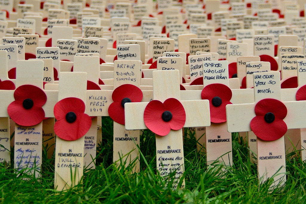
A remembrance shot was always going to go down well, maybe a bit of a cheap shot really. I took a few similar, and struggled to pick which to submit, as each had messages that carried their own poignancy. I felt a little odd photographing such personal stuff to be honest, and spent much more time just reading the notes. Humbling stuff.
 
Right, lets get back on track!

Week 45 - Food.

Hopefully self explanatory. I did want an eye shot with a tagged ear, or that was what was in my head, but none of those turned out as I pictured, so I'm going with this. I thought better of it a couple of times given the harsh light behind, but I rescued it a little, and can live with the overall image.


Beefy
by NickD71, on Flickr

Week 46 - Art.

It was always going to be martial art. I did want to try and get a nice clever Ono Ha Itto Ryu shot, but had to miss that session this week due to work. I took a few regular kendo shots at the Mumeishi 3s competition at the weekend as fallback, which is a nightmare. It's dark, it's orange and they run 3 courts in a small sports hall, so a clean background is almost impossible. I selected the cleanest shot, probably not the best shot, and plumbed for B&W, as it's the most straightforward way of dealing with the lighting problems. before I picked up a camera I always wondered why kendo pics were always in B&W... now I know!


Tsuba Zeriai
by NickD71, on Flickr

Thanks for looking! :)
 
English Longhorns... Super looking cows!

I like the way you have shot this picture Nick. Your focus on the eyes makes the eyes/horns look great on the main subject and the drop off to the others in the background give the context. Lovely range of textures too. :clap:

I know nothing about Kendo but I would like to have seen some kind of movement here, whacking each other or something? The processing is a bit flat too, no detail in the robes and no contrast in the background makes this one a bit uninteresting compared to the one above to be honest.
 
Hi Nick
Food - Good shot of some very nice looking animals. Excellent focus on front one, good detaill of animals and surroundings and nice muted colours throughout - I agree that shaft of light is really troublesome , but that is just unfortunate rather than anything else.

Art - good take on the theme. Lighting has obviously been a little difficult - even in b&w it lacks contrast, being all a bit grey. There is some movement in the 'skirts' of the robes but maybe a bit of blur in the instruments may have helped.
 
Hi Nick,
Food, great eye contact with the animal, composition works well too. I like the muted colours in the scene too.

Art, I agree with Alan, a good take on the theme and you've done well in what could have been tough lighting. I feel the fighters just need a little more room around them which would help compositionally but other than that (y)
 
Hi, Nick, missed a few....

Reflection, it's there but I'd rather see more reflection.

Melt, quite like this one. Has a rather sinister feel to it.

Left, cracker, just the right amount of fall off. Nice reds and detail, and good low angle.

Food, I see where you're going but, doesn't really inspire me...theme wise. That said, good detail and textures in the FG bull ?. Pity you could not isolate the FG one.

Art, as a martial artist, I like this one. Not the easiest to expose and I'm glad you went for keeping the blacks dark. Thought this does effect the whites that appear grey.

Cheers.
 
English Longhorns... Super looking cows!

I like the way you have shot this picture Nick. Your focus on the eyes makes the eyes/horns look great on the main subject and the drop off to the others in the background give the context. Lovely range of textures too. :clap:

I know nothing about Kendo but I would like to have seen some kind of movement here, whacking each other or something? The processing is a bit flat too, no detail in the robes and no contrast in the background makes this one a bit uninteresting compared to the one above to be honest.

Thanks!

I didn't know what they were (it's all beef to me:D), but they are a nice looking animal. I did want a close up of an eye and ear tag, to make a connection between senscience and commodity, but couldn't get close enough to make a decent job of it.

I know what you mean about the Kendo shot, I do have whacking shots from the same day, but chickened out as the backgrounds were pretty cluttered. It's a goal of mine to get good with Kendo images, but it's going to be tough with the conditions events are always held in. FF would be a real help but it's just not on the cards financially for about the next 18 years! I think the best practical option I have now is to try and develop some PP skills, and firstly, how to get the best out of B&W.

Hi Nick
Food - Good shot of some very nice looking animals. Excellent focus on front one, good detaill of animals and surroundings and nice muted colours throughout - I agree that shaft of light is really troublesome , but that is just unfortunate rather than anything else.

Art - good take on the theme. Lighting has obviously been a little difficult - even in b&w it lacks contrast, being all a bit grey. There is some movement in the 'skirts' of the robes but maybe a bit of blur in the instruments may have helped.

Cheers!

They are a handsome beast aren't they? I think it's the colours I like most about the shot, and they were a gift from a lovely autumnal afternoon. I'm starting to think that the troublesome light is partly responsible for the way the colours worked out. Nature gives and nature takes away!:)

As above, totally agree about the flatness of the Kendo shot, and you're right about movement. I've done a couple of shoots now (this tournament is probably the hardest, light wise), and the best shots I have taken are action shots with just a little blur in the tips of the shinai. Unfortunately, the best images I've taken are of a youth tournament run by my club, and so for obvious reasons (mainly Daily Mail style paranoia) I never get to show them off... I'm sure internet perverts are particularly interested in unidentifiable kids dressed head to toe in very loose fitting garments covering absolutely everything.:wacky:

Hi Nick,
Food, great eye contact with the animal, composition works well too. I like the muted colours in the scene too.

Art, I agree with Alan, a good take on the theme and you've done well in what could have been tough lighting. I feel the fighters just need a little more room around them which would help compositionally but other than that (y)

Thanks!

I see what you mean about space. I cut it tight to try and keep it clean, as I had half a referee, a disinterested looking official and a badly dressed scorekeeper in there. More room to breath would be nice.

Hi, Nick, missed a few....

Reflection, it's there but I'd rather see more reflection.

Melt, quite like this one. Has a rather sinister feel to it.

Left, cracker, just the right amount of fall off. Nice reds and detail, and good low angle.

Food, I see where you're going but, doesn't really inspire me...theme wise. That said, good detail and textures in the FG bull ?. Pity you could not isolate the FG one.

Art, as a martial artist, I like this one. Not the easiest to expose and I'm glad you went for keeping the blacks dark. Thought this does effect the whites that appear grey.

Cheers.

Thanks!

Don't worry about it... at this stage I'm really struggling to keep track myself. Any input is appreciated, but none is expected.

As above, I think they key to getting decent Kendo shots without spending a fortune or deserting my family every weekend to practice is going to be working on PP skills, particularly mono stuff. Why couldn't I have picked an art with a more easy to photograph dress code??? :D
 
Food - I'm liking the way the horns frame the eyes, and youve got the eye contact.

The Kendo shot is really competent, nothing cropped off the combatants, sticks or feet would be easy to do and would spoil it. I wonder if a slightly slower shutter might benefit this type of shot in allowing a bit more movement in the extremities, legs, arms, sticks maybe?? And if you're going to go B&W anyway, I'd worry much less about high ISO.
 
Hi Nick, Hope you are well. Where you been? Are you going to make it to the end? Not far now!
 
Hi Nick, Hope you are well. Where you been? Are you going to make it to the end? Not far now!

Yup, still hanging in... just! I have a catch up planned, just need a clear hour with a computer (and some kind of idea for Fantasy). If only I could do it all from my phone, as most of my TP activity over the past few weeks has been grabbed on the train to and from work!
 
Right, cheers people, for good or ill... here we go!

Week 47 - Friendship.

I knew what I wanted, but when I got there it didn't match how I'd remembered it location-wise, and didn't really lend itself to a decent shot. Onwards!


Postmans Park
by NickD71, on Flickr

Week 48 - Sleek.

If there's one thing I've learned this year, it's that product type shots aren't my strong point, but it's what I've got.


Sleek
by NickD71, on Flickr

Week 49 - Reshoot - Time.

Not sure about the processing now, but I liked it at the time.


Sundial
by NickD71, on Flickr

Week 49 - Colour.


Yellow on Blue
by NickD71, on Flickr

And finally... What's that sound?... Oh, that'll be the bottom of the barrel! :LOL:


Find Your Rapper Name
by NickD71, on Flickr

Thanks for looking! :)
 
Back
Top