weekly pjm1's TP52 in 2016 - week 31 Fauna

They're both fab shots Paul, but I especially like the second with its gorgeous quality of light and the more interesting clouds. It's beautifully composed. I love it as it is, but wonder what a longer exposure, smoothing out the water would have looked like, too?

Thanks Emma. Funnily enough, I had exactly the same thought which was why I wanted to a do a night time shot as well. I don't have a 10 stopper so I can't slow down water yet... although one is arriving with a foundation kit later in the month :)
 
Personal - Simply beautiful! :) You’ve lit it perfectly, as usual, and your boy looks quite angelic with that spotlight on him like that. I actually prefer your first version with the harsher light because it’s a more dramatic look and it does more justice to your son’’s gorgeous face, but the darker version is kind of nice, too.

Effort - Your first picture is not appearing in the thread. I had to click on it to see it on Flickr. Well, it’s a pity you weren’t able to get a shot on Ben Nevis but you still managed to produce two lovely photos on time, so well done! The fungus shot really stands out for me, with the dof and nice colour contrast. I wouldn’t say it’s not on theme. It’s nature’s effort, after all! (And your effort as a photographer to superbly represent nature’s beauty.) ;)

Technology - An amazing shot to welcome the arrival of your D750. :) I love that your beauty dish is as much part of the shot as the camera. It’s really clever interpretation of the theme that works on so many different levels. :) And of course, everything looks to be lit brilliantly. Well done!

Horizontal - Two stunning landscape photos! I can only dream about taking shots like that! (Well okay I will one day in the distant future, but for now I can only dream. :p)
 
Love the 2nd shot , great tones and colors and the reflections work well. (y)

Hiya Nigel, thanks for looking and commenting (y)

Personal - Simply beautiful! :) You’ve lit it perfectly, as usual, and your boy looks quite angelic with that spotlight on him like that. I actually prefer your first version with the harsher light because it’s a more dramatic look and it does more justice to your son’’s gorgeous face, but the darker version is kind of nice, too.

Effort - Your first picture is not appearing in the thread. I had to click on it to see it on Flickr. Well, it’s a pity you weren’t able to get a shot on Ben Nevis but you still managed to produce two lovely photos on time, so well done! The fungus shot really stands out for me, with the dof and nice colour contrast. I wouldn’t say it’s not on theme. It’s nature’s effort, after all! (And your effort as a photographer to superbly represent nature’s beauty.) ;)

Technology - An amazing shot to welcome the arrival of your D750. :) I love that your beauty dish is as much part of the shot as the camera. It’s really clever interpretation of the theme that works on so many different levels. :) And of course, everything looks to be lit brilliantly. Well done!

Horizontal - Two stunning landscape photos! I can only dream about taking shots like that! (Well okay I will one day in the distant future, but for now I can only dream. :p)

Hi Sheylara - thanks for pointing out the issue with flickr. I've found it's been a bit glitchy for me, which might be because I'm using Lightroom on two different computers. I don't know - it's fixed for now in both this and the main pictures thread so thank you for spotting it :)

I'm probably most pleased with my technology shot so thank you for the very kind comments. The landscape shots were easy by comparison - you get to the right spot, wait for the right light and press the shutter. Sounds simple :) Thanks as always for the detailed comments and keep shooting (y)
You're very welcome!

Flickr has been glitchy for me too. One of my photos completely disappeared recently. I was looking through my Flickr album and noticed my Topical photo isn't in there. It had vanished for no apparent reason. I had to upload it again and come back here to fix all the links!
 
Hi Paul

Love the Technology shot as I may have already said. On this week's topic, I have to say I wasn't enamoured with either when viewing on my phone earlier today.

Having looked again on the laptop tonight, both are far, far better when viewed large and I actually really like both of them when blown up. The second one just pips it for me as the tones and reflection are just lovely.

Good effort, sir.
Thanks Ian, appreciate the detailed comments and the phone point is an interesting one. Ignoring calibration etc, I also struggle to get some images only to realise it's sometimes the small details which make it. For me in image 2 it was the Bridge but everyone sees different things in all images :)

Cheers!
 
Thanks Ian, appreciate the detailed comments and the phone point is an interesting one. Ignoring calibration etc, I also struggle to get some images only to realise it's sometimes the small details which make it. For me in image 2 it was the Bridge but everyone sees different things in all images :)

100% the bridge makes it :)
 
Hi, Paul #2 for me, for the light and composition. As Dean @Dark Knight said the horizon is much more apparent, due to the white building on the left.

Cheers.

Thanks Andy - I'm still finding my feet in this landscape lark and I haven't had much success with water shots in the past. So each image is a step forward in working out what does and doesn't make a good landscape :) Cheers for the comments - helpful to know what it is that's ticked the box.

(y)
 
Wooo ... both very nice. Top use of natural daylight with the added bonus of starburst in #1

:clap:
 
If I had to choose I think the first one for me but both fantastic shots
 
Hi Paul, no question that the inclusion of water means they meet the theme :) The first is a lovely landscape with great light and starbursts from the lights, but #2 is a real cracker with those colours and reflections and the greater prominence of the bridge and water line. Very nice indeed.
 
If I had to choose I think the first one for me but both fantastic shots

Thanks Liz, appreciated (y)

Hi Paul, no question that the inclusion of water means they meet the theme :) The first is a lovely landscape with great light and starbursts from the lights, but #2 is a real cracker with those colours and reflections and the greater prominence of the bridge and water line. Very nice indeed.

Hi Andrea - glad you agree with my interpretation then :) I think, on reflection (ha, see what I did there?) I also prefer, slightly the second - pleased to have got those shots off and it was worth getting up early for #2! Thank you for commenting, as always.
 
Missed this somehow Paul,
Definitely the second with the reflected sky, great colours and loads to see in the image, without it being crowded :)
 
Hi Paul, a little late here with commenting but the second one for me, the overall scene and colour just work better, the bridge seems to stand out which makes the shot
 
Hi Paul, a little late here with commenting but the second one for me, the overall scene and colour just work better, the bridge seems to stand out which makes the shot

Thanks Allan - agree re: the bridge, that was it for me too.

The second horizontal shot for me.
I like the burnt orange colours and the bright point in the shot draws the eye which then settles on the bridge :)

Thanks Tim - I did lighten the central area a touch (radial exposure adjustment) just to get the eye to pull into the bridge more, so glad it worked!
 
Right, I'm not 100% happy with this theme. You'd have thought I'd have plenty of opportunities to photograph mountains, open spaces and the like... which I do, but right now I'm stuck at home so I decided to bite the bullet and do something different.

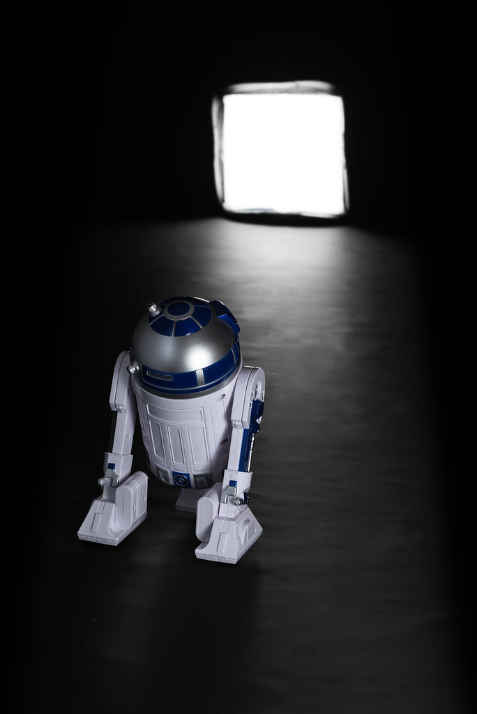
Yesterday early evening my son and I watched the new Star Wars which kind Amazon Logistics man delivered earlier in the day :) I think it's fair to say space is pretty vast, so I thought that would be a decent enough subject. Wanting to wangle in some particularly topical Star Wars angle, I decided to try to mock up a shot of R2D2 trundling along towards an entrance or exit hatch.


Week 16: Vast (Vastness of space)
by Paul M, on Flickr

I'm sort of happy enough with the overall look, but some of the detail doesn't quite work for me - being critical. I'm ok with my lighting on the the R2D2 model (which is bigger than you might think - nearly the size of my 2 year old daughter!) and the "doorway" light has more or less worked how I wanted it to, including the subtle shadow being cast back towards camera from R2 himself. Maybe it's just the floor material (a grubby black backdrop) which I thought would look a bit more "industrial" than it probably does. I don't know.

The lighting was quite quick to set up as it's just two flashes. The doorway is actually an on-camera softbox (one of those small ones that can sit on a hotshoe flash on top of your camera) with a flash inside, set to 1/32 or 1/64 (I forget which). That on its own would throw R2 into silhouette, so I've lit it from a second snooted flash aiming back more or less towards the doorway, from just out of frame, bottom right. I struggled to get that soft enough (since it was unmodified, except for being restricted to the snoot) because I really had to have the snoot to keep the light from spilling down onto the floor. So in the end I draped a muslin over a plate glass sheet which I then held up a bit like a window pane in front of the snooted flash. This softened the light being thrown onto R2 enough for now - there's still quite a big hotspot on the right 1/3 of his dome but it's a lot better than it was without the softening. I was basically trying to create a small silk... without having a silk. Finally, I added a large reflector also pointing slightly up (to avoid floor spill) just frame left bouncing some of that softened light back to R2 and to fill some shadows and create more of a soft glow around the left of his dome "head".

I shot at F8 because I wanted the doorway to be softer without being total "bokeh" and unrecognisable. I was also at the lower limit of flash power and at ISO100 so I couldn't have opened up much more without wrecking the exposure.

It's far from perfect this week, but I'm conscious it's now Wednesday (just!) and I'd better try to get something in :)
 
Hello Paul,

Horizontal - Love the reflections in the second one, I am not a landscape type of person, I can appreciate a good image though and both yours are brilliant.

love this image for Vast, several meanings for me, the space is of course large but what's behind the light, freedom or doom. Reading your explanation hasn't helped me as I am still none the wiser with flash. Something to try and read up on that's for sure.
 
Last edited:
Hello Paul,

Horizontal - Love the reflections in the second one, I am not a landscape type of person, I can appreciate a good image though and both yours are brilliant.

love this image for Vast, several meanings for me, the space is of course large but what's behind the light, freedom or doom. Reading your explanation hasn't helped me as I am still none the wiser with flash. Something to try and read up on that's for sure.

Clever idea Paul I like it a lot

I'm having trouble this week too

Thanks Lee and Mark - I appreciate your kind comments. Not sure why I ended up stuck this week - there were plenty of "obvious" scenes out there... just nothing that grabbed me, perhaps?

Cheers!
 
It's a good photo for vast, the details are picked out nicely on R2, perhaps a bit of a shame about the hot spot on the dome but a good image and I like the concept of into the vast open space beyond. Perhaps a ramp or track to give more a sense of R2 travelling out may convey the story more?

I know what you mean about being stuck with this theme, I have been there a few times where it's hard to get motivated for a seemingly obvious theme but you have created a really good idea.
 
Really helpful to read how you light your images, can't really add any advice as I know nothing about lighting. I really like the image and think the concept works well for the theme. I do like the choice to make the doorway softer and think that works well.
 
Nice idea Paul, always nice to see something different I think you have achieved what you set out to do, don't think I would have got it without the explanation but that in itself is not such a bad thing, well thought out indeed

I have never seen Star wars either but I recognise the robot at least
 
It's a good photo for vast, the details are picked out nicely on R2, perhaps a bit of a shame about the hot spot on the dome but a good image and I like the concept of into the vast open space beyond. Perhaps a ramp or track to give more a sense of R2 travelling out may convey the story more?

I know what you mean about being stuck with this theme, I have been there a few times where it's hard to get motivated for a seemingly obvious theme but you have created a really good idea.

Hi Chris, thanks for commenting as you always do! The hot spot was just too hard to remove "in camera" without causing light spill. If I had another modifier and/or a proper silk I might have been able to soften the light enough that it was less noticeable, but that's where I ran out of current kit and/or time :) And any, shiny metal should really have a bit of a reflection somewhere! I wanted the light spill from the door to be the pathway but agree something more obvious could have been an answer too - it's good to get different suggestions which I can try out next time. Cheers!

Really helpful to read how you light your images, can't really add any advice as I know nothing about lighting. I really like the image and think the concept works well for the theme. I do like the choice to make the doorway softer and think that works well.

Steve, I knew nothing about lighting not that long ago - it's just about learning some real fundamentals and then playing! Cheers for commenting :)

That works well, especially the path of light from the softbox leading you through the shot. Hope it's not doom on the other side of that hatch...poor R2!

Thanks Emma, it's still a shot I'm not 100% happy with but I do appreciate the positive comments (y)
 
Nice idea Paul, always nice to see something different I think you have achieved what you set out to do, don't think I would have got it without the explanation but that in itself is not such a bad thing, well thought out indeed

I have never seen Star wars either but I recognise the robot at least

Thanks Allan... It's not conventional and in my book that makes it worth trying at least. Glad it's worked for you (y) Cheers!
 
Horizontal -Two great Pictures there I like them both but I like the 2nd on best the colour tones and the reflection are great
Vast - good take on the theme, fun shot.
 
Last edited:
Ah, I was going to saw get the light out of the shot, but see why it's there.

Who doesn't love Star Wars.

Cheers.

Thanks Andy - yes, the light is the point! :)

Horizontal -Two great Pictures there I like them both but I like the 2nd on best the colour tones and the reflection are great
Vast - good take on the theme, fun shot.

Thanks Alison - appreciate it. I like to think that fun is good - this photography lark can get all serious and stuff and it's only a hobby!
 
Hey Paul

I like the overall look, and well done for biting the bullet and doing something different, but, I'm not familiar with the film so it doesn't mean as much as it could.
 
Hey Paul

I like the overall look, and well done for biting the bullet and doing something different, but, I'm not familiar with the film so it doesn't mean as much as it could.

Thanks David.

You do realise it's a capital offence to have not seen Star Wars?!?

Actually, seeing the film wouldn't make my connection to the theme much stronger - it's just about space being vast. And Star Wars is set in space. Ish.

Yes, not the strongest link ;)

(thanks for the crit though!)
 
Hi Paul. I really like the composition and the different take on the theme. Appreciate the set-up data; trying to follow your thinking behind the shot and it's beginning to make sense, especially the reduced setting on the "doorway". Must try and convince the powers that be (correction, power that be - singular) to release funds for a speedlite and softbox. Lovely detail and lighting on R2 - all works for me. :clap:
 
Hi Paul. I really like the composition and the different take on the theme. Appreciate the set-up data; trying to follow your thinking behind the shot and it's beginning to make sense, especially the reduced setting on the "doorway". Must try and convince the powers that be (correction, power that be - singular) to release funds for a speedlite and softbox. Lovely detail and lighting on R2 - all works for me. :clap:

Thanks Carl - glad it worked for you (y). I'll send you a message about flashes etc separately!
 
Hi Paul, I like your original take for the 'vast' theme. The lighting along with the figure work very well.
 
Hi Paul ....I've never watched a Star Wars either but I do recognise the figure, I really like the thinking behind it ....heading into the great unknown ....a very different take on the theme, well done to you for thinking that one up.

Thanks Susie :) I do try to be different!

Hi Paul, I like your original take for the 'vast' theme. The lighting along with the figure work very well.

Thanks Liz, pleased the lighting has worked for you!

Ok, I've decided to do something COMPLETELY different for Rough. In fact, something I've never attempted before: a rugby shoot! I love rugby but have never taken pictures before, so this is something completely new and untried for me :)

Nothing like a bit of experimentation... for me that's what the TP52 is all about.

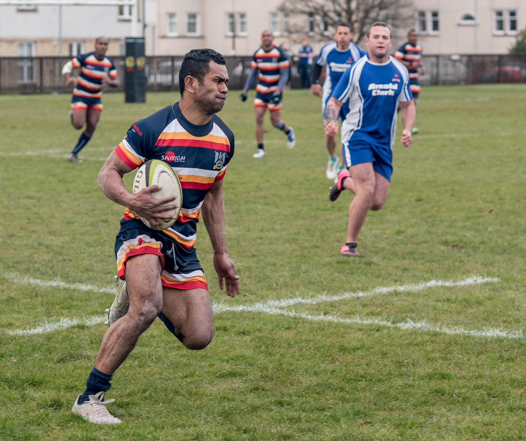
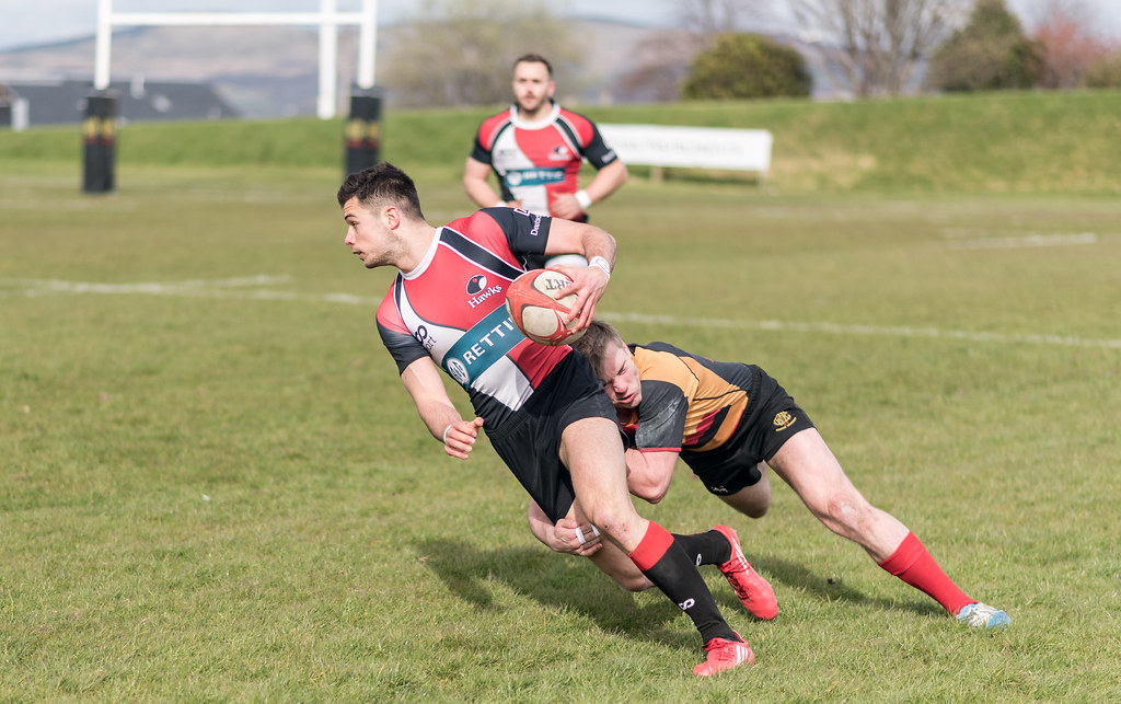
Are these technically brilliant pictures? No, not at all. But I think they convey the effort involved in playing the game and also the fact it's pretty rough at times (and hence on theme ;) )

It was overcast, so handy for lighting the players - probably no surprise the best couple of pictures don't have any sky in them! I've only tweaked the basic sliders and cropped - no mucking around in photoshop or anything. They're not massively impactful pictures, but I'm rather pleased with them despite that. Given it was my first attempt, anyway. All shot with an 85mm prime and quite a lot of them were shot at f/1.8 to isolate the player with the ball... I was surprised at how many were actually in focus!

Thanks for looking and I'm ready for some harsh crit :)

First one at an "easy" f/4.0:

Week 17: Rough 1
by Paul M, on Flickr

Second one a full-on tackle to prevent a breakaway (f/1.8):

Week 17: Rough 2
by Paul M, on Flickr

It'd be great if they were looking towards the camera, but then I'd need to be on the pitch and me and my camera wouldn't last very long! (I'm a diminutive former scrumhalf so easy to tread on)
 
Back
Top