weekly Reanimated 52 - Fit/Water added... 2013 done.

Hi Tony,
have to say your PP work on a lot of your pics is fantastic wouldn't know where to start myself, that light orb is brilliant :clap:
 
Hi Tony

quick off the mark there....interesting portrait especially as it was a requested one...most curious !

Can't offer crit as no idea with lighting but all looks good to me...except for the blue stripe going over his head...just looks odd to me :thinking: where the other strips of light look part of the shot this one looks added in or stray if you see what I mean ?

How did you create the sphere if you don't mind me asking ?

cheers
 
The sphere is shamelessly nicked - taken from stock on Deviantart (full credit on Flickr as I can't remember the chap's name) with some glow and colour tweaking and some twiddly bits added. As it was apparently a thing from a recognised source - in this case some anime thing - I didn't feel qualified to make the thing myself. I had no idea what it was supposed to look like!

Now that you mention it the top spiral does look off - I think it's the layer blending reacting with the black background. I'll mask it off and take it down further when I get a moment.
 
Last edited:
Hi
Portrait image is excellent you have captured that far away look in his eyes cant fault it :clap:

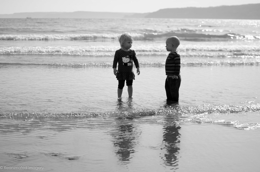
The child is a little scary, not sure why.
 
Power #1 is incredible technically (to me), and just works perfectly, but I'm drawn to the colours in #4.

The solitude portrait stands out a mile for me, largely because of how much is expressed in terms of the theme in such a straightforward shot.
 
Definitely the second shot for me. As you mentioned you have the connection and from my perspective the correct exposure on the faces. The first image i feel is not as pleasing as the second because of the exposure of the toddlers faces.
 
Third for me
 
Some great shots there. I prefer the b&w shots, if the two could somehow be combined, the composition of the first but able to see the kids like in the second that would be awesome.

I like the third too but it seems vivid but at the same time a little dark, not sure why. Maybe the contrast could come down a bit?...

I think all work for the theme, but they don't scream out sweet to me personally.

Sorry that sounded harsh! I think they are still good shots and I'm being picky. I can only ever dream of catching up to sweet at the moment!! ;)
 
Second shot for me, I think the faces (their expressions) make it "sweet". The first could almost (if you had a twisted mind) be interpreted as evil!
 
Hi

The first one for me as Brian says it could almost be evil, more sinister really i suppose and thats what i like about it maybe :thinking:
I think you could crop a lot off the bottom the reflections aren't really needed
 
Sweet - I think the third shot is more obvious re the theme, but I actually prefer the first! I guess that's the problem with shooting for a specific theme - we tend to go with the stronger theme'd shot rather than the stronger photograph!
I think the crop could improve the composition a little of the first if I'm honest, but I like the silhouettes idea...even if it is slightly evil looking! :p
 
Just been looking back at Solitude: haunting expression captured stunningly. top marks. :clap:
 
Helloooo....


Sweet.....think I'm drawn more toward the slush puppy drink on the beach for reasons that escape me other than it's punchy :)

The two toddler shots - I struggle with this type of shot cos it's got kid's in it but..... both seem to central & too much space at the bottom but I guess that's trying to get the shadows in ? I think there needs to be a bit of contact in them to really get the sweet feeling ( holding hands not just the eye contact of #2) :thinking: Sorry to sound negative

The last image for solitude with the smoke type trails....fascinating & spooky but definately fascinating (y)
 
Few for live:

This one was an interesting experiment as - inspired by Jerry Uelsmann - I basically did a photoshop job without using software. This picture is a composite of about 7 layers, all done with scanners and photocopiers: full details of how are on my blog:


Live for the Weekend by ReanimatedImagery, on Flickr

That took a lot of doing.

Oddly, the one that is probably going to be my Live shot took 30 seconds to set up and ten minutes to process.


It's Alive! by ReanimatedImagery, on Flickr
 
inetersting stuff - great result on the live scanned / photocopied shot - can't even start to imagine how to go about that - I'll have to have a peek at your blog when I have a spare minute.

the reflection one is super - Would imagine it would have been harder to do in PS wrt getting all the lighting consistent. Works really well... (What's the bright line by the right ear of the lady we can see the back of??)
 
Thats really clever must have taken a while to set up with positioning of the mirrors etc another really good picture
 
Sorry Tony, I seem to have missed out a few weeks...
Cut: love those kiwi, great colours and sharpness, Tangy!
Live: I don't really understand what you did with the montage and I can't see how to get to your blog, perhaps the link got lost in the move? do you have a link?
Reflection: this one blew me away, I could look at it all day. simple and complicated all at the same time, and I like how her her pony tail catches the light too, excellent image. :clap:
Melt: Yuk, clever idea though all the same!
Left: Looks like a lot of work, and You have done it well but if I'm honest its not to my taste.

Food this week... then only 6 left! - how time flies!
 
That last one is a great idea and really good effect. No idea where I'd start to do something like that!
I am a bit distracted by the twigs and tree in the background plus the way his shirt is lit blue seems a bit not right, but love all the hair flying around
 
The blue is quite interesting actually - for a given value of interesting, anyway. As per usual all my pictures are done because I want to try out a technique or idea. The main one with this was freezing motion with flash (hence the backlit hair) and using the diffuse glow on Photoshop. The diffuse glow is quite interesting as it adds a grain and almost IR halo to highlighted areas. A hidden little fact about it, however, is that it uses the background colour as the key colour for the glow - hence the blue in this shot. I did a green and white version as well, but the white looked like I'd stuck it through my favourite film emulator (Alien Skin Exposure 4, fact fans) and the green was too much with the green elements of the background. Hence, I stuck with the blue. I'll see if I can dig out the version without the blue for comparison.
 
Sorry Tony, I seem to have missed out a few weeks...
Cut: love those kiwi, great colours and sharpness, Tangy!
Live: I don't really understand what you did with the montage and I can't see how to get to your blog, perhaps the link got lost in the move? do you have a link?
Reflection: this one blew me away, I could look at it all day. simple and complicated all at the same time, and I like how her her pony tail catches the light too, excellent image. :clap:
Melt: Yuk, clever idea though all the same!
Left: Looks like a lot of work, and You have done it well but if I'm honest its not to my taste.

Food this week... then only 6 left! - how time flies!
Thanks, Brian.
Can't believe it's nearly over.
 
Hi ya Tony


never really know where to start with your images....fascinating , spooky , quite dark & menacing but excellently executed each one of them :clap:

Melt....had to look at this many times before I saw the Melt part , very clever but not enough Melting for me

Reflection....:notworthy: nuff said

It's Alive...again , took me a few looks to realise that the hand the chap is looking at isn't his own

Left....reminds me of an episode of The Dresden Files....Harry having his life force dragged from within by the evil female :clap:
 
Back
Top