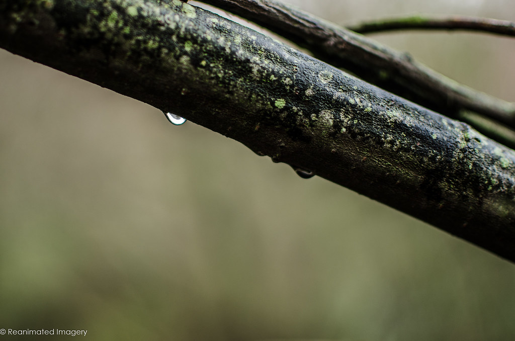
weekly Reanimated 52 - Fit/Water added... 2013 done.

Anyone know how to edit the thread title in the new setup?

Thread tools, top right!

Nice to acknowledge your inspiration with a shot, well set up - with a "just fallen" look that probably took a lot of thinking and placing to achieve./ (y)
 
Works for me, its nice to get away from actual food although I am guilty of that myself
 
I like that Tony, as Allan said, its away from actual food, a route I took myself :D

Compositionally very good, lots of detail and different colours in there to give the viewer time to look around the scene (y)
 
Hi Tony


Great image for Food , lovely lighting & a great texture to place them on :clap:
 
Art, my first thought was Dante's Inferno :)

As usual well processed and composed. I like to moody look. Just the atire that looks a bit out of context, although not sure what would have worked better. Maybe a bride in full bridal atire :)

Cheers.
 
It was just a quick grab at work, originally intended to be placed in an arctic scene :0 That one was more a proof of concept - - it's a technique I'll use again, I think.

Here's a graphic art shot:


My Little Friend
by ReanimatedImagery, on Flickr

And this is the one I'll probably use - the title is a quote from Einstein, of all people: "True art is characterized by an irresistible urge in the creative artist."


The Irresistable Urge
by ReanimatedImagery, on Flickr

The images coming out the head are, obviously, all ones produced during the 52 project.
 
Bloody hell, great work, I'd be proud of any of them, but were I forced to choose it would have to be Scarface
 
Awwwww... and I thought my puns were corny!

Hmmm, I prefer the open door and the DOC-TOR! of the first and everything else from the second... How many of these do you have? :D
 
Hi Tony :)

Looks like I'm miles behind again :bang:

Quick catch up...

Power - Loving the effect created in the second shot... wonderful colours and textures !!!

Solitude - Both good images, the portrait is excellent, but I'm preferring the child in the woods, a bit creepy looking through the leaves, great for the theme

Sweet - Liking the second child shot, that is a very sweet image, but for me the coloured slush (if I ignore the wonky horizon) is my choice, the colour of the slush goes so well with the background, and that orange straw is great (y)

Cut - Agree with the choice of the Kiwi... excellent lighting and detail

Live - I really like how you have done that first shot... you really are creative on the PP side of things :clap:

Food - 'For Thought' is what I initially thought of, but couldn't think of how to portray it, you have done a cracking job

Art - Boy thats a tough choice !!! Liking them all.. but will plump for the 3rd, so much in the shot, well thought out and executed
 
First off, sorry for being so crap on commenting. Things have been insane at work (when aren't they in a school, though?) and all sorts of fun with trying to move house. I promise I'll catch up before the end of the year, even if I have to wait for the Christmas hols!

I don't mind admitting, I have really, really struggled with sleek. Without a doubt the hardest one for me in the entire year so far.

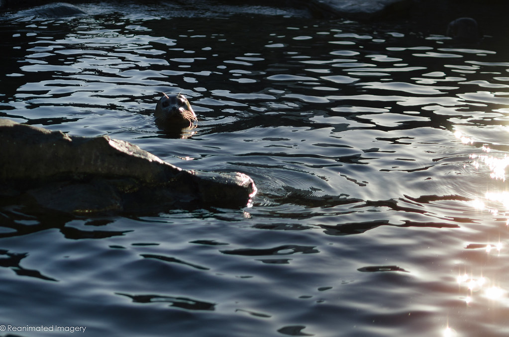
First off, Sleek as in '(of hair, fur, or skin) smooth and glossy'


Sleek
by ReanimatedImagery, on Flickr

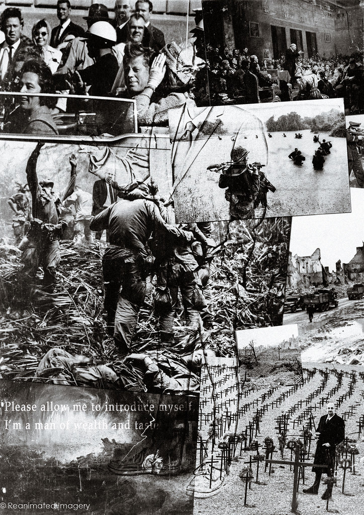
Then sleek as in '(of a person) having a wealthy and well-groomed appearance'


A Man of Wealth and Taste
by ReanimatedImagery, on Flickr

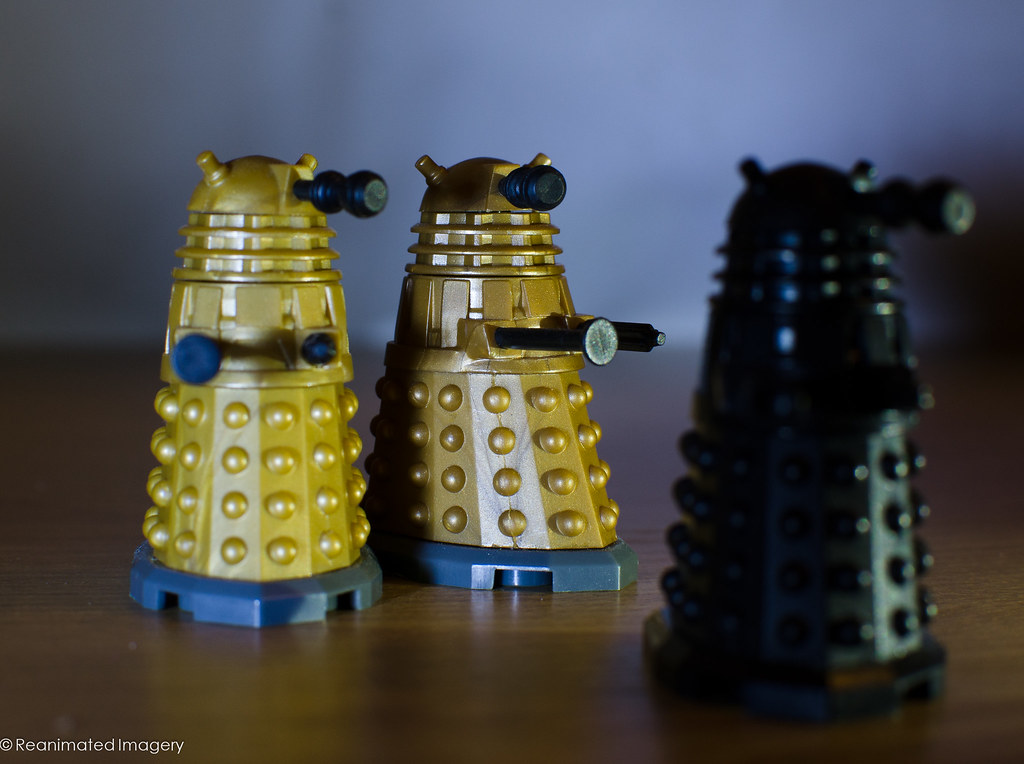
and finally, sleek as in '(of an object) having an elegant, streamlined shape or design'


Ages of Steel
by ReanimatedImagery, on Flickr
 
Hi Tony

your trio of Sleek has me in a quandry....I love the subject matter in #1 but the pp ( or whatever it is) loses something in the image...too much noise or is it grain ? detracts from the sleekness of his skin ?

2nd one does nothing for me I'm afraid though I can kinda see what you were after...maybe :thinking:

#3......think this is the pick of the 3 , dark & moody , lovely lighting & use of DOF but it bugs me that they're leaning........probaby my OCD again !
 
Hi Tony, Have yo found Scarlett Johansson yet? - loved the cradle of life shot on flickr btw. :)
 
Definately going to plump for the colour version of the Doctor...

The sea lion looks a bit like a camera phone snap if I'm honest, agree it was a theme I struggled with too...

Anyway, I'm sat here waiting to be blown away by your "fantasy" effort... If ever there was a theme made for you...... (no pressure now.. :lol;)

I think there are sneak previews on flickr Graham...:naughty:
 
Hi chaps; sorry I'm so late getting these up. Horrible, horrible end to the year with an Ofsted inspection in the last week. I've been taking them on time but haven't had time to do anything other than whack 'em on to flickr.

So, Colour. Three versions all done with a variety of inks and paints and simple model shots.

1: a couple of shots of peacock feathers and some texture shots, based around the colour of her eyes.

The Peacock Girl
by ReanimatedImagery, on Flickr

2. A double exposure of marbling inks in water, blue and green.

Colour
by ReanimatedImagery, on Flickr

3. A Pollock style painting done by a student and some layering.

Colour
by ReanimatedImagery, on Flickr

Fantasy was bloody hard; I struggled to get it down to one concept I liked. Brian, I am sad to report a distinct lack of Ms Johannsen. Restraining orders are such a drag.

As it turned out, most of these had very little post processing done.

1. Dark fantasy

Revenant
by ReanimatedImagery, on Flickr

A simple documentary shot caught on a walk with my son. With one, small addition :)

2. Classic Fantasy

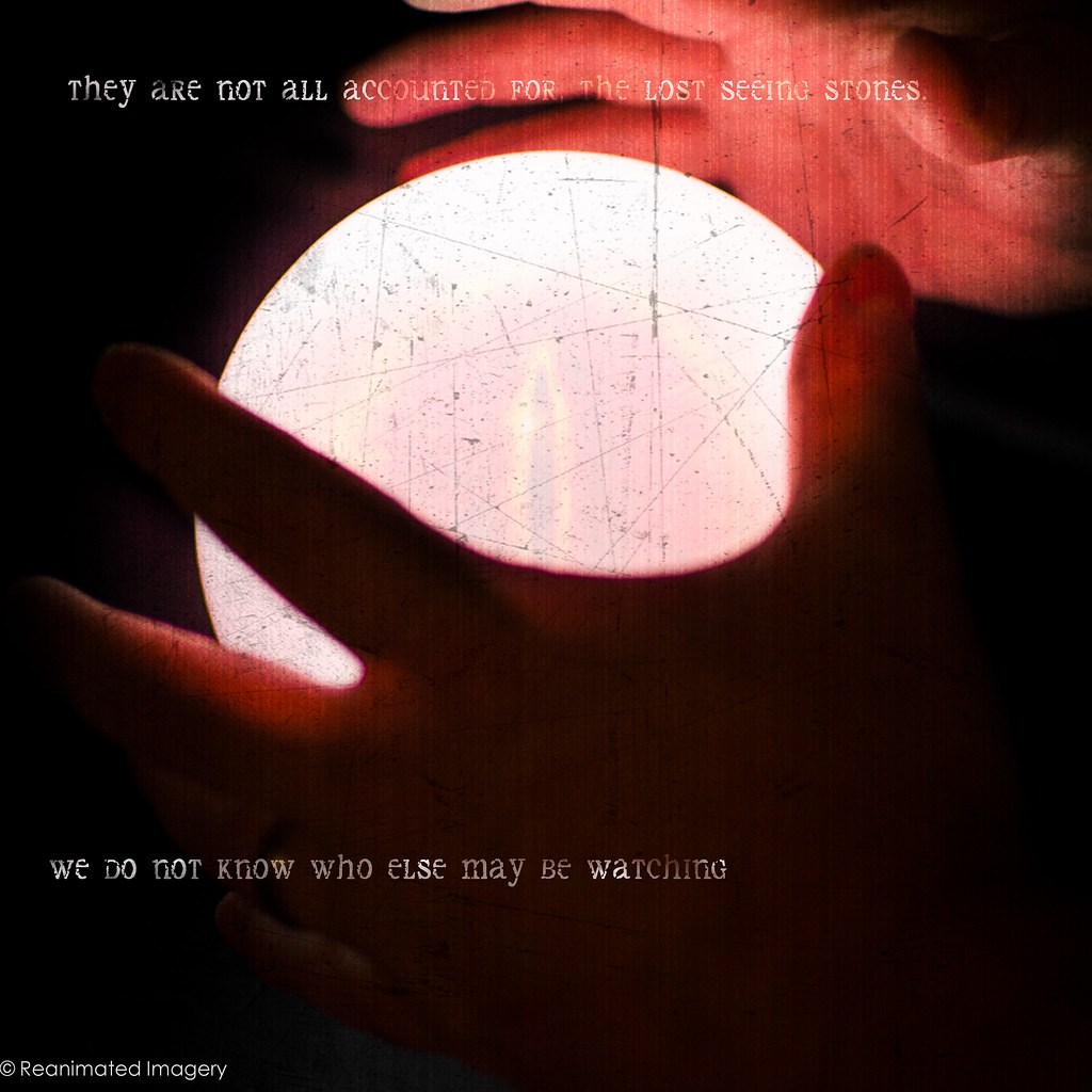
Seeing Stone
by ReanimatedImagery, on Flickr
This was actually just a proof of concept for the next shot and isn't really a serious contender.

3. Fantasy Portrait

Cradle of Life
by ReanimatedImagery, on Flickr
I wanted to do something a bit different to the usual pregnancy portrait. All lighting done in camera. One layer of bokeh texture added after.

4. Fantasy Elf
Two shots here, couldn't decide which I liked the best; probably the second one even if you can't see her ears.

If you want him, come and claim him.
by ReanimatedImagery, on Flickr


Live by the Blade
by ReanimatedImagery, on Flickr

5. Fantasy Literature
This was serendipity. I've got a commission from a local little school to produce some shots of staff reading in a slightly more interesting way than they're usually done; this one happened to fall in the right week. I'm not putting it in contention because due to lack of time the forced perspective led to a shoddy piece of post processing.

Two more to go and a HUGE amount of commenting from me on other people's threads....
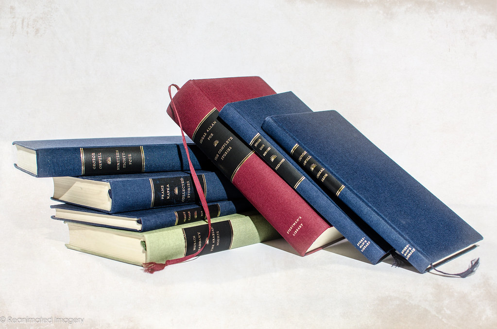
 
Hi ya.......

your output never ceases to amaze ( & baffle) me in equal amounts :D

The Fantasy portrait I love ,she reminds me of an actress whose name evades me currently ,was in the witches of eastwick , not cher , not the blonde one...I'll get there in a minute.......Susan Sarandon :clap:
the elves ear's aren't pointy enough for me :eek:

Dark Fantasy is just brilliant...though I am beginning to worry about you..........
 
Damn, I've missed a few. Apologies for this.

Stand outs for me apart from the overall high quality of the submissions and processing are:

Friendship #1. Great lighting, detail and tom's face is a winner :)

Sleek #1. The water flowing of the seal is great.

Colour #3. Anything with Pollock in is a winner for me.

Fantasy #1. Just works for me in loads of ways. Especially the light leak.

As a martial artist Fantasy elf works well. I like the cool tones.

Nice work.

Cheers.
 
Fantasy - how many?? and all great.. i knew you wouldn;t disappoint
Dark fantasy is great, super base shot, and excellent additions made after...

But my fave is the fantasy elf - the sort of image I would have loved to create, love the reflection of the face in the blade, and agree the ear could be pulled up a tad more, still beautifully shot!
 
Fantastic year Tony - I've loved following these and am in awe at the amount of effort and creativity you've put in!

Just having a flick through, so many stand out for me as marvellous,

The chef for season, the Myth of sisyphus for work, your creepy time child / man, time of the preacher, ride the lighnting, hounds of tindalos, and many many more.

Huge congratulations!
 
Congratulations on finishing Tony. I wouldn't know where to start trying to critique your marvellous work, so it's just a (y) from me!
 
Hi Tony :)

Sleek - I'm going for the cyber men, love the angle and the PP as usual, the lighting on this is especially effective (y)

Colour - I'm going for the first shot, love the look of your models eyes, they really draw me into the image :)

Fantasy - Oooo has to be the '4 - Fantasy Elf' well posed, great DoF and the PP adds that real fantasy element, love the reflection in the blade (y)

Fit - HAS to be the lego characters :D

Water - Agree, it has to be the final image, very simple but great detail, textures and well lit, movement caught spot on :)

Well done in finishing Tony, have loved the fine detail of the PP on your shots this year :clap:
 
Back
Top