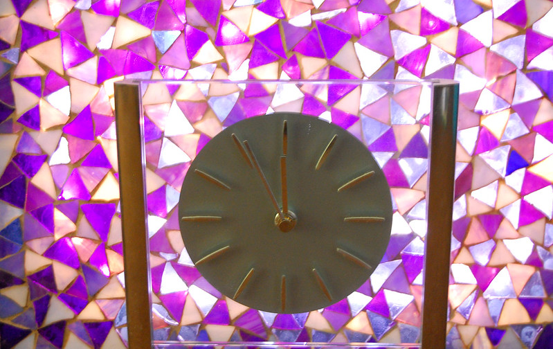
weekly Rosso's 52 challenge 2013 - Weeks 8 & 9 -Time & Juxtaposition - Added

season = Winter!

- the Colours are spot on and the snow is very white indeed. Composition is a little un- exciting though, I think it would have worked better with a deeper dof or maybe off camera flash to emphasise the texture in the snow.

Hope that helps.

2 down, only 50 to go! :)
 
You certainly nailed the theme. I like the crop and it was a good choice to go with out of the ones you posted. I would like to see a little more dof, or maybe the focus being on the front leaves then going out of focus in to the bg. Tricky subjects are leaves and snow and you have done well. Lighting is a bit flat, looks like it might need a slight exposure boost and maybe a bit more contrast. I do like the falling snow you have captured too.
 
Thanks for the comments all :) Brian - I'm looking at investing in a flash separate to my camera but at the moment I've only got the standard flash on camera. And I'm glad that I seem to be picking up from mistakes so hopefully the DoF and focal points will improve in the future :)
 
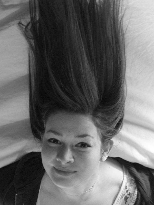
OK, week 3, not massively happy with it and think I may have to reshoot at some point but here goes!

8406999890_5ac4251592_c.jpg


Could have done without the top of the hair being cropped off, although I'm glad I spotted it despite it being too late!

Any comments welcomed :)
 
Matt, nice approach, and there's a LOT to like about this shot. The direct engagement of the eyes and the smile is just wonderful. I like the concept, though there are details that don't seem to work. You spotted the end of the hair being cropped; TBH I'm not sure if it would be better the other way; wouldn't there be a big risk of lots of ragged ends, as the hair isn't cut to be worn like that (unless you can get a stylist to work on it when she's in position!)? But my biggest niggle is top left of the image, where there are stray hairs that look as if they might be resting on something that "shouldn't" be there (in the fictional world where she's right way up). There are also some shadows there that I don't think help.

But great thought and pretty darn good execution, I'd say!!!
 
says super strength hair spray to me :LOL:

Well done for spotting things yourself though - good idea's still need a bit of practice to get there. It's the creases in the sheet that don't work for me - that hints she may be laying on something rather than standing or in fact being upside down.
 
What a fab image - Made me laugh out loud for real. Very engaging too.

I can see what you are thinking about the hair, I'm not so sure - it might upset the composition. There is enough hair there to send the message. You know, as I scroll up I can see that this shots works without the hair almost as good as with, I think that shows what a good image it is.
 
Hi, there, unusual take on the theme. Good eye contact and a very relaxed smile.

It's a tad grey and appears a bit noisy. Also, a tad OOF.

Lovely smile.

Cheers.
 
Thanks for the comments guys :) She was actually hanging upside down off the side of a bed to get the shot!

And Andy, I'm aware it's a bit out of focus but I was laid on the floor against a wall and she kept having the blood rushing to her head so didn't want to be there too long! This might be a stupid question, but how do I get rid of noise in photos? Is it something to do with shooting at a lower iso?
 
Hi, there, unusual take on the theme. Good eye contact and a very relaxed smile.

It's a tad grey and appears a bit noisy. Also, a tad OOF.

Lovely smile.

Cheers.
Yep... have to agree on all that, but I think you have a good idea there, and with a bit of fine tuning, looks like a perfect one for a 're-shoot' week :)
 
Great idea, on theme, and as the others have said with a bit more tuning you'll be on to a winner.
 
Hi Matt


good fun image & on theme for sure :) Shooting at a lower ISO helps prevent noise....if you can stop the blood rushing to her head try using a tripod if you reshoot it as a lower ISO will increase your exposure time if there's not enough light about...think thats right anyway :thinking:
 
Yep... have to agree on all that, but I think you have a good idea there, and with a bit of fine tuning, looks like a perfect one for a 're-shoot' week :)

Thanks Dark Knight, might have to resort to bribing her with chocolate to help next time!

Great idea, on theme, and as the others have said with a bit more tuning you'll be on to a winner.

Thanks Dave :)

Hi Matt


good fun image & on theme for sure :) Shooting at a lower ISO helps prevent noise....if you can stop the blood rushing to her head try using a tripod if you reshoot it as a lower ISO will increase your exposure time if there's not enough light about...think thats right anyway :thinking:

Thanks Lynne, still trying to get my head round technical stuff! :) And a tripod is currently on my shopping list so it's down to hand held or resting on something else at the moment!
 
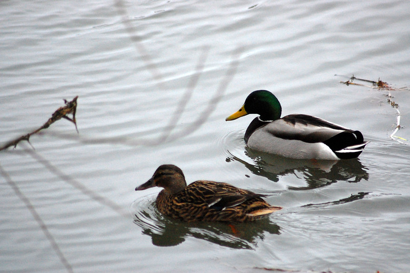
Well done Matt (y) - first things to jump out at me are the OOF branches in the foreground, and the weeds to the right of the male and behind the female......

But all-in-all, it's supposed to be "wild" and this is their natural habitat so I'm going to try and not get too bothered by them :LOL:

You seem to have lost a bit of detail in the dark areas on the birds though (males face and tail) - I wonder if this might be a bit more retrievable?
 
Hi Matt, another good effort.

Agree with what Graham has said.

Remove the branches and weed for me.
 
Thanks guys, they were my thoughts as well so had a go trying to clone them out afterwards but just made a real hash of it so left it how it was! All in all, for a quick shot as I was walking the dog I was quite happy with it :)
 
Wild branches + Wild birds = Wild photo. (y)

A good idea for shooting ducks is to take some bread, that way you get them coming towards you ;)

If I might be so bold, it's a little under exposed on the birds. Next time you are shooting ducks on a bright background you might want to consider a bit of exposure compensation -If that's your thing - I don't do auto modes - in other words exposing correctly for the birds as they are the subjects.
 
Last edited:
Thanks Brian, and quite a few of my photos from that walk were underexposed, decided to turn the exposure down instead of up :bang: Oh well, we live and learn!
 
Wild branches + Wild birds = Wild photo. (y)

A good idea for shooting ducks is to take some bread, that way you get them coming towards you ;)

If I might be so bold, it's a little under exposed on the birds. Next time you are shooting ducks on a bright background you might want to consider a bit of exposure compensation -If that's your thing - I don't do auto modes - in other words exposing correctly for the birds as they are the subjects.

Hi Matt - very well put by Brian above. I would only add that taking into a/c the issues of focus, exposure and extraneous material, I think that the composition is still pretty good.
 
Nice sharp image. I'd agree with what the others have said regarding the OOF branches, they are slightly distracting. But a great effort :clap:
 
Thanks for the comments :) And I think you may be right Christine but unfortunately I'm very new to photoshop so I've probably gone a bit too far!
 
Thanks Lynne :) Sorry I haven't replied sooner, combination of being away, lots of work and a broken laptop. Hence the lack of photos as well! I promise I will get back on track as soon as possible before Dark Knight tells me off :D
 
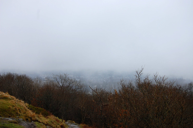
Right, time to get (pretty much) back on track! First off, space (as in lots of!)

8505955439_b8070bc15b_c.jpg


This is at Orrest Head in Windermere, visited for the weekend to see my girlfriend and unfortunately it was stupidly foggy the whole weekend!
 
8507066258_80d17a0d43_c.jpg


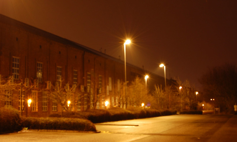
This is the building that I work in, it's a beautiful building but I'm not sure if I've done it justice or about cropping it, tried a crop but it didn't work at all so any advice is more than welcome :)
 
Week 6: Nothing much wrong with the crop I don't think, but it looks very soft / out of focus! I'd also tweak your white balance to reduce the heavy yellow tone.

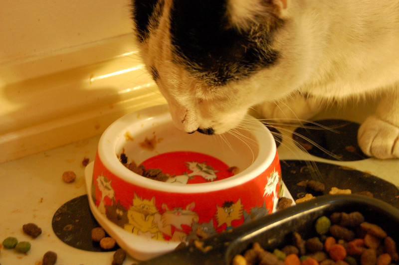
Week 7: Doesn't scream gluttony really, but nice detail in the whiskers! Again though, a bit of a tweak to the white balance and you could reduce the yellowness of the shot a little!

Nice catch up though! (y)
 
Hi Matt

Space - yes, lots of it but the conditions have not helped and hard to see a focal point.

Work - i like the comp, with the diags of building, road and lights but it looks ver oof. Also you need to experiment with the WB to get a better result

Gluttony - I think to get the theme better i would have removed the empty bowl, had the cat eat into the full bowl. Also poss move a bit further from the wall to remove the distraction of the skirting. Again WB issues
 
Matt, Space is the kind of shot I like to take; the contrast between the misty distance and sharp foreground is nice. But there's so little detail in the distance, I think you might need a bit more verticality in your foreground!

Work: oddly, I think it's that central ligt with the star burst effect that makes this one. Maybe need a bit more interest to move the eye around?

Gluttony: I like the idea and the colours. It feels a bit odd that the cat is so cropped, but there's lots of negative space to the left, but maybe that's what you wanted? A tighter crop might have worked. And maybe it would have been good to see at least a bit of Tux's eyes? Perhaps if you tried to nick his food in the middle? :D
 
Quite like Space. If only the lower left ground wasn't there it would be a cracker for me. Nice and minimal.

Work doesn't really appeal to me. Narrative helps but the WB is off and it's quite OOF.

Gluttony, cats, yup like cats. On theme but WB lets it down again.

Cheers and good catch up.
 
Hi ya

Work.....can see an interesting picture there just needs a little tweak...adjust the Wb for more natural color...am guessing it was handheld which would explain the softness ?

Gluttony...I love kitties...& 2 bowls of food puts it right on theme....again , tweak the WB a tad

Space....caught the fog well...nice n sharp in the foreground with some atumn color showing through...bet thats a cracking view on a clear day (y)
 
Thanks for all the comments guys, I will we having a play around with white balance on the last 2 as soon as I get a chance!

And Lynne, the view for the space photo is right across Windermere, happened to go up there as my friends had visited a few days earlier and thought it would be perfect for a photo but didn't quite go how I wanted!
 
Back
Top