rpn's 2011 Project 52 + Bonus Nature Added ***FINISH***

Thanks for all the kind comments, glad you like the images.

but with the long exposure is there a chance you knocked the camera, or didn't use a remote release? Or had you left stabilisation on?

The camera was on a tripod, no remote but use the timer instead to minimise any vibration.

btw, there were two or three people walking along the road at the time but because of the 25 second exposure, they are not visible in the photos.
 
I like the colour "Empty" image. I like the warmth in this pic. Excellent composition too. Very nice photo.
 
I've dropped in on your thread but this is the first comment!
The original clutter shot is great - while the sat dishes work for the image, they really spoil the street. Your retake on this theme does really suggest clutter to me; it all looks to organised and thought out.

I like your boat shot, but it makes me sad as it reminds me of my boat that I sold a few years back. It was nothing like the ones in your image though or I would never have sold it!

The street images is good.
I'm going with the colour version as I like that the sky is not black.
But the red traffic light reflection on the pavement is a little distracting for me.
 
Hi RPN ,just having a quick catch up on your thread , some great shots in here :)

The Empty capture is fab with the B&W version appealing most as the lack of colors adds to the feeling of empty (for me at least)(y)

Great architecture for Knowledge(y) but makes my eye's go funny :LOL:

Your reshoot of chaos certainly fits the theme well just wonder of the frame over powers a it ?But you've caught all those colors really well (y)

Like the shot of the Yachts , very moderate cost for one of those.....(y)
 
Sorry to hear about the extemely frustrating problems with camera repairs. I sympathise fully.

Love your "empty" images. Both the colour and mono are very appealing. The mono makes me think of one of those old pre-war British spy films full of chaps with stiff upper lips and dastardly foreigners.

The colour one looks very welcoming. Looks Christmassy with those coloured lights.

I find the double yellow lines a bit distracting, but not much you can do about that. I also think a little more sharpness in the mid-ground would add to the image.

Great pair of pics. (y)
 
Thanks Patrick for the Empty theme comments. (y) much appreciated

Well, it's been over two weeks since I last post here and also use a camera. Yes, you guessed it my DSLR is still not return from the repairer. Very frustrating :bang:

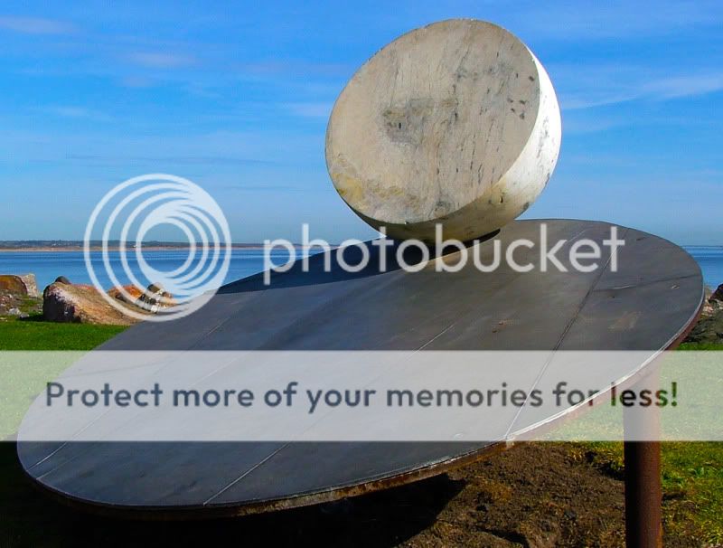
I don't really want to fall too much behind and last night I managed to dig out my old Fujifilm S5000. Went out for a walk this morning with the camera and came across this OBJECT

W14Object01.jpg
 
Hi, I like your object, quite a simple take on the theme but an interesting one.

I'd prefer to see a bit/lot more shadow on the disc...

Cheers.
 
Hiya rpn,

Glad you are back with us and have to say with two nice pictures too.

I like the 'object' photo .... my only crit would be ..... if you had taken the photo from different angles. I find the pole on the right a bit distracting, even though it is part of the sculpture. Perhaps if you lay on the grass in front and take a photo of it looking upwards using the lines on the base as lead-ins and also perhaps no shadow from the moon.

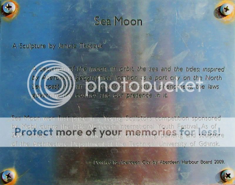
Thanks for posting the photo to explain the object ....Janusz Tkaczuk has produced a very poignant sculpture.

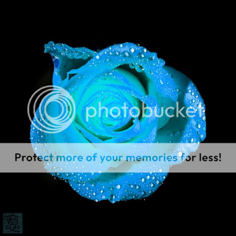
Onto week 'Wrong' and glad you have got your camera back. I absolutely love this photo :clap: The colour is so soothing and the detail you have capture is fantastic. I think as it is (even with your signature on the bottom left ... which works so well with this photo) would look fantastic hanging on the wall.

Well done and I look forward to seeing the other weeks.

Cheers

Dawn :)
 
now that's a CRAZY object!!!

wherever that is in the chaos pic, tis beautiful chaos to my mind ;0) looks a little fuzzy, but nonetheless a cracker

much much prefer the black and white empty street, lovely pic that one
 
Week 16 Paradox

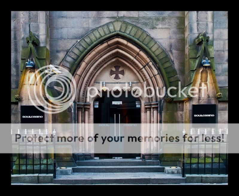
I’ve been over the meanings of the word again and again. Inconsistency; absurdity; irony; contradiction; impossibility; self-contradictory through often true statement. How can you take a photographic image of that! I’m really stuck with ideas since the theme came out over 10 days ago. After many thoughts and searches the interweb for inspiration then EUREKA.

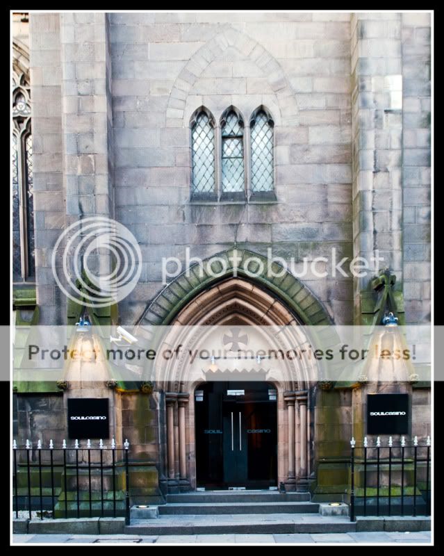
W16Paradox.jpg


This is in the town centre and actually not too far from my work. A church now turned into a bar/casino call SOUL.

Contradiction definitely, church: - a place of worship, adoration, respect, reverence then casino: - gambling, sin, offence, wrong, misdeed, felony, crime.
 
Hiya Stan,

Firstly, glad you have added your name in your profile so we know who you are (y), much better than calling your rpn.

Love your take on Paradox ..... hey and I think it is bang on theme. I have to say .... even though folk might not like the idea of a church being converted into a bar/casino .... I think they have chosen a very fitting name :D

That looks like a very grand building .... and I have to say, if there is no intended use for it's original build, why not turn it into something that will be of use ... otherwise it may just be demolished to make way for a more modern build (just my opinion .... no offence intended).

I agree with what Tina has said about the straighten .... although I think it could also do with a bit more processing. I notice you have opted for the 'no edit' on photos ... which I respect .... however I have done a bit of an edit which I won't post without your permission.

My ideas would be to straighten, lose the window on the left and the foreground paving to bring some equilibrium to the image, a very slight HDR application (but only a tad) [application in Picnik] and then a sharpen. In my edit that has really brought out a lot of the character of the building.

If you would like me to send you a photo of same to show what I had in mind, just let me know.

Otherwise a good idea for the theme.

Cheers

Dawn :)
 
I love this take on the theme, & I like the composition of the shot as it is, even with the empty space above the doorway. Ok it does need straightening but otherwise a nice shot of an unusual church/casino.
 
Hiya,

Thanks all for dropping by and the comments too. I'm still learning about post processing and Dawn, please do post up your edited version for me and onters to learn.

Hiya Stan,

I too still have much to learn about post processing, every day I seem to find something different to apply. I'd like to learn more about levels and some of the more technical things .... but all in good time.

For now I use what I am comfortable with, and find I do most of my post processing in Picnik because I find it easier to use than some of the more complicated software. One day I may get Photoshop and try to learn how to use that.

Thanks for agreeing to me posting the edit, it makes it easier to show what I had in mind than try to explain, so here is the edit I have done:

5660693602_42be5f8993_b.jpg
[/url] edit of rpn's paradox by crystal_singer (drodd), on Flickr[/IMG]

As I mentioned in my previous post, basically I applied the following: straighten, crop to lose the window on the left and the foreground paving to bring some equilibrium to the image, a very slight HDR application (but only a tad) [application in Picnik] and then a sharpen. I thought a plain dark border framed the building better, (minus an inner white frame, as a white surround blends too much with some of the lighter parts of the building).

I hope this helps and it would be interesting to hear your thoughts, and others, on this edit as it all forms part of my own learning too. Thanks for allowing to post here.

Cheers

Dawn :)
 
Hi Dawn,

I like that, the HDR is not too OTT but just enough to make the different. (y)

The straightening also makes the image 'easier' to the eyes (and brain) if you know what I mean. :)

I might have a go at that later myself.

Thanks.

Hiya Stan,

Glad you like the pic .... the processing has just given it a bit of a boost.

Give it a try later and see what you come up with .... if you need any help, just ask ... that is what we are here for.

Cheers

Dawn :)
 
Hiya Stan,

Well done, that is a great improvement :clap:

The crop works well and the colours great .... also like how the name on the doors is a lot clearer.

Cheers

Dawn :)
 
Nice paradox pic. The edit (cropped) brings in the focus nicely. Congrats.

Drodd - your HDR and straighten works too!

Hiya ecniv,

I agree, Stand had done a good job on the edit.

Thanks too for your compliment about the edit I did.

Cheers

Dawn :)
 
Thanks Dawn and everyone else for the kind comments. very much appreciated. (y)

I've tried HDR before but never quite like the end result. However, after seeing Dawn's effect I have to have another go but this time, easy on the processing and with only two images rather than the usual 3 or 5 or even 7!
 
Onto this week's theme.

Come on Sarah, give me a break. :D only joking. Tropical! I live in the North East of Scotland, how do you expect me to come up with an image of Tropical theme in this part of the world! It never goes above 10 degrees here, even in the mid summer if there’s a season called summer at all! :) :D

Anyway, have to dig deep into my archive….

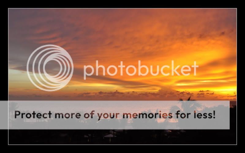
TROPICAL Sunset

W17Tropical.jpg


This was taken about two years ago in Kota Kinabalu, Malaysia. Looking out of my hotel room balcony on the first evening only a few hours after we arrived.

OK, I know it's not quite Project 52 in that sense but as I said 'tropical' up here in the frozen North! ;)
 
Hiya Stan,

Yep that indeed looks very tropical to me and WOW what a lovely sunset too (y)

I would have perhaps cropped it a bit on the left to remove the OOF trees, two to three trees in.

Otherwise a stunning photo.

Cheers

Dawn :)
 
Back
Top