
You are using an out of date browser. It may not display this or other websites correctly.
You should upgrade or use an alternative browser.
You should upgrade or use an alternative browser.
Monthly rpn's 2013-12 E.T.C. Challenge - December 12.4 Writings on Photo Added
- Thread starter rpn
- Start date
- Messages
- 2,820
- Name
- Mark
- Edit My Images
- Yes
Hi Stan, sorry it's taken a while to comment.
I really like those, and do think they tell a story. I think the processing is fine, and anyway it's a very personal thing.
Number one is possibly the weakest; without the processing and it's place in the story, it might not be much more than a snap. Four and five are superb!
I really like those, and do think they tell a story. I think the processing is fine, and anyway it's a very personal thing.
Number one is possibly the weakest; without the processing and it's place in the story, it might not be much more than a snap. Four and five are superb!
OP
- Messages
- 10,498
- Name
- Stan
- Edit My Images
- Yes
Lets get started with the second half of this challenge.
Was a beautiful evening yesterday so went out for a walk with Mrs rpn. Decided to take the camera with me with all the intension of grabbing some shots for this month and ended up with this.
7.1 Joiner Effect

Was a beautiful evening yesterday so went out for a walk with Mrs rpn. Decided to take the camera with me with all the intension of grabbing some shots for this month and ended up with this.
7.1 Joiner Effect

- Messages
- 19,304
- Name
- Andy
- Edit My Images
- Yes
Hi, Stan, June works well. Can't decide between #4 and #5, but I'll go for #5, well crafted set but I prefer them in one panel, IYSWIM.
July, oh, yeah, that works for me. Uneven light. Uneven composition and cracking BG. I'm on iPad so will have a closer loot when on laptop
Cheers.
July, oh, yeah, that works for me. Uneven light. Uneven composition and cracking BG. I'm on iPad so will have a closer loot when on laptop
Cheers.
- Messages
- 2,820
- Name
- Mark
- Edit My Images
- Yes
I really like that Stan. I especially like that the same guy appears in both of the beach panels, the slight misalignment, and the way the shape of your montage complements the composition. Great framing too ")
OP
- Messages
- 10,498
- Name
- Stan
- Edit My Images
- Yes
Thanks Andy & Mark, I am happy with the result too.
I used Program mode (can't remember the last time I used this setting ) to achieve the different exposure. Added some drop shadow to make the individual image stands out from the others and finish off with Reflected Gradient for the background
I am happy with the result too.I used Program mode (can't remember the last time I used this setting
) to achieve the different exposure. Added some drop shadow to make the individual image stands out from the others and finish off with Reflected Gradient for the background
OP
- Messages
- 10,498
- Name
- Stan
- Edit My Images
- Yes
Taken at the same evening as the Joiner Effect (7.1) and of the same building; Aberdeen harbour Marine Operation Centre. This is a reflection shot of an oil supply boat leaving the harbour with supplies for the North Sea oil rigs.
7.2 Reflection

7.2 Reflection

OP
- Messages
- 10,498
- Name
- Stan
- Edit My Images
- Yes
I'm not 100% sure about the exact meaning of the 360 Panomara theme but since we already had the 'Miniature Planet Panorama' I though this would just be 'coventional' panorama shot. So here's my theme 3 of this month
7.3 360 Panorama

7.3 360 Panorama - Aberdeen Uni by syf22, on Flickr
7.3 360 Panorama
7.3 360 Panorama - Aberdeen Uni by syf22, on Flickr
kelack
TPer Emerita - But she's back!
- Messages
- 10,607
- Name
- Kelly
- Edit My Images
- Yes
Really liking all your July set. I am so pleased that you are giving them all a go
And yes, your 360 is exactly how I meant so while it is a conventional panorama, it's not just a section of it but one that you turn in a full circle to take. I can see that it joins at either end. I think I might like to see you give it another go with less trees as the detail and interest gets a little lost
And yes, your 360 is exactly how I meant so while it is a conventional panorama, it's not just a section of it but one that you turn in a full circle to take. I can see that it joins at either end. I think I might like to see you give it another go with less trees as the detail and interest gets a little lost
- Messages
- 2,820
- Name
- Mark
- Edit My Images
- Yes
I love your reflection shot Stan: I can't fault it
I also like your panorama, but agree with Kelly about the trees. Do you not pack a chainsaw in your camera bag? Where's your commitment man!?
I also like your panorama, but agree with Kelly about the trees. Do you not pack a chainsaw in your camera bag? Where's your commitment man!?
- Messages
- 19,304
- Name
- Andy
- Edit My Images
- Yes
Joiner effect, wasn't sure at first....mainly because if the different lighting...but it's grown on me. Great composition! Good detail and frame.
Reflection, yeah, on theme and nice detail. Just feels a tad tight for me.
Panorama, good detail and I like that you've got the red door at the extreme LHS and RHS. Trees....yeah, would be good to see the building.
Cheers.
Reflection, yeah, on theme and nice detail. Just feels a tad tight for me.
Panorama, good detail and I like that you've got the red door at the extreme LHS and RHS. Trees....yeah, would be good to see the building.
Cheers.


OP
- Messages
- 10,498
- Name
- Stan
- Edit My Images
- Yes
Thanks Andy and good point about the empty space.
However, Im one of those self-conscious photographer and would feel a bit uncomfortable if I stand amount the crowd pretend to watching the game taking shots from the hip would looks suspicious especially in these time and age.
However, Im one of those self-conscious photographer and would feel a bit uncomfortable if I stand amount the crowd pretend to watching the game taking shots from the hip would looks suspicious especially in these time and age.

OP
- Messages
- 10,498
- Name
- Stan
- Edit My Images
- Yes
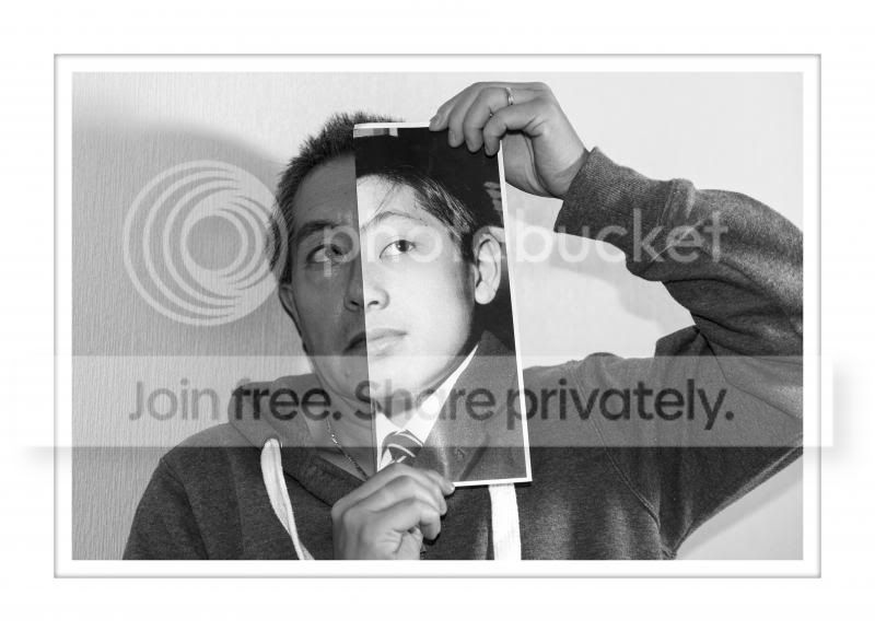
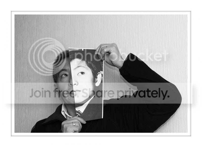
July theme 6, Selfie Now and Then.
Dont usually find me in front of a camera lens so Im actually behaving quite oddly here by standing still and getting my photo taken! Ive done this selfie shot earlier this year for another photo project but decided to do it again this month to keep in the spirit of the monthly challenge. I put up both versions for you all to critique.
7.6 Creative Self-Portrait


- Messages
- 19,304
- Name
- Andy
- Edit My Images
- Yes

- Messages
- 2,820
- Name
- Mark
- Edit My Images
- Yes
Hi Stan, sequence is fantastic. I might have stopped it at the kick for a little more dynamism, but it's hard to fault
From the hip I'm not so sure about. It's a nice shot, but it's not saying a lot to me I'm afraid.
Self portrait is brilliant! I like the second one best, as your expression is less strained. B&W was a flash of genius; looks great!
From the hip I'm not so sure about. It's a nice shot, but it's not saying a lot to me I'm afraid.
Self portrait is brilliant! I like the second one best, as your expression is less strained. B&W was a flash of genius; looks great!
Your sequence has come out really well , i do think i tighter crop may improve it further though.
I like your idea for your self portrait, I prefer the first version, the tighter crop and more texture/contrast showing in the clothing adds a bit over the 2nd
I like your idea for your self portrait, I prefer the first version, the tighter crop and more texture/contrast showing in the clothing adds a bit over the 2nd
OP
- Messages
- 10,498
- Name
- Stan
- Edit My Images
- Yes
Please ignore, image removed, not quite 'on theme' and jumped the gun Will resubmit in later month. I hope
Done this shot couple of time before for other project and also trying out the technique. Here's my first submission for August.
One of my previous version can be found in my 500px account below or here
8.1 Cinematic Scene - American Beauty
Will resubmit in later month. I hope Done this shot couple of time before for other project and also trying out the technique. Here's my first submission for August.
One of my previous version can be found in my 500px account below or here
8.1 Cinematic Scene - American Beauty
Last edited:
OP
- Messages
- 10,498
- Name
- Stan
- Edit My Images
- Yes
Restart my August challenge and hopefully this one is OK.
Struggling to find a suitable old photo for this theme. Another difficulty with this shot is trying to get both the foreground 'dear photo' and the background location in focus even with f16 aperture.
8.1 Dear Photography - School Sport Day

Struggling to find a suitable old photo for this theme. Another difficulty with this shot is trying to get both the foreground 'dear photo' and the background location in focus even with f16 aperture.
8.1 Dear Photography - School Sport Day

 :shrug: Hello, everyone on holiday?
cowboy
Guy Fawkes
- Messages
- 3,143
- Name
- Mark
- Edit My Images
- No
I like your dear photograph, I can't crit it as I don't think that type of photo can be.
You've lined everything up well and got the focus as best you can
I can't see your fisheye effect (unless it's a little square with a question mark in it
") )
)
You've lined everything up well and got the focus as best you can
I can't see your fisheye effect (unless it's a little square with a question mark in it
)- Messages
- 19,304
- Name
- Andy
- Edit My Images
- Yes
Hi, Stan 
Dear photo, works for me and you've done to get focus. I can see that the roof of the main building is the same size, but the fence loos much further away in the older photograph. I suspect that would have been a nightmare to correct.
Fisheye, yeah, on theme and you've done well to get it all in the frame. I think I'd like see see it a bit more extreme, IYSWIM.
Cheers and 4 more to go
OP
- Messages
- 10,498
- Name
- Stan
- Edit My Images
- Yes
I like your dear photograph, I can't crit it as I don't think that type of photo can be.
You've lined everything up well and got the focus as best you can
I can't see your fisheye effect (unless it's a little square with a question mark in it
Hi, Stan
Dear photo, works for me and you've done to get focus. I can see that the roof of the main building is the same size, but the fence loos much further away in the older photograph. I suspect that would have been a nightmare to correct.
Fisheye, yeah, on theme and you've done well to get it all in the frame. I think I'd like see see it a bit more extreme, IYSWIM.
Cheers and 4 more to go
Thanks Mark and Andy,
I tried to get the main feature i.e. the roof to line up the best as I could. To replicate most other features would be quite difficult giving the focal length and distance to subject etc.
Here's another Fisheye image with more extreme 'Bend' applied.

- Messages
- 2,820
- Name
- Mark
- Edit My Images
- Yes
Hi Stan, I like your dear photo one. Yes the focal lengths are different, but I think you've got it nicely aligned anyway, and I like the colours. I think these shots should be judged on how well they convey the personal history, and yours does that very well indeed.
Fisheye one I don't think works . If it were actually taken using a fisheye lens I think you'd think it was a test shot, not one that used the lens' characteristics to best effect, and I think that's what this theme demands; a shot/subject that looks like it should and would have been taken with a fisheye in the "real world".
Fisheye two is better. I still don't think it's a subject that demands a fisheye, but at least in this one the sky and the sea benefit from the treatment
Fisheye one I don't think works
. If it were actually taken using a fisheye lens I think you'd think it was a test shot, not one that used the lens' characteristics to best effect, and I think that's what this theme demands; a shot/subject that looks like it should and would have been taken with a fisheye in the "real world".Fisheye two is better. I still don't think it's a subject that demands a fisheye, but at least in this one the sky and the sea benefit from the treatment


- Messages
- 2,820
- Name
- Mark
- Edit My Images
- Yes
Very clever Stan! I like them both equally as takes on the theme, but think the first one is technically better. The lightegg isn't instantly recognisable as an egg (having the kite mark stamp visible might have helped?), though once you realise it's obvious, and I think the background is a little too dark for my liking; I'd prefer it to be a bit whiter, with the debris from the shell being a little clearer.
- Messages
- 19,304
- Name
- Andy
- Edit My Images
- Yes
Saw these on my phone but waited for bigger views before I commented.
#1 is a good take but it doesn't have the wow factor that #2 has. Really good take on the theme and overall well executed. I'd like to see a closer crop, thought. Not sure if you could have got it any brighter as looks a tad dark on iPad. The shell bits in th front look slightly OOF.
Overall, made me smile and as said cracking ideanono.
Cheers.
#1 is a good take but it doesn't have the wow factor that #2 has. Really good take on the theme and overall well executed. I'd like to see a closer crop, thought. Not sure if you could have got it any brighter as looks a tad dark on iPad. The shell bits in th front look slightly OOF.
Overall, made me smile and as said cracking idea
nono.Cheers.


I like your dear photography shot it very well lined out and the focus is clear on both the photo and the background.
I think the light egg is the better of your two ordinary object ideas, not sure why just looks more interesting to me and I like the lighting.
I like the concept for your scale shot improving the focus and not chopping the feet off i think would add to it.
I think the light egg is the better of your two ordinary object ideas, not sure why just looks more interesting to me and I like the lighting.
I like the concept for your scale shot improving the focus and not chopping the feet off i think would add to it.