- Messages
- 6,502
- Name
- Peter
- Edit My Images
- Yes
I like this. As said above slight crop in on the left. The reflections in the jug do distract a bit too much though.

Nice idea and good composition, the reflections been mentioned, I'd slightly crop the LH side a smidge so the tile grout line thats not straight isn't visible.")

Hi Sarah, Whilst I agree about the reflections, I think it's a nice clean image and nicely composed.
Looks a bit stark. A bit closer on the lemons and have the lemonade in a glass is what comes to my mind. Not that bothered about the background either. However I do like the perfect DoF, lemons and jug in focus, background not.
") It was a bit of a shoot and be damned, was hoping that I would have more time/inspiration later in the week
It was a bit of a shoot and be damned, was hoping that I would have more time/inspiration later in the weekLiking the text and the large white border... reflections don;t cause me too many troubles, but if the set up was swung round to the right, the two vertical grout lines would have been equal and you'd have lost the one on the right.
 I should've cropped that line out though
Ho Sarah....I really like the idea for the theme...very original....I think a close crop would look good too.
... arty ... love the rich colour of the mature-looking lemons ... and the complex light diffusion.
You're brave ... a glass jug against a glossy tiled background.
I get given lemons by the carrier bag full - which once they are a few days old are still OK for juicing, but not so good for photography and I didn't really have the time to go out and Apart from that tile line on the left I like all of it, the reflections are a bit strong but they add to the picture for me.
Thanks I'd never be brave enought to shot a glass jug against a shiny tile....stuff of nightmares ... Crit.....cropped a smidge to close at the top for me but I suspect that was to line up with the line of the tiles.....& the lhs tile line showing , just needs a smidge off but am having a problem with #1 house model and the Time one If she doesn't put up soon it might have to be a scary selfie


 Great catch up from you.
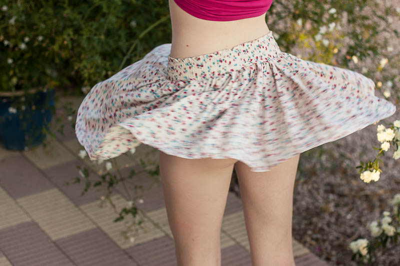
") . Good sense of movement and as Darren said, a tad right on the RHS and maybe a little dark. , well caught movement , smidge more room to the rhs but looks well lit to me....( me or Andy have a problem with our monitors.....!)
. Good sense of movement and as Darren said, a tad right on the RHS and maybe a little dark. , well caught movement , smidge more room to the rhs but looks well lit to me....( me or Andy have a problem with our monitors.....!)
