I can't believe I've not commented on your shots before Vicky. I've left myself a lot of work to do in one go, but your pictures are worth it so here goes!
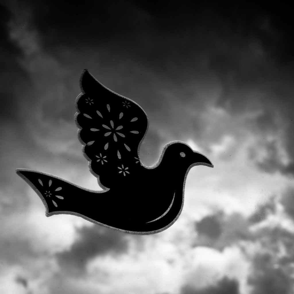
Sweet; I love the colours and dark background. Nicely composed too.
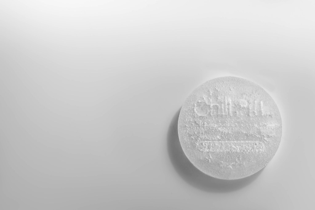
Secure; sooo, we learn something about you, despite what you tell us! Very nicely exposed simple shot.
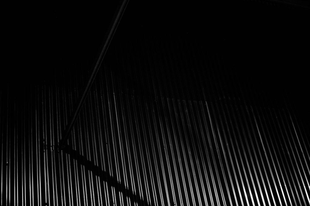
Industry; I like the tone on this one, but think the wagons do get a little lost.
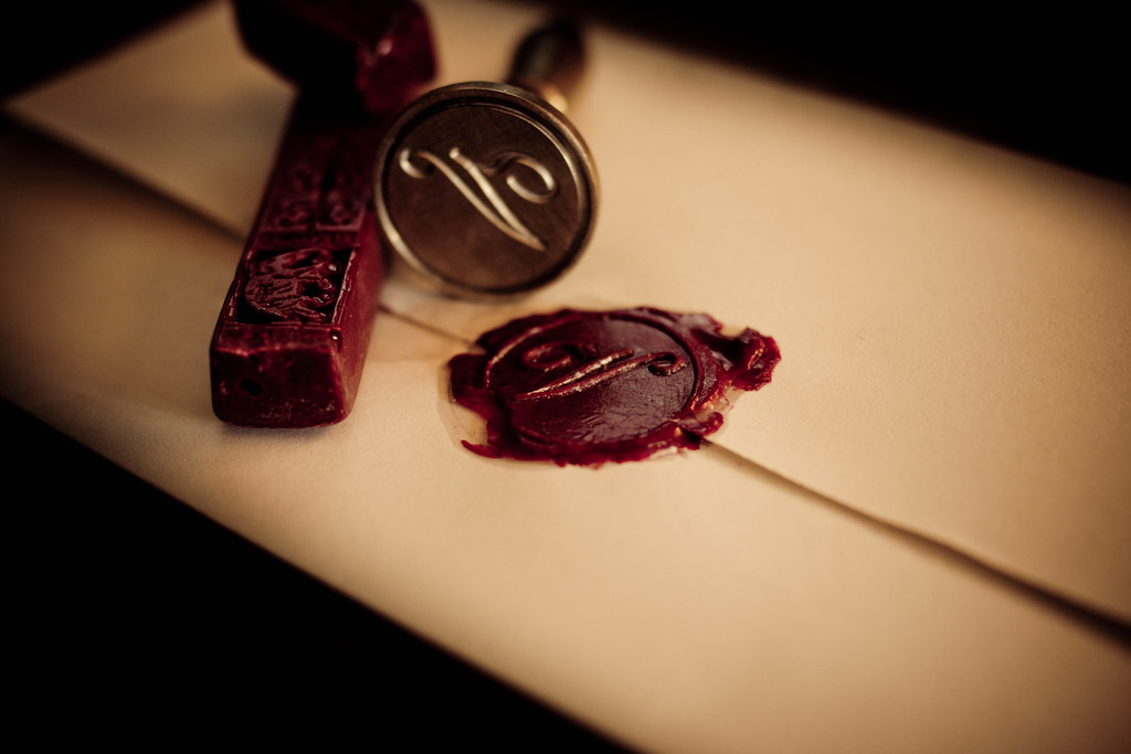
Handmade; lovely shot, but I'm not certain it screens handmade to me. Great colours.
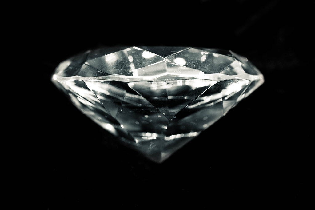
Shiny is the only one of yours I'm not so keen on. It definitely says shiny, but I just don't like it so much as an image. There's nothing wrong with it, it just doesn't connect somehow

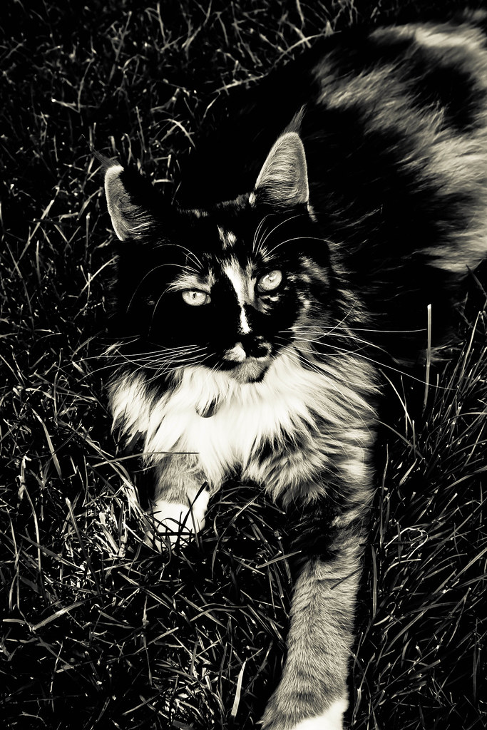
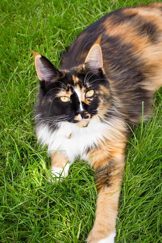
Soft; wow, I just feel the softness. Makes you want to snuggle up on the carpet with the cat!
Leave; blimey girl, what have you done to that poor animal! Great shot, and I love the B&W.
Abstract; lovely shot again, but not really abstract IMHO. Love the starburst
Symmetry works well because you've got symmetry in the reflections.
Moody; needs your explanation, and I agree with your self critique, but it is a nice well taken shot.
Joy; took me a while to spot the theme in this one, but once I did I loved it! Very very clever.
Small; really nice, and your composition makes it I think.
Have I missed any? Phew!!!!
I think you have your own distinctive style, which is a very good thing. Most of your shots I'd stand a reasonable chance of guessing were yours in a blind taste test!
I hope you're enjoying your A77. I don't know why more people don't use Sony's; to my mind they offer a lot that Canikon don't (yet).
If you want to bring those handcuffs along to my next
random party, I'll do you a special rate!!!!

 sorry it's taken me a while to get here, not enough hours in the day:bonk: