weekly Southdowns' 52/2012 - Week 52 - Busy SP Posted. Thank You, and Goodnight :)

Ooh! I love the idea, and I do actually like the crop as well. It does look a tad rushed to me though - Mandy's expression is wonderful, clear, sharp, good colours, but I think I'd have liked the watermelon to be in focus too, and a bit more red (however accurate that may or may not be). Though if you were pushed for time I think it's a job well done!
 
That secure shot is an absolute cracker. I love it.

I like the PP on the AotN too. Good work.
 
Ooh! I love the idea, and I do actually like the crop as well. It does look a tad rushed to me though - Mandy's expression is wonderful, clear, sharp, good colours, but I think I'd have liked the watermelon to be in focus too, and a bit more red (however accurate that may or may not be). Though if you were pushed for time I think it's a job well done!

Cheers Vicky. It's an odd one; it was rushed, but sort of in a good way; I was actually trying to photograph my daughter with this pose, but she wasn't really cooperating. Mandy just grabbed the melon and I got the shot with no expectation of using it (either from me or her), but it worked really well because the expression needs to be spontaneous.

It's also odd because it's one of those photo's that HAS to be viewed large to get the best out of it. I agree completely that the melon would work better in focus in a small view, but blown up full screen on my 27" monitor it looks fantastic (deep breaths between puffs on my own trumpet!), because you are drawn to the eyes past the melon, and the DoF gives it depth.

I just think it needs that extra room to work well :).

Strange. In LR I loved it (still do), but was disappointed the moment I saw it on Flickr/my iPad.
 
Last edited:
It's also odd because it's one of those photo's that HAS to be viewed large to get the best out of it. I agree completely that the melon would work better in focus in a small view, but blown up full screen on my 27" monitor it looks fantastic (deep breaths between puffs on my own trumpet!), because you are drawn to the eyes past the melon, and the DoF gives it depth.

I just think it needs that extra room to work well :).

Strange. In LR I loved it (still do), but was disappointed the moment I saw it on Flickr/my iPad.

I know what you mean :) I'll trust you on that then - I tried looking at the largest version full-screen on my ridiculous monitor and putting my face closer(!) and I think I can see what you're talking about :)
 
He he ... melon-chops ... very good image of joy (y)
 
Thanks Michael, Dean and Gramps :)
 
I have two candidates for Small. I can't decide which to submit because I like both a lot for different reasons, so over to you guys :)

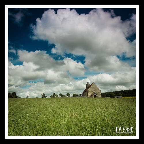
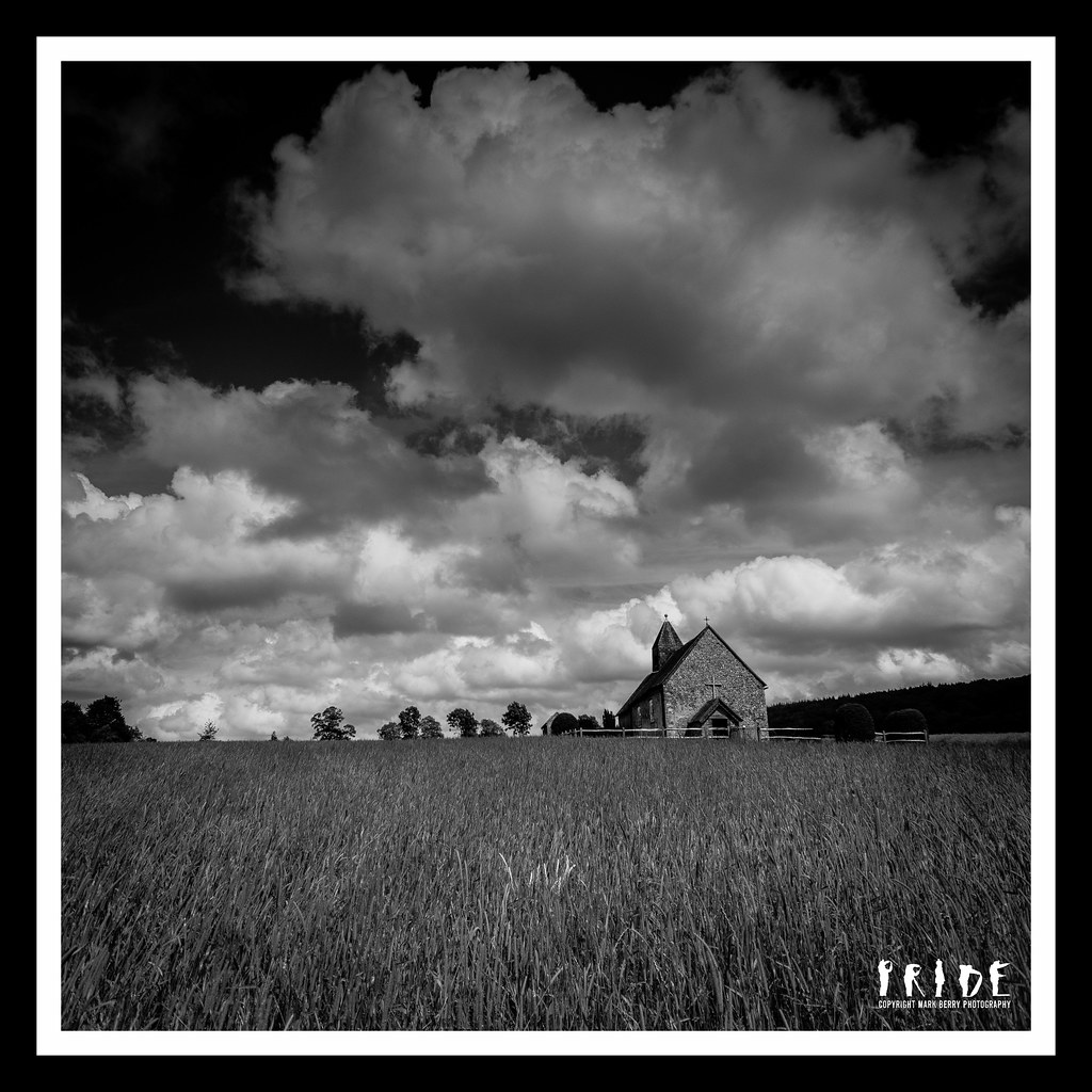
#1: Small Church

This is a very tiny church in Finchdean, where my brother and sister in law were married 25 years ago. It stands all on it's own on top of a hill, with just a grass pathway to it, and is lovely.

I think I've managed to enhance it's "smallness" in the landscape and below the sky, but I'm not sure it'd say small without the explanation?


W27 - Small Church.jpg by MarkBerry1963, on Flickr

#2: Small Boat In A Big Sea

OK, so I know it's a windsurfer not a boat as such, but you know what I mean!

Tiny bit of "tilt shift" type processing applied, but I didn't want to make it an actual miniaturised shot, just to enhance how small and vulnerable the craft looked in the big heavy sea. This is the shot I had in mind as soon as I saw the theme, though I'd have preferred a dingy to a windsurfer.


W27 - Small Boat Big Sea.jpg by MarkBerry1963, on Flickr
 
Last edited:
Hi Mark

Joy - smashing shot, lovely focus on and colour in the face. I think I fall into the 'melon in focus' camp.:D

Small - like#1 for the composition, the pov and the mono treatment and I think that it does work for the theme without an explanation. The building becomes small in the context of a big sky and a big field. Well done.(y)

#2 is on theme but does not thrill me, sorry.
 
Cheers guys, looks like number 1 so far then :). I did wonder if #2 was a bit marmite (there's an awful lot of featureless sea in it), but I really like it on a big screen.

Mike, here's the colour version. It's actually MORE processed than the B&W one, which beyond the normal sharpening had just the conversion and a vignette applied. In colour it needed WB to correct for my cheap ND grad, aqua reduction because the sky was more aqua than blue (still is a little), and green and yellow taking down too because the foreground colour swamped it otherwise. I also "undid" the physical ND grad a little with a dodge one in LR, because while it added to the drama in the B&W version, it just looked too dark in colour.

It's nice, but I think the B&W works better, especially for the theme :)


W27 - Small Church Colour.jpg by MarkBerry1963, on Flickr
 
Last edited:
Mark, superb shot for Joy, really liking that and think the OOF melon works great... Stunning detail in the eyes.

Small, I prefer the first, excellent and mono works great for me. The second just doesn't really do much for me, sorry.
 
Cheers Brian, Michael (no need to be sorry Brian; it's hardly your fault and I want honest feedback :)

I agree re 2; a different boat might have worked much better. I have so many ideas for a similar composition on both land and sea, but this was the only one I could find to shoot!

So, #1 is my submission for this week :)


W27 - Small Church.jpg by MarkBerry1963, on Flickr
 
Hi, Mark, Joy is a cracker...real fun. Just like to see the melon a tad lower so it didn't block the nose.

Small, #1 (B&W) is to my liking, nice and moody. I doesn't scream Small, even though it is :thinking:

Small, #2 is messing with my eyes :nuts: good interpretation and defintley Small.

Cheers.
 
Two fabulous shots! I do like the B&W treatment, but the colours are so good, that's where my preference lies. I don't think it's obviously "small", but it's not a great leap away, and I quite like that it's relatively small rather than flat out small. Such pretty clouds.
 
Thanks Marsha, Andy and Vicky.

That's the trouble with putting up more than one photo; you never get a unanimous decision!

I'm VERY aware that I've not been commenting. If I don't get a chance tonight, I will definitely do as much as possible tomorrow :)
 
Not sure which one I prefer edging towards the colour, excellent shot though couldn't fault it.
 
Joy - This made me smile. I like the fact you can see joy in the eyes as well.

Small - The are both on theme but as an image I am drawn towards #1. Looks like you had some nice clouds that day.
 
Hi mark, i'm glad you have picked the black and white it's the one I'd have gone for as well! It looks like lovely small church and must have been a special place to get married!:) I think the colour version is lovely but the colours sort of take over (difficult to explain but I know what I mean!):):)
 
Great submissions, both strong pictures. The B&W makes the church stand out but the colour church shot is really appealing to me. The blue is looooooovely.

The little dude windsurfing is a good idea, just a little lost in that sea.

You have made the right choice...I think...I do like that colour one though....:D
 
Hi Mark, quick catchup on a few.
Blimey though your reshoot was moody rather than secure, great shot though.
Moody - great processing to bring out a moody type sky and darkness of the figure.
Joy - Liking the idea with the face showing joy but unsure if placement of melon needs to be a tad lower or not.
Small - again great subject but torn between colour or B/W, both right in some way or other. Idea of subject lost in the ocean is great. As you say a different boat would have made the picture and been the winner.
 
Like the idea with 'small', for me it looks a bit 'over the horizon' if you get my drift ... needed taking from higher up ... but that might have destroyed the effect? :shrug:
 
I love your shot for joy, very good. Although the church is a good shot it doesn't really say small to me, but I can see what you were trying to do (colour one for me) however the windsurfer is great, tiny indeed :clap:
 
I like both the colour and B&W versions for small Mark, for differing reasons.
I think the B&W is perhaps a little more dramatic with the greater contrast in there over the colour one. The church does indeed look small beneath the big sky but agree with Gramps in that the bottom of the church is a little lost 'over the hill'.
That said, I do like the overall composition, the field gives a nice lead in, drawing the viewers eye upwards towards the church and then beyond to the big sky. The sky is why I like the colour version too, lovely blue sky behind those fluffy clouds.
Iain
 
Symmetry - nice and well focused images, draws you straight into the subject ;)

Moody - The angel steals it for me - nicely done

Joy - Its good that her eyes are smiling thats always the key

Small - I prefer the church, although I take your point about with the explanation - tiny tweak I would make is that little patch of highlighted grass, and maybe pop a curve adjustment onto the building to brighten it just a touch
 
Thanks everyone, some very helpful comments :)

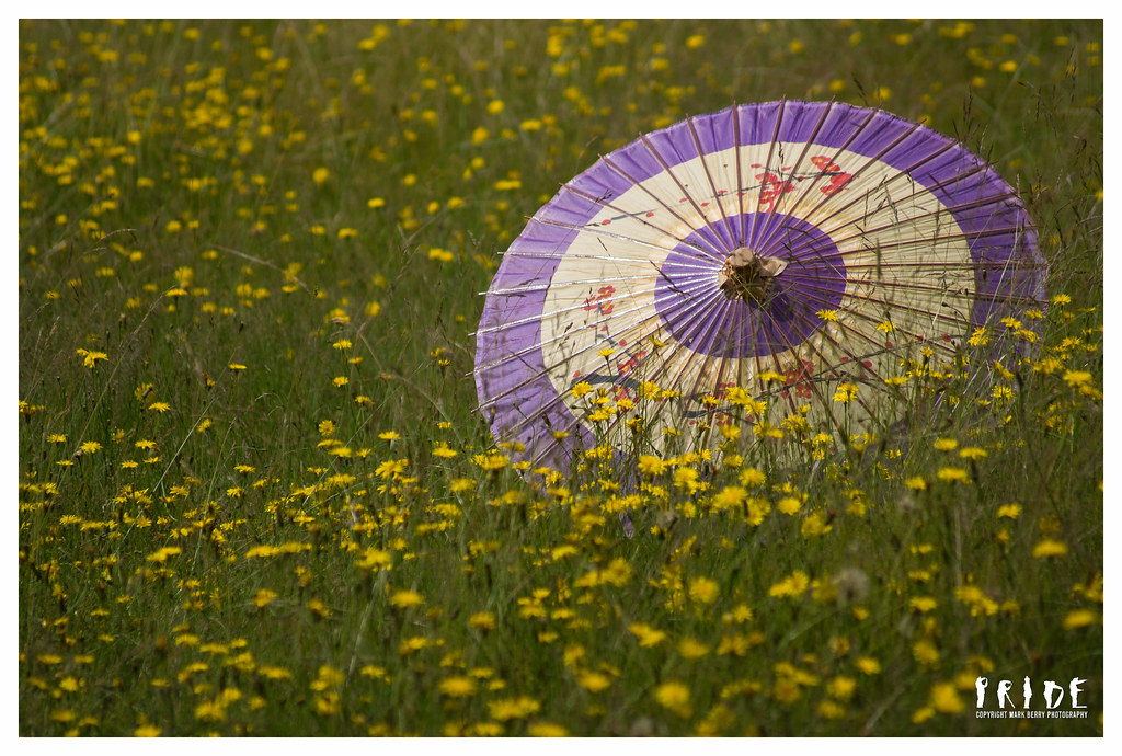
I've been a little "togged out" this week - it is possible to have too much of a good thing! I went on the Practical Photography DSLR Bootcamp at the weekend (with Chris Weston amongst others), and it was brilliant, but it really was a boot camp! I've posted my favourite pic from the weekend at the bottom just for fun; we had to pick props and go shoot them :)

So, I'm not entirely happy with this week's. I'm over the moon with the concept, just not so sure I've nailed it with the execution. This is not Photoshop trickery; it is as it was :)

Straight. Or maybe not so straight?:


W28 - Straight Or Not?.jpg by MarkBerry1963, on Flickr

Bootcamp shot:


Creativity - Meadow.jpg by MarkBerry1963, on Flickr
 
Last edited:
good shot I like it too :clap: I think the yellow G is a bit bright compared to the rest and maybe another green one would have worked better, but that assumes a green G was available lol Love the umbrella too :)
 
Cheers Marsha. Actually it's growing on me! I got a bit hung up on the line between the floor and the wall of my backdrop, but on reflection I think it probably adds to the effect.

The Bootcamp was really really good; if they do it again next year I'd highly recommend it, no matter what your level.

Summer, yes I agree re the yellow, and would also have preferred not to have two reds and two blues next to each other, but the letters dictated the colours. I guess in the days of handmade toys they'd have been random colours, but not so with these mass produced ones :(.
 
Last edited:
Thanks Michael, but I'm not quite with you; what bright G? And Summer, I think there's a problem with your monitor; there's no yellow here ;):


W28A - Straight Or Not?.jpg by MarkBerry1963, on Flickr
 
Back
Top