You are using an out of date browser. It may not display this or other websites correctly.
You should upgrade or use an alternative browser.
You should upgrade or use an alternative browser.
weekly DK's 52 in 2014 - Wk's 52 'Support' Added - AND FINISHED :)
- Thread starter Dark Knight
- Start date
- Messages
- 13,760
- Edit My Images
- Yes
Thanks PhilGood thinking DKEdit looks better, the ring certainly stands out more. Detail in sands good too, loads of minerals in there too

Cheers MandyI like the edit much better well done.
Hahaaaa where did it go... behind the sofa ??Ok, I replied to your thread last night, where'd it go
Yeah rightI'll say it again!
Smoke, love the colours in number one and the sun beams in number two, now go back and wait until you can combine the two
ThanksMineral. I like the edited version best, the detail in the stone is better. I don't think you needed to use the sand though as the ring has a big enough mineral in it, I think the sand is a touch distracting!
I did wonder whether to just keep it on Mrs DK's hand, or on a dresser, or in a box... settled for Sand lol
- Messages
- 13,760
- Edit My Images
- Yes
GOD NO... wouldn't dare go to the beach with it... The wife would be a nervous wreckcolour of the sand is fine for me - great detail picking out every single grain, second of the two originals for the detail retained in the top facets of the ring.... and there was me thinking you went to the beach for this one!
Exactly :OAt least if you lost it in a builders bag in the garden, it would be easier to find than somewhere on Great Yarmouth beach!!
Cheers AdamThe edit is a lot better. The ring stands out more, an the sand looks a better tone. Well rescued background
- Messages
- 4,831
- Name
- Alan
- Edit My Images
- Yes
Hi DK
Mineral - I find jewellry surprisingly hard to get right, but have failed to fathom the reason. They always seem to look right in the viewfinder but the metal often looks dull. I prefer #2 cos the stone and the small claws are better and the sand seems to complement it better. If anything i would have tried to bury it even further and make the contrast between the stone and its setting with the sand, without the 'ring' part
Mineral - I find jewellry surprisingly hard to get right, but have failed to fathom the reason. They always seem to look right in the viewfinder but the metal often looks dull. I prefer #2 cos the stone and the small claws are better and the sand seems to complement it better. If anything i would have tried to bury it even further and make the contrast between the stone and its setting with the sand, without the 'ring' part

- Messages
- 13,760
- Edit My Images
- Yes
Thanks JasonHi DK......A nice idea you've had there...
Edited image is a little more balanced and complimentary to the subject I think
Looking back it is surprising the difference it does make !!!
Oooo good thinking Batman !!!! Thanks Alan... may try that if the weather is poor again this weekendHi DK
Mineral - I find jewellry surprisingly hard to get right, but have failed to fathom the reason. They always seem to look right in the viewfinder but the metal often looks dull. I prefer #2 cos the stone and the small claws are better and the sand seems to complement it better. If anything i would have tried to bury it even further and make the contrast between the stone and its setting with the sand, without the 'ring' part
- Messages
- 13,760
- Edit My Images
- Yes
Cheers KevI prefer the edit, good colours and detail.
Thanks ColinNice take on the theme and like the use of the sand
- Messages
- 8,398
- Name
- Lynne
- Edit My Images
- Yes
Hi Dean
apologies for my delayed visit to your thread ...I will try harder in future !
Smoke....liking that take on the theme.....prefering #2 I think lovely silhouette & colors .....might have cropped a chunk from the lhs to make the building less central ?
Mineral....love that edit of #1.....can't really add anything to what's been said already
apologies for my delayed visit to your thread
Smoke....liking that take on the theme.....prefering #2 I think lovely silhouette & colors
 .....might have cropped a chunk from the lhs to make the building less central ?
Mineral....love that edit of #1.....can't really add anything to what's been said already
- Messages
- 13,760
- Edit My Images
- Yes
Oooo you naughty ladyHi Dean
apologies for my delayed visit to your thread...I will try harder in future !

Thanks LynneSmoke....liking that take on the theme.....prefering #2 I think lovely silhouette & colors.....might have cropped a chunk from the lhs to make the building less central ?
Mineral....love that edit of #1.....can't really add anything to what's been said already
- Messages
- 13,760
- Edit My Images
- Yes
Thanks MichaelEdit much better nice to see something different
Cheers CraigHI Dk, again all been said above but the edit is great
Thanks SarahBeautifully sharp and clean - agree about the yellowness of the sand - but the edit has much improved it.
Why thank you young man... Cheers AlanAbsolutely fantastic smoke shot Dean. Great colours in there and the sun just visible above the horizon makes 1 my personal fave. Great work.
- Messages
- 13,760
- Edit My Images
- Yes
Well... a bit of a tough one this week, had a good idea but was unable to find my subject, so I will be keeping an eye open during the week....
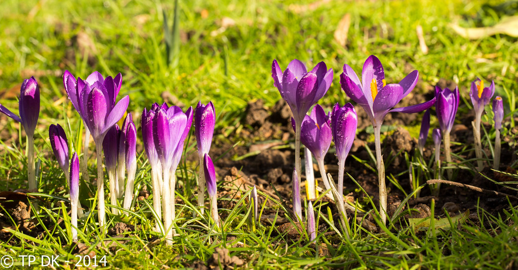
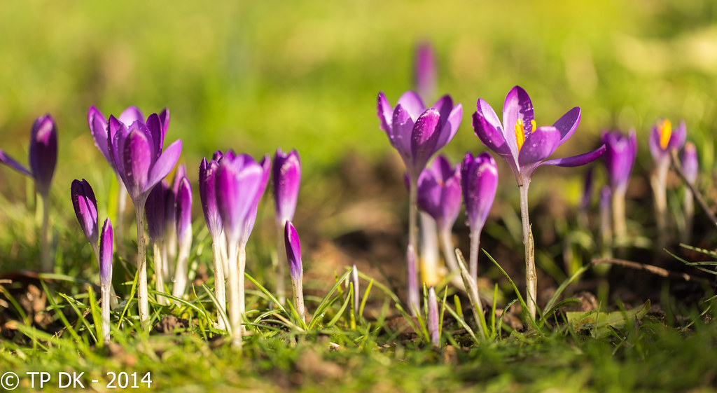
In the mean time, wandering around the garden i realised that, with the wind down, blue sky and the sun finally out there was a 'Sense' of spring in the air.
Wk 7 - a 'Sense' of Spring
2 too choose from, both very similar I'm liking the really narrow DoF on the second shot but feel it may be too shallow, hence shot One is my first choice
<EDIT> Nooooooooooo just see Nathalie has the same idea... AND the same flower lol :bang:

Wk 7 - a 'Sense' of Spring by TP DK, on Flickr

Wk 7 - a 'Sense' of Spring 2 by TP DK, on Flickr
In the mean time, wandering around the garden i realised that, with the wind down, blue sky and the sun finally out there was a 'Sense' of spring in the air.
Wk 7 - a 'Sense' of Spring
2 too choose from, both very similar I'm liking the really narrow DoF on the second shot but feel it may be too shallow, hence shot One is my first choice
<EDIT> Nooooooooooo just see Nathalie has the same idea... AND the same flower lol :bang:

Wk 7 - a 'Sense' of Spring by TP DK, on Flickr

Wk 7 - a 'Sense' of Spring 2 by TP DK, on Flickr
- Messages
- 7,070
- Name
- Sarah
- Edit My Images
- Yes

OMG if you'd gone halfway between the two you'd have got it spot on - slightly too much DOF in the first and too little in the 2nd if you'd gone about 5.6 or 8 I think it would have been spot on for me. It's the crocus about 1/3 in from the left being OOF that spoils it a bit in the 2nd one.
- Messages
- 13,760
- Edit My Images
- Yes
Thanks Sarah
Fools never differGreat minds thinking alike.
OMG if you'd gone halfway between the two you'd have got it spot on - slightly too much DOF in the first and too little in the 2nd if you'd gone about 5.6 or 8 I think it would have been spot on for me. It's the crocus about 1/3 in from the left being OOF that spoils it a bit in the 2nd one.
I think you're right, in the middle would have been much better... and with Nathalie doing a similar image I am really desperate to find my original shot I wanted
- Messages
- 7,070
- Name
- Sarah
- Edit My Images
- Yes
Thanks Sarah
I think you're right, in the middle would have been much better... and with Nathalie doing a similar image I am really desperate to find my original shot I wanted
Bloody copy cat

- Messages
- 13,760
- Edit My Images
- Yes
Me neither this year... Took my shots and edited them before looking again this week :bang:Bloody copy catI tend not to look at other people's photos until I've posted my own,......
- Messages
- 13,760
- Edit My Images
- Yes
Very true mate... hard to get the wow factor, and this week not even an original idea lolPhotographing flowers is not easy. They are everywhere and as a consequence hard to get the 'wow factor'.
Thanks mate... 2 out of 3 ain't badOn theme, nice low angle and I like the yellow peaking out of the RH flower. Slightly wider DOF for me.
Cheers.
- Messages
- 13,760
- Edit My Images
- Yes
Thanks Allan... and well would you believe it, yes I do get the jistHi DK, i think the first one as more of the crocus are in focus, but just to repeat a little less DoF or a little more on the second
has it sunk in yet
- Messages
- 9,095
- Name
- Mandy
- Edit My Images
- Yes
Great take on the theme I have to pick the second image but I do think it's a smidgen ott on the dof. I do like the crocus such a small pretty looking little flower.
- Messages
- 531
- Edit My Images
- No
Well, it IS a very pretty flower, the crocus. I <3 it!.<EDIT> Nooooooooooo just see Nathalie has the same idea... AND the same flower lol :banghead:
I think I prefer number 2 because of the more OoF and less distracting background, but if it were me I'd have cropped it and kept the right hand side half of image. Great colours and I like the PoV. (But then I would say that!
Oh, and I agree with Andy, flowers are not the easiest to photograph!
- Messages
- 13,760
- Edit My Images
- Yes
Thanks MandyGreat take on the theme I have to pick the second image but I do think it's a smidgen ott on the dof. I do like the crocus such a small pretty looking little flower.
Cheers Kev... I know you are spot onGood viewpoint and colours. I like the RH side of the 2nd one, the DOF on the first shows too much detail.
- Messages
- 13,760
- Edit My Images
- Yes
Thanks NathalieWell, it IS a very pretty flower, the crocus. I <3 it!.
I think I prefer number 2 because of the more OoF and less distracting background, but if it were me I'd have cropped it and kept the right hand side half of image. Great colours and I like the PoV. (But then I would say that!)
Oh, and I agree with Andy, flowers are not the easiest to photograph!
I might have a go at your crop suggestion...
- Messages
- 13,760
- Edit My Images
- Yes
Thanks MarkNice colours, good dof and the one on the right makes it a little more special.
Thanks Phil... and yes I did on that one, forgot on the other1st image for me DKprefer the dof and you've cloned out the one growing out the top of the other

Cheers Susie... me too really, can't wait for a bit more of the sameNumber one for me DK .... Not a problem for me being reminded of spring twice in the theme
- Messages
- 13,760
- Edit My Images
- Yes
It's good to be different SimonI prefer number two, DK, but as Sarah said, slightly over done on the DOF. Funny how what I like seems to be opposite to other peoples' preferences.
Thanks as alwaysIt's #2 for me. Lovely strong colour of the flowers and I like the DoF. Thanks for the reminder that spring isn't too far away now!
- Messages
- 13,760
- Edit My Images
- Yes
Thanks IainBright, colourful, and on theme Dean, good work
As mentioned combination of the two would have nailed it but it's no biggie.
May be no biggie... but you know how it winds some of us up... DOH why did I not do some shots in between, I have loads of other angles at f7.1 and f8 - but not from this low angle :bang:
- Messages
- 338
- Name
- Simon
- Edit My Images
- No
Spring is on its way... for you maybe  bloody rain here!
I prefer the 2nd one myself, you already know the crit so I won't repeat it.
Good efforts mate
I prefer the 2nd one myself, you already know the crit so I won't repeat it.
Good efforts mate

