weekly pjm1's 52 in 2014 week 52 (Support) added... FINISHED!

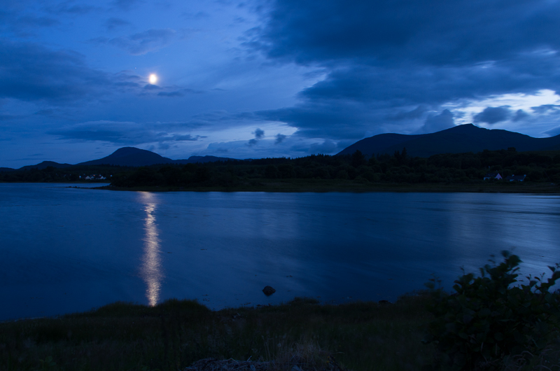
Strong (I seemed to have missed this) - Good shot of the bridge which has been nicely positioned to flow from/into the top right hand corner

Action - I much prefer the edit although I find the deep blue a little too strong
 
Strong (I seemed to have missed this) - Good shot of the bridge which has been nicely positioned to flow from/into the top right hand corner

Action - I much prefer the edit although I find the deep blue a little too strong

Thanks Peter... Strong wasn't exactly one of my favourite shots or one that I was particularly expecting positive crit, but seems to have gone done reasonably well! Thanks for the comments.

Action - yes not sure why I didn't do that in the first instance... ??

Below is the SOOC shot (except for a 2EV uplift because I was shooting with massive exposure comp to try to minimise the blowout of the moon) - as you'll see, I had to do quite a bit of editing in post to remove the foliage (erm... and add something ;)) but the blue is pretty much straight as is:

eZA2pJ1.jpg
 
HI Paul,

Rich, DOF works for me, composition is good along with the lighting as mentioned it does look a bit staged - question is that chequered plate you have used as the background?

Numbers - On theme and a simple idea that works the addition of the train adds a bit of interest and colour
 
HI Paul,

Rich, DOF works for me, composition is good along with the lighting as mentioned it does look a bit staged - question is that chequered plate you have used as the background?

Numbers - On theme and a simple idea that works the addition of the train adds a bit of interest and colour

Thanks Craig - my fears about the cookies just not being sharp enough was obviously unfounded :) There are no plates involved in the production of this photo... the props you see and a kitchen floor!

Numbers is definitely simple, but I think it's the better for it - it was also a handy test for me to play around with black backgrounds (taking it to a fairly extreme place in this instance)...

Right - more learning and playing now. Sorry guys and gals, but it's time for another catch up.

NATURAL (week 14). Now, living where I do and with hobbies such as climbing/walking etc... there are some easy subjects and choices. But by now you're getting to know me, and I don't usually favour the "obvious". So, for natural I decided to take your comments onboard re: Rich and go for a completely unstaged shot - "natural", if you will. The subject is my son who is quite happy to pose for the camera (when he's in a good mood) but I managed to catch him unawares and, I have to say, I'm quite pleased with the shot. There's no eye contact, very little background and, for me, that makes the shot a lot more natural. It's pretty much the antithesis of Rich - a shot which was grabbed in a fleeting moment. He's thinking about something - most probably chasing pigeons or thinking about doing a jigsaw back home.


Natural: contemplation
by pjm1 (Paul), on Flickr

C&C welcome, although I realise there is a certain (and understandable) reluctance to critting family photos, especially kids. So, what I'd politely encourage (if it makes the crit more "comfortable"), to focus on the shot, composition, lighting and things which aren't personalised. Of course, you're most welcome to tell me my son is a handsome little fella, although sadly for me I think he takes most of that from his mother's genes!

I've played a touch in post with this - boosting the contrast around the edge of the face to try to make the image "pop" a bit more, whilst softening some of the lighting on the face itself. So not 100% natural, I guess!! Maybe I should title it "Natural?"

I used to spend 90% of my camera time taking photos of the kids, but with this challenge I've really enjoyed spreading my photographic wings a bit. So, in a way, it's quite nice to get back to a comfort zone of sorts, albeit I'm trying a few new things with this shot. I did like the lighting which was 100% natural light - the benefit of not enjoying the glorious sunshine here that most of you have probably had over recent days!

One point - the photo looks very "contrasty" when viewed on this forum - I think it's the white background. To me it looks 100x better (and far more natural) on Flickr at a decent resolution with a black background...
Edit: I did something stupid in Flickr so if you see a broken image symbol, Ctrl+F5 should refresh...

Thanks in advance everyone.
 
Last edited:
Hi aul

I am not a people photographer & struggle like hell with portrait type stuff so I'll do my best.....it does indeed look really natural both in pose & lighting, eye's look perfectly sharp & DOF is spot on .The skin seems a little too soft to me especially round the nose ? It doesn't appear contrasty on my screen either

Cheers

Hi Lynne

Thank you very much for the feedback... you're absolutely right re: the nose - it doesn't look quite right to me either. There was actually a weird blemish/dark patch on the end of his nose which I've tried to fix but looking at it again, I haven't done particularly well. It's better than the original, but still not quite right.

I'm glad it doesn't look contrasty - I never think colour portraits look flattering when they are. I was worried that I might have overdone the contrast, but it sounds like you don't think I have - good! I was really pleased with the lighting, which can be one of my downfalls at times.

I was playing with some new PS techniques so I've got more practising to do... I am sure I've overcooked the following, but it was a fun learning experience:

1. Frequency separation (allows me to preserve and/or clone fine textural detail whilst smoothing out background tones - it's really quite a clever technique and my new favourite toy!)
2. Skin smoothing using "surface blur" - requires #1 and in theory (i.e. not in my hands) allows for very selective smoothing - I think it is this I have overdone!
3. Dodging & burning using curves & masks (rather than the D&B tools in PS) - a bit fiddly but it does allow very "micro" and subtle tweaks. I think I need to do a bit more burning on the nose as you've implied. I also think I've over-dodged the eye shadows...

Will keep experimenting though - it's all good practice. Thanks again for the comments.
 
Hi Paul, i think its a good portrait and all the better for him being unaware,
the lighting is good and not too contrasty so you have that right
but as Lynne said something about the softening of the skin did it really need softening?
a very good portrait none the less
 
Thanks Allan... yes, you're both right re: softening. Definitely overdone (and unnecessary on children)!

Thanks for commenting - I've nearly caught up with my comments on others' photos so need to get out there and catch up on both Skill (that will be tomorrow) and Half (maybe later today, work permitting)...
 
Right... I need to wait until tomorrow to shoot Skill, but in the meantime I've found 15 minutes to prep and shoot Half. C&C as always very welcome!


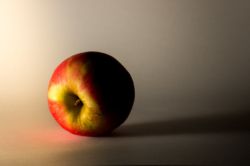
Half: light vs dark
by pjm1 (Paul), on Flickr

So, why this? Well, in terms of theme I wanted to play a bit - rather than just shoot half an object, I wanted to light half of the object, leaving the other half in dark. I remind myself sometimes why I am doing this challenge, and very selfishly, it's to improve areas of photography where I'm currently weakest. For me, that's flash lighting, "studio" type setups and still life.

This setup was very simple: everything lying on the floor in a hallway where there's little natural light. A couple of white A4 sheets curved into a background & base on top of a chopping board to provide some solidity (I didn't want the apple sinking into the carpet). Single flash lying to left of image, bounced off the wall (well, skirting board) to diffuse slightly. Flash dialled right down and exposure brought back up manually in post. Extra EV of grad lighting added to left, 1/2 EV dark grad added to top right. Shadows pulled back further (i.e. darker) on the right half of the apple - had I been able to find a room without pale walls, I shouldn't have needed to this but there was too much reflected light in my simple setup.

For once, I don't think I overcomplicated my composition ;)

Please do suggest room for improvement though - this is an area of photography that is still out of my comfort zone...
 
Hi Paul, not sure the light BG has helped really but that might just be personal choice, I tend to like this type of thing against a black BG so it disappears into the dark as it where,
I think it's just the uneven light of the BG that bothers me, the apple itself is well lit.
not sure on the placement of the apple either I would have gone core upwards, again just personal taste
As you say you are doing it to improve aspects of your photography not at all selfish in my book

Thanks Allan - that's precisely why I like getting feedback... I don't see things you all do :)
The background was just some curved white A4 - I've never really taken shots with background before, so very much learning. I chose the white for a couple of reasons: it's what I had (!) but also because I wanted the dark half to stand out rather than just disappear... I might well have made the wrong choice so I'll try to see what a dark background would do next time. The thing which was bothering me was the reflection of the red onto the paper... it's just genuine reflection, but it was annoying me! I nearly took it out, but thought that would be more work than it was worth...

Your point about the core/stalk made me smile. I initially took a few shots with the stalk the "right way up". I looked at them and thought, "hey, that's what everyone does... I'm going to be different!" So I put the apple on its side. I also thought the lighting inside that part of the apple was more interesting that way around, but it could very well be everyone takes photos of apples the other way for good reason - it looks better!

Thanks for your quick and detailed feedback... it's all helping me get better at this photography lark... :)
 
Thanks Susie... consensus so far is definitely in favour of a black background! Thank you for the positive comments re: lighting though... it's all still learning the ropes at this stage.

I've decided to bite the bullet and submit another entry for half - more conventional. It's also nicking an idea others have used frequently - merging two objects.

So, here is half a "Lemon-egg". Tangy!


Half... a "lemon-egg";
by pjm1 (Paul), on Flickr

I have to say, from a PP perspective, an egg is a nightmare choice of blend - all those different yellows/oranges that I had to blend the lemon into didn't make this a good choice for a beginner!

C&C very welcome but not expected given it's shot number 2.
 
Hey Paul :)

That is a nice portrait, I like the natural light and the wooden background, it's out of focus just enough as to not distract, your sons eyes are lovely and sharp, the tight crop/framing works for me too.... Crit, nothing I can add unfortunately, real nice (y)

Half - I like playing with lights/lighting too, and again like how you have done this, great explanation, crit, for me I would prefer just the main directional shadow rather than the light bounced one too, I do like how the background has been set up and the faded light using the grads :)

Half 2 - I like these type of images, looks like it was a hard one as you say, would like to see more definition in the lemon as not very clear (but on my lappy so may be fine on a descent display) also the springy thing is a bit overpowering, something a bit more plain, white porcelain etc would emphasise the egg... now that is being picky :D

Thanks Dean - your very generous comments are appreciated! Re: the portrait, it's funny how we each develop a "style" and mine is definitely taking pictures without the tops of people's heads! I choose to do it as I find it focuses attention on the eyes more and, to be honest, I just prefer tighter crops... which means it's difficult to get the whole head in and still get the vertical positioning "right" from a composition point of view (having a face dead centre, vertically, leaves it all a bit flat for me).

Thanks very much for the crit re: the first Half shot. I was really pleased with the lighting on the apple itself but I can't say I'm as happy with the rest of the lighting/shadows. It might well be my choice of background colour which is the problem... will have to get some more paper and experiment!

Re: Half 2, I think I can probably recover a bit more detail on the lemon - I had to reduce its size a fair bit and also boost the colours to match those of the very yellow egg yolk. I think the white between the segments has been lost as a result. I like the springy thing but you're right it takes away from the main subject... will remember for next time!

Cheers as always - especially given how late it was!
 
Some excellent images Paul, well done for all this catching up :clap: I was keen when we started back in January but I'm guilty of loosing a little enthusiasm lately.........but you have plenty for both of us.........and a few more :D ( meant as a compliment :))

The figure of 8 train track and train caught my eye, simple, but works very well (y)
 
Some excellent images Paul, well done for all this catching up :clap: I was keen when we started back in January but I'm guilty of loosing a little enthusiasm lately.........but you have plenty for both of us.........and a few more :D ( meant as a compliment :))
The figure of 8 train track and train caught my eye, simple, but works very well (y)

Thanks Phil! You've spotted that I have an advantage by joining late - I'm still in the honeymoon period and "keen and eager"!

If you're ever losing enthusiasm, just remember how much benefit you get from posting here and receiving feedback and crit. It may take an hour to plan, execute and post a single shot, but I reckon we must all benefit 100-fold (versus just taking "snaps") in terms of learning and improvement. Consider how much a "proper" photography course would cost... being a part of this project and community is giving you some similar benefits without spending a penny!
 
Hi Paul, I cant make my mind up on the apple shot quite like the light on the one side just not sure on the background or the positioning of the apple :thinking:

Egg - I have only ever seen this type of shot on here think Jason done one a while back and Lynne I really like them and think you have done well
 
Half - two very good shots and ideas,but I do feel on the first one that the background is a bit of a let down. The second image I think works better for me good idea and fits the theme better than the first image.
 
Hi Paul, I cant make my mind up on the apple shot quite like the light on the one side just not sure on the background or the positioning of the apple :thinking:

Egg - I have only ever seen this type of shot on here think Jason done one a while back and Lynne I really like them and think you have done well

Thanks Craig... yes, I've shamelessly nicked the "blend two objects into one genetically-modified one" idea from others. It's quite good fun to do and definitely helps improve the photoshop skills.

Half - two very good shots and ideas,but I do feel on the first one that the background is a bit of a let down. The second image I think works better for me good idea and fits the theme better than the first image.

Thanks Mandy - you're not alone re: background on first. Glad you liked them though!
 
Skill... well this has proven a lot trickier than I expected. I was at the Commonwealth Games hockey last night and very much hoped to grab some action shots. Sadly, it turned out our seats were behind the goal, meaning we had some very heavy-duty fencing to protect us from flying balls... and ruining all chances of photography!

The backup plan was to take some shots in the surrounding "live zone" where surely there will be people doing "skillful" things. Again, a bit of a blank...

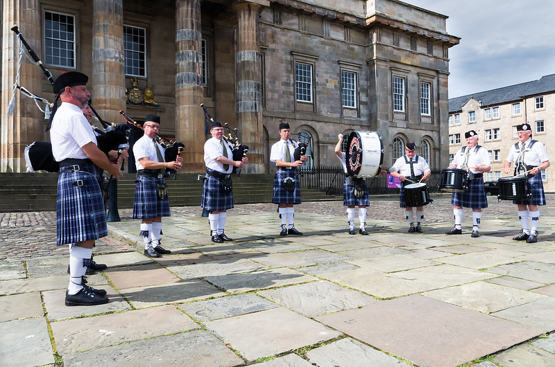
So I'm afraid it's a PABD effort from me, although still from the Games. This is a shot (and very snapshottish, at that) of a pipe band playing at the regatta which sailed down the Clyde last Saturday morning. I took plenty more (and better) shots of boats, but since they were under power, I don't feel they qualify as "skillful"...

As I said, PABD :(...


Skill: Commonwealth pipe band
by pjm1 (Paul), on Flickr

The only upside of this shot is I've spent ages cloning people out and improving (slightly) my skills here. It's not perfect, but for a shot which isn't even really a keeper, I can't justify more time than I've spent!

BTW, there was a REALLY annoying fellow photographer who decided he wanted a shot or 300 of this same group of pipers. Fair enough, but after you've spent over 15 minutes loitering in shot, wandering in front of them, wandering behind them, please get out of shot and allow the 10-12 other people who'd quite like to take a picture WITHOUT YOU IN IT to do so... :rage:

Yes, he's cloned out. Although I might keep a copy of him and just insert him into all of my future photos to bring a smile to my face ;)
 
The apple... More about the experimentation rather than the image here I feel, also feel that it should be placed the conventional way up.

Lemony egg... I do like it when others take inspiration from within the 52, imitation being a sincere form of flattery. An interesting choice of items used here. Good effort here blending two different items. Not sure the relative sizes work for you here, and maybe possibly the unevenness of the slice of the egg, with the smooth cut on the lemon. Making it look like a slice of lemon has been placed on the cut egg, rather than being "in" the egg when it were sliced.

Good job with the pipers, can't see any telltale signs of the removals you say you've done, good verticals and nice crisp white on their shirts.

Good submissions though. Stronger crit given than maybe "necessary" on the egg, but you are one who "enjoys" it and will take positive,s from it. (y)

Graham, thank you very much for the detailed and comprehensive crit and commentary... you are shockingly spot on with my own thinking and honest assessment - spooky, almost!

Apple - couldn't agree more... it's a bit of a selfish shot in that sense, but I'm going to allow myself a bit of selfishness sometimes ;)

Lemon-egg - you've nailed what I was struggling to get clear in my own mind... the lemon looks like a slice has been dropped on top, rather than sliced through! Thank you... more practice required but now I know what I need to tweak :)

Pipers - not a compelling shot for me, but thanks for the kind words re: PP ;)

Thanks again and look forward to more of your photos too!
 
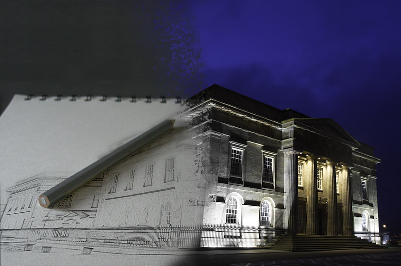
Week 31: Architectural

An early entry this week for me... it was an idea which popped into my head last night as soon as I read the theme. I've never done this sort of composite before, so C&C very much needed!

(Yes, I know this is supposed to be a photography site, but I've seen others do clever composites so I'm allowing myself an exception this week - the subject is a photo I took myself):


Architectural: The Customs House
by pjm1 (Paul), on Flickr
 
Very clever Paul! Did you handsketch the left hand side and photograph it, or is it pp work on the original photo?

My only crit would be that the nearest corner of the building seems to be leaning slightly and I think I would have given it a little CCW rotation.
 
HI Paul

Half......the more I look at this the more I like that it's on it's side ,as you say , a bit different to the norm . I like the lighting on the apple itself & even like the red shadow (y) The bg lighting is a bit uneven but no idea how you'd sort that as lighting is something I struggle with .The bigger niggle for me is the placement of the apple in the frame , just doesn't sit right for me - was it to get the rear shadow in frame ? I would have / need to see more room in front of the apple & less behind but that's just me...it's your shot & if you're happy that's what counts :)

ooop's....just realised I missed a couple of your weeks images :banghead:

Architectural....I'm liking that , both the idea & the exectution :clap: I could probably have done something similar in pp but the thing I'm interested in .....is it 2 shots ? One of the building from camera & one of the art pad or did you create the spiral binding as well ? It works so much better for having the binding in , although we know it's pp it looks less like it...not even sure that makes sense to me :thinking: but hopefully you'll know what I'm trying to say ;)
 
Last edited:
Good take on the theme there Paul... I like what you've done...
Is there a bit of photoshop in there ? ;)

Damn, I can't believe you found me out! Ok, fair cop... I might have tweaked a pixel or two.

Very clever Paul! Did you handsketch the left hand side and photograph it, or is it pp work on the original photo?

My only crit would be that the nearest corner of the building seems to be leaning slightly and I think I would have given it a little CCW rotation.

Yes, you're right Elaine - frustrating now I can see it!

I am no way artistic enough to draw anything properly... I'm afraid it was all done electronically.

HI Paul

Half......the more I look at this the more I like that it's on it's side ,as you say , a bit different to the norm . I like the lighting on the apple itself & even like the red shadow (y) The bg lighting is a bit uneven but no idea how you'd sort that as lighting is something I struggle with .The bigger niggle for me is the placement of the apple in the frame , just doesn't sit right for me - was it to get the rear shadow in frame ? I would have / need to see more room in front of the apple & less behind but that's just me...it's your shot & if you're happy that's what counts :)

ooop's....just realised I missed a couple of your weeks images :banghead:

Architectural....I'm liking that , both the idea & the exectution :clap: I could probably have done something similar in pp but the thing I'm interested in .....is it 2 shots ? One of the building from camera & one of the art pad or did you create the spiral binding as well ? It works so much better for having the binding in , although we know it's pp it looks less like it...not even sure that makes sense to me :thinking: but hopefully you'll know what I'm trying to say ;)

Thanks Lynne... glad you quite like the apple. Background was a toughie - I think I just need a bigger sheet of paper and that way I can get it all a lot more even. Placement you're bang on: I was trying to get the shadow in frame but maybe compromised the scene as a result?

Glad Architectural has hit the spot... it is a single shot, although I used a stock image of a spiral bound pad. I took the pencil and shadow away first. I then twisted the building to "fit" the paper using the warp tool and converted to a line drawing (I then had to try to replicate the shallow DOF on the original picture of the pad). I added the shadow and pencil back and then did a blend/shatter between the pad image and the "real" image.

All in all, it took a good hour but most of that was learning a massive number of new effects. I'd only done a line drawing conversion once before so needed to refresh the memory. Pretty much everything else was new in PS to me...

Good fun!
 
Hi Paul,
cricky you have given me some catching up to do!!
Mono.. I agree with most of what Graham said, I like the space at the front of the truck, I would like to see a lower more angled pov, but good work:clap::clap:
Rich... nice looking cookies :) I like the idea i feel that you have too much of your lovely butter in there but no flour, sugar or chocolate chips, I like the reflection in the bowl and the dark bg (y)(y)
re-shoot numbers... simple and effective, you have lost a little bit of light at the top but good one:)
Action... the second shot is lovely even if it did need a crowbar seeing the whole of the boatman makes it :clap::clap:
 
Hi,
Natural... a lovely portrait bearing in mind what others have said i will just say what a bonnie boy love his curls(y)
half.. I think that I am on the side of trying a black bg nice idea:)
half 2... love it I like the composition and the pp work that you have done nice lighting too:clap:
Skill...well done on the cloning, nice shot fits the theme:)
Architectural... clever processing I like the way the front of the building it lit too:clap::clap:
 
Hi Paul,
cricky you have given me some catching up to do!!
Mono.. I agree with most of what Graham said, I like the space at the front of the truck, I would like to see a lower more angled pov, but good work:clap::clap:
Rich... nice looking cookies :) I like the idea i feel that you have too much of your lovely butter in there but no flour, sugar or chocolate chips, I like the reflection in the bowl and the dark bg (y)(y)
re-shoot numbers... simple and effective, you have lost a little bit of light at the top but good one:)
Action... the second shot is lovely even if it did need a crowbar seeing the whole of the boatman makes it :clap::clap:

Sorry Judi - I will slow down once I've fully caught up with the ones I missed by starting late!

Agree with all your crit above. I actually darkened the Reshoot of numbers at the top as I wanted it fading away slightly. I would probably have been better applying a blur rather than darkening to make the DOF even more shallow.

Hi,
Natural... a lovely portrait bearing in mind what others have said i will just say what a bonnie boy love his curls(y)
half.. I think that I am on the side of trying a black bg nice idea:)
half 2... love it I like the composition and the pp work that you have done nice lighting too:clap:
Skill...well done on the cloning, nice shot fits the theme:)
Architectural... clever processing I like the way the front of the building it lit too:clap::clap:

Thanks for the very kind comments - there's an increasing amount of PP in my shots but that in itself is because I'm looking to develop those skills alongside improving my photography. In most cases, I do little with the lighting etc. in post so I think they're complementary skills rather than PP in any way replacing (or recovering from) poor core photography skills.

:ty:
 
Hi Paul, can't really offer any crit on the pipers as i hate bagpipes horrible disgusting things but I know what you mean about annoying photographers :mad:
Architectural is a great idea and you have done really well blending the two images together (slightly off at the railings)
Its good to try new things however frustrating it might be

Thanks Allan... yes, it was good fun doing that blend - aargh! I hadn't spotted the railings and now it's going to annoy me :mad:

Bagpipes are marmite - owing to my Scottish wife, I have a fondness for them but realise they're not to everyone's taste! Thanks for commenting as always...
 
Thought I commented on the apple shot already ... very good indeed and thank you for sharing your techniques.

Architectural ... truly brilliant. The sort of image I love (dream about) doing. Just need more practice.
 
Thought I commented on the apple shot already ... very good indeed and thank you for sharing your techniques.

Architectural ... truly brilliant. The sort of image I love (dream about) doing. Just need more practice.

Thanks David... It's nice to get really positive feedback occasionally (a big old pat on the back, if you will) so thank you. I always appreciate criticism as well so certainly don't just want that to stop! (but I guess deep down we all want our output to be liked...)

If I'm honest, it took a while to do - but that was because I was learning the techniques as I went. Conversion to line drawing is itself very simple and quick. Applying it over the pad took a few minutes but the more time consuming parts were the shattering effect, blending the two images (imperfectly, I might add) and extending the dark grey background above the pad. A few extra tweaks like faking DOF on the line drawing all took a bit more time.

It was fun though, and it seems that it has been worthwhile! Cheers.
 
Hiya Paul, architectural is an excellent idea, from drawing to completed building in one image, very well executed (y) :clap:

As for the technique, I wouldn't have a clue :p a lot of your explanation to Lynne (Blonde606) had me baffled :D but the effort and time you put in was well worth it (y)
 
Hiya Paul, architectural is an excellent idea, from drawing to completed building in one image, very well executed (y) :clap:

As for the technique, I wouldn't have a clue :p a lot of your explanation to Lynne (Blonde606) had me baffled :D but the effort and time you put in was well worth it (y)

Thanks Phil - if it's any consolation, my explanation would have had me confused until I sat down to try to do it. The wonders of google, some spare time and a bit of trial and error... :)

Cheers!
 
Skill - nothing wrong with a pabd we all do them now and then. Fits the the theme looks like a quick grab shot but it works for me.

Architectural - :clap::clap: Just fantastic, I have no idea how you have achieved this fits the theme wonderfully zero crit from me.
 
Skill - nothing wrong with a pabd we all do them now and then. Fits the the theme looks like a quick grab shot but it works for me.

Architectural - :clap::clap: Just fantastic, I have no idea how you have achieved this fits the theme wonderfully zero crit from me.

Thanks Mandy. This week has officially been a good week for me, photographically! Cheers...
 
Hi Paul
Natural - my kind of shot. I find nothing wrong in not having eye contact - I often think that this brings out the character of the subject better to those who know him. good b/g but the missing lathe to the left of the head is a bit distracting for me. Looks good on Flickr as you say. Like the proportion and the cropped off head - which is not always to everyone's taste. Nose and area under the eyes a bit bright losing some detail.
Half - unusually the apple is not cut and the front 'half' and the half light works well. I am not sure about the reflected red of the apple but the b/g I find to my taste with the graduation of the shadows.
Half #2 - imaginative and well handled - altho in this instance I find the b/g a little grey and dull:D
Skill - on theme and i cannot see where you have cloned out the interference. good pov, nice curve of the men and interesting main b/g but the houses to the right are a bit off and the exposure of the two chaps to the right is accordingly a bit bright
Architecture - good idea and very well handled. Good choice of main image and props.(y)
 
Back
Top