
You are using an out of date browser. It may not display this or other websites correctly.
You should upgrade or use an alternative browser.
You should upgrade or use an alternative browser.
weekly Posiview's 2013 52. Week 52, Water added TTFN.
- Thread starter posiview
- Start date
- Messages
- 13,760
- Edit My Images
- Yes
On my old laptop mate... had to steal it back from my wife :shake:Thanks, all, appreciate the feedback. Really like how folk are drawn to different photographs.
Is it week 2 yet!!
You back on line proper, Dean, or are you in some pokey Internet cafe
Cheers.
On a good note my PC has been collected by couriers today so hopefully they will get into it tomorrow and get it back next week, I'll have to take my pics and wait until it gets back before I edit/upload em
")
OP
- Messages
- 19,461
- Name
- Andy
- Edit My Images
- Yes
Dark Knight said:On my old laptop mate... had to steal it back from my wife :shake:
On a good note my PC has been collected by couriers today so hopefully they will get into it tomorrow and get it back next week, I'll have to take my pics and wait until it gets back before I edit/upload em
Good show...life without a computer....gasp...eeeek...falls over!
- Messages
- 5,787
- Name
- Storm Trooper
- Edit My Images
- Yes
Nice take on sin with the condom, great lighting and framing. Going to be tough to top this one
- Messages
- 14,766
- Name
- Michael
- Edit My Images
- No
Greetings Professor Giddyness for me, I prfer the first version of your bottle, the slightly reduced lighting works very well when compared with your next version, but the durex image is a "brilliant" idea, b+w suits it so well, cracking dof on the pin, probably one of the most fitting images for a theme I have seen since we started. 
for me, I prfer the first version of your bottle, the slightly reduced lighting works very well when compared with your next version, but the durex image is a "brilliant" idea, b+w suits it so well, cracking dof on the pin, probably one of the most fitting images for a theme I have seen since we started. The goblin
<span class="poty">POTY Winner 2015</span></br>
- Messages
- 4,407
- Name
- Marsha
- Edit My Images
- Yes
Hi Andy, I like the beer bottle shots, especially the JD one but for the theme it's got to be the condom shot Great lighting and pin sharp. It made me laugh too, I remember hearing a confessions on Simon Mayo along these naughty lines many years ago!
but for the theme it's got to be the condom shot Great lighting and pin sharp. It made me laugh too, I remember hearing a confessions on Simon Mayo along these naughty lines many years ago!
OP
- Messages
- 19,461
- Name
- Andy
- Edit My Images
- Yes
foggy4ever said:Nice take on sin with the condom, great lighting and framing. Going to be tough to top this one
Cheers. Only 6 days until week 2...!!
OP
- Messages
- 19,461
- Name
- Andy
- Edit My Images
- Yes
michael23 said:Greetings Professor Giddyness
Cheers, Michael and hope alls going well.
It is week 2 yet...
Cheers.
- Messages
- 14,766
- Name
- Michael
- Edit My Images
- No
Cheers, Michael and hope alls going well.
It is week 2 yet...
Cheers.
All good now thanks. Week 2 lol, I an trying really hard to get my brain into gear for week 1!
- Messages
- 6,964
- Name
- Phil
- Edit My Images
- Yes
I really like the condom shot - a good interpretation of the theme and a nice crisp, well-lit image.
- Messages
- 588
- Name
- Jason
- Edit My Images
- Yes
Aww, I liked the percentage of negative space in your original image but also the upgraded version where you can read the whole word. I think i'd prefer them merged! 
Like the JD pic too btw.
Like the JD pic too btw.
OP
- Messages
- 19,461
- Name
- Andy
- Edit My Images
- Yes
All good now thanks. Week 2 lol, I an trying really hard to get my brain into gear for week 1!
I really like the condom shot - a good interpretation of the theme and a nice crisp, well-lit image.
Aww, I liked the percentage of negative space in your original image but also the upgraded version where you can read the whole word. I think i'd prefer them merged!
Like the JD pic too btw.
Thanks, all. Another blooming week to wait for week 2 :bonk:
Cheers.
D
Deleted member 60145
Guest
Well, even though it's my third year of TP52, I'm as giddy as a person who's just been appointed Professor of Giddyness and the University of Giddyness
Week 1 Sin 6 by andysheader (Posiview), on Flickr

Love this, captures the theme perfectly for me! Think, think and think again, great advice, thanks!
- Messages
- 588
- Name
- Jason
- Edit My Images
- Yes
Could always start the ETC picturesThanks, all. Another blooming week to wait for week 2 :bonk:
Cheers.
OP
- Messages
- 19,461
- Name
- Andy
- Edit My Images
- Yes
Could always start the ETC pictures
Lol, I have arranged a night shoot in Leeds for my submissions
OP
- Messages
- 19,461
- Name
- Andy
- Edit My Images
- Yes
mich66 said:great framing and lighting in both shots.. I think I prefer the first shot to look at but the condom one fits the theme better for me.. if that makes sense
Cheers. It seems aaaggesssss since the Sin theme was posted...
- Messages
- 1,084
- Name
- Craig
- Edit My Images
- Yes
ok here goes.........
Pic 1 I like the amount of detail you have in the foil area not sure I really understand the reasoning for the blackness is that what you mean by negative space?
Pic 2 It fits the SIN subject wonderfully I just prey you don work in a chemist
Pic 1 I like the amount of detail you have in the foil area not sure I really understand the reasoning for the blackness is that what you mean by negative space?
Pic 2 It fits the SIN subject wonderfully I just prey you don work in a chemist
Last edited:
OP
- Messages
- 19,461
- Name
- Andy
- Edit My Images
- Yes
Nice lighting on your first image Andy. The sort of image I can imagine with condensation across it. Not so keen on your condom image, which whilst technically good is just a little too sinful
Condensation, never crossed my mind :bonk::bonk::bonk:
The condom is very Sinful, but does happen!!
ok here goes.........
Pic 1 I like the amount of detail you have in the foil area not sure I really understand the reasoning for the blackness is that what you mean by negative space?
Pic 2 It fits the SIN subject wonderfully I just prey you don work in a chemist
Nice and decent C&C.
I thought a lot about the composition of #1. I didn't want a central composition so decided to offset it and use negative space to emphasise the bottle and text.
If you're interested here is a quick article on negative space clicky linky
#2, yeah, just came to me. Sinful indeed.
Cheers, all.
OP
- Messages
- 19,461
- Name
- Andy
- Edit My Images
- Yes
Hi, all.
Firstly, Best viewed via Flickr
#1 beginnings of a new Season. Found this bulb in our yard...blooming squirrels. Wanted to get in close with shallow DOF and have another go at light painting. I upped the exposure and made sure I left some shadows in there.
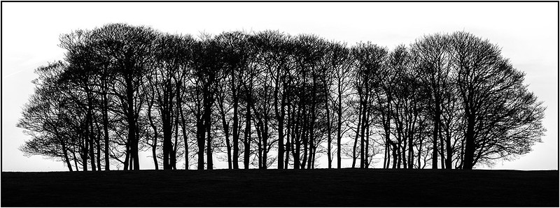
#2, a photograph that represents to stark and comparatively minimal nature of Winter. I did very little to the sky because it was almost totally white. I exposed for the sky to put the trees into silhouette and brought back a smidgen of the FG. I was really happy with the detail in the trees, even at 100%.
Anyway, here you go and to those that made it to week 2!

Week 2 2 Season by andysheader (Posiview), on Flickr
Week 2 Season by andysheader (Posiview), on Flickr
Firstly, Best viewed via Flickr
#1 beginnings of a new Season. Found this bulb in our yard...blooming squirrels. Wanted to get in close with shallow DOF and have another go at light painting. I upped the exposure and made sure I left some shadows in there.
#2, a photograph that represents to stark and comparatively minimal nature of Winter. I did very little to the sky because it was almost totally white. I exposed for the sky to put the trees into silhouette and brought back a smidgen of the FG. I was really happy with the detail in the trees, even at 100%.
Anyway, here you go and
to those that made it to week 2!Week 2 2 Season by andysheader (Posiview), on Flickr
Week 2 Season by andysheader (Posiview), on Flickr
Last edited:
M
Mad Hatter
Guest
No.2 is a fabulous shot and a winner for me
- Messages
- 1,353
- Name
- Chris
- Edit My Images
- Yes
Mad Hatter said:No.2 is a fabulous shot and a winner for me
Yeah I would agree
Nothing wrong with #1 either but just doesn't grab my attention like the second one. Dark and moody I like
I agree, they're both brilliant, but the second one has to win it for me. The dark and sparse atmosphere fits winter perfectly, where we sit in cold and dark waiting for spring and to thaw our feet out. I also agree that it would look great on a wall.
Last edited:
- Messages
- 588
- Name
- Jason
- Edit My Images
- Yes
I can't quite put my finger on it, but I'm not a big fan of number 1. Either it's too simple, or there's not enough to keep my attention.
Number 2?
Number 2?
- Messages
- 229
- Name
- Mark
- Edit My Images
- Yes
Number 2 for me.
When I first look at it I think it looks really simple, just black and white, but then all the detail of the empty branches start drawing my eye.
Cracking shot.
When I first look at it I think it looks really simple, just black and white, but then all the detail of the empty branches start drawing my eye.
Cracking shot.
Brian_of_Bozeat
Jeff
- Messages
- 3,235
- Name
- Brian (not Jeff)
- Edit My Images
- No
Both are good enough to frame. I Love the trees though - it's a from me.
from me.- Messages
- 13,760
- Edit My Images
- Yes
Hi Andy
Season - Both excellent shots mate, and another vote for number 2, love the crop and really like how there is still foreground detail
Season - Both excellent shots mate, and another vote for number 2, love the crop and really like how there is still foreground detail
- Messages
- 8,398
- Name
- Lynne
- Edit My Images
- Yes
& he strikes again with 2 shots ...you have wayyyyy too much time on your hands mister
#1 for me.....love the clarity & detail of the bulb , well lit with just a hint of shadow The only little niggle is the upper part of the stem...color seems a bit to strong & " clean " for want of a better word with a hint of yellow fringing round the very tip ?
#2...for me , whilst I envy your ability with exposure , holds no interest for my eye's...maybe bigger would change my mind..sorry
#1 for me.....love the clarity & detail of the bulb , well lit with just a hint of shadow
The only little niggle is the upper part of the stem...color seems a bit to strong & " clean " for want of a better word with a hint of yellow fringing round the very tip ?#2...for me , whilst I envy your ability with exposure , holds no interest for my eye's...maybe bigger would change my mind..sorry