
- Messages
- 13,760
- Edit My Images
- Yes
Cool - nice shadow, good lighting and composition where you would want it, what's not to like with this ")

Thanks very muchCool - nice shadow, good lighting and composition where you would want it, what's not to like with this
thanksGood photo for tiny, I like the minimal composition that keeps the eye on the ant and provides a sense of scale
Thank youGreat minimalist photo of an ant, well composed and lit
Like your tiny shot Allan, like the simplicity of it.
The ant /hand shot is really good, I like that a lot.
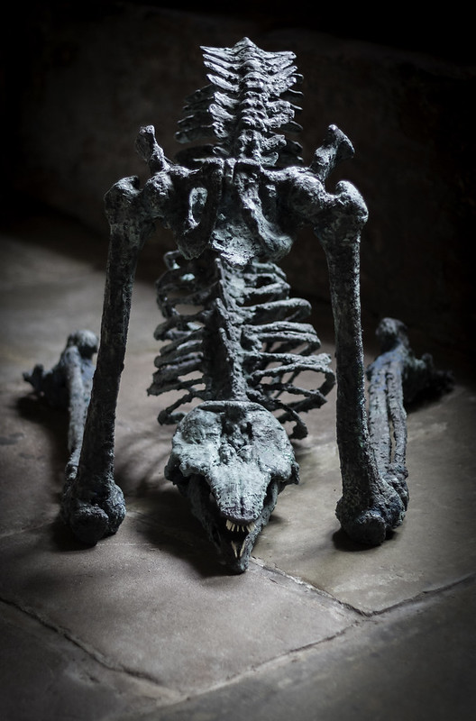
Damn now that is unusual...I like the low PoV and the way it is lit, the dark background helps it stand out nicely too, not certain if lit with a spotlight or a vignette has been added, still looks cool either way
<EDIT> That looks a cracking exhibition Allan, must be cool having that being set up where you work !!! do you get early access to the exhibits ??
ThanksFantastic beast; great shot. I love the low POV
Thanks DaveA good shot for face Allan, like the low down pov and colours
thanksLove the sculpture, love the website, nice design. You couldn't find a better setting ... dark cloisters, flagstone floor.
f*** me...that;s a bit weird/scary and works for me
Cheers.
I agree with @d00d, Tiny would have also fitted well for minimalistic. It could perhaps do with something to provide scale? Nicely executed though.
Face though is pure genius, loving it.
Thanks DaveA nice B&W Allan of the crops, love how the eye follows the line from foreground to background
Thanks for the extensive catch upHi Allan. I've been all but absent for a couple of months so I'm just trying to catch up by looking back over what I've missed. I love Vivid - possibly because it's quite similar to what I tried to do. Large is cool, very dramatic and you don't see a lot of macro stuff converted into mono. Broken works well and the wave effect of the pedals in Transport is really eye-catching. Progress is a great idea and well taken, despite the fact you sounded apologetic about it! You could argue all day about where the focal point should be but effectively focussing ahead of the subject, to where it's going, seems very apt given the theme. Really like the simplicity of the ant photo. The skeletal alien/dinosaur/monster is a bit scary but a very eye-catching shot. Agriculture works very well, leading your eye up to the farm buildings at the top. The conversion almost makes it look wintery.
Hi, summery is a little of, maybe it wasn't symmetrical
Looks a little washed out, but good use of lines.
Cheers.
Face thing is great, like both the "thing" and your shot.
Agriculture just looks way to over exposed to me Im afraid.
The conversion has had the greens and yellows pushed and the orange pulled down to emphasize the lines, maybe a little to much, but it is not overexposed, the colour image is on flickr feel free to take a look, thanks for the commentsInteresting looking crop (Growing crop), looks quite ultra-violet type a shot, certainly good use of the lines and the portrait crop too, would be good to see the colour image so can see why the bright exposure
fair comment its a bit too farCertainly agriculture and good use of the lines but I'm not convinced by the mono conversion, sorry.
............... we all know colour very rarely improves things ................
 Facing Forward
 Crops
Crops