weekly brownin's prjct52: 52,FINISHED!

Hi Nathan. I am envious - both nice shots. The face has that added curiosity factor of course which b&w helps to enhance. As for Freddy Mercury - awesome shot for Entertain; sharp with action and expression thrown in for good measure. Excellent.
 
Hi Nathan,

A couple of very nice shots - I think your broken shot's a really good take on the theme :clap::clap:
 
Just quickly had a look at some of your images.
Figures: Well composed. Lovely colours in the sky.
Household/limit/bizarre: Fit the themes
Broken: Like your approach to this theme further emphasised by the moodiness of the sky. Shame about the waste bin.
Entertain: Fits the theme and a nice bit of booked
 
Hi broken, really well processed photograph and the detail, especially the sky works really well. Pity You just clipped the nose.

Entertain on theme and who doesn't like a bit of imitation Freddie :)

Cheers
 
Broken ... nice artwork beautifully photographed ... moody light & shadows ... but yes a bit close to the tip of the nose.
 
Hi Nathan. I am envious - both nice shots. The face has that added curiosity factor of course which b&w helps to enhance. As for Freddy Mercury - awesome shot for Entertain; sharp with action and expression thrown in for good measure. Excellent.

Thanks Carl, I was lucky I had hired a lens known for its sharpness for a cousins wedding the day before so rude not to use it for the event :)

Hi Nathan,

A couple of very nice shots - I think your broken shot's a really good take on the theme :clap::clap:

Thank you very much

Just quickly had a look at some of your images.
Figures: Well composed. Lovely colours in the sky.
Household/limit/bizarre: Fit the themes
Broken: Like your approach to this theme further emphasised by the moodiness of the sky. Shame about the waste bin.
Entertain: Fits the theme and a nice bit of booked

thank you for taking the time to look and comment, much appreciated, I Didn't notice the waste bin, Whoops! whats booked :p (assuming you meant bokeh!)

Hi broken, really well processed photograph and the detail, especially the sky works really well. Pity You just clipped the nose.

Entertain on theme and who doesn't like a bit of imitation Freddie :)

Cheers

Yer only so wide you can go with aps-C at 10mm if i stepped back it just didn't fit as well. thought black and white pulled the details out of the clouds best, thanks again

Broken ... nice artwork beautifully photographed ... moody light & shadows ... but yes a bit close to the tip of the nose.

as above, maybe next time i'll try a slight reposition when i visit and give it another go, thanks for your comments.
 
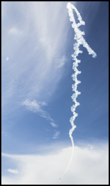
So i cheated a little, in the fact that I held off on spiral as I knew I was heading to weston super mare airshow to watch the vulcan so was definitely going to have plenty of 'spiral opportunities' so the best fitting and shot for me was this one. Hope you like

Week24 by Nathan Browning, on Flickr
 
Well, worth waiting for Nathan - quite a dramatic image. Like that you managed to keep the full spiral and the plane in the frame. :clap:
 
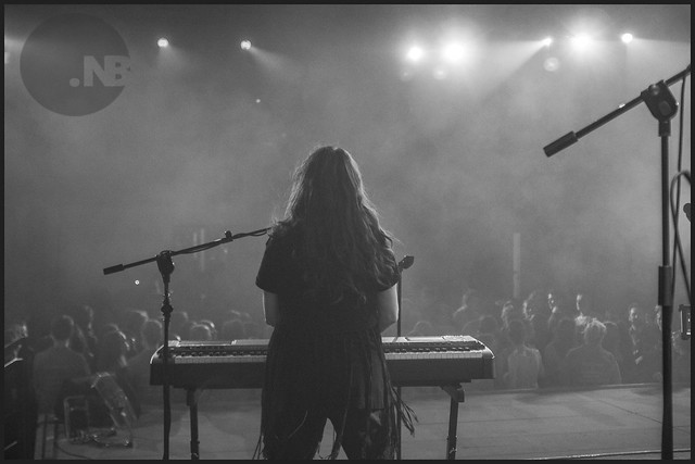
I'd be proud of that one Nathan (crop or clone out the mic on the right would make it so much better) - a very interesting image and great to capture all those details in the figure ... too many maybe to make it a silhouette as such ?!?!
 
Not quite a silhouette but an interesting shot nevertheless. I wonder what most of the audience were looking at because they are certainly not looking at the stage.
 
I'd be proud of that one Nathan (crop or clone out the mic on the right would make it so much better) - a very interesting image and great to capture all those details in the figure ... too many maybe to make it a silhouette as such ?!?!

up there with most 'dramatic'/atmospheric shots i've ever taken was quite pleased with it, I have pulled the shadows a bit too much for the theme though i think, nvm lol too much texture to clone out maybe? lots of light changes, i'll give it a go at some point though, thanks for stopping by.

Not quite a silhouette but an interesting shot nevertheless. I wonder what most of the audience were looking at because they are certainly not looking at the stage.

The guitarist is in the audience I believe with a wireless pack, there's also a row of people/staff stopping kids from trying to climb on the stage up front.. Cheers
 
week26: animal

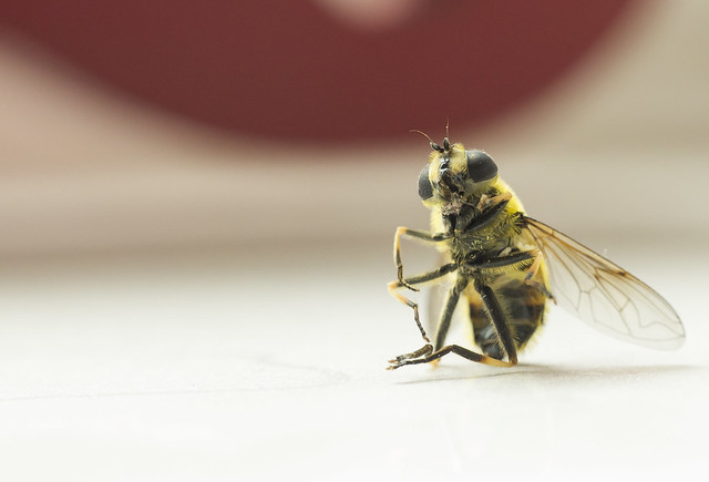
Late as most of my recent shots have been, A little morbid I know, but was cleaning the spare room when I noticed this poor fella sitting like this on the windowsill, almost looking at me, I didn't swat him so he must have died of whatever natural causes a wasp can? (assuming that's what it is)

week26 by Nathan Browning, on Flickr
 
Excellent! I'm not really into these macro insect shots [only because I don't have a macro lens and a killing jar] but this is good 'n sharp with an interesting OOF BG and an element of humour.
 
wahey, sort of caught up in last few days, still behind but... only 1 :)

so...

week27:medical

self explanitory, kitchen worktop, water, tablets, this is my medicine. Daily routine for hayfever during these summer months.

week27 by Nathan Browning, on Flickr

Week28:proverb

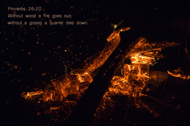
Had an idea to use the bible but instead used it in 2 ways, Shot down the beach at night with some friends (camera now stinks). Not sure I'm happy with the font but nevermind

week28 by Nathan Browning, on Flickr
 
Well done with the catch-up Nathan. Love the texture and colour of Proverb (as well as the adage itself) - the glowing embers are really eye-catching. :clap:
 
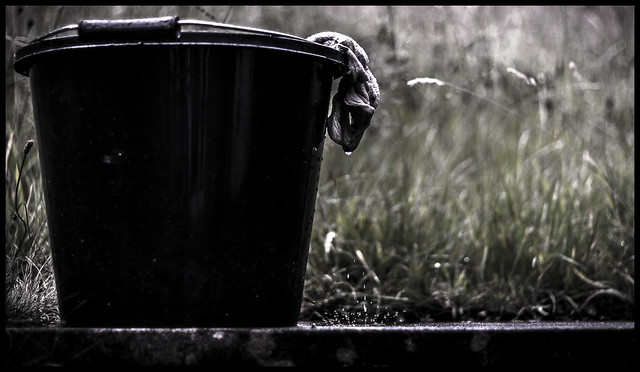
So, had a wicked idea but came to taking it and could not get it quite as I wanted, no clean backgrounds in my hideously overgrown garden, So i feel the splash gets lost and not focused on.

Tried multiple crops etc but still not there or took away from the actual pail. Processed to be as Pale as can be without taking all the colour out.

Its a Slight play on words and use of a Homophone (so my wife has told me) this is my submission for pale/pail

Week29: Pail of water
week29a by Nathan Browning, on Flickr

Please feel free to comment or edit to find 'that' crop that may help make this more interesting.
 
Last edited:
Hi Nathan. I quite like the thinking behind the composition, particularly the inclusion of the splash of water and the background but I'm not sure it entirely works for me; perhaps a little too dark (?!?)
 
Hi Nathan,

Broken: I really like this. I echo others comments that it is a bit tight on the left and bottom. A great mono shot though and a good interpretation.
Entertain: This really portrays entertain for me. Perfect :clap:
Spiral: Another cracking shot. It works well the have the whole spiral and the plane in the frame too.
Silhouette: Good shot from an interesting angle but isn't really enough of a silhouette for me.
Animal: Good macro shot. Sharp and well composed.
Medicine: I'm with you on this one - it's been a bad year it seems. Good fit to the theme and having it in mono works well.
Proverb: Not heard that one. I really like the detail in the embers. Excellent stuff :)
Pale: Good play on words and capturing the water drop is fantastic but I would like to see more detail in the pail. Re the crop or edit to make it more interesting, you could try mirroring the image to have the pail on the right hand side maybe?
 
Hi, you have caught the burning logs in Proverb really well,
I really like Pail/pale the desaturated colours are excellent it just needs a little more space to the left hand side and top as its very tight in the frame, i think the BG works too
 
nathan ... your pale shot is stunning! Beautiful live splash, perfect soft BG :clap:
 
Hi Nathan. I quite like the thinking behind the composition, particularly the inclusion of the splash of water and the background but I'm not sure it entirely works for me; perhaps a little too dark (?!?)

Cheers mate, it was a very dark and dingy day but i get what you mean, thanks again for stopping by.

Hi Nathan,

Broken: I really like this. I echo others comments that it is a bit tight on the left and bottom. A great mono shot though and a good interpretation.
Entertain: This really portrays entertain for me. Perfect :clap:
Spiral: Another cracking shot. It works well the have the whole spiral and the plane in the frame too.
Silhouette: Good shot from an interesting angle but isn't really enough of a silhouette for me.
Animal: Good macro shot. Sharp and well composed.
Medicine: I'm with you on this one - it's been a bad year it seems. Good fit to the theme and having it in mono works well.
Proverb: Not heard that one. I really like the detail in the embers. Excellent stuff :)
Pale: Good play on words and capturing the water drop is fantastic but I would like to see more detail in the pail. Re the crop or edit to make it more interesting, you could try mirroring the image to have the pail on the right hand side maybe?

Thank you very much for stopping by and taking the time to offer such useful critique.

Hi, you have caught the burning logs in Proverb really well,
I really like Pail/pale the desaturated colours are excellent it just needs a little more space to the left hand side and top as its very tight in the frame, i think the BG works too

I always get either too much or too little space in the empty areas, nvm will get it right one day lol. Thanks again for popping in

nathan ... your pale shot is stunning! Beautiful live splash, perfect soft BG :clap:

Cheers mate.
 
UPDATES! lol

Week30 : Tear

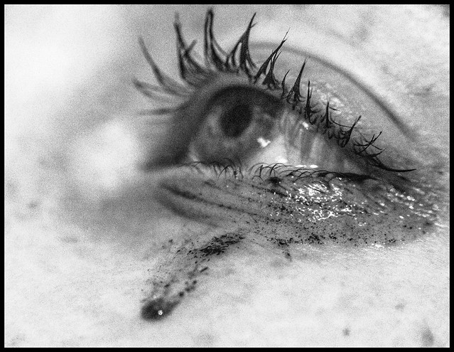
So I had an idea for Tear, well an idea is all it was, definitely didn't execute how I wanted it but just have to move on to the next theme...
Week30 by Nathan Browning, on Flickr

Week31 : Words

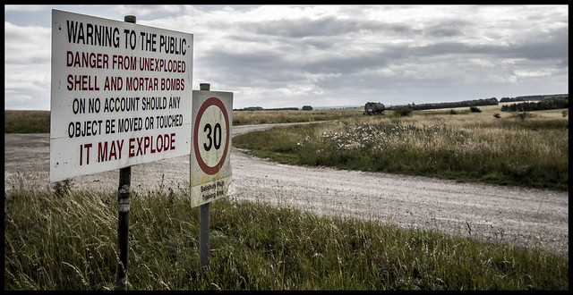
A sign I spotted whilst away and mooching around in old familiar territory, but for the first time with the Camera. Very strict words on this sign. In a desolate but beautiful area of the Salisbury plains.
Week31 by Nathan Browning, on Flickr
 
Hi Nathan. Tear: I'm choked. I think the focus point is on the eyelashes rather than the eye but that takes nothing away from the emotion being expressed. Like it.
Words: Lovely panoramic scene, contrasted by the worrying danger notice. Well themed and really good image :clap:
 
Sorry if i'm pointing out the complete obvious here, but as I learner I guess im allowed to do that. I love these images because they are just so simple, to me there is something about the simplicity of your images that evokes more of a reaction. Especially tear, its brilliant...it may not be appropriate to use this simple but as I love it so much I will anyway...:banana:
 
Hi Nathan,

Pale shot looks fine to me, I like the DOF....an eye catching image,
Tear ...I agree it works really well, it actually looks like a proper tear and not just one added on for effect, the wet eyelashes are perfect focal point for me, it has a very honest look about it ...nice one :clap:
Words ... bleak words and a bleak landscape ...well spotted.
 
Hi Nathan

Tear ... striking, creative stuff.

Words ... perfect POV.

(y)
 
Hi Nathan. Tear: I'm choked. I think the focus point is on the eyelashes rather than the eye but that takes nothing away from the emotion being expressed. Like it.
Words: Lovely panoramic scene, contrasted by the worrying danger notice. Well themed and really good image :clap:

As always Carl, very prompt.

If I could execute the tear shot better I would use an actual macro lens instead of my raynox as the DOF is so strong with this. I would then use some bounced flash to even out the shot, but... a) no macro lens b) no batteries in my flash gun lol

It was a beautiful day and then the clouds came in, no rain thankfully but made a dramatic bleak looking background.

Thank you again for your comments mate, really helps and encourages us all to keep going

Sorry if I'm pointing out the complete obvious here, but as I learner I guess I'm allowed to do that. I love these images because they are just so simple, to me there is something about the simplicity of your images that evokes more of a reaction. Especially tear, its brilliant...it may not be appropriate to use this simple but as I love it so much I will anyway...:banana:

Thanks Laura, appreciate you taking a peak and commenting, I try to keep things simple at the moment concentrating on making something pop and make it interesting, I find often in photography that people try too much too soon without mastering the basics (guess that goes for a lot of things in life) so I'm doing my very best to try and compose and make a non interesting thing seem interesting through my photography. There are some stunning shots coming out of this forum of which are so simple to execute and so inspiring... so simple most certainly isn't inappropriate.

:)

Hi Nathan,

Pale shot looks fine to me, I like the DOF....an eye catching image,
Tear ...I agree it works really well, it actually looks like a proper tear and not just one added on for effect, the wet eyelashes are perfect focal point for me, it has a very honest look about it ...nice one :clap:
Words ... bleak words and a bleak landscape ...well spotted.

Thanks Susie.

I quite like the Tear shot, very simple and fit the theme perfectly.

Strong Words of warnings, the front to back sharp focus with the view gives the shot its openness location.

Thank you mate

Hi Nathan

Tear ... striking, creative stuff.

Words ... perfect POV.

(y)

Cheers Dood :p
 
So I've FINALLY caught up,
This weeks theme for once didn't scare me, It's my job, as a '3rd line/Server Engineer' I have to provide a support service to multiple companies every day, so...
Fairly simple execution on this one, grabbed a colleague, working away providing remote support service to a customer, DOF and a cheaky colour pop (although i'm not sure whether I'm sold on this particular edit). 2 shots 2 lens' (beloved nifty fifty being a must)

Week32: Support

week32a by Nathan Browning, on Flickr

week32b by Nathan Browning, on Flickr
 
Just re-read my comment... I meant, it may not be appropriate to use this symbol ie the banana and certainly not simple! Sorry that's my fault for not checking what I had written! X
 
Hi Nathan.

Support: Brilliant interpretation (although dare I say ... personal experience puts the title of IT Support under serious scrutiny ha ha). #2 with the reduced clutter makes a nice image but #1 with it's busy background is I think more appropriate to your interpretation - dare I say, typical workspace in an IT function. Selective colour seems to suit #2 better .... imo. Both good. :banana:
 
Last edited:
Hi Nathan,

Tear: I really like this. The grain gives it grit and emotion and the focal point of the eyelashes links to the mascara in the tear. Good stuff :clap:
Words: Strong words indeed! Interesting cloudscape too. Nice composition but the colours seem a bit muted to me but it could be my screen settings.
Support: I prefer the first one too. All the screens help with the support theme. The selective colour isn't my bag though - sorry.
 
Back
Top