Monthly Cowboys 12 Bokeh 2 added

Two great shots, Mark.

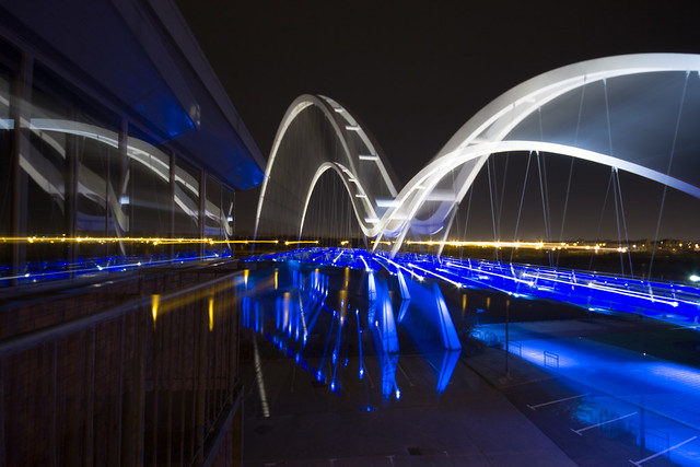
Beautiful colours and subject for the Joiner Effect but just a pity you missed part of the reflected arch.

Self Portrait; different take and very very sharp image.

Excellent shot, good lighting and spot on focus.


Hi Mark, your SP is stunningly sharp, which isn't easy on a close range SP! Great work.

Reflection is a lovely shot. Nice and natural, and with good context. Like it a lot :)

Thanks, I took a few to get it as sharp as I required.

I thought it would be nice to have a slightly different take on a model.
 
Hi, there, Hip shot, yeah, nice candid that captures the moment.

Joiner Effect, nice minimal composition with strong frame. Good detail and colours. I'd prefer the same colour in the sky thought out.

Selfie, good detail and composition. Looks a tad dark?

Reflection, good over the shoulder view and Georgious model. Tad off the top to remove the lighter wall, maybe.

Good show (y)
 
:thinking: Been looking at this a few times and can't really come up with any comments because I haven't taken a 'fisheye' shot yet so don't really know how difficult it would be.
For me, I would crop a bit tighter at the right to balance the other side. Don't know whether a different view point would gives any different result! :thinking:
 
Hi Mark, I like that, but agree with Stan that the crop needs attention. I think also it might have worked better straight on to get some symmetry in there, accentuating the curve in the verticals?

Nice shot though; you've done well to keep detail in the whites :)
 
Yes, thats very good indeed, can't fault it :)
 
Hi Mark.

I like both shadow shots, but prefer the first one. The only shame is the amount of distraction in the courtyard, such as the shrubs, as this would have looked great on a clean simple floor. Not a lot you could do about that though!!!
 
Hi Mark.

I like both shadow shots, but prefer the first one. The only shame is the amount of distraction in the courtyard, such as the shrubs, as this would have looked great on a clean simple floor. Not a lot you could do about that though!!!

Thanks.


I too like both shadow shots. For the second shot I would crop out the building and people with just a shot of the barrier and its shadow.

Like the Mag Cover, three brilliant shots. Where can I find page 7? :LOL:

Thanks.
 
Hi, Shadow #1 really works for me. The length of the shadows really makes an interesting photograph. In this occasion, IMO, the blue bins add rather than distract.

Magazine cover. Well composed and good overall colour. Thinhs like issue number, month and perhaps a bar code would take it up a few levels.

Fishyeye #1 is on theme but pity you clipped the edges ;)

Fisheye #2 works for me. It's has a really old feel to it. Being critical, I'd like to see the symmetry sorted.

Good show.

Cheers.
 
Hi Mark.

Magazine cover. Hmm, I think it's good as far as it goes, but it just doesn't look finished to me. I think it needed more shots, and a bit more attention to the fonts, because it looks a bit, umm, basic?

Nice photo's though. I especially like the pose in the bottom left one; very natural looking :)
 
Thanks for the comments.
It's been a bit of a traumatic time family wise for the last couple of months hence the lack of posting but hopefully most of that is now behind me and I can get back on track.

On the bright side I did get to see this before I saw the themes for this month :)
Sunrise

Spanish Sunrise
by cowboy72, on Flickr
 
Hi Mark. I like your first sunrise, but the second one is a stunner! Can't fault it :)
 
Back in April I tried the zoom burst with a 70-200 lens but I was never really happy with the results hence the lack of posting. Now it's dark earlier and I can go for the longer exposure I tried again, this time I am happy with the result although it is only a 10-20 lens.

Zoomburst

Different style
by cowboy72, on Flickr
 
Hi, English Sunrise is a cracker. The oranges are beautiful and the composition works for me. Lovely detail in the clouds. Me, I'd have cloned out the pylons :)

Zoom burst, I like the blues and the curve but it doesn't spring out as a zoom burst, may be that's a good thing :thinking:

Cheers.
 
Hi, English Sunrise is a cracker. The oranges are beautiful and the composition works for me. Lovely detail in the clouds. Me, I'd have cloned out the pylons :)

Zoom burst, I like the blues and the curve but it doesn't spring out as a zoom burst, may be that's a good thing :thinking:

Cheers.

Thanks.
I left the pylons in for a bit of foreground interest but looking again the tree would probably be able to do that on it's own.

Maybe I need more zoom for my zoom burst :), I'll probably give it another go as it's not too far from me.
 
Wow, love that zoom burst shot; really really well composed!

I prefer the second bokeh one too, because I think it needs the figure to give it context and depth, even if do normally dislike Lego figure shots! Great, clean bokeh shapes too.
 
Wow, love that zoom burst shot; really really well composed!

I prefer the second bokeh one too, because I think it needs the figure to give it context and depth, even if do normally dislike Lego figure shots! Great, clean bokeh shapes too.

Thanks.
 
Zoombursts
These will be my final submission for this years challenge.
Thanks to the others who have stuck it to the end, for the comments and for the comerarderie (sp???) that has gotten me here.
Thanks to Kelly for the ideas/themes/challenges :clap:


InfinitXX Zoom
by cowboy72, on Flickr


Infinity Zoom
by cowboy72, on Flickr


Infinity Zoom B/W
by cowboy72, on Flickr
 
Back
Top