cowboy
Guy Fawkes
- Messages
- 3,143
- Name
- Mark
- Edit My Images
- No
I've been struggling a bit with this, I know what I want but the weather isn't playing.
For starters
Physiogram
It took a few goes to get the exposure somewhere near

4 by cowboy72, on Flickr
A nice swirly one

3 by cowboy72, on Flickr
My favorite
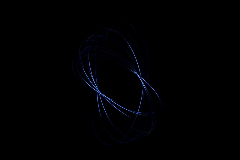
2 by cowboy72, on Flickr
Night lights
The view along the river
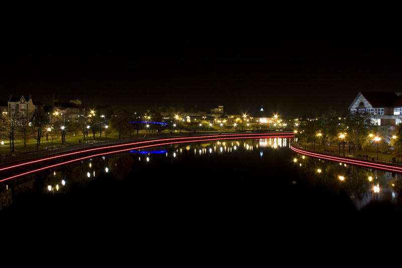
tees by cowboy72, on Flickr
For starters
Physiogram
It took a few goes to get the exposure somewhere near
4 by cowboy72, on Flickr
A nice swirly one
3 by cowboy72, on Flickr
My favorite
2 by cowboy72, on Flickr
Night lights
The view along the river
tees by cowboy72, on Flickr
Last edited:

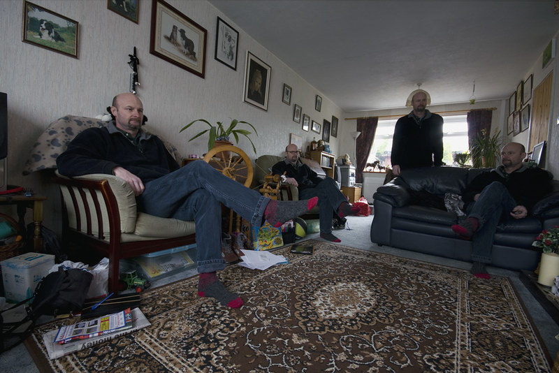
 . Are any of those pictures on the wall your own?
")