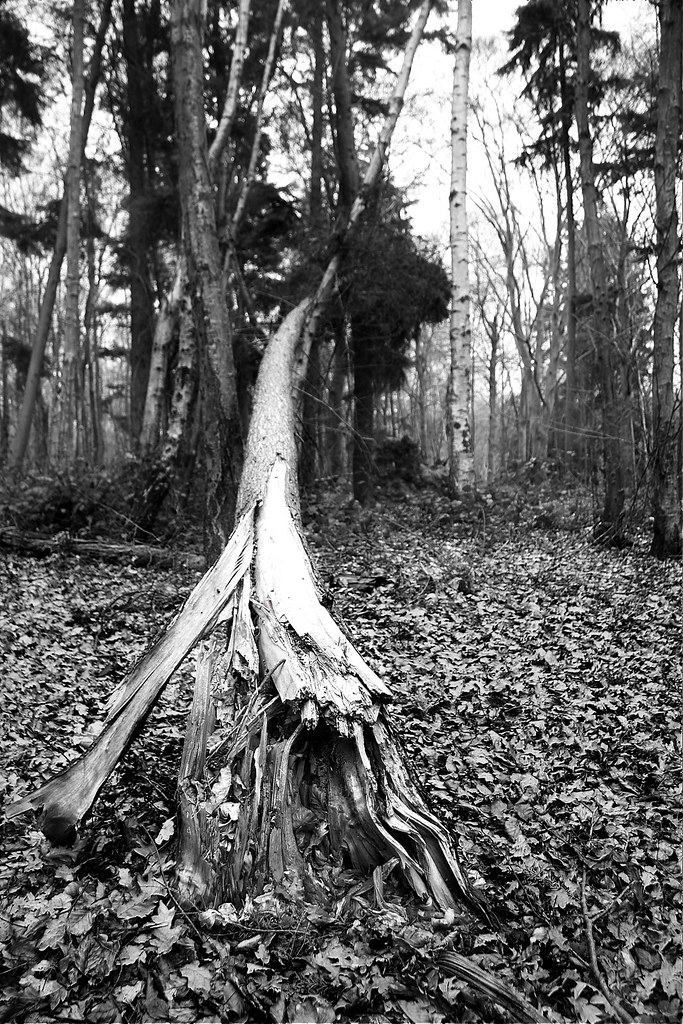
weekly Danhardwick's Photo 52 - Week 8 - Ending

It's much clearer but still not right IMHO. I looked at the picture in Flickr and zoomed in on the fractured bit only and that looks stunning. I believe I am able to edit the authors pictures if permissions are there and I would have done that to show what I mean but don't know how. I'm not trying to mess with your images, just show what I see in the picture.
 
It's much clearer but still not right IMHO. I looked at the picture in Flickr and zoomed in on the fractured bit only and that looks stunning. I believe I am able to edit the authors pictures if permissions are there and I would have done that to show what I mean but don't know how. I'm not trying to mess with your images, just show what I see in the picture.


Feel free to edit and post, thanks
 
I see, I agree it looks great with the lines, I have just been looking at original and its much clearer. I think the editing process on this tablet takes a lot out of the image.

Thanks for the edit, I sometimes get very blinkered on the image I want to show and dont see the details.
 
I am liking both these last two....the last edit suggestion I think works too for the ending shot.

The signposts to me seems a bit tightly cropped at the top and personally I think I'd prefer standard b&w for it.....I'm rarely into sepia tones....although I have done it once myself this year already and committed it to canvas so perhaps I need to reassess myself! ;)
 
Sense - Fits the theme but I feel the image is very flat. Difficult to improve given the probable lighting conditions.

Ending - I'm much preferring the more contrasty edit and again the cropped version
 
Hi Dan, I know you was struggling with Sense so glad to see you finally got one in the bag, I like the image but feel it could work better in colour and from a slightly different angle, the line in the background off the path is distracting.
I like your edit of End, I think the full image works better than the crop, nice image.
 
Sense: a difficult theme to do much with, I agree. Well done for having a go. I'm not sure I could offer any suggestions about improving it.

Ending: I like what you are trying to do with this. Suggested crop and edit works better.
 
Sense - on theme but a bit lacking in contrast/impact. The clipping of the words by overlapping the 'fingers' is a bit distracting too - not sure what pov could have been used to overcome this.

Ending - i prefer the edit of the larger drop - I feel that the context of the fallen tree fits the theme better than the shot of the split wood.
 
Sense - I think the lighting was against you for this one. Nice effort with the conversion but still looks a little flat.

Ending - Your edit is much better as you can now follow the tree. I also like the cropped version.
 
Hi Dan :)

Sense - Liking that, a good idea for the theme, I think maybe a tad more room needed on the top above the signs, nice and sharp where it matters :)

Ending - Nice downed tree and liking the angle, feel it needs some more contrast or something to help separate it from the background, maybe selective colour ?? :)
 
Hi Dan


Sense of Direction works for me , toning suits ,just maybe a little more above the sign post ?

Ending....Nice detail in the broken trunk ( possibly a slightly blown patch though ?)the other still upright tree's behind it give a bit of depth to the image :)
 
Back
Top