You are using an out of date browser. It may not display this or other websites correctly.
You should upgrade or use an alternative browser.
You should upgrade or use an alternative browser.
weekly IanD's 52 Week 2019 Walk Of Shame - Week 26 - Drink
- Thread starter IanD
- Start date
- Messages
- 1,566
- Edit My Images
- Yes
And so it begins....
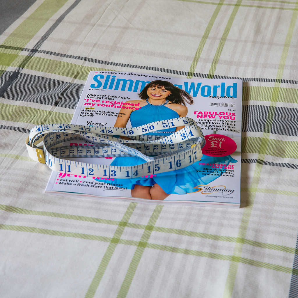
Being that we've been given a nice easy subject to start us off, I thought i'd begin by using the most tenuous link to get me on the board....
So, subject New and i'm into the 'New' Year with a 'New" diet and the image was taken with my fairly 'New' camera bought in December 2018
Go easy on me eh
 52W2019 - New by ***tuttifrutti***, on Flickr
Being that we've been given a nice easy subject to start us off, I thought i'd begin by using the most tenuous link to get me on the board....
So, subject New and i'm into the 'New' Year with a 'New" diet and the image was taken with my fairly 'New' camera bought in December 2018
Go easy on me eh
 52W2019 - New by ***tuttifrutti***, on Flickr
- Messages
- 1,566
- Edit My Images
- Yes
A good start Ian! What week will be getting the New You selfie pic I wonder
Cheers Dave - and you've got no chance of a 'New You' selfie - i'd get banned by Cobra
- Messages
- 996
- Name
- peter
- Edit My Images
- Yes
I like the idea good thinking It will be new for a lot of people i bet 
I do like the Tape measure on it it does add that nice touch to it.
the only thing that detracts for me is the large crease in the cloth to the left of the mag it really caught my eye and pulled me away a little.
I do like the Tape measure on it it does add that nice touch to it.
the only thing that detracts for me is the large crease in the cloth to the left of the mag it really caught my eye and pulled me away a little.
- Messages
- 1,566
- Edit My Images
- Yes
the only thing that detracts for me is the large crease in the cloth to the left of the mag it really caught my eye and pulled me away a little.
That was like a dagger to the heart Peter - believe it or not, I very nearly ran the iron over the bed, but I thought nobody would pick me up on that
- Messages
- 996
- Name
- peter
- Edit My Images
- Yes
I am sorry for that It just caught my eye straight awayThat was like a dagger to the heart Peter - believe it or not, I very nearly ran the iron over the bed, but I thought nobody would pick me up on that
I blame the Mrs she moans about creases non stop even if i fold the curtains back wrong etc.
Last edited:
- Messages
- 199
- Name
- Walter
- Edit My Images
- Yes
A good image and good idea for the theme.
Walter.
Walter.
- Messages
- 1,566
- Edit My Images
- Yes
No problem with the crease here, it makes it less staged imo.
Nice colours, I like the use of angles and the inclusion of the tape to add 3D to the image.
Thanks @LC2 - definitely no staging came to mind. I had a short window working from home and thought i'd have a go at what I had in mind. I'm sure over the year, i'll be getting a bit more thoughtful about my presentation though
Nice image. Interesting interpretation of the theme. Nice use of contrasting colours...like it.
Thanks @GarethB
Fitting for the theme most certainly, I like the inclusion of the tape measure. I think it would suit a different, tighter crop as for me there is too much top and bottom in the image.
Thanks @michael23 - you're quite right to be fair. I know it's only early days, but it's critique like yours that makes me think that I should have paid a little more attention to detail
Good idea for the theme. Maybe a plain background would work better? Or the magazine on a table or something similar.
Just a thought.
Thanks @BobBCN - I did think about taking the shot on the table but it was a bit cluttered and I wanted a reasonably clear surface
A good image and good idea for the theme.
Walter.
Many thanks @Happysnapchat (Walter)
Nice idea for the theme....good luck with the diet.
Thanks @CliveNX - think i'm going to need luck with the challenge and the diet this year
D
Deleted member 59779
Guest
Good choice of theme. Something I could do with doing this year. Magazine really stands out... so much I am tempted to buy this issue. Plain background would have made the image stand out much better. I’ve purchased a roll of black and white paper from the range for such shots. Lasts ages and does not cost a fortune. Just need somewhere to store them. They do other colours as well. Think I’ve seen red and green in there as well. Good luck with the new you.
- Messages
- 1,566
- Edit My Images
- Yes
Hi Ian, that’s where I’ll be on ThursdayI like the composition with the tape measure, I do agree about the background though, a closer crop would definitely work.
Thanks Susie - good luck for tomorrow - I lost 4lb for the first week, but I did have a good Christmas
Hi Ian, nice idea and as others have said the tape adds to the image. I think it would benefit from a crop as the bg is a bit distracting or possibly a slightly lower angle
Thanks Missycat - I think you (and the others are right). I must start to think more about how I present the images once I take them
New
Good start, I like the way you've added the tape measure. Maybe a bit of vignetting would highlight the magazine and tape.
Thanks Nostromo - that's a great idea on the vignetting. I really wish it was me that thought of it, but great tip
Good choice of theme. Something I could do with doing this year. Magazine really stands out... so much I am tempted to buy this issue. Plain background would have made the image stand out much better. I’ve purchased a roll of black and white paper from the range for such shots. Lasts ages and does not cost a fortune. Just need somewhere to store them. They do other colours as well. Think I’ve seen red and green in there as well. Good luck with the new you.
Thanks HeartandSoul - I did used to have a few bits of different coloured card, so might look at those at my local range
- Messages
- 4,640
- Name
- Pete
- Edit My Images
- Yes
I see you have focused on the 49" does that mean anything
- Messages
- 1,566
- Edit My Images
- Yes
I see you have focused on the 49" does that mean anything
Ouch

- Messages
- 1,566
- Edit My Images
- Yes
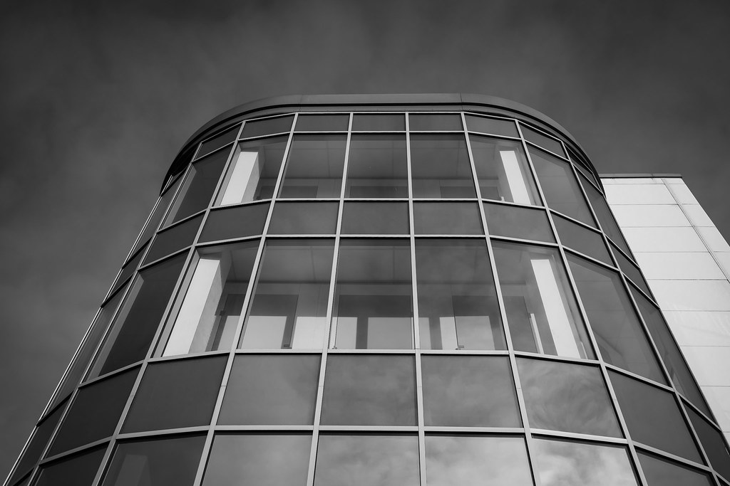
Well, here's my Week 2 entry Clean Lines
I absolutely love buildings, angles and the lovely clean lines they have, and more so, converting them to black and white, so this worked really well (pending all the critique )
)
 52W2019 - Clean by ***tuttifrutti***, on Flickr
I absolutely love buildings, angles and the lovely clean lines they have, and more so, converting them to black and white, so this worked really well (pending all the critique
 52W2019 - Clean by ***tuttifrutti***, on Flickr
- Messages
- 1,566
- Edit My Images
- Yes
Cheers Bob. To be fair, I wouldn't have minded it symmetrical but i'm reasonably happy how it turned out...... especially as i'd managed to rack about 6 shots off before the receptionist from Lock & Store Aldershot got on her high horse and told me I need permission from head office to take photos 

- Messages
- 2,835
- Name
- Bob
- Edit My Images
- Yes
Cheers Bob. To be fair, I wouldn't have minded it symmetrical but i'm reasonably happy how it turned out...... especially as i'd managed to rack about 6 shots off before the receptionist from Lock & Store Aldershot got on her high horse and told me I need permission from head office to take photos
Yes, I imagine there are laws which have to be taken into account. It's all to do with what's public and what's private I guess. When I get told to move along I just go back later!!
GarethB
Likes to peek
- Messages
- 2,291
- Name
- I don't even know anymore!
- Edit My Images
- Yes
Cracking image, love the B&W processing.
I really like the use of reflections and the crop works well too - the slightly off-centre composition gives it an interesting feel, and the gentle vignette brings you nicely into the lines of the architecture.
Great tones in the sky too!
Very nice work Ian!
I really like the use of reflections and the crop works well too - the slightly off-centre composition gives it an interesting feel, and the gentle vignette brings you nicely into the lines of the architecture.
Great tones in the sky too!
Very nice work Ian!
- Messages
- 3,817
- Name
- Carl
- Edit My Images
- Yes
Really love this! I like the range of tones- nice deep blacks in the sky, velvet smooth mid tones on the front of the building and then nice bright whites in the windows to add a pop of contrast. I think you've processed it perfectly, and the image suits the theme perfectly. Nicely done.
- Messages
- 5,432
- Name
- Andrea
- Edit My Images
- Yes
Nice one, Ian  I have begun to enjoy photographing buildings in recent years and this is a super fit for the theme with those great lines and curves, and all that glass. B&W is a good choice too, putting all the attention on the shape of the building itself - and those lines are very clean.
- Messages
- 1,645
- Name
- Steve
- Edit My Images
- Yes
I like this a lot. Have you added a vignette to the sky or is the darker corners natural? either way I think it works to frame the building. One small point, and I don't know if it would have been possible, but I would have preferred the bottom right glass part of the building to start in the corner like the left hand side does.

