weekly Ian's 52 for 2015: Week 16 - Experiment

Hi Ian,

The light and shadows work perfectly to create an avenue. All beautifully framed. I like and the B&W just makes it all the crisper.

Karl
 
Wonderful Verticals there. Textures, detail, shadows, nice moody sky through the trees. I prefer #1, mainly because #2 looks a little off compositionally, IMO.

Cheers.
 
Really like the 2nd image you've chosen, it's a good conversion and theme fitting.
I do though, really like the first shot on your contact sheet :)
 
Version 2 for me also Ian (y)
 
Another vote here for the second shot. I prefer the perspective. Nice idea to show us thumbnails of all the shots:I actually like some of the sky shots and don't thing they're off theme at all. Nice work.
 
Hi Ian yes it's another here for No2 it is the stronger shot I love the conversion and I find it interesting as I don't do much in the way of B&W. The art of converting to B&W Is not something I'm familiar with!

Anyhow I like the shadow and texture on the LH tree and the light on the RH tree both really nice foreground anchors. Nice shadows and textures in the leaf strewn ground/path which gives a bold lead in, running off into the woodlands. Very symmetrically planted trees! Nice sharp image with great light. Nice work!

The first image is no where near as strong, the trees rant as defined and that close foreground interest is lost here. Because of the angle the two thirds on the Left your looking into the woodland that's quite busy and undefined rather than down the lines of trees (which is the more striking angle in No2). The shadow interest has vanished. No2 has eclipsed this by a long chalk.

I do like the looking upwards into the blue sky shots on your contact sheet btw!

Really hope the Wife gets better soon mate, I spent a year on crutches and that was no fun so she must be really fed up! Wish her all the best hope the recovery goes well.
All the best
Steve
 
Hi Ian,
Another vote for #2 from me too.
For me it has a stronger sense of the theme, maybe because it has a bit more contrast.
Both have leading lines but again, #2 has more defined lines.

Wonderful composition, it draws the viewer in and through. The B&W conversion suits the subject too.

Good work (y)
 
Bold - wow them boots really are bright and boldly coloured, really very fitting for the theme.

Relax - nice image of the cat, looks very relaxed indeed.

Vertical - version two works better for me I prefer the composition, the b&w enhances the image nicely.
 
Seems like you're all number twos... :angelic:

I mean... You prefer the second one....

Thanks everyone for your comments.
 
I'm noticing a pattern...

When I see a shot in my head, I struggle to make the time to make it happen...

So on that note it's "shoehorn week" for me. On Sunday a friend asked me to take some photos of her daughter. She wanted typical headshot portraits which was fine. I don't have any lights, so this was room lit and Sunday was a really dank dark grey day so the Fuji was pushing the ISO. The longest prime I have (that I trust myself with) is 35mm so I took a few nice head-and-shoulder shots. This was the first shot of the reel to get the lighting balanced. Some people say there are only three things we can move on our face. The eyes, eyebrows and mouth. With specs hiding the eyes and eyebrows, the mouth was all that was left to express the feelings.


Week 10
by Harlequin565, on Flickr

And I really like this portrait out of the whole reel. It's (probably) not mums choice, and perhaps "Eyes" would be a better theme fit but it was either this or nothing this week.
 
It's a good portrait and hits the theme. Yes maybe the focus is the eyes first i think thats only natural (y)
 
Bit of a shoehorn Ian, but its a cracking portrait :)
 
Shoehorn or not, it really is a lovely portrait.
 
Love this (Mouth) image Ian, really do. So simple, it just stands out, its a great portrait, the model is excellent too.

Phil
 
I don't think it's a massive shoehorn [emoji12]..... Very nicely done Ian, especially with the light available
 
Kind of you all to comment considering I got nowhere this week. Thankyou.
 
Week 11: Crowds

Just thought about looking at whether it's plural or not. Realised it was irrelevant.

After such a huge shoehorn last week, I felt that crowds of trees/daffs or cocktail sticks was going to be an even larger shoehorn this week. So I went for people. I was up early this morning so Chester was where I ended up going as the closest place with any likelihood of a crowd. The initial contact sheet was 127 shots so I edited the carp straight out and ended up with about 30. I think I ended up keeping maybe half a dozen. Of those, none really said crowd. And Chester was helpfully really quiet today and had shut the main bit of the wall over the high street where you can get some good views of the hustle and bustle.


Week 11: Crowd Contact
by Harlequin565, on Flickr

TIL (Today I Learned) several things which has been really useful. Thankyou 52 for teaching me...
- My favourite Street lens is 80(ish)mm full frame equiv. 35mm and 50mm are too short
- The Nikon Df is SLR sized and not A7/Fuji-X sized. It weighs a ton and it isn't selling (in Chester anyway)
- The X-T1 is so nice I almost went "the hell with it" and bought one
- I'm getting better at Street Photography. Slowly.

There are quite a few "non crowdy" ones on Flickr which I think are better shots, but I really liked this one. This group of Cheshire Housewives were obviously out for the day. As they "crowded" together to take their selfie I watched the passers-by dodging the waving stick but by the time I'd got camera to eye, the pavement was empty and within one frame - they were done. Do we need to see their faces? I think the image works with just their similar hair styles.
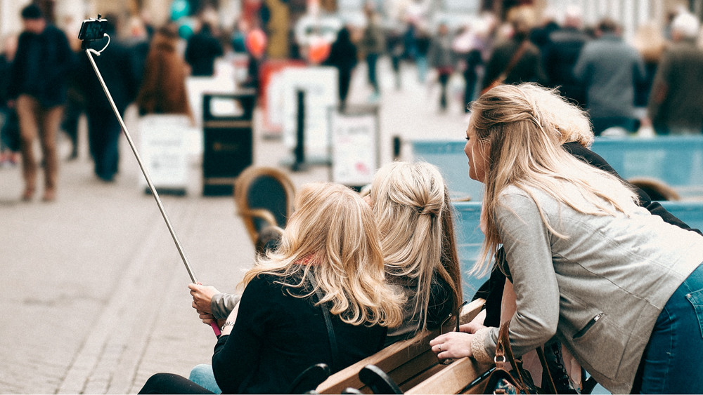

Week 11: Crowd
by Harlequin565, on Flickr, 16x9 crop obligatory...

Didn't quite have the courage to approach anyone for a formal portrait (ala @blakester and the Strangers Thread. - pls visit - it's worth it!) but I quite like to sit and watch the world go by.
 
Your last image for me Ian is a fantastic choice.
They say 3's a crowd and there are four ladies maybe even five on looking again in your shot so definitely on theme (y)

I do like your chosen aperture, a sense of place has been captured without the background being obtrusive.
It really does tell a little story in itself, makes this viewer ask questions about the image and the ladies. We don't need to see their faces IMHO, they are engrossed in their selfie, we can paint the picture of them all saying 'cheese'

Thanks for the thread plug BTW ;)
 
Didn't quite have the courage to approach anyone for a formal portrait (ala @blakester and the Strangers Thread. - pls visit - it's worth it!) but I quite like to sit and watch the world go by.

Hi, I wasn't sure about Crowds when I first saw it, but I took time to look at it and have a think. The selfie stick makes it very current and the crowds in the BG work well.

Rearding Mr Blakester, tru dat :)

Cheers.
 
Crowd: Works for me. The similarity in the hair and DoF draws the eye to the girls. If all of them had had a little bit of facial profile so much the better but the scene is the scene and short of yelling out "hey, girls!" at the top of your voice the picture is as good as it gets.
 
... and short of yelling out "hey, girls!" at the top of your voice the picture is as good as it gets.

I would have been verbalised in Scouse.

By 5 ladies.

There would have been no Week 11.

I project. :)
 
Hi as above I agree the picture is so current you don't need to see their faces it's not needed for such a familiar event these days, it tells a story as it is :clap:

what time where you there I went about 2pm, no idea you are near Chester either
 
I was there from about 9.30 'till just gone 1. Lovely peaceful day out. The Cathedral was free entry too (and is until April) which was a nice surprise. I love walking round in there.
 
I was there from about 9.30 'till just gone 1. Lovely peaceful day out. The Cathedral was free entry too (and is until April) which was a nice surprise. I love walking round in there.

The Cathedral is free entry all the time, I know that because I work there
 
I agree, no faces required.
The scene itself tells a story.
 
A bustling OoF background and a crowded bench, it fits well, good call Ian :)
 
The girls image for me Ian, "Crowds", just needed to be a bit more to the right ;)

Phil
 
Hi Ian :)

Sorry but a quick catch up from me :)

Bold - Looking through your shots I think although they are just laid down, you have chosen wisely, the boots are bold enough on their own they don't need to be staged... as for the actual boots I don't think you could get bolder if you tried, lovely vivid colours and all round image (y) from me

Relax - Again good to see such a variety of test shots, the final image I'm not sure if the background is too much, think it is on the limits for me, but in any case the cats eyes are lovely and bright and sharp, nice focus :)

Vertical - Another vote for the second shot from me, and much preferring the B & W conversions compared to the colour shots :)

Crowd - I feel there are going to be a lot of similar images for this theme, but I doubt anybody will capture a shot like yours, well spotted, really liking the angle, a perfect street shot for me (y)
 
Thanks for your comments everyone.

The girls image for me Ian, "Crowds", just needed to be a bit more to the right ;)

In a dream world, I'd prefer to have been able to capture their faces and expressions for the selfie. I see what you mean though. It's tough to make fast decisions like this. I had maybe 15 seconds from spotting them to getting into position for the shot. More experience would have made it better.
 
they are all 'crowded' around the stick so works for me, were you being discreet when you cropped out the backside? lol

as for mouth, well you could have done loads with this if you'd known at the time - I mean, is it just me or does she have a 'Mona Lisa' smile? Get her back and do the pose :)

To fit the theme better you could have cropped down to just her smile.

final point - well done to get the specs without reflections, tis an art I tell you!

:clap:
 
Last edited:
they are all 'crowded' around the stick so works for me, were you being discreet when you cropped out the backside? lol

as for mouth, well you could have done loads with this if you'd known at the time - I mean, is it just me or does she have a 'Mona Lisa' smile? Get her back and do the pose :)

To fit the theme better you could have cropped down to just her smile.

final point - well done to get the specs without reflections, tis an art I tell you!

:clap:


Thanks. I think every other "specs-on" shot had terrible reflections. Took a while to convince her to lose them. There were other ways for being more on-theme, but I made the decision to stick with the photo I liked even if it was more of a shoe-horn. I suspect that with practise, I'll improve on hitting the theme. Some times it's easy when the theme is in one's "comfort zone". Sometimes it's not so easy, and on those occasions, does one submit something that's sub-standard (in one's own eyes) or something quality but less thematic. Both the chickens and the cats were up for a portrait session, but I didn't want a chicken "gob shot".
 
Back
Top