^Joe's Photo 52, abstract, pair, safe.

Hi Joe

love your 2nd shot for Blur...well caught :clap:

Brilliant light trail as well...the lighter sky works well...adds some interest apart from the actual trail (y)

keep up the great work :)
 
I'm liking your Time. Don't touch the sky, the coffee colour really works for me.

Works for me. I'd like to see it bigger....

Cheers.
 
AFAIK, the Ivy killed the tree, and got inside it after death. I think someone cuts the ivy from the tree every now and again.

I am not happy with this pic, so I'm saying it's a temporary attempt until I get a better one in Turkey.
 
Hiya Joe,

Like the light trails for time .... a different take for 'time', well done.

Also the 'mix' shot is an original idea, although it appears slightly over exposed in places.

Cheers

Dawn :)
 
joe..love the larger time shot... love light trails... the sky is great.. i get blue round here if i leave it too long...maybe i shoot more towards the city lights... but the larger has good sharpness to it..

mix... lets wait for the second shot... sorry.
 
Hiya Joe,

Like the light trails for time .... a different take for 'time', well done.

Also the 'mix' shot is an original idea, although it appears slightly over exposed in places.

Cheers

Dawn :)

Thanks Dawn - I am really happy with the exposure on Time, Although I think the sign and composition can be imrpoved.

Mix - I am not happy :LOL:


joe..love the larger time shot... love light trails... the sky is great.. i get blue round here if i leave it too long...maybe i shoot more towards the city lights... but the larger has good sharpness to it..

mix... lets wait for the second shot... sorry.

Thanks, really happy with time. Mix - I agree, will HAVE to revisit it!!

Mix don't say mix to me Joe, sorry.
I see you're not happy with it so I look forward to seeing the replacement.

Thanks mate.

So, week 38.

As mentioned, I was in Turkey, so on the last day I checked the BlackBerry to look for this weeks Theme.

The missus wanted to get get changed and wait about all day, ''NO''; we have to get this shot.


Fun by ^Joe, on Flickr

I think it shouts fun :)

Was not an easy shot to get either, which for me, makes it even more fun.

Cheers :wave:
 
Fun indeed! Nice bokd colours and I love the expression. Nice one.

Great shot Joe ... shouts "Fun!" to me ;)

Joe... sun + water slides = fun ... job done (y)

Thanks all :D

It hits the theme all right.
A slower shutter speed and some more panning would have been nice.

Thank you! That was my intention, it was 1/125 and I did pann it along. Perhaps a bit l;onger would ahve worked better :D
 
Joe,

Welcome to the mad house!

Sorry I’ve missed your first few shots, but here goes.

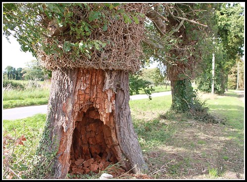
Record - Great DoF, great angle, and you have a good eye for a shot. The green is a distraction, and a tighter crop would sort that out. The point of focus, although easy enough to find, could do with a point of interest on it. An example might be a finger pressing down on that key. It would also add texture, and another lead in line (which you have grasped well :clap:)
Overall, well shot!

Work - As others have said, the bg is busy, and the point of focus doesn't leap out as work. But that said it is on the right track. A bit more concentration on the rule of thirds, and what is going on in the bg would nail this! (y)

Blur - Shot 1 doesn't work for me. No point of interest, distracting bg, nothing leading me into the shot, and too symmetrical.
Blur - Shot 2 :clap: Dead space is so often avoided, but in this case it really adds to the shot! The ring is in the right place, the contrast between colour and motion all work. Well done.

Time - This is an "almost there" shot for me. The road is tilted which is a bit off putting. Good lead in lines though. The sky is fine (maybe a tad darker) but as others have said, Black sky wouldn't have any interest in it. I think it is a bit noisy, but then it was a looooooooooooooong exposure, so that can be forgiven. Overall though, I think there is "something" missing, and I can't think what it is... sorry :thinking:

Mix - Sorry, but it is over exposed, with a lot blown. It also lacks the composition that you have clearly shown in all your other photos. It is certainly an interesting subject though.

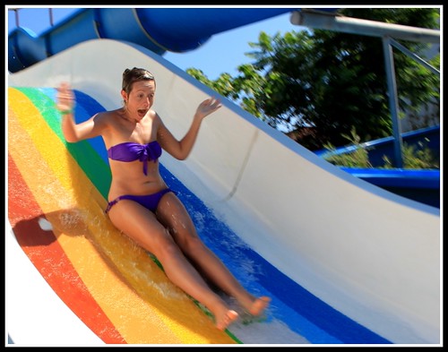
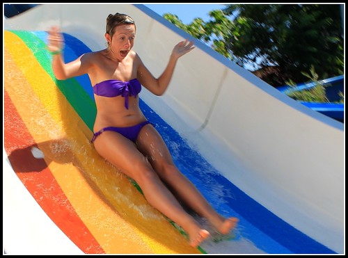
Fun - A great shot that just shouts FUN!!! (y) Great colours and a fantastic expression. The top right is distracting however, and it is worth trying to remember to look at the whole of the image when shooting.

Mix retake - I like this. It works other than the top of the shot where there is no Smarties. Just crop a bit tighter, and that’s a keeper! (y)

Hope this helps

Kind rgds


Adie
 
Adie - really appreciate you taking the time to comment, and I take them all on board and hope to improve to get a perfect picture!

Thanks.

Cheers Neil - I'll give it another crop when I get home and see if it's worth replacing!

Thanks :D
 
Week 39 - Volume!

I love, love home cinema and High volume so I was quite happy with the theme. I've taken about 35 pictures of the same thing today, and I can't decide which is my favorite, so I shall post 2. As well as a standard volume picture.


Volume 1 by ^Joe, on Flickr


Volume 3 by ^Joe, on Flickr


Volume 2 by ^Joe, on Flickr

I am really getting into this 52. So I now aim to complete the whole 52, so I've got some catching up to do.

Cheers
 
Blimey Joe, you're quick off the mark with this week's theme :LOL:
And for somebody who says they're new to this, there are some absolutely spectacular photos so far.

I'm going to say that I prefer the original crop for volume. Not that either is right or wrong, but the first just works better for me personally.
It's definitely the pick of the 3 for me.

My only complaint is the reflection in the centre of the speaker. I would have been tempted to hold a piece of black / white paper or fabric in front with a gap just big enough for the camera lens. The end result could have been easily cleaned up and cloned in PP.
 
:agree:

Great work Joe, and I agree about the original crop and the slightly distracting reflection in the cone, but overall EXCELLENT effort for someone new to this.

:clap::clap:
 
Liking the re-edits of Fun and Mix.

What about doing a Tryptych or similar of the speaker images - then you don't have to pick one?
 
Hi, Joe, I quite like the angle of #1. But, overall, I prefer the edit. I'd like to see one without the reflection to give it more of a graphic feel. I'd also like to see the photograph a bit blacker.

Fun, well done. It really does have a fun feel to it with a great expression.

Cheers.
 
Back
Top