weekly Johns 52 Thread for 2015 - Week 8+9 - Relax and Vertical added.

Nice John, I really like the tulip, great positioning in the frame and the back by makes it stand out.

As for watery. Good idea and well executed by especially for a phone shot.

Thanks for the kind words Dan.
 
The composition on elegant works really well, the curve of the tulip, and the large negative space give it a nice overall feel.

There's nowt wrong with watery either, beautiful colours, and on theme.
 
Hi John

My apologies....I seem to have managed to overlook your thread!
I shall be taking myself off to the naughty step forthwith. :(

You got some "cracking" images so far.....and yes, FRAGILE is one of my favourites :)
I also adore ELEGANT and WATERY...both are very pretty images, and both fit the theme well.
 
... another one who loves the tulip ... you've really brought out strong greens and whites against a contrasting black BG. (y)

Watery ... nice work.
 
Elegant: Gorgeous picture.
 
The composition on elegant works really well, the curve of the tulip, and the large negative space give it a nice overall feel.

There's nowt wrong with watery either, beautiful colours, and on theme.

Elegant - clear black background which I like, and the tulip does look very nice in its pose.

Watery - fits the theme and I also like the colours as well.

Hi John

My apologies....I seem to have managed to overlook your thread!
I shall be taking myself off to the naughty step forthwith. :(

You got some "cracking" images so far.....and yes, FRAGILE is one of my favourites :)
I also adore ELEGANT and WATERY...both are very pretty images, and both fit the theme well.

... another one who loves the tulip ... you've really brought out strong greens and whites against a contrasting black BG. (y)

Watery ... nice work.

Elegant: Gorgeous picture.

Many thanks to all for commenting, if I have managed to comment on yours for a while then I apologise I am attempting a mass comment marathon this evening.

John
 
Watery, I wondered what it was, no you explained it, I can see it.
Very nice light, colours and textures (y)
 
Elegant, beautifully lit with good details retained in the tulip, contrasts nicely against the black. Definitely my kind of thing

Watery, very cleverly done, nice colours with sharp droplets drawing the eye to the setting sun (Y)
 
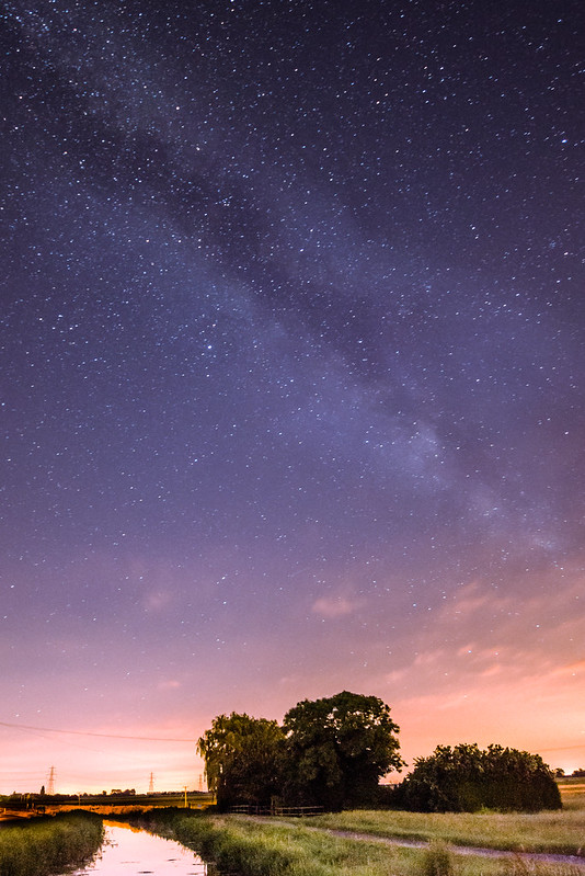
Well here is my image for BOLD, it's an image that was taken last year, I have an idea what I wanted to get for this theme but I haven't had the time so in an effort to catch up I have submitted this, I hope to get the image I had originally planned taken when we have a re-shoot week.

To BOLDly go.

Bold by JSN-Photography, on Flickr
 
Oh very nice indeed.
I'm always a little envious of MW shots!
 
Oh very nice indeed.
I'm always a little envious of MW shots!
Thank you, not as visible as it could be due to light pollution but I guess I can't grumble, you can see it with your naked eye at times from my back garden.
 
Nice shot of the MW, I think the last time I properly saw it I didn't have my camera with me :(

Nice shot, although I may have been inclined to darken the lower section with a grad to make the sky more prominent. Very well done none the less (y)
 
Elegant, beautifully lit with good details retained in the tulip, contrasts nicely against the black. Definitely my kind of thing

Watery, very cleverly done, nice colours with sharp droplets drawing the eye to the setting sun (Y)

Thank you, the Tulip was actually my wife's idea and was more of a quick snap that a thought through shot but thanks for the kind words. I just got lucky with the Watery shot, right place right time although I am quite surprised with how well my phone coped with the image.

Hi John ...a catch up from me.
Elegant ....your tulip looks wonderful, I love that one, an elegant composition against the stark black background, very eye catching indeed.
Watery ....a smashing abstract style image, some great colour and texture in there.

Many thanks for the kind words.

Nice shot of the MW, I think the last time I properly saw it I didn't have my camera with me :(

Nice shot, although I may have been inclined to darken the lower section with a grad to make the sky more prominent. Very well done none the less (y)

It's nice when you actually get to see the Milky Way, not so nice when you don't have a camera with you, if I'm honest I think I am slightly infatuated with the MW and I am hoping to get a picture of it this year as a full arch. I have to agree with your comment about darkening the lower section and I think it would improve the image.
Thanks for your comments and taking the time to stop by.
 
Hi, never done this type of shot before as the light pollution round here is shocking, that works really well
 
Lovely Milky Way. Bold? Hm, about three steps to the left of the theme but it's a good picture so I'll let you off (my own entry for Mouth was a very wide interpretation too).
 
Lovely Milky Way. Bold? Hm, about three steps to the left of the theme but it's a good picture so I'll let you off (my own entry for Mouth was a very wide interpretation too).

I wanted to get something posted so I don't fall any further behind and as I have quite a few Milky Way/Astro pictures I thought it was a reasonable take on the theme lol.

Many thanks for stopping by and looking.
 
Bold, a great interpretation John, well captured too!
Just a minor niggle as t'other Chris said, the lower half could do with a slight darken IMO, as well.
 
Bold - I like this John, and, as others have said, a slight darkening at the bottom would improve it, but great shot nonetheless.

I live in SE Spain, out in the countryside with little light pollution and, in the summer especially, the MW is amazing as it zooms overhead (and we get the Perseids too) :D
 
Nice shot of the MW, I think the last time I properly saw it I didn't have my camera with me :(

Nice shot, although I may have been inclined to darken the lower section with a grad to make the sky more prominent. Very well done none the less (y)

Bold, a great interpretation John, well captured too!
Just a minor niggle as t'other Chris said, the lower half could do with a slight darken IMO, as well.

Bold - I like this John, and, as others have said, a slight darkening at the bottom would improve it, but great shot nonetheless.

I live in SE Spain, out in the countryside with little light pollution and, in the summer especially, the MW is amazing as it zooms overhead (and we get the Perseids too) :D

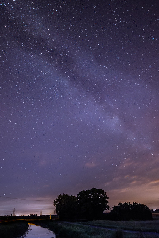
Not the best edit in the world as it was just a quick lightroom effort but here is the image with the bottom darkened.

Bold 2-1 by JSN-Photography, on Flickr
 
Hi John,

A catch up on your catch up!

Elegant - now that screams elegant, tulips are such gorgeous flowers and the white against the black background works so well :clap:

Watery - another cracking shot there, sums up the theme nicely

Bold - another lovely shot. I pprefer the edit with the darker foreground. I've wanted to try some shots of the milky way for a while, but haven't managed it yet. It does look magical though :)

Bold - that's a great shot, works for the theme for me as well.

Thank you for the comments and the feedback, much appreciated.
 
Really liking your MW shot... Edit works well on it - quite a magical feel to it!
 
Hi John :)

And here is me thinking I had commented on these :thinking:

Elegant - Really like how you have set this one up with the leaves curving back and the flower coming back into the frame, lovely colours and nicely lit too (y)

Watery - Liked this when it was posted, superb colours and effective DoF, no crit from me on this, love it :clap:

Bold - Again a nice choice for the theme, what a cracking sky that is, well captured (y)
 
Hi John, doing some catching up so here's some feedback from me:

Patterns - A good starting one, I like it, reallt good detail on the leaf and ice and I think the DOF works well for this one

Bliss - Cracking image, I really like this, the black background works well, and seems blacker than i've got any of mine lol. I like the reflection and its a good idea using the hob. I've tried to find a gloss black tray for similar situations but haven't found one, although i've not really tried hard..

Fragile - This is a really good idea, I did similar for mine(using an egg), I like how you have manage to capture the egg hitting/jumping up as I bet it was pretty hard, the leaking egg bit works perfectly directly at the bottom. I definately prefer the tighter crop though.


Scenic - Theme fitting images, i'm not a massive fan of panoramic, so no real feedback on this one, its still a good photo just not my cup of tea. No 2 works well, the sky is very eye catching and draws the eye, my only critisim on this if you can really call it that is i would have prefered some more vibrant colours from the ferns.


Companions - I saw this at first and thought woah (with the green) but scrolled down, I like the black and white but not the green. It may be a cop out but its still a good one, I've come close a few times having to cop out, time's a killer. Fits the theme well, I don't agree it looks staged but everyones opinion is valid and different.


Elegant - This is a really good photo!! The colours and sharpness are superb, and the contrasting background is bang on. This is the best photo of your so far, IMO.


Watery - Again, a good photo, fits the theme well, I like the fact you have the sunrise in the background, but it's not as impressive after seeing your tulip one, sorry :)


Bold - I'm a little bit jelous of this photo, whilst something doesn't quite look right at the top of the river/stream, the colours in this and the sky/stars is fantastic and I really like it. Perhaps a tiny bit too much PP, but this is being picky. Not really a fan of the 2nd photo, prefer the first one.
 
Hi Nick

Elegant...beautiful, needs printing & framing...nuff said :clap:
 
Elegant - Superb image of a tulip. I’m loving the bright green and white against the black background. The lighting has been really well handled.

Watery - Very simple but very effective made by the lovely tones of the sunrise

Bold - Great link to the theme. As for the photo well that’s great as well. There’s nice detail on the ground (which I prefer than the edit) and the sky is something else. Nice one John.
 
Really liking your MW shot... Edit works well on it - quite a magical feel to it!

Hi John :)

And here is me thinking I had commented on these :thinking:

Elegant - Really like how you have set this one up with the leaves curving back and the flower coming back into the frame, lovely colours and nicely lit too (y)

Watery - Liked this when it was posted, superb colours and effective DoF, no crit from me on this, love it :clap:

Bold - Again a nice choice for the theme, what a cracking sky that is, well captured (y)

Hi John, doing some catching up so here's some feedback from me:

Patterns - A good starting one, I like it, reallt good detail on the leaf and ice and I think the DOF works well for this one

Bliss - Cracking image, I really like this, the black background works well, and seems blacker than i've got any of mine lol. I like the reflection and its a good idea using the hob. I've tried to find a gloss black tray for similar situations but haven't found one, although i've not really tried hard..

Fragile - This is a really good idea, I did similar for mine(using an egg), I like how you have manage to capture the egg hitting/jumping up as I bet it was pretty hard, the leaking egg bit works perfectly directly at the bottom. I definately prefer the tighter crop though.


Scenic - Theme fitting images, i'm not a massive fan of panoramic, so no real feedback on this one, its still a good photo just not my cup of tea. No 2 works well, the sky is very eye catching and draws the eye, my only critisim on this if you can really call it that is i would have prefered some more vibrant colours from the ferns.


Companions - I saw this at first and thought woah (with the green) but scrolled down, I like the black and white but not the green. It may be a cop out but its still a good one, I've come close a few times having to cop out, time's a killer. Fits the theme well, I don't agree it looks staged but everyones opinion is valid and different.


Elegant - This is a really good photo!! The colours and sharpness are superb, and the contrasting background is bang on. This is the best photo of your so far, IMO.


Watery - Again, a good photo, fits the theme well, I like the fact you have the sunrise in the background, but it's not as impressive after seeing your tulip one, sorry :)


Bold - I'm a little bit jelous of this photo, whilst something doesn't quite look right at the top of the river/stream, the colours in this and the sky/stars is fantastic and I really like it. Perhaps a tiny bit too much PP, but this is being picky. Not really a fan of the 2nd photo, prefer the first one.

Hi Nick

Elegant...beautiful, needs printing & framing...nuff said :clap:

Elegant - Superb image of a tulip. I’m loving the bright green and white against the black background. The lighting has been really well handled.

Watery - Very simple but very effective made by the lovely tones of the sunrise

Bold - Great link to the theme. As for the photo well that’s great as well. There’s nice detail on the ground (which I prefer than the edit) and the sky is something else. Nice one John.

Thanks all for the kind words and taking the time to comment, I really have my work cut out now for catching up however I am determined to finish this year so watch this space.
 
Well better late than never I guess. In an effort to catch up I apologise for the lack of thought, execution and standard of images over the next few posts, hopefully once caught up I can start taking a bit more time and putting a bit more thought into my shots, anyway here are two for relax. Relaxing by the sea with a BBQ and a beer.

Relax-1 by JSN-Photography, on Flickr

Relax 2-1 by JSN-Photography, on Flickr
 
Last edited:
Hi John, good to see you hanging on in here (y)

Vertical.....like that , abstract with just enough texture in the in focus slat to add some interest , mono works really well :clap:

Relax....not really feeling this I'm afraid , with your words about sea & bbq I would've liked to see more of them...sorry :(

Don't be sorry, that what this process is all about, constructive criticism, if I'm honest I'm not that keen either I just want to post stuff and catch up.

Thanks for stopping by and commenting, I will endeavour to get to your thread this evening.
 
Relax - sorry, but I have to agree with Lynne on this one and would have liked to see a tad more of the context rather than just the beer glass - which is a good image in itself, but for me doesn't really illustrate the theme as well as it might. :sorry:

Vertical - nice use of mono and whilst it could have ended up looking rather flat, the shadows and highlights give it shape (y)
 
Back
Top