
You are using an out of date browser. It may not display this or other websites correctly.
You should upgrade or use an alternative browser.
You should upgrade or use an alternative browser.
Liz's 52's for 2017 - Week 52 - Weather(and done)
- Thread starter Liz Reeve
- Start date
- Messages
- 11,218
- Name
- Tim
- Edit My Images
- Yes
Hi Liz,
You - Nice and sharp. What f-stop were you using? as the background is in focus too. I think I would have tried for a blurring of the background so that it didn't compete with the subject. The building growing out of the side of his head isn't very flattering.
Arch(ing) - Great looking car and bang on theme for the subject. Any idea what make/model it is?
I appreciate you wanted to get the whole car (I would have too) but did you consider / take any close ups of details (such as the arches) to lose the background?
Display - Nicely done, it pops out from the background")
Bent - Cool idea and you've captured detail such as the bubbles well. I have to say I'm not keen on the background, but then again, I don't have anything better and I know the pain of trying to get a clean background myself.
You - Nice and sharp. What f-stop were you using? as the background is in focus too. I think I would have tried for a blurring of the background so that it didn't compete with the subject. The building growing out of the side of his head isn't very flattering.
Arch(ing) - Great looking car and bang on theme for the subject. Any idea what make/model it is?
I appreciate you wanted to get the whole car (I would have too) but did you consider / take any close ups of details (such as the arches) to lose the background?
Display - Nicely done, it pops out from the background
Bent - Cool idea and you've captured detail such as the bubbles well. I have to say I'm not keen on the background, but then again, I don't have anything better and I know the pain of trying to get a clean background myself.
- Messages
- 13,393
- Edit My Images
- Yes
That's a clever idea for bent Liz, having the background slightly further back could have helped a bit, but still liking the colour and thought, nice one
OP
- Messages
- 398
- Name
- Liz
- Edit My Images
- No
Hi,
Thanks. A few comments:
BENT - The background colour is from a paper tablecloth I happened to have, which had been folded and so had to be propped up so that the glass could stand on it and also act as background to hide everything else + high enough to be able to take it at a reasonably eye level view. It was not possible to have it set anywhere else than where it was. Lighting was a ceiling light.
YOU was just a holiday shot so the background was just there.
ARCHING - as above. I just took it because it was there and it was fantastic. The title came up a few days later and it just fit.
DISPLAY - same again. I saw a couple of people taking pics from the appt and thought I'd better get dressed and see what they were photographing at 8am. Good job I did or I might have missed it. I took it with IPad, phone and camera to see which worked best - my Olympus SZ-30MR 16 megapixels automatic camera won out.
Liz
 The background is a bit creased. By dropping the highlights they mean reducing the intensity of the white bits at the bottom of the glass and the couple of spots on the rim. You could probably do this in photoshop

OP
- Messages
- 398
- Name
- Liz
- Edit My Images
- No
Week 42 - Symmetry
A bit late this week but eventually found this wonderful example at one of the only three Mansion Houses in the country - London, York and this one being Doncaster. Also managed to achieve three Gold awards in the Doncaster in Bloom competition at the same time! Lighting a bit bright in places, but it was the best I could do.

A bit late this week but eventually found this wonderful example at one of the only three Mansion Houses in the country - London, York and this one being Doncaster. Also managed to achieve three Gold awards in the Doncaster in Bloom competition at the same time! Lighting a bit bright in places, but it was the best I could do.


- Messages
- 977
- Name
- Tilly
- Edit My Images
- Yes
Symmetrical
I really like the shot, good find for the theme. I agree with Dave I might have cropped the image at the top to remove that picture but not sure of that would affect the composition.
Worn
Nice colours you've captured here, works well against the green background.
I really like the shot, good find for the theme. I agree with Dave I might have cropped the image at the top to remove that picture but not sure of that would affect the composition.
Worn
Nice colours you've captured here, works well against the green background.
- Messages
- 11,218
- Name
- Tim
- Edit My Images
- Yes
Hi Liz,
Wooden - I'm one for boosting parts of the image to give more impact. I like the general image but to my taste it's a git samey...
Increasing the contrast, clarity and adding some de-haze, then boosting the orange and red hues while dropping the greens and blues really makes it pop. (If you want I can PM you what I mean).
That said, that's just me, so...
Great imagery though")
Walled - What a good thing to have on your doorstep (literally). So much to look at, such a range of colours
Symmetry - I know this is probably just me, but I would have played around with the black 7 white points in the levels adjustment to give more impact.
Worn - Nice range of colours and good use of contrasting the reds / pinks with the greens.
Wooden - I'm one for boosting parts of the image to give more impact. I like the general image but to my taste it's a git samey...
Increasing the contrast, clarity and adding some de-haze, then boosting the orange and red hues while dropping the greens and blues really makes it pop. (If you want I can PM you what I mean).
That said, that's just me, so...
Great imagery though
Walled - What a good thing to have on your doorstep (literally). So much to look at, such a range of colours
Symmetry - I know this is probably just me, but I would have played around with the black 7 white points in the levels adjustment to give more impact.
Worn - Nice range of colours and good use of contrasting the reds / pinks with the greens.
OP
- Messages
- 398
- Name
- Liz
- Edit My Images
- No
Hi Liz,
Wooden - I'm one for boosting parts of the image to give more impact. I like the general image but to my taste it's a git samey...
Increasing the contrast, clarity and adding some de-haze, then boosting the orange and red hues while dropping the greens and blues really makes it pop. (If you want I can PM you what I mean).
That said, that's just me, so...
Great imagery though
Walled - What a good thing to have on your doorstep (literally). So much to look at, such a range of colours
Symmetry - I know this is probably just me, but I would have played around with the black 7 white points in the levels adjustment to give more impact.
Worn - Nice range of colours and good use of contrasting the reds / pinks with the greens.
Hi, would be good to see your take on wooden. I'm afraid I wouldn't know where to start. Likewise with symmetry.
- Messages
- 11,218
- Name
- Tim
- Edit My Images
- Yes
Hi Liz,
This would be my edit for wooden.
Not overly different, but I've boosted the warm colours while dropping the saturation of the colder ones.
I suspect you would need to put them side by side to really notice the difference.

This would be my edit for wooden.
Not overly different, but I've boosted the warm colours while dropping the saturation of the colder ones.
I suspect you would need to put them side by side to really notice the difference.

OP
- Messages
- 398
- Name
- Liz
- Edit My Images
- No
Symmetrical ... haha almost there. The second one looks about right top & bottom but could probably do with a smidgen off RHS.
Worn clothes yes why not, nice idea.
Yes, I think you're right about the crop.
OP
- Messages
- 398
- Name
- Liz
- Edit My Images
- No
Hi Liz,
This would be my edit for wooden.
Not overly different, but I've boosted the warm colours while dropping the saturation of the colder ones.
I suspect you would need to put them side by side to really notice the difference.
View attachment 113658
Thanks for taking the trouble to show me what can be done. As you say, it's not altered it a lot, but perhaps just enough to highlight the colour in the wood where the light was catching it.

- Messages
- 11,218
- Name
- Tim
- Edit My Images
- Yes
Hi Liz,
Somehow I've missed Colourful being posted, but it certainly works, plenty of colours there. Good find.
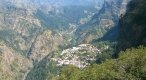
Remote - It certainly is. Was this taken through a coach window?, I'm thinking it might have been given the hazy appearance of the top of the photo.
De-haze might be able to recover that. You're certainly getting about and making us jealous of your travels")
Somehow I've missed Colourful being posted, but it certainly works, plenty of colours there. Good find.
Remote - It certainly is. Was this taken through a coach window?, I'm thinking it might have been given the hazy appearance of the top of the photo.
De-haze might be able to recover that. You're certainly getting about and making us jealous of your travels