Monthly Mattd85's 12's for 2013 ETC

Messages
5,812
Name
Matt
Edit My Images
Yes
Hi,

Well after last years failed attempt at the 52 I have decided to have a bash at the 12's, The Step out of your comfort zone version :). I hope to learn many techniques and learn from others as we all do this and comment on each others work. Hopefully you will enjoy my photo's, some will be plain and simple, some will be arty, some will be completely bonkers :wacky:.

Thanks

January - Theme selected Sparklers/Fire Dancing
February - Theme selected Water drops/splash
February - Theme selected Natural Light

Matt
 
Last edited:
So, month one, It took me a while to decide on a technique and as I struggled to get any decent shots of the sparklers on bonfire night last year I decided to choose that theme. My original plan was to get the kids out in the Garden with the Sparklers but that didn't work so I went a different route :)

Overall I enjoyed it and did learn a lot, Roll on next months themes :)

Hope you enjoy,

Matt

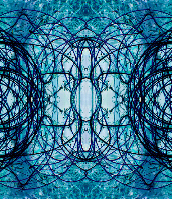
1. This was a crop of a spin in the garden with the sparkler, flipped in pshop and Inverted.


12's Challenge, Jan Theme Sparklers 1-6 Abstract by mattd85, on Flickr

2. Played about using the other half(who was VERY COLD!!) as a model, Tried to make this as 'out there' as possible.

12's Challenge, Jan Theme Sparklers 2-6 Distorted Angel by mattd85, on Flickr

3 + 4 Again playing about with flipping and rotating to get some abstracts, In No 3 a devilish Cat appeared, I can also make out an Owl's eyes at the top.


12's Challenge, Jan Theme Sparklers 3-6 The Cat_ by mattd85, on Flickr


12's Challenge, Jan Theme Sparklers 4-6 Burst of colour by mattd85, on Flickr

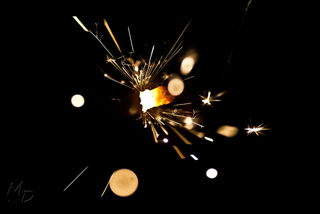
5. Macro shot of the Sparkler Burning down, I could of got a lot closer but I value my lens lol!

12's Challenge, Jan Theme Sparklers 5-6 Sparkler Up Close by mattd85, on Flickr

6. Again more flipping

12's Challenge, Jan Theme Sparklers 6-6 Burst_ by mattd85, on Flickr
 
Hi Matt, great sparkler shots. I'll get the bad stuff out of the way. I don't like number 2 at all :puke:, sorry. It's too much for me.

The other 5 are great. The symmetry in #1 is good, really nice abstract. 3 and 4 are also great, with 4 being the better IMO. Bold colours and really crisp, my favourite of the lot actually. The last 2 are more of the classic sparkler colours and what you'd expect to see. So a nice variety. Good work.
 
Im Bald Ok said:
Hi Matt, great sparkler shots. I'll get the bad stuff out of the way. I don't like number 2 at all :puke:, sorry. It's too much for me.

The other 5 are great. The symmetry in #1 is good, really nice abstract. 3 and 4 are also great, with 4 being the better IMO. Bold colours and really crisp, my favourite of the lot actually. The last 2 are more of the classic sparkler colours and what you'd expect to see. So a nice variety. Good work.

Hi,

Thanks for taking the time to look and give critique, no2 was a bit of a random jobby lol! I think I'm going to try some different techniques before the months out :)

Thanks again.

Matt
 
Hi Matt, difficult to comment on all of those because they're all great but for different reasons. I think if I had to pick a favourite, it'd be number one, because I just love those colours :)
 
Kerioak said:
No 1 is interesting but am not keen on the c ircles all going off the page. No 2 was probably fun to play with but my least favourite, the coat needed something doing to it, maybe semi transparent? The other four are great, can see pictures of thing in all of them especially the insect

Thanks, I think the transparent coat is a great idea!
 
macs said:
#5 is my favourite. It's probably just me, but i'm not a huge fan of flipping and rotating shots in post.

I quite like #2 though.

Thanks :), it was a 1st try at the flipping and rotating etc, can't see much use for it outside of this tbh but it was a fun editing technique to learn :)
 
Hi,

Well who had trouble working out the meaning behind some of this months themes!! Lol, I know I did, Thank god for google. I'm Hoping to attempt all 6 this Month.

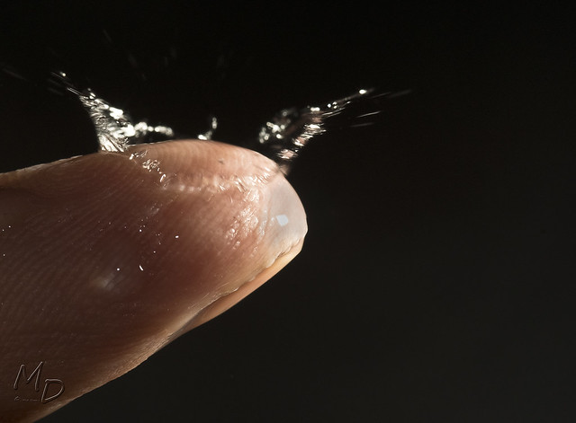
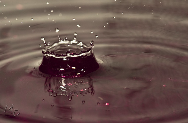
First up is Water Drops/ Water Splash. I have done this before but it was in the kitchen sink, this time however I set it up a bit better, Still never got a collision :( but I'm very happy with the drop on my finger.

Thanks for looking :)


12's Challenge, Feb Theme - Water drops/water splash 3/3 by mattd85, on Flickr


12's Challenge, Feb Theme - Water drops/water splash 2/3 by mattd85, on Flickr


12's Challenge, Feb Theme - Water drops/water splash 1/3 by mattd85, on Flickr
 
rpn said:
Well caught, Matt.

1 is different from the usual water drops shots. 2 & 3 are miles better than my one and only attempt so far about a couple of year ago. Although I have submitted, also different, water drops for this month but I may come back to it if I'm stuck with the other 5 themes

Thanks , I will have a look at your thread tonight along with everybody else :)
 
beckyboy1 said:
I like your water drops. I did some of these about 18 months ago but only got 1 crown all the rest were drops.
I like the drop on the finger well thought out.

cowboy said:
Love the finger tip one.

Thanks guys, the Green crown is in Flickr explore today :)
 
The finger shot is the one for me, I don't know how you lasted 300 shots (y). Well done on the explore too.
 
Hi Matt :)

While 1 and 2 of 3 are technically spot on, I do think they're a little generic. However, 3/3 is stunning! It takes a lot to get an original take on these shots, but you've done it!
 
Last edited:
The finger shot is the one for me, I don't know how you lasted 300 shots (y). Well done on the explore too.

Hi Matt :)

While 1 and ⅔ are technically spot on, I do think they're a little generic. However, 3/3 is stunning! It takes a lot to get an original take on these shots, but you've done it!

Thanks guys, I must admit it was tiring trying to get that finger shot without the aid of a second shooter or trigger, It was all worth it though :)
 
Love the sun beaming through the clouds, that's a nice landscape. A bit more interest in the foreground would have added to the picture. You can't really control that tho :LOL:
 
Hi Matt, while I like the shot (though could do with more foreground interest as Jason says), for me the natural light means a shot using natural light, rather than a shot of natural light. No rules, so it's just me, but if I was awarding points I'd knock one off for not using the theme to it's fullest :)

That said, I'm not awarding points, so can be ignored!!

Your triptych is very good, with nice complementary colours. I agree; get it hung!!!
 
Like it Matt, looks better when viewed larger in Flickr. Good stuff.

Thanks man :)

Hi Matt, while I like the shot (though could do with more foreground interest as Jason says), for me the natural light means a shot using natural light, rather than a shot of natural light. No rules, so it's just me, but if I was awarding points I'd knock one off for not using the theme to it's fullest :)

That said, I'm not awarding points, so can be ignored!!

Your triptych is very good, with nice complementary colours. I agree; get it hung!!!

Hi mark,

I agree with the natural light comment and that's exactly why I chose something a bit different rather than a naturally lit portrait etc :)

Thanks for looking guys.

Matt
 
Back
Top