You are using an out of date browser. It may not display this or other websites correctly.
You should upgrade or use an alternative browser.
You should upgrade or use an alternative browser.
weekly Minx 52 for 2018
- Thread starter Minx
- Start date
- Messages
- 754
- Name
- Daniel
- Edit My Images
- No
Great creativity for the Over shot, took me a while to work out what I was looking at!
- Messages
- 5,432
- Name
- Andrea
- Edit My Images
- Yes
Well done on getting a real street scene in your first for People. I struggled with the theme and resorted to a long-range shot in the end, but your first has a sense of being among the people and the second is a typical scene from any high street and I think the warm tones make it my favourite.
Stark shows two very contrasting textures and that is usually ideal for B&W, but when you added the colour version I think I prefer that as the colours are such a bold contrast too.
Over is very clever and colourful, and something I keep meaning to try. It works very well for the theme, with the droplets suspended over the sweets, but also as a striking image
Minx
Papillon
- Messages
- 2,513
- Edit My Images
- Yes
Age - A little late but here it is(they are)
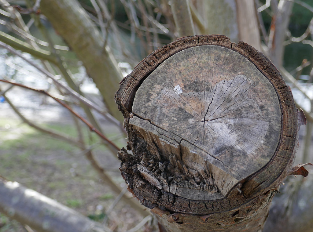
The Age of the Tree
age by Alison White, on Flickr
This was my original plan
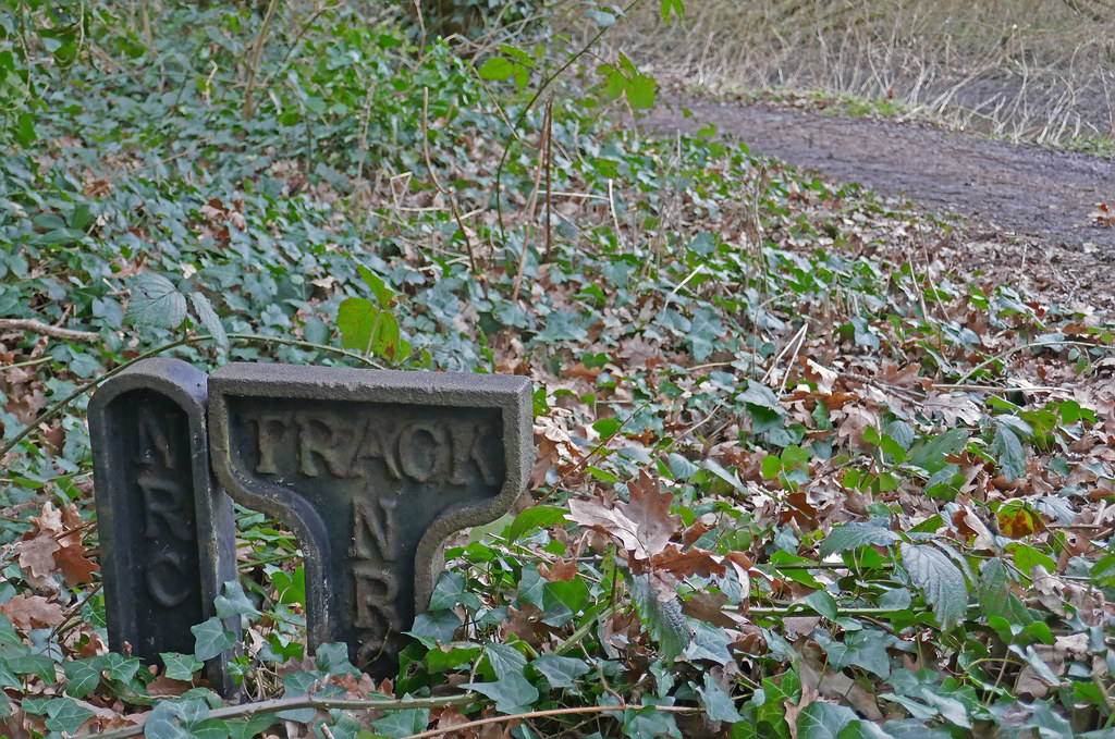
But then I saw this. not sure what it is maybe from the old Gunpowder Mill


age by Alison White, on Flickr
Age by Alison White, on Flickr
The Age of the Tree

age by Alison White, on Flickr
This was my original plan
But then I saw this. not sure what it is maybe from the old Gunpowder Mill


age by Alison White, on Flickr

Age by Alison White, on Flickr
Last edited:
- Messages
- 4,331
- Name
- Martin
- Edit My Images
- Yes
I like the tree shot as it is sharp and holds my interest. Of the two photos of the strange metal thingys I prefer the second as the extra dimension of the surrounding land adds to the picture; the first picture seems to bring my attention to the ivy rather than the metal.
- Messages
- 616
- Name
- Ross
- Edit My Images
- Yes
I like the tree shot too. Nice and crisp and sharp with good dof. Nice one. I agree that the first picture of the metal thing that the bramble infront seems to be more in focus that the metal object.
Last edited:
- Messages
- 4,562
- Name
- Mark Gameson
- Edit My Images
- Yes
The tree trunk for me for Age fits the them nicely
- Messages
- 4,640
- Name
- Pete
- Edit My Images
- Yes
Alison
I feel the tree is the better image for age, focus is good and isolates the important bits.
On the second sign I think I can see what you are trying with them being foreground interest, but the background does not live up to the picture.Both appear quite dull.
I feel the tree is the better image for age, focus is good and isolates the important bits.
On the second sign I think I can see what you are trying with them being foreground interest, but the background does not live up to the picture.Both appear quite dull.
- Messages
- 9,071
- Name
- David
- Edit My Images
- Yes
I like the metal objects could have done with a bit of tidying up before taking the photo
 ... as I think your focus point has hit a leaf or something.
Minx
Papillon
- Messages
- 2,513
- Edit My Images
- Yes
- Messages
- 4,562
- Name
- Mark Gameson
- Edit My Images
- Yes
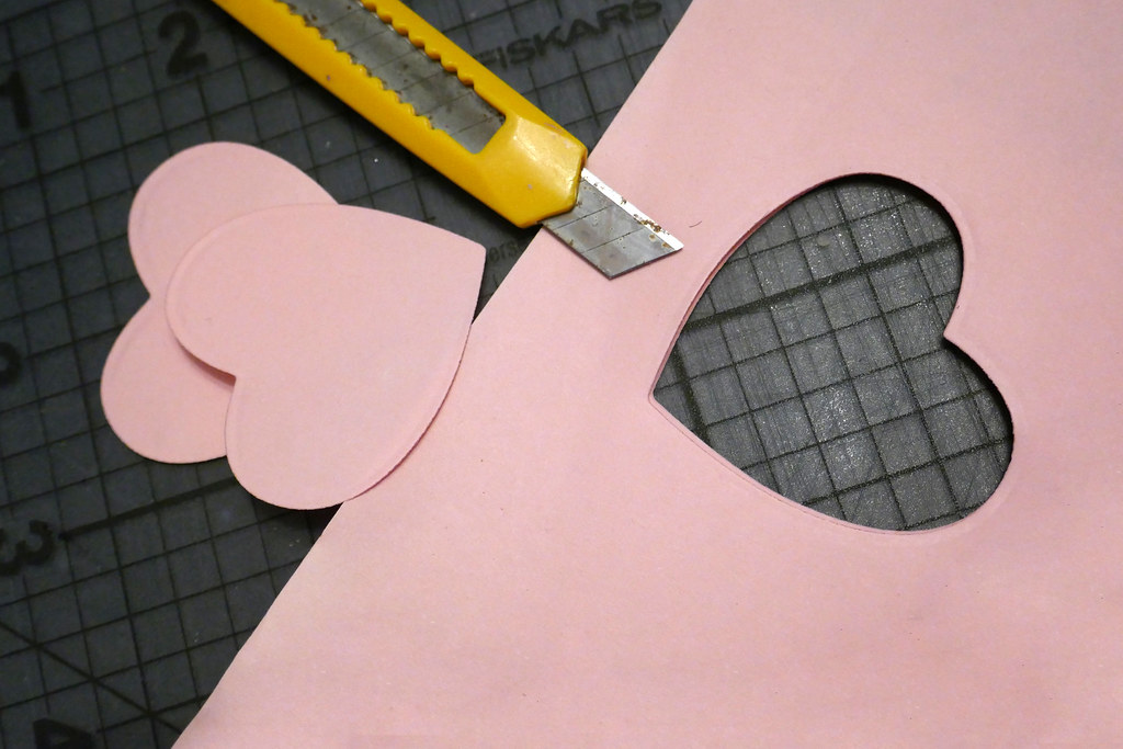
Sharp - Nicely set up with a nice bit of light on the sharp edge of the blade.
- Messages
- 9,095
- Name
- Mandy
- Edit My Images
- Yes
Age(ing) - I much prefer the tree stump, as it is a lovely sharp image and the details really stand out.
Sharp - I agree with Mark its a nicely set up image, if I was to be picky I think that I would prefer new blades in the knife as I find the rust spots a little distracting.
Sharp - I agree with Mark its a nicely set up image, if I was to be picky I think that I would prefer new blades in the knife as I find the rust spots a little distracting.
Baloo
Pleurodelinae and proud
- Messages
- 4,212
- Name
- Roger
- Edit My Images
- Yes
People, like you I was anxious about pointing my camera at strangers, worked out well for you though.
Stark, really like the contrast, good idea for the theme.
Over, my fav shot, bright, colourful and clever.
Age, suits the theme and well executed.
Sharp, bang on theme, topical and again well executed.
Stark, really like the contrast, good idea for the theme.
Over, my fav shot, bright, colourful and clever.
Age, suits the theme and well executed.
Sharp, bang on theme, topical and again well executed.
LC2
Negan
- Messages
- 10,448
- Name
- Tim
- Edit My Images
- Yes
Hi Alison,
Age - I want to love the metal signs, I'm thinking they look like some kind of canal or navigation artefact, but I do have to agree that they are slightly out un-sharp and that the tree trunk, with the way it pops out of the image, is the better shot.
Sharp - Spot on. Nicely controlled DoF, nice lighting, good composition and appropriate the the week too.
- Messages
- 4,640
- Name
- Pete
- Edit My Images
- Yes
Alison
Sharp - nice image, on theme for week as well, maybe a bit better if the whole image was moved down a little bit, showing a bit more knife and the cut out and hearts a bit closer to the bottom of the image. My 2p's worth.
Pete
Sharp - nice image, on theme for week as well, maybe a bit better if the whole image was moved down a little bit, showing a bit more knife and the cut out and hearts a bit closer to the bottom of the image. My 2p's worth.
Pete
Minx
Papillon
- Messages
- 2,513
- Edit My Images
- Yes
Well you would think it was the Thick of winter

Snow at Bushey Park by Alison White, on Flickr
I was hoping for more snow but we have an inch or so so not very thick

Snow at Bushey Park by Alison White, on Flickr
I was hoping for more snow but we have an inch or so so not very thick
Minx
Papillon
- Messages
- 2,513
- Edit My Images
- Yes
Some more pictures from yesterday morning

Snow at Bushey Park by Alison White, on Flickr
 Snow at Bushey Park by Alison White, on Flickr
 Snow at Bushey Park by Alison White, on Flickr

Snow at Bushey Park by Alison White, on Flickr
 Snow at Bushey Park by Alison White, on Flickr
 Snow at Bushey Park by Alison White, on Flickr
LC2
Negan
- Messages
- 10,448
- Name
- Tim
- Edit My Images
- Yes
Very nicely done indeed Alison 
The treescapes are really good, but you know what, the shot of the birds is the stand out for me. The way you've captured the manic action there puts me in mind of one of those aircraft landing composites where there are hundreds of aircraft in the same shot.
The treescapes are really good, but you know what, the shot of the birds is the stand out for me. The way you've captured the manic action there puts me in mind of one of those aircraft landing composites where there are hundreds of aircraft in the same shot.
Minx
Papillon
- Messages
- 2,513
- Edit My Images
- Yes
Very nicely done indeed Alison
The treescapes are really good, but you know what, the shot of the birds is the stand out for me. The way you've captured the manic action there puts me in mind of one of those aircraft landing composites where there are hundreds of aircraft in the same shot.
Thank you I had one with a crow in and had thought he was in the thick of it but liked that picture better. There was a a lady throwing bird feed hence all the flapping.
Minx
Papillon
- Messages
- 2,513
- Edit My Images
- Yes
Mud GUARD
I did head down to the Barrack where the Irish Guard are currently based but was asked not to take photos so here is my shoe horn

Guard by Alison White, on Flickr
I did head down to the Barrack where the Irish Guard are currently based but was asked not to take photos so here is my shoe horn

Guard by Alison White, on Flickr
- Messages
- 2,625
- Name
- Bernd
- Edit My Images
- Yes
Sharp - I like light on the sharp edge of the blade and the seasonal touch  I think if the blade was clean the photo would work even better!
Thick - Some nice wintry photos, my favourites are #2 with the deep sun creating long shadows of the tree branches, and #3 with the abundance of gulls
Guard - And another wintry photo, I like the tight crop with the focus on the icicles in the centre!
Thick - Some nice wintry photos, my favourites are #2 with the deep sun creating long shadows of the tree branches, and #3 with the abundance of gulls
Guard - And another wintry photo, I like the tight crop with the focus on the icicles in the centre!
- Messages
- 9,095
- Name
- Mandy
- Edit My Images
- Yes
Thick - lovely set of images for the theme, I can't fault the first image at all, a beautiful scene to look at.
Guard(ed) - well it works for me for the theme, seems your car was covered like mine was this morning in icicles.
Guard(ed) - well it works for me for the theme, seems your car was covered like mine was this morning in icicles.
- Messages
- 1,075
- Name
- Georgina
- Edit My Images
- Yes
Love the thick pictures Alison. Really lovely white snow and blue sky. I particularly like the last of you extra pictures with the single tree. Mud guard works for the theme and the icicles are a nice touch. Shame about the barracks though
- Messages
- 4,640
- Name
- Pete
- Edit My Images
- Yes
Thick of Winter, nice image, well exposed, clean and bright. Maybe better if the branches left (could be cloned out) and right are cropped out but leaving the other trees in.
Pete
Pete
Minx
Papillon
- Messages
- 2,513
- Edit My Images
- Yes
- Messages
- 4,640
- Name
- Pete
- Edit My Images
- Yes
Abundance.
Lots of nice colourful buttons on show, now all you need to do is sort them out.
I see the image on here suffers from the Talkphotography/Flickr interface and lacks the contrast shown on Flickr.
But you still could'nt find a matching button.
Lots of nice colourful buttons on show, now all you need to do is sort them out.
I see the image on here suffers from the Talkphotography/Flickr interface and lacks the contrast shown on Flickr.
Reminds me of the button box we had when I was a kid, loads of colour and detail, I like it.
But you still could'nt find a matching button.


