You are using an out of date browser. It may not display this or other websites correctly.
You should upgrade or use an alternative browser.
You should upgrade or use an alternative browser.
Severn Bore's 52 for 2016
- Thread starter SevernBore
- Start date
- Messages
- 1,566
- Name
- Lee
- Edit My Images
- Yes
Wow, camouflaged is striking image, good idea
- Messages
- 3,925
- Name
- Carl
- Edit My Images
- Yes
 I've been playing around wit the Displace function too - not easy by any means, just needs a high tonal contrast image. Good on you for experimenting - half the fun is trying something new.
- Messages
- 1,645
- Name
- Steve
- Edit My Images
- Yes
Abandoned - nice selection of location and perfect for the theme. I'm in the group that like the for sale sign, agree that it adds something to the story of the picture.
Camouflage - I've not heard of displacement maps before so thanks for showing me something new.
Camouflage - I've not heard of displacement maps before so thanks for showing me something new.
- Messages
- 601
- Name
- Andrew
- Edit My Images
- Yes
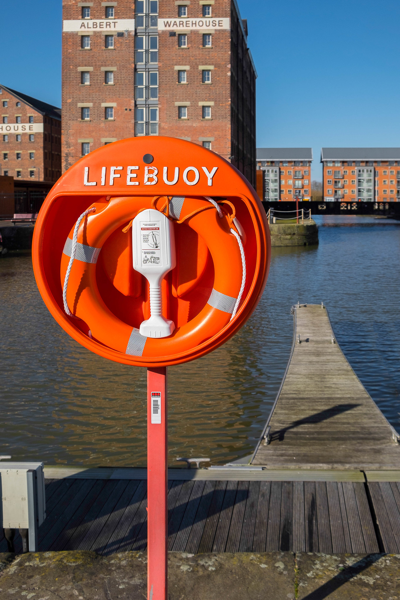
Danger -  Danger.jpg by SevernBore, on Flickr
 Danger.jpg by SevernBore, on Flickr
- Messages
- 3,925
- Name
- Carl
- Edit My Images
- Yes
What a bright vivid colour Andrew .... and a lovely BLUE sky too !!! tack sharp and spot on for the theme.
- Messages
- 9,095
- Name
- Mandy
- Edit My Images
- Yes
- Messages
- 1,566
- Name
- Lee
- Edit My Images
- Yes
Danger, on theme, and nice and bright,
LC2
Negan
- Messages
- 10,459
- Name
- Tim
- Edit My Images
- Yes
Okay, going to go against the vein here. I like the colours in the shot, and the subject is nicely sharp (I will agree a shallower DoF might have helped a bit with separation), but the shot doesn't say Danger to me, it says "Health & Safety".
I appreciate where you're coming from and docks can be dangerous to the unwary, but it doesn't sell the story to me.
I appreciate where you're coming from and docks can be dangerous to the unwary, but it doesn't sell the story to me.
- Messages
- 601
- Name
- Andrew
- Edit My Images
- Yes
Interesting set of comments. Rather like that of Tim/LC2. If one wishes to be PC one could strongly argue that H&S would have required the lifebuoy to be there because of a clear and present danger thereby fully backing my claim for "Danger". However, I am terribly cynical about PC and especially the English attitude toward H&S which I consider to be entirely over the top! So,Tim, you have a point.

- Messages
- 13,760
- Edit My Images
- Yes
Hi Andrew 
A quick catch up from me...
Happy - A lovely bright image, not so sure about the WB, but minimal of an issue, loads of stuff going on, well set up and a good unusual choice for the theme
Abandoned - Buildings screaming out to be apartments, this sure looks like it was a hive of activity in times past, a good choice of buildings for the theme
Camouflaged - Sorry, really not liking this at all, but good that you tried something
- Messages
- 4,562
- Name
- Mark Gameson
- Edit My Images
- Yes
Morning Andrew
Camouflaged - I'm with DK on this sorry a good idea but just didn't work as I find the colour make the bird stand out more
Danger - Really like this nice bright image, with the main subject of the image standing out helping to spell our Danger.
Camouflaged - I'm with DK on this sorry a good idea but just didn't work as I find the colour make the bird stand out more
Danger - Really like this nice bright image, with the main subject of the image standing out helping to spell our Danger.
- Messages
- 601
- Name
- Andrew
- Edit My Images
- Yes
- Messages
- 601
- Name
- Andrew
- Edit My Images
- Yes
Hi Dark Knight and Mark,
Sorry you did not like the "camouflaged" Buzzard, but you can't win them all. It was actually intended to be a bit of a joke - and also for me to try displacement maps ( with minimal success. Keep the comments coming as they are always appreciated.

Sorry you did not like the "camouflaged" Buzzard, but you can't win them all. It was actually intended to be a bit of a joke - and also for me to try displacement maps ( with minimal success. Keep the comments coming as they are always appreciated.
- Messages
- 3,925
- Name
- Carl
- Edit My Images
- Yes
That is brilliant Andrew - however did you manage to get that in sharp focus. Love the take on this highly current topic. 

- Messages
- 1,344
- Name
- Philip
- Edit My Images
- No
I like that "falling pound" Andrew, a well executed image.
Phil
Phil
Brian_of_Bozeat
Jeff
- Messages
- 3,235
- Name
- Brian (not Jeff)
- Edit My Images
- No
A good idea and well shot & processed Andrew. The SC adds to the slightly unrealistic feel, good story telling.
- Messages
- 13,760
- Edit My Images
- Yes
Hi Andrew 
Well, that is a fabulous image, nothing not to like, nice crp, good colours, cracking effect or capture of movement, love it, no crit from me

Well, that is a fabulous image, nothing not to like, nice crp, good colours, cracking effect or capture of movement, love it, no crit from me

Will do... as we will never all like everyone's pics, and best to be honest heyHi Dark Knight and Mark,
Sorry you did not like the "camouflaged" Buzzard, but you can't win them all. It was actually intended to be a bit of a joke - and also for me to try displacement maps ( with minimal success. Keep the comments coming as they are always appreciated.

- Messages
- 9,095
- Name
- Mandy
- Edit My Images
- Yes
Topical - this is fantastic as DK says excellent capture of movement, nice background, no crit from me either.
- Messages
- 601
- Name
- Andrew
- Edit My Images
- Yes
Thanks for all of the comments on "Topical". As most of you realised, Photoshop proved a godsend. I am of an age where my reactions are such that the coin would have been dropped and back in my pocket by the time I had pressed the shutter button! 
- Messages
- 601
- Name
- Andrew
- Edit My Images
- Yes
- Messages
- 3,925
- Name
- Carl
- Edit My Images
- Yes
A very vibrant and sharp image Andrew - spot on for the theme. Excellent DoF which shows the subject in excellent detail. 


 The Falling Pound.jpg
 The Living World.jpg