You are using an out of date browser. It may not display this or other websites correctly.
You should upgrade or use an alternative browser.
You should upgrade or use an alternative browser.
weekly Sharp's 52 of 2015 - Wk 16 'Experiment' added
- Thread starter Sharp
- Start date
- Messages
- 4,344
- Name
- Martin
- Edit My Images
- Yes
Yes, that is bold; and pleasing to the eye. Good.
- Messages
- 104
- Name
- Paul
- Edit My Images
- Yes
Ok, here's my take on relax. Not sure how fitting to the theme this is, but I wanted to try something a little different from everybody else.
Resting between sets.
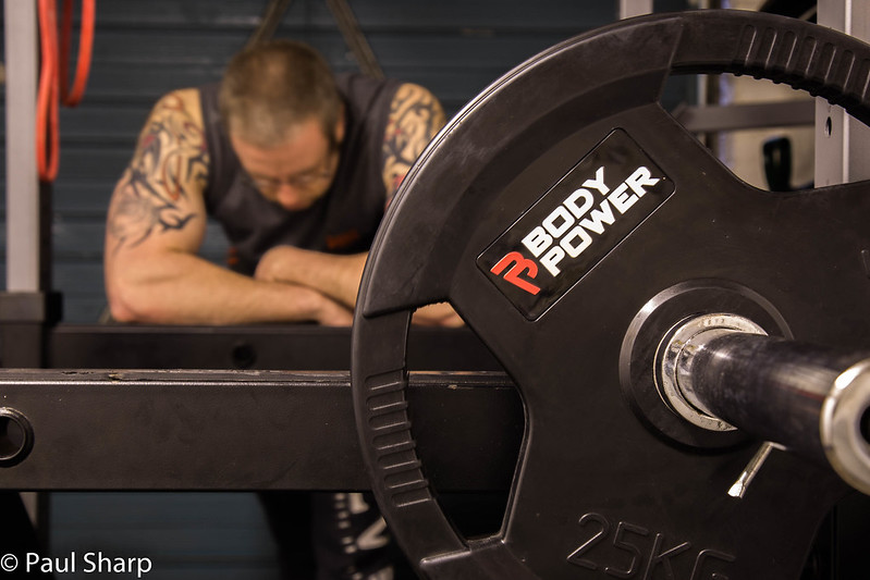 Relax by paulsharp738, on Flickr
Resting between sets.
 Relax by paulsharp738, on Flickr
Brian_of_Bozeat
Jeff
- Messages
- 3,235
- Name
- Brian (not Jeff)
- Edit My Images
- No
This a very well composed image, and all the important bits (exposure, lighting etc) are "right" as far as I'm concerned. I also like the colours with the orange bit of the weight echoed by the (extension lead?) in the BG and it all looks good against the greyish garage door.
Now, Constructive criticism is very hard to deliver, and take! So try not to be offended, I mean to help.
When I ask myself... What is the subject of this image? the story? - I think its like an advertising shot for a set of weights.
I think the focus would have been much better placed on the man, making his resting between sets in his garage the story, with the foreground weight helping to tell that story.
I have looked back through your thread and I think this is the best shot you have shared so far this '52. Keep on working at it.
- Messages
- 104
- Name
- Paul
- Edit My Images
- Yes
This a very well composed image, and all the important bits (exposure, lighting etc) are "right" as far as I'm concerned. I also like the colours with the orange bit of the weight echoed by the (extension lead?) in the BG and it all looks good against the greyish garage door.
Now, Constructive criticism is very hard to deliver, and take! So try not to be offended, I mean to help.
When I ask myself... What is the subject of this image? the story? - I think its like an advertising shot for a set of weights.
I think the focus would have been much better placed on the man, making his resting between sets in his garage the story, with the foreground weight helping to tell that story.
I have looked back through your thread and I think this is the best shot you have shared so far this '52. Keep on working at it.
Thanks for the comment, I completely agree with the criticism, I hadn't really thought about it like that. So do you think I should blur the weight slightly or will the foreground then become a distraction? I did do a couple of shots with a larger DoF but I did't really like them.
- Messages
- 908
- Name
- nathan
- Edit My Images
- Yes
You have a great eye, lovely composition on the last few shots, keeping it brief i particularly like the movement in the water and the use of DOF in both your recent bold and relax shots, not to mention they are all bang on theme and well composed. nice interpretations differ to the norm, overall very pleasant to view. 
- Messages
- 115,214
- Name
- The real Chris
- Edit My Images
- No
Actually, I'm going to be different on this, I quite like the use of DoF that way around,
it makes the "rester" look more rested, also dream like, and the reason behind him resting brought to the fore,
making the statement if yo see what I mean.
Very nice, and certainly one of the more imaginative ones this week
it makes the "rester" look more rested, also dream like, and the reason behind him resting brought to the fore,
making the statement if yo see what I mean.
Very nice, and certainly one of the more imaginative ones this week
- Messages
- 6,502
- Name
- Peter
- Edit My Images
- Yes
Watery - Shame about the lighting conditions but there’s nothing you could have done about that on the day. Out of the two I prefer the second. The overall image is less cluttered and you’ve captured the movement of watery nicely.
Bold - Definitely bold with the choice of selective colour for this one
Relax - Nicely light and good use of DoF to throw the subject out enough to allow the eye to settle on the weights.
Bold - Definitely bold with the choice of selective colour for this one
Relax - Nicely light and good use of DoF to throw the subject out enough to allow the eye to settle on the weights.
- Messages
- 4,344
- Name
- Martin
- Edit My Images
- Yes
Is he relaxing or hoping that after his last workout he won't die  . Yes, on theme, nice use of DoF.
- Messages
- 9,095
- Name
- Mandy
- Edit My Images
- Yes
Bold - nice use of sc works really well for this image, well composed great work.
Relax - good composition, nice crisp and sharp where it needs to be.
Relax - good composition, nice crisp and sharp where it needs to be.
- Messages
- 8,398
- Name
- Lynne
- Edit My Images
- Yes
Hi Paul
I could've sworn I'd commented on your Watery shot Must be my age ! 2nd image for me .....the milkiness is just right for me ,the mist in the bg add's a lovely serene feel to the image
Bold.....like that a lot, good use of DOF to give context .....
I could've sworn I'd commented on your Watery shot
 Must be my age ! 2nd image for me .....the milkiness is just right for me ,the mist in the bg add's a lovely serene feel to the image
 Bold.....like that a lot, good use of DOF to give context .....

- Messages
- 104
- Name
- Paul
- Edit My Images
- Yes
Hi Paul
I could've sworn I'd commented on your Watery shotMust be my age ! 2nd image for me .....the milkiness is just right for me ,the mist in the bg add's a lovely serene feel to the image
Bold.....like that a lot, good use of DOF to give context .....
Thanks Lynne, you might be getting my watery shots mixed up with my friend 'ThyJones' we often visit the same places and on this occasion had very similar shots.
- Messages
- 8,398
- Name
- Lynne
- Edit My Images
- Yes
Ahhh...thought I was really losing the plot...but yup ,that must be what i've done 
- Messages
- 104
- Name
- Paul
- Edit My Images
- Yes
WK9-Vertical
I pass this tower most days on my commute and thought it fitted the theme well. Not sure about the bit of tree on the top left, but I dont like to edit out larger sections really.
Second photo was actually taken for bold, although I think it also fits this theme.
 WK9-Vertical by paulsharp738, on Flickr
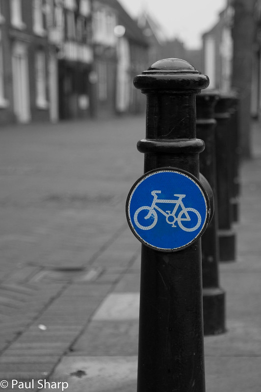 Cycle Path by paulsharp738, on Flickr
I pass this tower most days on my commute and thought it fitted the theme well. Not sure about the bit of tree on the top left, but I dont like to edit out larger sections really.
Second photo was actually taken for bold, although I think it also fits this theme.
 WK9-Vertical by paulsharp738, on Flickr
 Cycle Path by paulsharp738, on Flickr
Last edited:
- Messages
- 9,095
- Name
- Mandy
- Edit My Images
- Yes
Vertical - two good images, I think I prefer the composition of the second image.
- Messages
- 3,724
- Name
- Chris
- Edit My Images
- Yes
Two nice shots, No 2 for me. The bike sign works well 
- Messages
- 284
- Name
- Ferg
- Edit My Images
- Yes
Hey Paul - bit of a catch up from me
Bold: Really great shot! The SC on th postbox just works brilliantly
Relax: Nice interpretation - like the soft focus on the guy and sharp on the weight......feels a bit advert-like - good job!
Vertical: Both fit the theme - think you're right about the tree on LHS of the first one, it would heal out OK with some patience. Having said that, the second shot is stronger for me.
- Messages
- 2,031
- Name
- Lee
- Edit My Images
- No
Just catching up on a few shots...
Watery: I prefer the second shot. A nicer composition and the slow shutter effect on the water is just the right amount
Bold: Wow - that is bold I'm not a huge fan of selective colour but this one really works. Great use of DoF too.
Vertical: The second shot is the stronger for me. A better composition but the selective colour doesn't work as well on this one for me - sorry.
Watery: I prefer the second shot. A nicer composition and the slow shutter effect on the water is just the right amount
Bold: Wow - that is bold
Vertical: The second shot is the stronger for me. A better composition but the selective colour doesn't work as well on this one for me - sorry.
- Messages
- 8,398
- Name
- Lynne
- Edit My Images
- Yes
Hi Paul
#2 image for vertical ( or BOld, whichever you're going for), the sc works really well here , great DOF ...like it
#2 image for vertical ( or BOld, whichever you're going for), the sc works really well here , great DOF ...like it
- Messages
- 104
- Name
- Paul
- Edit My Images
- Yes
WK-10 Mouth,
I'm playing catchup this week, really hate being behind but it is the result of a few busy weeks and several themes I have found difficult.
Not quite what I set out to capture but I feel its the best of the bunch, a little unsure about the DoF.... Crit please
 WK10-Mouth by paulsharp738, on Flickr
I'm playing catchup this week, really hate being behind but it is the result of a few busy weeks and several themes I have found difficult.
Not quite what I set out to capture but I feel its the best of the bunch, a little unsure about the DoF.... Crit please
 WK10-Mouth by paulsharp738, on Flickr
Last edited:


 totally agree with Mandy it was exactly what i was going to put.