weekly Stephen's TP52 for 2015 - Week 12 - Close Up

Messages
26
Name
Stephen
Edit My Images
Yes
Hi, Somehow I managed to delete my first comment.. My name is Stephen and this is my first one.

Week 1 - Bliss
Week 2 - Fragile
Week 3 - Scenic
Week 4 - Companions
Week 5 - Elegant
Week 6 - Watery
Week 7 - Bold
Week 8 - Relax

Week 9 - Vertical
Week 10 - Mouth
Week 11 - Crowd
Week 12 - Close Up
Week 13 - Machine


So this is my first entry ever to the TP52. I wasn't sure which photo I liked the best. The first one is the standard JPEG and the second has been edited in Nikon ViewNX2. I am a complete newbie to photgraphy and editing so please be honest and tell me which one you like best(If any), why and what I can do to improve.

I thought the original was too dark and no colours really stood out to me. I have made the edited version my choice for week one bliss :)


Exif: f/4.5 1/2sec ISO-100 90mm

Original

DSC_0057 by Stephen Gibbon, on Flickr
Edited

DSC_0057 by Stephen Gibbon, on Flickr
 
Last edited:
Hi, sorry to have to say this but somewhere between the two would be better, I think you have pushed it a little to much
good start though and the composition is good
 
Thanks for your honesty. To be honest with you I have to agree. I will have another go at it and like you say try to find a nice balance somewhere in the middle.
 
Spot on image for Bliss. Good composition but I have to agree the happy medium is somewhere in between.
I'm not familiar with View NX so I don't know how much control you have. Looking at your jpeg image, I can see sparkly detail on the white 'snowflakes' on the left edge of the big bauble. This detail isn't visible on the edited image - it just looks all white. Try backing off little by little until the detail starts to reappear and see how that looks.
 
Bliss, not my idea of bliss :)

The edit does seem to have gone a little far and your WB may be a little off.

You're getting there with composition and DOF.

Cheers.
 
For me I'd like to see most of the first image but with the tree detail from edited detail.
 
Hi Stephen & welcome aboard :wave:


Composition wise I think you have it nailed & of the 2 posted I'd go for the 2nd as it has a bit more pop with nice bright colors & good DOF :)

I have viewnx 2 but haven't ever managed to suss how it works so well done for figuring it out (y)

Stick around & keep posting , the 52's is a great place to learn both from comments received & by looking & commenting on others shots....you've certainly made a good start (y)
 
Hi Stephen

Well for your first week, I think you have a cracking shot. You'll probably hear this again and again, but no amount of post processing can turn a poor image into a good one. It can certainly turn a good one into a great image, though.

I'll agree with the others that your edit is a touch "shouty" for want of a better word, but in certain circumstances, that can work too. If the theme had been "vibrant" or something, I think that processing would be absolutely apt.

I don't know what program you use to edit, but I actually quite like the punchy colours on the baubles, but I agree the background is then a bit more distracting than you'd probably like. If you used a graduated filter (or a brush) to apply whatever enhancements you made, so that it only affects the baubles, I think it'd be perfect.

Really, really good start to the 52 and, frankly, an amazing start to your photography... keep it up! :clap:
 
Hi Stephen, and welcome - this is a first for me too, but everyone's been very welcoming and the feedback really helps you learn.

Of the two images I prefer the first one, the colours look more natural, just maybe a little dark (which is probably pretty much what others have said) nicely composed though :)
 
Hi Stephen ... Welcome to the challenge ... I'm sure you will enjoy it, this is my second year and I learnt so much last year as very much a novice, so do stick at it. Everyone is very helpful.

Of the two I prefer the second ...I like the bright vibrant colours.
 
Hi, I would agree the second picture is the best, great composition and DOF.
 
Hi Stephen & welcome aboard :wave:


Composition wise I think you have it nailed & of the 2 posted I'd go for the 2nd as it has a bit more pop with nice bright colors & good DOF :)

I have viewnx 2 but haven't ever managed to suss how it works so well done for figuring it out (y)

Stick around & keep posting , the 52's is a great place to learn both from comments received & by looking & commenting on others shots....you've certainly made a good start (y)

I just searched it in YouTube. Some videos on there that will explain the basics to you.
 
For week 1 and first time doing it well done and welcome!!

Its a great project for learning and gaining others perspectives.

Somewhere between the 2 and I would be tempted to try messing with B&W, just out of interest!!
 
Welcome aboard Stephen.

Can't add any more to what's already been said critique-wise, but just wanted to pop in to welcome you to the madhouse :D

A really good start, especially considering how new you are to this.
Looking forward to seeing what else you come up with, this really is a great way to learn your way around your camera.
 
Hey, so here is my week 2 submission of fragile. Sorry its a late submission but it was taken a week ago.

To be honest last week I had very little time with working 12 hour shifts to come up with anything good.

The fragile idea is clearly visible with the fragile tape with the knife cutting it but within the bag is also a Lee Big Stopper! I presume they are also fragile but I hope I do not put that to the test.

Wl 2 - Fragile by Stephen Gibbon, on Flickr
 
Last edited:
Interesting image, in rather an "anti-fragile" kind of way :)
 
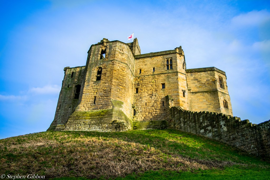
Technically the photo has been taken very well and processed in the same manor, but I cant help but wonder what scenic views could be seen from the castle? They are usually built on high ground to give a natural vantage point. Maybe a wider shot would have helped?
 
Hi Stephen,

scenic - nicely taken shot. I think the low pov works well with Warkworth because of where the castle is in the town :)
 
My submission for week 4 - companions

I would like to apologise how late I am and have some serious catching up to do. I have spent every spare second looking to buy my first house :) I also go skiing on Saturday for a week.

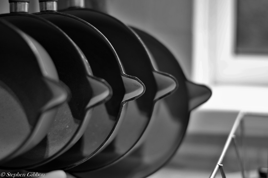
Anyhow this is my submission for companions. I haven't had time to get out of the house properly but trust me the pans of my mothers have been side by side for many moons have never bickered once!

[url=https://flic.kr/p/rkYeR3]Wk 4 - Companions by Stephen Gibbon, on Flickr[/URL]
 
first time I've been in your thread and I love your pictures :clap: no crit, these are lovely :D
 
HI Stephen

Companions...like that , different take on the theme , normally I'd like to see the foremost object in focus but this kinda works as it is & mono works well (y) The only thing I'm undecided on is the edge of the draining rack :thinking:
 
Hi - Companions - I really like the shot, agree with Lynne about the draining rack though :)
 
Hi Stephen .. nice idea, eye-catching on the mail thread. (y)

Like Lynne @blondie606 ... normally I'd like to see the foremost object in focus ...

Plus the furthermost pan looks like it's a bit out of place. o_O
 
Sorry I am so far behind. I went on holiday and I am in the process of buying my first house so have zero spare time. I did manage to get away to the lakes for mothers day and managed to get a few snaps. I am hoping to get out again on Thursday to complete the rest of the back log. I have also got around to purchasing a years subscription of Lightroom and Photoshop CC to help me along. Once again I am sorry for being late.

Week 5 - Elegant

Wk 5 - Elegant by Stephen Gibbon, on Flickr

Week 6 - Watery

DSC_0316-1 by Stephen Gibbon, on Flickr

Week 7 - Bold

Wk 7 -Bold by Stephen Gibbon, on Flickr

Week 8 - Relax

Wk 8 - Relax by Stephen Gibbon, on Flickr

Week 12 - Close Up

Wk 12 - Close Up by Stephen Gibbon, on Flickr
 
Hi Stephen


well done on your catch up , sounds like you're having a mega manic time :hug:

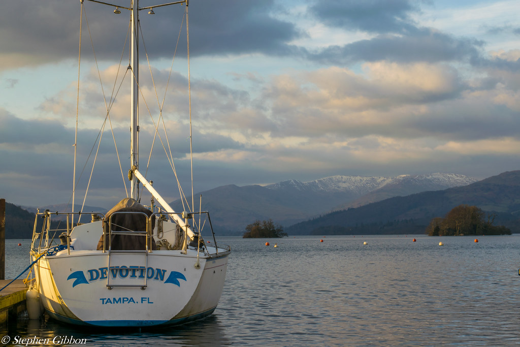
Relax is the one that catch's my eye...looks some lovely light coming from the lhs on to the boat , there's a lovely view , some good detail in the clouds & the snow capped mountains finish it off nicely (y) Minor niggles - the top of the mast being cropped & those bouys.....I'd be tempted to clone them out to make the image just that little bit cleaner :)
 
Hi Stephen,

that's a fair old catch up, well done :)

I do like your relax photo, but I agree with Lynne about the mast and the buoys.

Close up - that is close! I really like the golden light on the swan's wings. It's just a shame that the head & neck are in the shade
 
Back
Top