Vdubster's Photo52 for 2011 Week 42 - Weave added!!! (Index in 1st post)

Hiya James,

Well done on the 'time' shot .... something I still have to try at some time :D

Cheers

Dawn :)
 
Hiya James,

Have to agree with Michael, I prefer the 1st shot too.

Hope you enjoyed the sugar rush :D

Cheers

Dawn :)
 
james.. i prefer the first shot too.... very appealing.

and thanks for the video... i am in tears over Kai Wong's humour..??? ''windows boarded up like some weird dracula p*** squatter''.... ''like those vets that try to stick their hands up a cows backside''....''and me behind a tramps house''.....love it..
 
Hiya James,

Have to agree with Michael, I prefer the 1st shot too.

Hope you enjoyed the sugar rush :D

Cheers

Dawn :)

Thanks Dawn, the second shot (sweets in the jar) was my first line of thought. Then when i was finishing up i just decided to photograph the massive bowl of sweets i had to work with and it just worked better.

And yes i enjoyed my sugar rush, lol.

james.. i prefer the first shot too.... very appealing.

and thanks for the video... i am in tears over Kai Wong's humour..??? ''windows boarded up like some weird dracula p*** squatter''.... ''like those vets that try to stick their hands up a cows backside''....''and me behind a tramps house''.....love it..

LOL Thank Kev, If you haven't already check out the other Digital Rev videos on YouTube. Kai is brilliant, lol.

Thanks

James
 
Hi James

of your 2 shots for MIX I think I prefer the 1st (y)...but something is bugging me about it...possibly a little bit too bright to the righthandside ?

The 2nd shot...I love that you have very little shadow around the container but ot quite as appealing as the 1st shot ...sorry
 
OK,

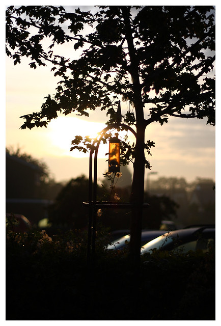
First off, still not in work so not a fun time and i couldn't find anything that inspired me with "Fun" so for the first time in the project I've used a Joker. They were taken on an early Sunday morning while taking the dogs for a walk, enjoy.


Week 38 - Fun (Joker2) by j.fordham, on Flickr

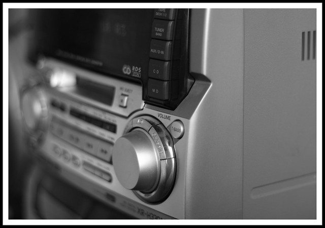
OK and onto Volume, was an easy choice this one as music is a big part of my life, I've always got the volume up and listening to music.


Week 39 - Volume by j.fordham, on Flickr

Thanks

James
 
Last edited:
I like the cobweb but feel it's slightly too central?

Nice DOF on the volume shot from a fellow media fan (y) . The grill things slightly distract me though.

Hi James


we all get stumped sometimes...maybe FUN will be for a reshoot ?

Liking the Volume shot though...B&W looks good,DOF & focus on the volume button are spot on , lose the grill & it'll be spot on (y)...nice bit of kit as well


What grill :)


Week 39 - Volume2 by j.fordham, on Flickr
 
Great shot for volume.

I'm inclined to agree with Neil, and I think the dead space on the right adds nothing. A bold tighter crop might give the shot more impact. Try loosing most of the right grey side (crop from the end of the groove) and crop through the AUX/In button and crop the left up to the tuning dial. This should give some nice lead in lines from corners, and balance the shot. Then stick your border back on, which really lifts the shot.

Kind rgds

Adie
 

:)

Nice DOF on the volume, but the right hand side is letting it down, it's just a grey space.
I'd rather some of it was cropped out, but then I don't think the rest of the image would work well :thinking:

Thanks

great use of dof, is better without the grill!

Thanks

Great shot for volume.

I'm inclined to agree with Neil, and I think the dead space on the right adds nothing. A bold tighter crop might give the shot more impact. Try loosing most of the right grey side (crop from the end of the groove) and crop through the AUX/In button and crop the left up to the tuning dial. This should give some nice lead in lines from corners, and balance the shot. Then stick your border back on, which really lifts the shot.

Kind rgds

Adie

Thanks for the comment, what about this?


Week 39 - Volume3 by j.fordham, on Flickr
 
I think it's better, but then again, I would say that LOL

;-)

The real question is, "what do you think"?
 
Hiya James,

The crop on the volume shot definitely works better (y)

Cheers

Dawn :)
 
I love that tight crop on your rather spiffing volume shot (y)

Thanks

Volume edit is an improvement. Sometimes a literal interpretation works very well.

Thanks


:)

Edit works better

edit is 100% better (y) really stands out..

Thanks

Hiya James,

The crop on the volume shot definitely works better (y)

Cheers

Dawn :)

Thanks.
 
Hi all,

It's been a bust few weeks so couldn't really find the time to take a shot just for this theme, but i think this works well as it was a very Rapid car :)

OK I've pulled a shot out of a set i took earlier in the year, this was taken at Snetterton race circuit in Norfolk.


Week 41 - Rapid by j.fordham, on Flickr


James
 
Excellent capture. Bang on theme. Might be worth looking at a slightly tighter crop, bit off the bottom and of the right, putting the rear wheel on the bottom third line. I think it would add more impact.

But still a great shot!!

Adie
 
That's a great capture, nice panning with 1/60th!!

I like that. Great bit of panning.

Hi James,

I think I'd prefer some of the bottom cropped out and the red off the kerb to be somewhere else other than in line with the headlights.
Other than that it's a nice shot and hits the theme.

Excellent capture. Bang on theme. Might be worth looking at a slightly tighter crop, bit off the bottom and of the right, putting the rear wheel on the bottom third line. I think it would add more impact.

But still a great shot!!

Adie

Thanks for the comments everyone, now getting an edit and a new picture uploaded.

Adie, I can never get my head around the rule of 3rd's when taking a picture any tips?

James
 
James,
The rule is more of a guide line.
Draw an imaginary naughts and crosses grid over the image. Now key points of interest sit on the intersections, horizons sit on the horizontals and lead in lines move into the intersections.

If you look at good photos in magazines, the rule is often used. You will not often see a subject or point of interest bang in the middle.

As always, there are striking images that break this rule, but I think it is wise to understand and use the rule before you break it LOL

I will try and upload examples with grids.

Rgds

Adie
 
Hiya James,

I agree with Adie's comments and advice.

The shots are nice and clear ... but they are too central .... you need to add some space to give the sense of motion to them.

Cheers

Dawn :)
 
Back
Top