weekly viv1969 (Ruth) 52 Challenge - SPIRAL Added

Hiya Ruth, wow - some amazing shots here :)

Elegant - lovely backlighting here and a nice semi-abstract image. Very elegant!

Bliss - a nice grab shot but not my favourite of the set.

Fragile - that really is a beauty. Fab shadow, nice light and overall great composition... makes for a superb image.

Scenic - beautiful as well. I don't mind the sun in shot here as for me, it balances the lone tree. Wonderful light you've captured - a lovely shot.

Companions - funny yet slightly disturbing at the same time! Well captured detail, simply lit (presume plain window light) but it works. Would also prefer to see at least a bit of the bottom shelf in frame, but minor point.

Watery - a great fun shot. Those are some funky curtains you have ;) Could perhaps benefit from a touch more DOF but I'd understand if you were light-limited on that. Nice take.

Really really good start - so looking forward to more of your images in weeks to come!

Paul....thankyou so much for your comments On each shot...I really appreciate It.

Re companions, shelves of skulls are floor to ceiling. It's tough To choose A shot.

And watery....thankfully that's Wrapping paper, not curtains!


Watery - what a fabulous shot. Really bright colours and pin sharp. Thanks for your description of how you did it. I too thought it was just droplets on a piece of glass.

Lee, thanks for looking in.
With drops of water on glass I wouldn't have got so wet :LOL:
 
Hi Ruth, Wonderful set !!
Your elegant, scenic and watery images are my favourite, that's a great effect with the water, (y)
I've been trying to think who Mr Bloblet reminds me of, first thought was one of the old guys from the Muppets show,
or one of the little ghosts from ghostbusters, lol.
Looking forward to more great images like these. :)

That's it!!! I think it's the little green slimy guy from ghostbusters! Thank you :LOL:

Thanks also for taking the time to look and comment. :)
 
LOL as Allan said, very clever, simple but brilliant (y)
 
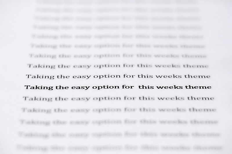
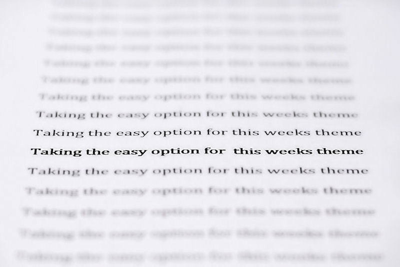
Good DOF and no reasons why not to have a simple shot. it works and is on theme. Just wondering whether a larger font on the bold line to emphasise it more :thinking:
 
Good DOF and no reasons why not to have a simple shot. it works and is on theme. Just wondering whether a larger font on the bold line to emphasise it more :thinking:

Many thanks for taking a look.
I tried the larger font, and several different fonts, but I found it didn't work unless the lines were the same length.
 
:LOL: Well done Ruth!
I'm not quite so sure how easy an option that was though - focus and DoF are perfect.

I was a bit bothered at first by there being two lines on the focal plane and was going to suggest that it may have worked better with just one line in focus . . . on consideration though, I think you would have lost the key point about that one line being in 'bold' type. So :clap: just as it is.
Simple but clever and very well executed.

Thanks Sarah.
I took quite a few shots before getting one I was happy with.
I do have one with just the one line properly in focus, but as you said the bold type became less apparent so I plumped for this one.
I tried a few on the diagonal too, but I couldn't nail the focus at all.
I really appreciate your comments :)

Well done Ruth. Good idea. I love the dof. There's not much more I can say lol.

Thank you Mike....thanks for looking :)
 
Neat idea Ruth. (y) I don't know what to do for BOLD but I thought there was no mileage in BOLD fonts. You've proved me wrong. :runaway:
 
Hi Ruth.....love this one ....what a great idea....wish I'd thought of that one ....well done :)

Thanks Susie.
To be honest it's the only thing that sprang to mind!


Neat idea Ruth. (y) I don't know what to do for BOLD but I thought there was no mileage in BOLD fonts. You've proved me wrong. :runaway:

David. I spent ages looking through books trying to find an appropriate bit of text that was in bold.
It was someone else who suggested just printing my own.
Couldn't see the wood for the trees, as it were :)
Thanks for looking.
 
Last edited:
Sometimes the obvious interpretation works, IYSWIM.

Nice strong font and well composed.....well maybe a little off. I see these things after taking part in TP52: the gap on the LHS is slightly wider than the RHS. Uber critical but worth a mention.

Cheers.
 
Nice, simple,effective. Very cleverly done, not sure how it would have come having the front to back DOF more evenly spread over the 2 lines either side. My first impression was oo a little back focus ;). JK love it as is really :p
 
Sometimes the obvious interpretation works, IYSWIM.

Nice strong font and well composed.....well maybe a little off. I see these things after taking part in TP52: the gap on the LHS is slightly wider than the RHS. Uber critical but worth a mention.

Cheers.

Shhhhh....I was hoping no one would notice!
Thanks for your comment :)
 
Nice, simple,effective. Very cleverly done, not sure how it would have come having the front to back DOF more evenly spread over the 2 lines either side. My first impression was oo a little back focus ;). JK love it as is really :p
Thanks Chris...ya cheeky beggar :LOL:
 
Perhaps it is the easy option but it's effective and that's what matters.
 
Thanks Jill, you're right, it does.
I notice it every time now :LOL:
 
Watery - excellent shot, can I ask how you achieved it ?

Bold - certainly hit the theme on the head :)
 
Well, to begin...be prepared to get wet I taped a long length of bright wrapping paper to the conservatory door.Then I got someone to hold the hose steady about 5 ft infront of the paper.Took the camera (50mm 1.8) a few inches in front of the water stream and keep trying

Watery - excellent shot, can I ask how you achieved it ?

Bold - certainly hit the theme on the head :)
 
Perfect dof and cracking idea.
 
Thank you very much Simon :)

This week I'm struggling! :(
 
Elegant - The lighting on the petals is superb only matched by the sharpness. The detail on the surfaces really shows up as a result. A lovely image.

Bliss - The pose gives it that blissful feel. The exposure looks good given what seems like some harsh lighting on the day.

Fragile - Very suitable for the theme. I have to admit to not being keen on selective colour but the detail in the veins (if that’s what you call them) of the lantern is lovely as is the use of some directional lighting to length the shadows

Scenic - Super landscape image. Very atmospheric and well exposed given you are shooting straight into the Sun. I like the lead in of the bank and fence towards the tree which has been strategically placed on the third. Very nice.

Companions - Certainly a very different image to the ones above or indeed those I’ve seen for this theme. Lighting is good as is the framing using the shelves. Would it work as a gritty B&W I wonder?

Watery - Great choice of oof background. The water has been nicely used to refract the colours. Was this water or glycerine?

Bold - A nice exercise in DoF control. The question is which line up/down the frame should be the centre of focus. Rule of thirds? Top? Bottom? Centre? It’s probably down to personal choice and I feel this one works as you’ve presented it.

Thanks for taking the time to comment on all of them Peter. I really appreciate that.
The Watery shot was indeed water....out of the hosepipe :)
 
Back
Top