You are using an out of date browser. It may not display this or other websites correctly.
You should upgrade or use an alternative browser.
You should upgrade or use an alternative browser.
Anita's 52 in 2017
- Thread starter anitacv
- Start date
- Messages
- 13,760
- Edit My Images
- Yes
I'm sure you can Anita - Good luck !!! 
- Messages
- 9,095
- Name
- Mandy
- Edit My Images
- Yes
Good luck with your 2017 challenge.
- Messages
- 765
- Name
- Anita
- Edit My Images
- Yes
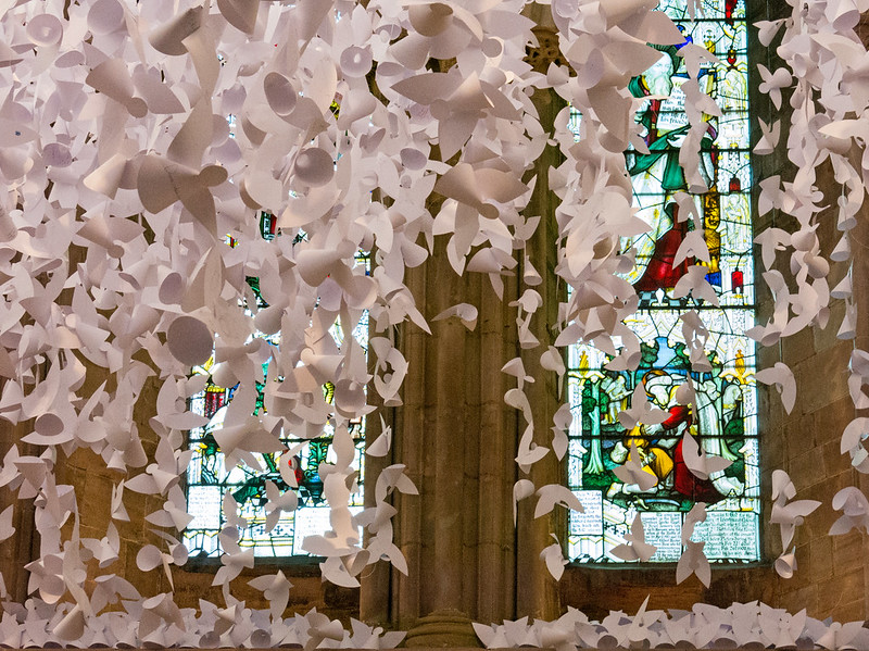
 SONG TITLE-LYRICS-Angels by anitacv.1, on Flickr
- Messages
- 13,760
- Edit My Images
- Yes
Blimey there is loads of them Anita, I bet the poor mites that made them got scissor cramp !!! - A nice unusual image for sure, the splash of colour from the stained glass works well 
- Messages
- 3,925
- Name
- Carl
- Edit My Images
- Yes
What a beautiful decoration - love it Anita, excellent take.
- Messages
- 9,095
- Name
- Mandy
- Edit My Images
- Yes
Wow that's a lot of angels, and a good song choice works for me.
- Messages
- 765
- Name
- Anita
- Edit My Images
- Yes
I'm going to ask, though... Is the WB correct? They lok a little pink (but what do I know, I don't know what they looked like IRL).
Thanks for commenting. I'll take a look at that. They were all white card angels that local school children drew on.
- Messages
- 13,760
- Edit My Images
- Yes
- Messages
- 13,760
- Edit My Images
- Yes
Hi Anita
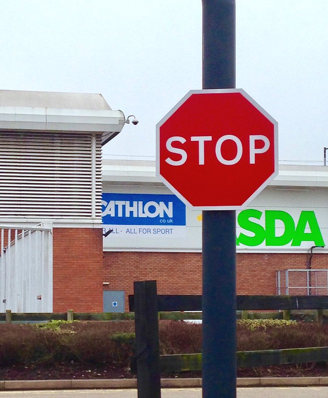
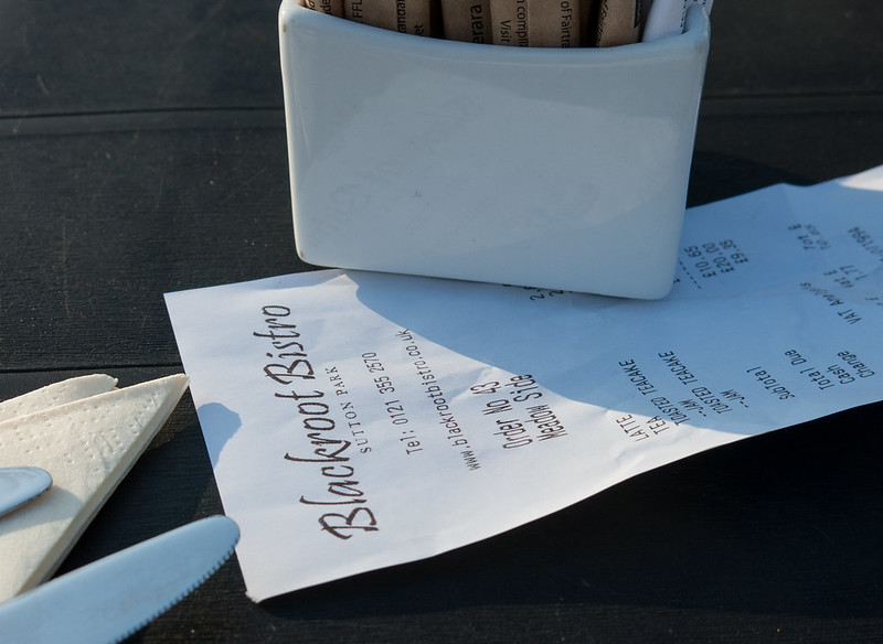
Order - yes a great sign, phone = poor DoF but hey, gotta do what one has to do at times, nice idea still - for me I prefer the bistro receipt, works much better for me
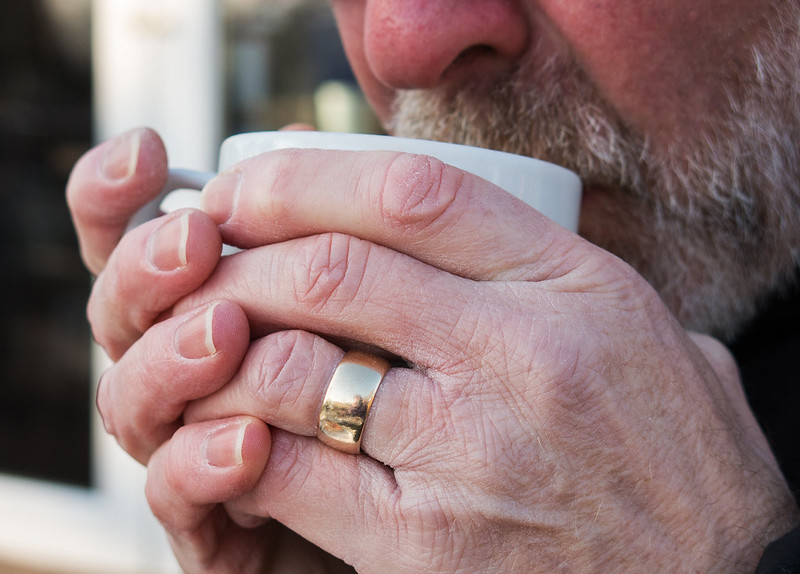
Comfort - shame about the big white bands, but really like this other than that, real nice DoF and I like the idea, glad to see nice clean nails and a pleasing reflection on the ring too, works very well for the theme
Order - yes a great sign, phone = poor DoF but hey, gotta do what one has to do at times, nice idea still
Comfort - shame about the big white bands, but really like this other than that, real nice DoF and I like the idea, glad to see nice clean nails and a pleasing reflection on the ring too, works very well for the theme
- Messages
- 3,925
- Name
- Carl
- Edit My Images
- Yes
I like the signs for Order - clean, sharp and colourful, but the soft shadow falling across the receipt and the textured table #2 create something a little extra. The grasp of the cup says it all for Comfort - nice and sharp where needed.
- Messages
- 765
- Name
- Anita
- Edit My Images
- Yes
Looking closely I see what you mean.....but have no idea what caused it [emoji15]In comfort there seems to be an odd effect around the two middle knuckles on the outer hand, but I love the details captured in the skin.
- Messages
- 5,787
- Name
- Storm Trooper
- Edit My Images
- Yes
That does look like a well deserved cup of hot something. Nice angle, framing and detail in the weathered hands. 
LC2
Negan
- Messages
- 10,457
- Name
- Tim
- Edit My Images
- Yes
Hi Anita.
Order - Well, they are both certainly on theme. I'm going to er on the side of the second one. With the first one, the signs in the background are too off putting, blurring them out to a mess of colour may have worked though.
With the second shot, the knife and napkin seem a bit out of place to me, a bit 'accidental'
Comfort - I was going to say the focus was misplaced as I was guessing this was 'hairy'. But as it's Comfort, then yup, it works nicely, nothing is blown (the ring could easily have caught too much light), plenty of textures and fits the bill well.
- Messages
- 13,760
- Edit My Images
- Yes
Annnnnnita are you there 

- Messages
- 4,562
- Name
- Mark Gameson
- Edit My Images
- Yes
Hi Anita
Song/Lyrics - A nice find for the theme the splash of colour form the window really adds to the image.
Order - 2 Great images for the theme I keep changing my mind on which one I prefer I like the first for the colour but like the composition of the second (I didn't realise you were in the Midlands)
Comfort - I really like the detail in this great composition and use of DoF love the diffused reflection in the ring too


 Order
Order Order
Order Comfort