- Messages
- 6,502
- Name
- Peter
- Edit My Images
- Yes
The textures of those pieces can almost be felt. Nice composition with the low PoV. As said though noise is an issue on this image.

")
")
Thank YouHi Michael, and welcome to the 52. I've just had a first look through your thread:
Odd - lovely bright image. The slight crease on the left of the background has already been mentioned, but this is an original take on the theme.
Line - another bright, clean image and a clear interpretation of the theme. Nicely lit, too.
Play - I like the dark tones and texture of the wood in the foreground, and it's well lit. It looks like a little dust on the board to the right, but it doesn't detract from the theme and it's the sort of thing you notice after the shot is taken.
You're off to a great start and I look forward to following your thread
Dust is my biggest nightmare always miss some :banghead:Thank youThis is lovely - the tones and texture of the wood really make it - it wouldn't have been the same with plastic pieces and a cardboard board. I like the composition and the lighting.
It was the texture that made me use them rather than the chess pieces.Thank youNice texture on the dark wood. I find my eyes continually being pulled away from focusing on the dark chequers by the white, OOF ones in the background.
The textures of those pieces can almost be felt. Nice composition with the low PoV. As said though noise is an issue on this image.
Hi Michael
you've caught the texture of the wooden pieces really well , like the composition & use of DOF
Good start to your 52 Michael, i like the colour tones and textures in your play shot.
I am not overly bothered by the noise, it suits the subject IMHO
Hi Michael - liking Play - it could be Close as well!!
On the spot for the theme, as mentioned above the wooden pieces really look good, they have a really nice texture.
Hi Michael
Play - Excellent DoF you have there mate, I like the composition you have chosen with the low PoV and diagonal of the board, and some great detail - Nice One
On theme and well composed.
Cheers.
Good use of DOF there Michael...
Fits the theme well... I know that feeling

Fits the theme well... I know that feeling

I agree with Mandy about the clutter but well done its differentFits the theme, I feel however composition wise it is a little cluttered for my taste.
Thank you and yes I agree about the clutter.Fits the theme, I feel however composition wise it is a little cluttered for my taste.
Thank youFits the theme well... I know that feeling
Thank you
Thank youIt certainly conveys your feelings well.
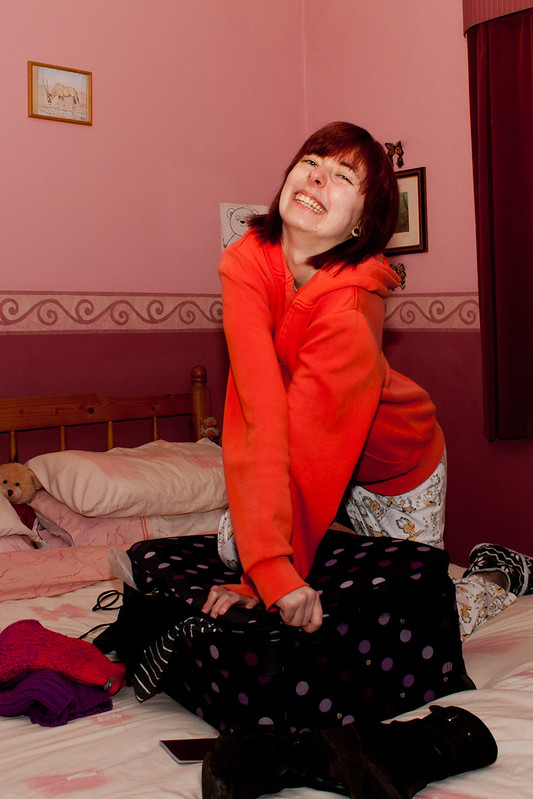
Thank you. It took some bribing to get my daughter to model for me so I'm happy with the results as she was a little unwilling and wanted it done a quick as possible.The expression of the model helps this image which does fit the theme. I was also amused by the teddy getting in to the picture.
What a pain your having software issues, fits the theme nicely
Close is a nice humerous take and her facial expression is great. I'd prefer more clothes, etc poking out of the suitcase.
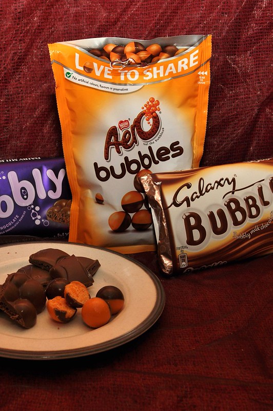
Bubbles, on theme and focus, colours looks good. I'm not too keen on the composition/crop.
Cheers.
Have to agree, shame about the crop (Mainly the cropped plate, but also the cropped 'Bubble' words) it's nice and bright and fits great - hope you get your LR sorted soon, i'd be lost without mine
I agree with Mandy about the clutter but well done its different
like you bubbles too well done
A different take, perhaps a closer up shot of the sweets to show the bubbles might have helped.
What a PITA is technology when it goes wrong
Well jel of all the lovely confectionary you can get hold of in the UK
Hi ya
hope you get your editing woe's sorted...what a pain :banghead:
Close....yeah , on theme but more stuff poking out of the case would have lifted it bit
Bubbles....agree with the other's comments regards the crop but it's on theme

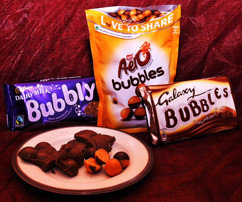
The second Image of bubbles looks great.
#2 is much better crop wise. I feel the bottom half is a little under exposed though.

Thank you. I used a long exposure and light up with so red fairy lights.Works well in red Michael
Totally agree about the smoke just couldn't get it to show up with the red. Maybe I should have used a white light on the smoke from the other sideI think adding smoke would have added a bit of interest to me. Maybe add it in a reshoot month once your kit is back to spec.

