weekly Chevin"s 52 in 23 ... Week 9: Broken

Week 5 ... Snappers Choice + Tech

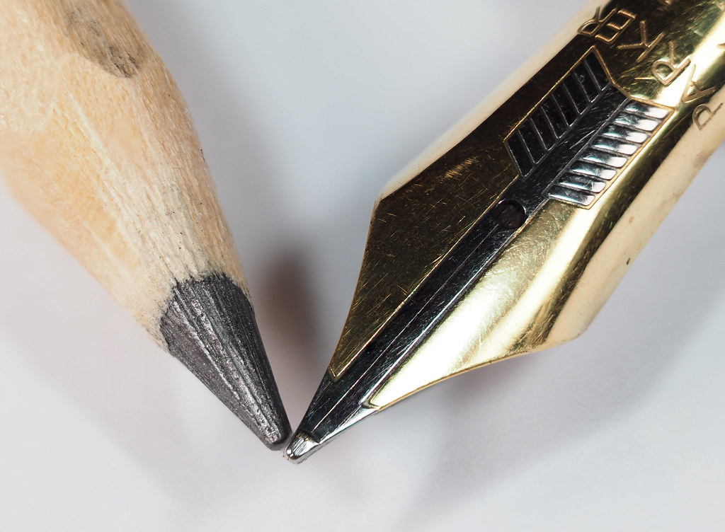
This image is my effort to use off camera stacking. It's a 60 stack image processed in Photoshop. The Tech bit is the juxtaposition between pen & pencil.

Constructive comments appreciated

2023 - Snappers Choice + Tech by Chevin, on Flickr
 
Last edited:
60 frames!!!

I shot a pencil this week and needed 2 or 3 shots just to get the graphite tip fully covered so understand how narrow the DOF can be!

Cracking shot, well lit and composed. Nice one.
 
Very detailed picture, I'm not sure what you mean by a 60 stack image...( I'm assuming you've taken 60 images and layered them on top of each other?) Either way, a brilliant picture!
 
I think that it's a good macro Duncan and the composition adds interest but I'm wondering if 60 images is overkill for the subject? Maybe 6 to 8 images would have gotten you something comparable and saved some processing power?
 
60 frames!!!

I shot a pencil this week and needed 2 or 3 shots just to get the graphite tip fully covered so understand how narrow the DOF can be!

Cracking shot, well lit and composed. Nice one.
60 frame stack OMG.
That is a very good set of shots to get it looking so good.
Very detailed picture, I'm not sure what you mean by a 60 stack image...( I'm assuming you've taken 60 images and layered them on top of each other?) Either way, a brilliant picture!
An original take on the tech challenge, well done!
Great picture for the tech and such a simple image too, although 60 frames! wow
That's a great shot. Love your idea. Wow, 60 images stacked! Some memory power your machine must have! I like the composition and the very subtle shadows. Don't mind if I'm being a bit picky, the meeting point is slightly off.
Liking that Duncan. Very good.
I think that it's a good macro Duncan and the composition adds interest but I'm wondering if 60 images is overkill for the subject? Maybe 6 to 8 images would have gotten you something comparable and saved some processing power?
Good juxaposition, nice detail and texture captured.

Hi folks and thank you very much for the comments.

I was playing around with a Nisi focus rail I’ve just bought and wondered how photos I could take and stack before the mac ground to a halt. With a total image depth of 8.5 mm, Photo Pills indicated that with the camera settings I decided to use gave a single image DoF of 0.15mm so I ended up with 60 images.

Certainly made the mac grunt for a couple of minutes but I think it turn-out ok
 
Simple but very effective and a nice take on the tech.
 
Transparent - such a simple yet effective idea.
Week 5 - another great idea, and it just looks sooo sharp, I love the detail.
 
Transparent - such a simple yet effective idea.
Week 5 - another great idea, and it just looks sooo sharp, I love the detail.
Thanks Nicky for the comment
 
Week 6 ... Knob

This is the rear drag control from one of my salmon reels.
Sadly it didn't get much use in 2022 :(, this year however;)


2023 - Knob by Chevin, on Flickr
 
Beautifully photographed!

Thanks for the explanation, I never would have guessed what it was.
 
Now you have explained, I knew I had seen something similar before, probably on one of my tiny trout reels
lovely shot
 
A nice composition. Love fishing. Haven't been for ages.....
 
A nice composition. Love fishing. Haven't been for ages.....
Cheers Simon, sadly I don't get out fishing as much either ... I tried explaining this to the missus who was as ever totally unsympathetic
 
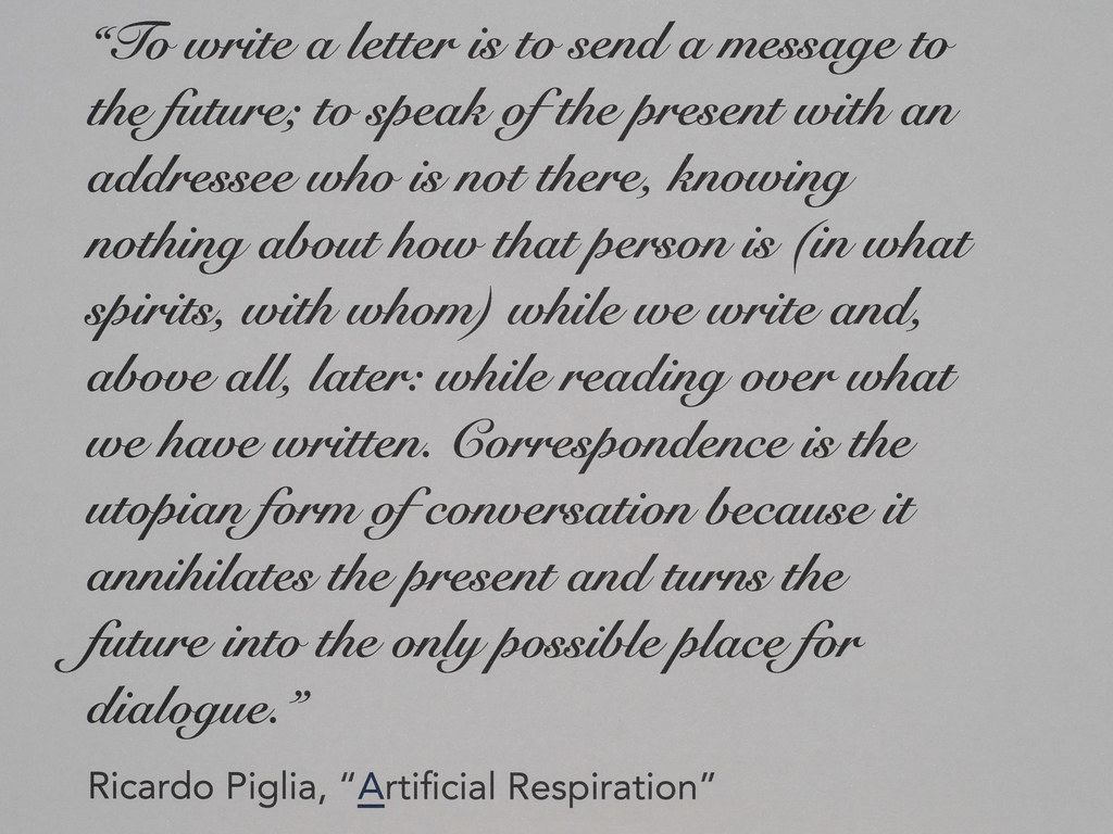
This is an image of a quotation from an Argentinian writer who I enjoy reading, it's regarding Letters


2023 - Letters by Chevin, on Flickr
 
Last edited:
Thank you Simon
 
Intersting take on the theme, interesting quote too!

Well taken - possibly too straight maybe, as It almost looks like a "screenshot" rather than a photo. If you were going for 'straight' though - you've nailed it!
 
Intersting take on the theme, interesting quote too!

Well taken - possibly too straight maybe, as It almost looks like a "screenshot" rather than a photo. If you were going for 'straight' though - you've nailed it!
Thanks Graham.

The quote was typed out and printed it @ A4 onto some grey paper I had lying about. The printed sheet was supported on a lectern I use for reading @ about a 45deg angle.
The image was taken with a handheld Olympus M1 mk11 and a 60mm lens and a small amount of infill flash.
A little bit of sharpening, crop and rotation to get the text correctly aligned in post and that was that.
 
Last edited:
What an interesting quote to read, quite thought provoking. Great picture for the theme.
 
A very profound quote.. a great choice for the theme. It's such a shame that letter writing has fallen so far from fashion.
 
A really thought provoking quote Duncan, thanks for posting it.
 
What an interesting quote to read, quite thought provoking. Great picture for the theme.

A very profound quote.. a great choice for the theme. It's such a shame that letter writing has fallen so far from fashion.

A really thought provoking quote Duncan, thanks for posting it.

Thank you Sophie, Helen & Bill.
I included the quote ashore me it's so thought provoking.
I'm probably a modern-day luddite and do correspond with people by letter, practice and enjoy penmanship ... I write in a cursive style, not well mind you but I think legible enough.
There is something about the process of letter writing ... the satisfaction of completing a well crafted letter, the anticipation of a return and I'm sure the thought process also helps your wellbeing. I'm not a text messenger, e-mail fanatic or ticky-tocker I prefer my life (or what's left of it) to proceed at a slower and more relaxed pace. :)
 
Week 8 ... Kitchen

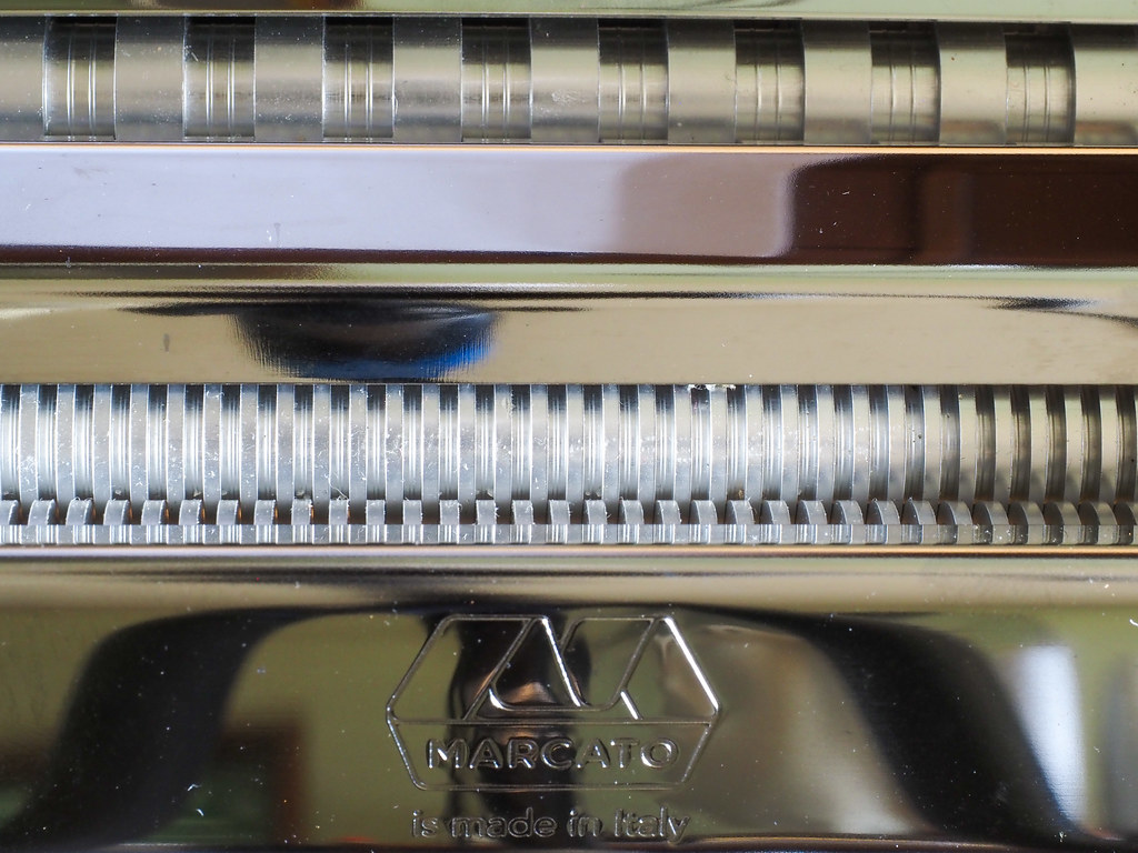
These are a couple of images of my pasta rolling machine, I love pasta (hence the slight weight problem) and make fresh whenever I can ... the taste and textures are far removed from the dried stuff.


2023 - Kitchen 1 by Chevin, on Flickr


2023 - Kitchen 2 by Chevin, on Flickr
 
Cracking detail in the first. At f/16 did you get enough DOF to get away with a single shot or is this stacked again?

Nice composition and the metallic ness comes through wonderfully.

Second is useful to show the context, but it looks like the photographer was wearing a blue hat! Shiny things are difficult.

Thanks Graham, a single shot this time f/16 gave me the DOF I was looking for.

As you say the second was purely to show the context of the image, the blue is the base plate of the ball head. I was trying all sorts of angles to get a reasonable image which just didn't really work due to the shininess of the pasta m/c so I revised things and took a close up of the spaghetti rollers instead.
 
Interesting and abstracty :)
 
Managing some comment catch-up!

Transparent - The use of the word "focus" was quite apt, the image works for the theme.

Snappers Choice - The discolouration on the pencil distracts my attention. I might have moved the pencil down a bit to get the points together.


Knob - An interesting item, I would have considering rotating the reel enough to show the full wording on the bottom half.

Letters - A very profound quote.

Kitchen - Nice level of detail in the first image, I don't think I would have worked out the equipment.
Thank you for the comments Stuart
 
These are really interesting Duncan. I think that I like the second shot better but I would have cropped it to keep the width but lose the logo at the bottom. I like them both.
 
Back
Top