weekly Crazylady's 2015 52 challenge Crowd and Close Up added

Those last two shots are amazing Hazel.

The wineglass really caught my eye in the main images thread, hence my visit. Lovely range of tones and an excellent study. Watery may be an archive shot but it's beautiful nonetheless. Very minimalist and simple enhanced by the off-centre positioning of the subject. Right up my street.
Thank you very much Ian, have to say i am blown away by the positive comments about the wineglass!
 
I like the nice clean lines of watery, Hazel. Very crisp and clear.... You almost wouldn't realise it was water if it weren't for the reflection. Lovely gradient and I really like the reflection and the way the top of the Daymarker post starts to vanish into the mist.
Nice Work(y)
Thanks for stopping by Steve
 
Hi Hazel, sorry for the delay in commenting... better late than never :)

Scenic is a lovely scene but agree with your own and others' comments re: the blown sky. You could either dial in a heavy amount of exposure comp (possibly 3 stops in this example?) which then means you need to be shooting at 100-200 ISO to avoid too much noise in the shadows (3 stops EC @ 100 ISO still equates to over 800 ISO in "real" terms) - or use an ND grad on the camera. Unfortunately, once you've shot there's no way of recovering except maybe 0.5-1 stop if you shoot RAW. Still, the composition works well for me - very pretty scene.

Companions made me smile - very good! I'd slightly more (and perhaps more even) light on the snake, but otherwise it's spot on. Like your DOF choice.

Elegant - very artistic lighting on that glass... I like it a lot. The only tiny crit is the additional reflection on the right side of the glass (as we look at it in frame) - do you have light walls? If so, I reckon you were getting quite a bit of reflected light back at the glass from the right of frame which I personally find interferes very slightly with the lovely dark silhouette edge of the right part of the "bowl". Still a cracking shot and you've achieved some fine lighting notwithstanding the point above. And it's very elegant :)

(Note that we all have different views on things because @69Bonni likes the lighter reflection you have!)

Watery - very nice, gently and relaxing. I love the way the fog just gradually thickens until you have bright white at the top of the frame. Super image!

Thanks Paul for your comments
The scenic shot was taken on my compact so no grads, did try and spot meter from the sky but as i wasnt using a tripod then i couldnt align it to process together with the next shot metered from the field.

Elegant, yes we do have very pale walls hence some of that light
Glad you like watery, i do and i was drawn to it by its simplicity
 
Watery... I wasn't taken by it straight away but I keep looking at it and the more I do, the more I like it. Subtle colours and that gentle gradient that become pure white at the top. A super photo indeed :)

Thanks Lee, I appreciate your commenting
 
Hi Andy

Yes, I hadn't considered a square crop here, something else to consider next time I am faced with a lone subject. This is what I love about the 52, all ideas in together!
 
Elegant and Watery both lovely minimal shots. Prefer your edited version of elegant.
 
Absolutely beautiful shot for watery Hazel !!!
Sooo atmospheric. Amazing how much feeling has been packed into so few elements.

Anyway, a belated welcome aboard for 2015, since I seem to have completely missed your thread until now and looking forward to seeing this week's entry.

p.s. :LOL: Fanatstic avatar pic too. Is that one of yours?


Hi Sarah
Thanks for the positive comments and welcome.
Yes, the chain saw jelly baby massacre is one of mine too, glad you like it, it just makes me smile whenever i see it!
:naughty:
 
And so on to Bold

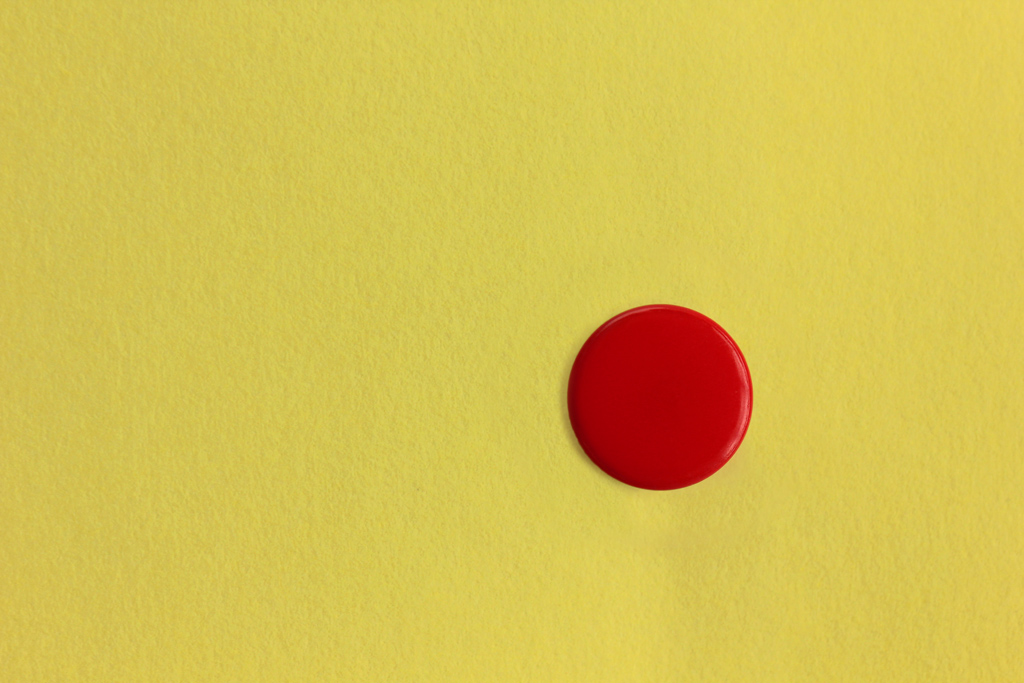
This is a red drawing pin stuck in a post it note!

10120-1424197000-7817b758a80fbe27e65e3012addbe98e.jpg
 
I like that I can see the texture in the paper and the light works to tell my eye that its not just a red dot on the paper. I like that it's not central too. Nice and simple idea to fall within a difficult theme. Well done!!
 
I like that I can see the texture in the paper and the light works to tell my eye that its not just a red dot on the paper. I like that it's not central too. Nice and simple idea to fall within a difficult theme. Well done!!

I'm lazy, but it saves the typing...lol
I agree with all the above and I love the shot :)
 
Watery - great shot, pure and simple but very effective

Bold, again plain and simple but hits home the theme perfectly
 
I like that I can see the texture in the paper and the light works to tell my eye that its not just a red dot on the paper. I like that it's not central too. Nice and simple idea to fall within a difficult theme. Well done!!

Thanks Mike

I did try to lose the texture to see if that worked but thought it added more depth and interest to the image
 
very good idea and nicely done :)
 
Fragile - For me the interest in this image is the glowing red in the head on the match. I think the under exposure of the stick part has helped draw the eyes towards the glow.

Scenic - I do like sunsets/rises but for me the fence, whilst it brings some extra interest into the image, creates a barrier between the viewer and the very scenic backdrop. Definitely a location to go back to though.

Companions - Love this. Unlike some other comments the use of the shallow DoF is the image’s strength. The composition which roughly follows the thirds rule seems also to work.

Elegant - Taking photos of glass can be tricky but you seem to have done well here. I especially like the cropped edit which I feel accentuates the curves of the wine glass. Nice one.

Watery - This has a lovely peaceful feel to it. I am prone to a good minimalist mono images and this is a good one. The positioning of the post is spot on as is the inclusion of the squiggly reflection in the water.

Bold - Another simple image but again it works for the theme. The bold saturated colours are tastefully done as it would have been easy to turn up the sliders in PP too much.
 
Back
Top