You are using an out of date browser. It may not display this or other websites correctly.
You should upgrade or use an alternative browser.
You should upgrade or use an alternative browser.
weekly David's 52+2 for 2014 - SHAPE
- Thread starter minnnt
- Start date
- Messages
- 4,350
- Name
- Martin
- Edit My Images
- Yes
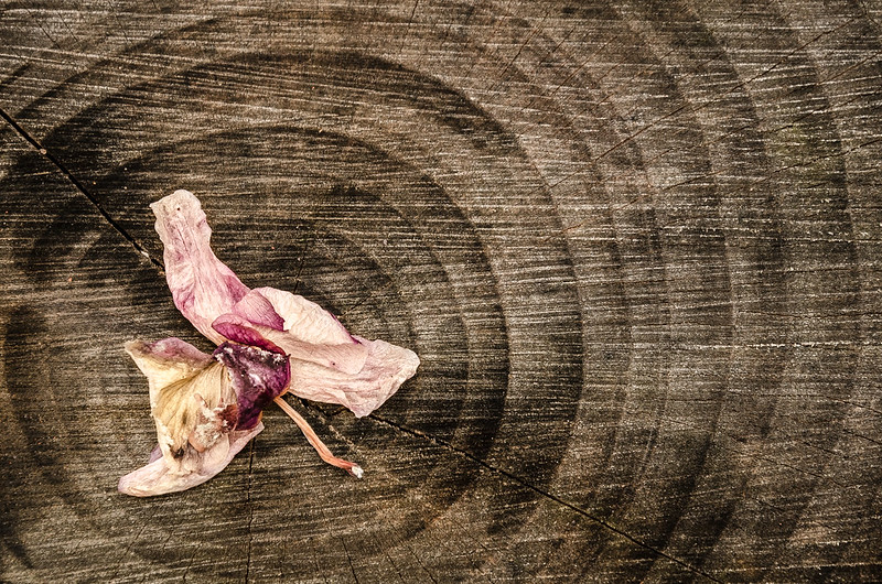
Can't get too enthusiastic as I like my wood woody-coloured and this kinda looks like a cross-section of an old telegraph pole (of course that may be what it is). Good contrast between the two elements though.
- Messages
- 19,461
- Name
- Andy
- Edit My Images
- Yes
Hi, David, 
Close, yeah, I do like barb wire. Nice detail, the blown BG does distract slightly.
Edited bubbles has cracking colour and detail.
Smoke, on theme and it's good to nail this one.
Mineral. A little dark for me, but nice detail and I do like the crack in the wood.
Cheers.

Close, yeah, I do like barb wire. Nice detail, the blown BG does distract slightly.
Edited bubbles has cracking colour and detail.
Smoke, on theme and it's good to nail this one.
Mineral. A little dark for me, but nice detail and I do like the crack in the wood.
Cheers.
- Messages
- 18,233
- Name
- David
- Edit My Images
- Yes
Another week, another week behind.  Although in my favour i have two images this week!!

Sense of Humour by David Raynham, on Flickr
And a load of marmite...

Sense of Smell by David Raynham, on Flickr
Enjoy.
 Although in my favour i have two images this week!!
Sense of Humour by David Raynham, on Flickr
And a load of marmite...

Sense of Smell by David Raynham, on Flickr
Enjoy.
- Messages
- 9,095
- Name
- Mandy
- Edit My Images
- Yes
I like them both, they both fit the theme nicely. Crit wise I don't think the sc works on the second image I think I'd prefer it in colour as well.
- Messages
- 18,233
- Name
- David
- Edit My Images
- Yes
- Messages
- 9,095
- Name
- Mandy
- Edit My Images
- Yes
I do like the third image i love the log and the flower clearly shows that it has reached the end of it's life.
- Messages
- 18,233
- Name
- David
- Edit My Images
- Yes
Bit of a cheat this week... Wasn't took specifically for this theme, but alot of other people seem to be shoe horning images in so i think i'm going to jump on that band wagon too! 
This was took at my little girls 6th birthday party on Saturday... She was feeling very positive indeed as it was her first party at home and was uber excited!

Lily by David Raynham, on Flickr
This was took at my little girls 6th birthday party on Saturday... She was feeling very positive indeed as it was her first party at home and was uber excited!

Lily by David Raynham, on Flickr
- Messages
- 9,095
- Name
- Mandy
- Edit My Images
- Yes
Cracking work lovely composition.
- Messages
- 4,088
- Name
- Graham
- Edit My Images
- Yes
Great shots the past few weeks David, on a roll as you say!
Mineral works well, in terms of the processing and the composition.
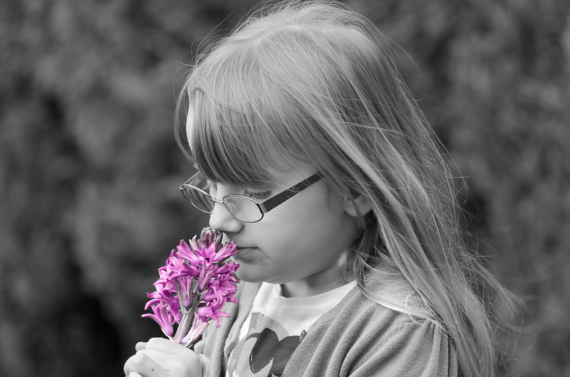
Sense is two really lovely candids, the little girl seemingly unaware of the camera in each. I am a large fan of SC, but wonder if the deep blue brings down the mood of the shot a little, as does the darkness of the cardigan to some degree... In my mind if I change the cardigan to a lighter colour, and the flower to a pretty pink, it works. (Could be done in PP, with the red slider in the B&W conversion, and the hue adjustment on the SC layer).
That log in ending is going to serve you well, I can see it already!! again, nice composition with the rings radiationg out, the contrast of colours between the log and the 'flower' working well for you.
And positive, a great smiling princess, suits the high-key processing, looks to have lost the bottom of the tiara(?) though leaving the top half floating. But a very winning smile, and sparkly eyes.
Mineral works well, in terms of the processing and the composition.
Sense is two really lovely candids, the little girl seemingly unaware of the camera in each. I am a large fan of SC, but wonder if the deep blue brings down the mood of the shot a little, as does the darkness of the cardigan to some degree... In my mind if I change the cardigan to a lighter colour, and the flower to a pretty pink, it works. (Could be done in PP, with the red slider in the B&W conversion, and the hue adjustment on the SC layer).
That log in ending is going to serve you well, I can see it already!!
And positive, a great smiling princess, suits the high-key processing, looks to have lost the bottom of the tiara(?) though leaving the top half floating. But a very winning smile, and sparkly eyes.
- Messages
- 18,233
- Name
- David
- Edit My Images
- Yes
Hello mate, great post. Really appreciate your comments. I will have a play with the hyacinth photo. I totally agree with you tbh.
The bottom of the tiara is covered with white fluff so it's been lost with the exposure slider I believe?
I'll sort the original out tonight and an edited version of the SC.
Muchos Gracias...
The bottom of the tiara is covered with white fluff so it's been lost with the exposure slider I believe?
I'll sort the original out tonight and an edited version of the SC.
Muchos Gracias...
- Messages
- 18,233
- Name
- David
- Edit My Images
- Yes
@Phil-D @overbez here is the original 'POSITIVE' image... different much, yeah? As you can see Graham, there is some white fluff on the bottom of the crown/tiara.

Unedited by David Raynham, on Flickr
And here is an edited version of the 'SENSE' sc shot. I think it's like you said... maybe? ish? kinda?
Sense Edit by David Raynham, on Flickr
All C+C welcome as always!

Unedited by David Raynham, on Flickr
And here is an edited version of the 'SENSE' sc shot. I think it's like you said... maybe? ish? kinda?

Sense Edit by David Raynham, on Flickr
All C+C welcome as always!
- Messages
- 13,760
- Edit My Images
- Yes
Have stumbled upon your thread again... and there was me thinking you were WAY behind.... DOH :bang:
Guess your images have not been added to the 'Photo's only Thread' ??
Guess your images have not been added to the 'Photo's only Thread' ??
- Messages
- 13,760
- Edit My Images
- Yes
- Messages
- 13,760
- Edit My Images
- Yes
Your last image on there was Wk 3 'Close' - I marked you as 'On the Edge' was going to put you on the naughty list tomorrowThanks DK. Yeah I have neglected the images only thread. Maybe I should figure out what my last image was and update it...
You will get LOTS more visits when you stick a pic on there to guide people... It's been 6 weeks since I have been because I only follow that generally
Last edited:
- Messages
- 4,088
- Name
- Graham
- Edit My Images
- Yes
Re-edit of the sc flower shot is perfect. (To my description of what was in my mind). The tone of the shot is much lighter and the sc adds greatly now.
Amazing what a difference can be made in the editing. I reckon that could easily justify a place in a frame on the mantelpiece now.
See what you mean about the tiara fluff too. Nice edit, very different to the original.
Amazing what a difference can be made in the editing. I reckon that could easily justify a place in a frame on the mantelpiece now.
See what you mean about the tiara fluff too. Nice edit, very different to the original.
- Messages
- 18,233
- Name
- David
- Edit My Images
- Yes
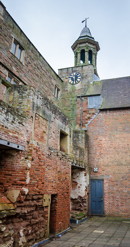
This is my take on this weeks theme. Spotted whilst walking around the ruins of the old Abbey at Rufford.
Time by David Raynham, on Flickr

Time by David Raynham, on Flickr
- Messages
- 8,398
- Name
- Lynne
- Edit My Images
- Yes
Hi David
in no particular order.....
Positive....quite partial to high key shots , love her expression as well.....can't help thinking you need to dial the exposre back just a smidge ?
Ending....yeah , liking that , lovely detail in the log & the subdued colors in the flower head works really well....very very appelaing image to me
Smoke...not gonna crit as I had such a mare but love the color !
Sense....the edit of the little girl with the pink flower works well...I think the blue flower was just too dark
Bubble....super image...great color combo I may have been inclined to crop to almost portrait to lose the random bubbles on the rhs
in no particular order.....
Positive....quite partial to high key shots , love her expression as well.....can't help thinking you need to dial the exposre back just a smidge ?
Ending....yeah , liking that , lovely detail in the log & the subdued colors in the flower head works really well....very very appelaing image to me

Smoke...not gonna crit as I had such a mare but love the color !
Sense....the edit of the little girl with the pink flower works well...I think the blue flower was just too dark
Bubble....super image...great color combo

- Messages
- 11,087
- Name
- Allan
- Edit My Images
- No
Hi not sure where I am with your pics so will start with time,
there is a clock in there but it seems a little lost, the bottom of the image isn't particularly interesting
from the point of view of the theme
I have no idea what lens you used but a closer view of the clock and dome might have worked better
there is a clock in there but it seems a little lost, the bottom of the image isn't particularly interesting
from the point of view of the theme
I have no idea what lens you used but a closer view of the clock and dome might have worked better
- Messages
- 9,095
- Name
- Mandy
- Edit My Images
- Yes
I like the idea on this image but I feel a closer crop would work better.
- Messages
- 1,412
- Name
- Elaine
- Edit My Images
- Yes
I really like this one. I think that the dilapidated buildings and wonky paving stones help to emphasise the passage of time theme and enhance rather than detract from the clock itself.
- Messages
- 1,417
- Name
- Judi
- Edit My Images
- Yes
Hi David, it seems that I have got a bit behind in my commenting so here goes
Sense.... love the nice smiley little face full of fun

not keen on the dark sense of smell but do quite like the edited version
Ending.. I really like it but would have liked it to be a bit closer to the flower

Positive ...is an Awwww picture lovely we should have a shoehorn on the smileys
Time... I like it double time with the clock and time seems to have nearly run out for the building

Sense.... love the nice smiley little face full of fun
not keen on the dark sense of smell but do quite like the edited version
Ending.. I really like it but would have liked it to be a bit closer to the flower
Positive ...is an Awwww picture lovely
Time... I like it double time with the clock and time seems to have nearly run out for the building
- Messages
- 646
- Name
- Michael
- Edit My Images
- Yes
Hi David not looked in for a while but now you've added to the Pic only thread..... although there's no link to here from your Time shot.... anyway here goes
Bubble - Like both edits and love the colours
Smoke - Good clean image, the smoke is nice a clear and I like the fact that you can see the top of the incense stick with the smoke going across the frame
Mineral - This does have a gritty feel about it but I find theres more interest in the wood rather than the stone.
Sense - Sense of humour all the way for me lovely shot
Ending - Again as with the other shot involving the log the real interest lies with the log and not the subject.
Positive - I wish my girls were that young again and that happy to still be photographed, another cracker
Time - Closer crop on the clock but some nice detail in the brick work. The sky is a bit flat though maybe try to bring out some of the blue.
- Messages
- 6,502
- Name
- Peter
- Edit My Images
- Yes
Smoke - A lovely shot - very sharp. The choice of colour is really nice.
Mineral - I really like this. The dark wood background with a hint of colour lifts this from an ordinary picture of a stone to something you might see in Ikea.
Sense - Selective colour very rarely works for me and I'm afraid this is an example. Sorry
Ending - Another lovely wood one. The dead flower hits the theme. Maybe you could do a series of these. I think they really work.
Positive - A super shot of your little princess. Ultra high key but it works especially with such a willing and happy model
Time - The image doesn't do much for me although it looks like you've done a good job in handling the exposure for this
- Messages
- 18,233
- Name
- David
- Edit My Images
- Yes
Hey, thanks for the good feedback. Appreciate all comments and advice. Unfortunately there was no blue in the sky to bring out. Would have made for a better image I agree.
As for the kid, yep she's pretty easy going with regards to pics being taken. Very much a poser.
As for the kid, yep she's pretty easy going with regards to pics being taken. Very much a poser.
Last edited:

