Em's 52 for 2017 - You added

Love the colours in the marbles shot and the reflection too. I too prefer the square crop :) The reflective surface works well for the necklace as well. Think I might have to invest in a sheet of glass :D
I've enjoyed mine Georgina - just a largish picture frame from a cheap shop, spray painted black on the back. This stops double reflections and picks up the colour of any backdrop you hang behind it.
 
all nice and clean and shiny (y)

:agree: with andy ..

"I think there's a better composition in there. I'd like to see the bracelet on the RHS on the front leading away to the back, or maybe rotate it maintaining the heart shape"
 
all nice and clean and shiny (y)

:agree: with andy ..

"I think there's a better composition in there. I'd like to see the bracelet on the RHS on the front leading away to the back, or maybe rotate it maintaining the heart shape"

Not an easy theme was it Emma ...your necklace works well ...I love reflections, it adds so much to a photo. That's a handy hint about the white card ...I'll try and remember that.

Mineral - simple composition resulting in a sharp, crisp, clean image for the theme. A nice looking bracelet as well, and the big works well for the image.

Thank you :)
 
Last edited:
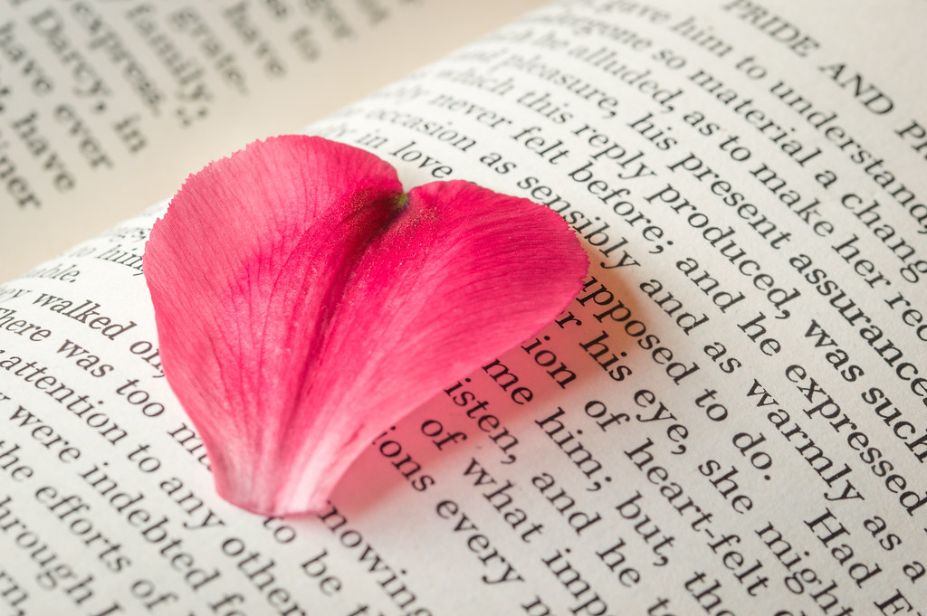
It's nicely taken Emma with that bold colour set against the words of Pride & Prejudice. Definitely romance and a Whole lot of love in that book for sure.
 
Perfectly shaped petal for your subject leading to he word "love", very nicely done
 
nicely lit and good attention to detail, even if its a shoehorn its a well produced one, it works (y)
 
It's nicely taken Emma with that bold colour set against the words of Pride & Prejudice. Definitely romance and a Whole lot of love in that book for sure.

Nice shot Emma, like the idea and the colours and the DOF works well.

Hi, I tend to prefer the nearest part of a subject in focus.

Vivid pinks and good lighting.

Cheers.

Perfectly shaped petal for your subject leading to he word "love", very nicely done

Thanks everyone :)

nicely lit and good attention to detail, even if its a shoehorn its a well produced one, it works (y)
Thanks Allan - just window light and a reflector to soften the shadows. I'd tried the night before with lamps, but seemed to lose a lot of detail in the petal.
 
Hi Emma

Song/Lyrics - Really like that the one seagull looking down and separated from the others is great love how the mist/fog has diffused the BG.

Order - Great idea although the first one has messed with my head! but strangely I think that's my favourite, although I really like the DoF used on the second one

Comfort - What a great image love the colours in the scarf and the eyes I also like the third image. For me personally the B&W doesn't work as well I think the image is all about the colours.

Hairy - Lovely image great details lovely use of DoF.

Smooth - 2 great images but the marbles one really stands out for me I prefer the cropped version it feels more balanced absolutely love the colours and reflections.

Mineral - I really like how you've used the reflections at first I wasn't sure about the DoF but having viewed it full size on Flickr I think it works really well. I also like the lighting.

Whole - Emma shoehorn it maybe but who cares when its as good as that love the splash of colour the petal adds to the black and white of the pages of the book.
 
Great idea, nice lighting that makes the petal pop against the pages of the book and good DoF!
 
Really nice composition Emma, love the colours and lighting too. I'm a but stuck on where the focus is though. I like the shallow DoF, but I'm undecided as to whether I'd prefer the focus on the base of the petal or actually on the word love (I'm leaning to the latter) Great shot all the same (y)
 
Hi Emma

Song/Lyrics - Really like that the one seagull looking down and separated from the others is great love how the mist/fog has diffused the BG.

Order - Great idea although the first one has messed with my head! but strangely I think that's my favourite, although I really like the DoF used on the second one

Comfort - What a great image love the colours in the scarf and the eyes I also like the third image. For me personally the B&W doesn't work as well I think the image is all about the colours.

Hairy - Lovely image great details lovely use of DoF.

Smooth - 2 great images but the marbles one really stands out for me I prefer the cropped version it feels more balanced absolutely love the colours and reflections.

Mineral - I really like how you've used the reflections at first I wasn't sure about the DoF but having viewed it full size on Flickr I think it works really well. I also like the lighting.

Whole - Emma shoehorn it maybe but who cares when its as good as that love the splash of colour the petal adds to the black and white of the pages of the book.
Wow Mark - thank you so much for taking the time for such a massive catch up and your thoughtful comments - it's very much appreciated!
 
Really nice composition Emma, love the colours and lighting too. I'm a but stuck on where the focus is though. I like the shallow DoF, but I'm undecided as to whether I'd prefer the focus on the base of the petal or actually on the word love (I'm leaning to the latter) Great shot all the same (y)
The focus was a tricky one here Chris - too much depth of field meant the writing took over. I tried it in a few different places, but because the petal was really the subject, it didn't look right to me to lose the detail in the veins and the edging on the left. This way love was pretty much in focus and a lot of the petal. Thanks for your thoughts...it makes me feel I was right to faff with it for so long!
 
I like that ... nice & clean, sharp in the right places. :clap:
 
Very fitting for the theme Emma, and very topical too :)
 
Mineral - Interesting piece of info on how you achieved the lighting. It's tidbits like that which make doing the 52 worthwhile.
I do find it a bit muted, which isn't my favourite look, but that's just me.
Whole - Now this I like a lot more, it's the use of colour vs the mono of the book which sets it off.
(y)
 
I like that ... nice & clean, sharp in the right places. :clap:
Thanks David :)

this is my favourite so far this week. great image, love the text in the background, topical too with valentines day and the heart. lovely.
Thank you - that's lovely feedback :)

Very fitting for the theme Emma, and very topical too :)
Thanks Chris :)

Nicely done, I like the petal in focus rather than the words and just enough of the title of the book so that we know what it is. Works very well.
Cheers Steve - that was my thinking too :)

Fits the theme and close to valentines day too. (y)
Thank you :)

See, I told you you'd come up with something brilliant :clap:
Aww...that's very kind Jill - thank you!

Mineral - Interesting piece of info on how you achieved the lighting. It's tidbits like that which make doing the 52 worthwhile.
I do find it a bit muted, which isn't my favourite look, but that's just me.
Whole - Now this I like a lot more, it's the use of colour vs the mono of the book which sets it off.
(y)
Thanks Tim :)

great composition on Whole, really like this
Thank you Donna :)

Lovely idea Emma, nice touch with the heart shaped petal :)
Thanks Georgina :)

Whole - another nice image from you, good composition, lighting, I do enjoy following your thread.
Thank you Mandy - that's very kind!
 
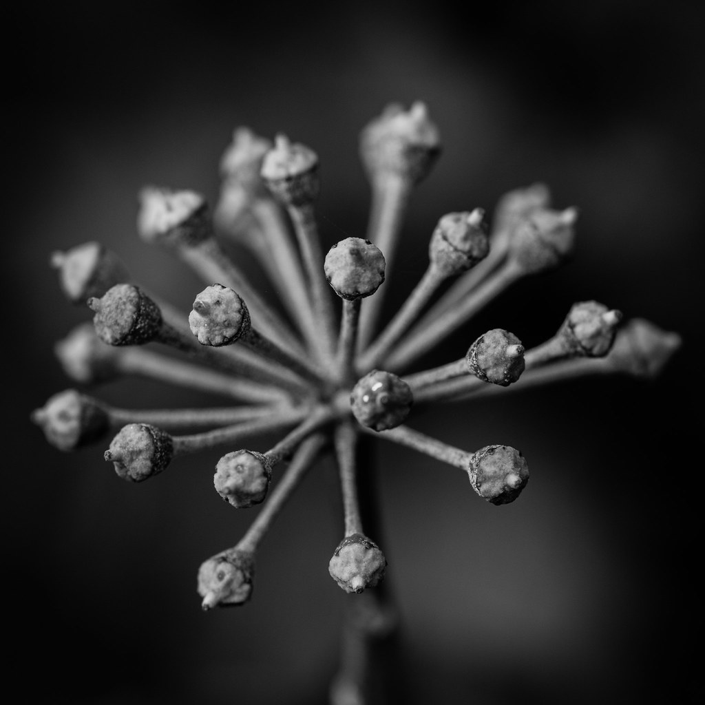
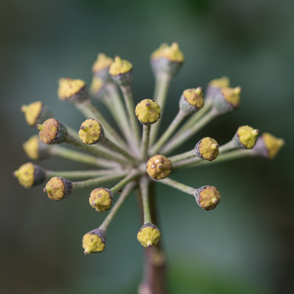
I think the colour version, i do like a black and white shot but on this occasion the subtle green and yellows with the DoF work really well

:clap:
 
I do like both these very much. I keep looking at both and I feel the black & white is my favourite.
 
Structure - a good take on the theme, works for me, my only crit is the oof berry, I expect it might of been a tad tricky to get all the berries at the front sharp and in focus.
You're absolutely right Mandy - I couldn't see it on screen on my camera - but I wish it had been in focus!

I do like both these very much. I keep looking at both and I feel the black & white is my favourite.
Thanks Kath ..i still can't decide :)
 
Back
Top