You are using an out of date browser. It may not display this or other websites correctly.
You should upgrade or use an alternative browser.
You should upgrade or use an alternative browser.
Hertsmans 2018 52....Rural/Bright/Elegant/Derelict added
- Thread starter Hertsman
- Start date
- Messages
- 3,413
- Name
- Mark
- Edit My Images
- Yes
Don`t be pulling my Lego
Stark, well I do like this shot Mark as it looks good and gritty plus has an old look to it, good job well done.
And a great book it is too - nice work
Good shot. I like the grain on this, and aren't you glad all your books are not the Kindle versions.
Great shot, and not even a shoehorn, is it? I like the grain and muted grey tones.
A man of culture and plywood. Processing works a treat.
Spotted it straight off so works well for me good thinking for the theme and the processing works for me too
Typical weather mate... where on my coast the damn sun came out and blue sky when all I wanted was dull and miserable
Theme/image wise it took me a while to find the book title, but once I did a perfect tick for the theme
I like that one Mark nice take on the theme. I really like the processing
Love the people theme, cracking colours in it and a bit of ingenuity to boot. Well done with the stark image as well, had me looking for the relationship between your image and the theme, eventually spotted it
People - I can see plenty of effort went into setting up for this image, it's a good fun take on the theme as the others have said well done for controlling the light and reflections.
Stark - I had to do a double take on this image as I couldn't initially see the connection to the theme, the gritty feel to the image works well for this image.
Thanks all, glad it wasnt immediate tbh....
I couldnt get the colour balance right at all as the room is lit very orangey, so ended with what you see....Ben Elton's Star Ark was one something I had considered for this theme, but I don't think my bookshelf is anywhere as tidy as yours.
I'm not sure on the B&W processing, I think I would prefer to see the colours of the books.
However, that is just personal preference and I think you've pulled off a good image for the theme.
Good original thinking for the theme Mark, nice composition too, it looks more sepia than B&W to me which works well.
Hi Mark, Great minds think alike with the lego peopleI like this, tricky to do with all the reflections. It works for me
. Stark - first saw the Ben Elton name and as I was thinking "I'm sure he wrote something about Stark" it jumped out at me. I like the pp, I think the effect works well. Did you consider cropping it to just the shelf with the relevant books?
good take on the theme, personally I would prefer a clean colour shot but I can see what you were going for with the Grainy black and white and it works
Thanks guys......
- Messages
- 3,413
- Name
- Mark
- Edit My Images
- Yes
Over.....the sea....
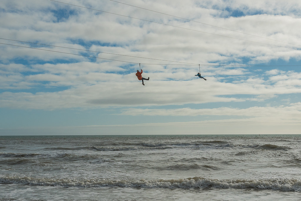
Bournemouth Pier Zip line.....
 Bournemouth (7 of 9) by Mark P, on Flickr
OR
Colourfull kite against OVERcast sky....
Took this as an early doors banker, but Im not that happy with it tbh....
 Bournemouth (1 of 9) by Mark P, on Flickr
Bournemouth Pier Zip line.....
 Bournemouth (7 of 9) by Mark P, on Flickr
OR
Colourfull kite against OVERcast sky....
Took this as an early doors banker, but Im not that happy with it tbh....
 Bournemouth (1 of 9) by Mark P, on Flickr
- Messages
- 4,562
- Name
- Mark Gameson
- Edit My Images
- Yes
2 Great images for Over
I like the people over the sea that looks like fun the orange/red coat really helps the one stand out.
But like Chris and Dominic my pick is the kite love the colours and simplicity of it
I like the people over the sea that looks like fun the orange/red coat really helps the one stand out.
But like Chris and Dominic my pick is the kite love the colours and simplicity of it
- Messages
- 4,640
- Name
- Pete
- Edit My Images
- Yes
I'm with Chris on this one.Good sky with the people over the sea but I think I prefer the colourful simplicity of the kite TBH
LC2
Negan
- Messages
- 10,451
- Name
- Tim
- Edit My Images
- Yes
Mark, there seems to be something wrong with your sensor. There are blue blotches across the sky. Surely it should all be grey 
Nice action shot, freezing the motion of both the waves and the people on the zipwire.
I may have had a play in pp, brightening the white, darkening the blacks and maybe adding to the blues, but that is purely personal preference.
Nice action shot, freezing the motion of both the waves and the people on the zipwire.
I may have had a play in pp, brightening the white, darkening the blacks and maybe adding to the blues, but that is purely personal preference.
- Messages
- 662
- Name
- John
- Edit My Images
- Yes
Number 2 for me Mark. The simple colours and composition work well against the grey (what else !) sky. Number one looks like an exciting experience but a s photo I prefer the second.
- Messages
- 3,413
- Name
- Mark
- Edit My Images
- Yes
Thanks ChrisGood sky with the people over the sea but I think I prefer the colourful simplicity of the kite TBH
Cheers DomI'm with him above, I prefer the second shot.
2 Great images for Over
I like the people over the sea that looks like fun the orange/red coat really helps the one stand out.
But like Chris and Dominic my pick is the kite love the colours and simplicity of it
Thank you Mark
#1 for me ... shows vastness, a good sky, lashings of waves plus a bit of colour & detail in the people.
Glad to see you saw the same scene I did D....
I'm with Chris on this one.
Thanks guys1st one for me looks like a crazy thing to do
Mark, there seems to be something wrong with your sensor. There are blue blotches across the sky. Surely it should all be grey
Nice action shot, freezing the motion of both the waves and the people on the zipwire.
I may have had a play in pp, brightening the white, darkening the blacks and maybe adding to the blues, but that is purely personal preference.
Over - that first one looks like fun good sharp image, but I too like the kite more
I did when I took it....
#1 for me, great sense of scale, something my children would want to do! I do like the kite image too for its colour,
Number 2 for me Mark. The simple colours and composition work well against the grey (what else !) sky. Number one looks like an exciting experience but a s photo I prefer the second.
I think I'd have to agree that I prefer the second over shot but that might just be because the first gives me the shivers (I don't do heights)
Thanks all....
Interesting of opinion, which I like....
Firstly - the overhead shot was virtually straight into a pretty low sun - tbh, if I didnt shoot RAW, I dont think that would ahve come to anything, it has been prettey heavily worked on in LR to make what you see, and I know its not perfect...
Secondly - the kite shot- when we first got the beach, the weather was pretty threatening tbh, and I saw this young girl and her parents flying this kite - so I grabbed a shot. Now, Ive tried quite hard with pp to make this what I wanted, but even tho it was only ISO320 it still looks pretty noisy and not as crisp as I would want usually.....
Thanks all for dropping by...
- Messages
- 9,095
- Name
- Mandy
- Edit My Images
- Yes
Over - they both work for the theme, but I also much prefer the bright colours and the simplicity of the kite.
- Messages
- 6,964
- Name
- Phil
- Edit My Images
- Yes
Two cracking shots - kits is my first choice, but both strong!
- Messages
- 5,432
- Name
- Andrea
- Edit My Images
- Yes
Good original idea for Stark, Mark. It took me a moment to remember that Ben Elton wrote 'Stark', and as it came to mind my eyes found it. The processing is nice and gritty and does seem to add to the 'stark' feel too.
I like both images for Over, especially the sense of height and danger in the zip line image, but the colours and simplicity of the kites just edge it for me.
I like both images for Over, especially the sense of height and danger in the zip line image, but the colours and simplicity of the kites just edge it for me.
- Messages
- 671
- Name
- Nigel
- Edit My Images
- Yes
Week 3 - Stark - Nice idea on the the theme and like the processing but would of cropped out the stop self as its not level  .
.
- Messages
- 3,413
- Name
- Mark
- Edit My Images
- Yes
Over - they both work for the theme, but I also much prefer the bright colours and the simplicity of the kite.
Thanks Mandy
#1 for me, the sky, the sea, the dangling people... top
Thanks DaveZip over the sea is a great shot well timed, just wish I`d thought of the Brighton zip.
Week 4 - hard choice, #1 has the interest (and terror) while the composition and contrast between sky and kite makes me prefer #2.
I’m using a rota to make sure I spread my comments round. Will be doing about 1 in 7 each week, so this week you got lucky
Cheers PhilTwo cracking shots - kits is my first choice, but both strong!
Good original idea for Stark, Mark. It took me a moment to remember that Ben Elton wrote 'Stark', and as it came to mind my eyes found it. The processing is nice and gritty and does seem to add to the 'stark' feel too.
I like both images for Over, especially the sense of height and danger in the zip line image, but the colours and simplicity of the kites just edge it for me.
Pretty haevily PPd as it stands tbh...Think I prefer the kite too. It's the constrast with the colours against the grey sky - I might even have made them more punchy but it's perfect for the theme
Week 3 - Stark - Nice idea on the the theme and like the processing but would of cropped out the stop self as its not level.
- Messages
- 3,413
- Name
- Mark
- Edit My Images
- Yes
Catch up time....
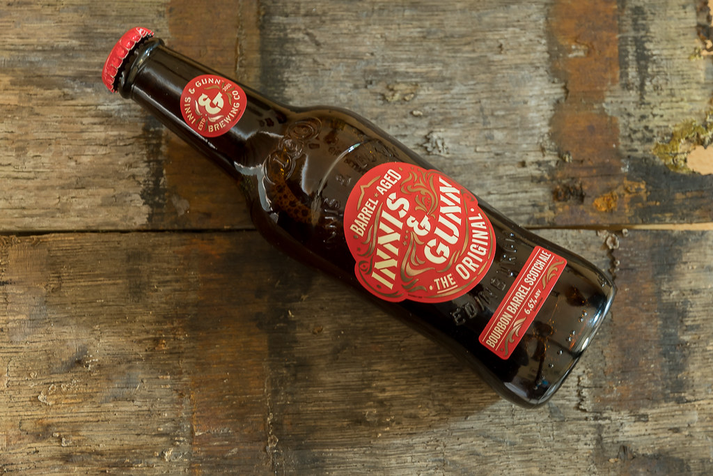
Aged...
 Aged (1 of 1) by Mark P, on Flickr
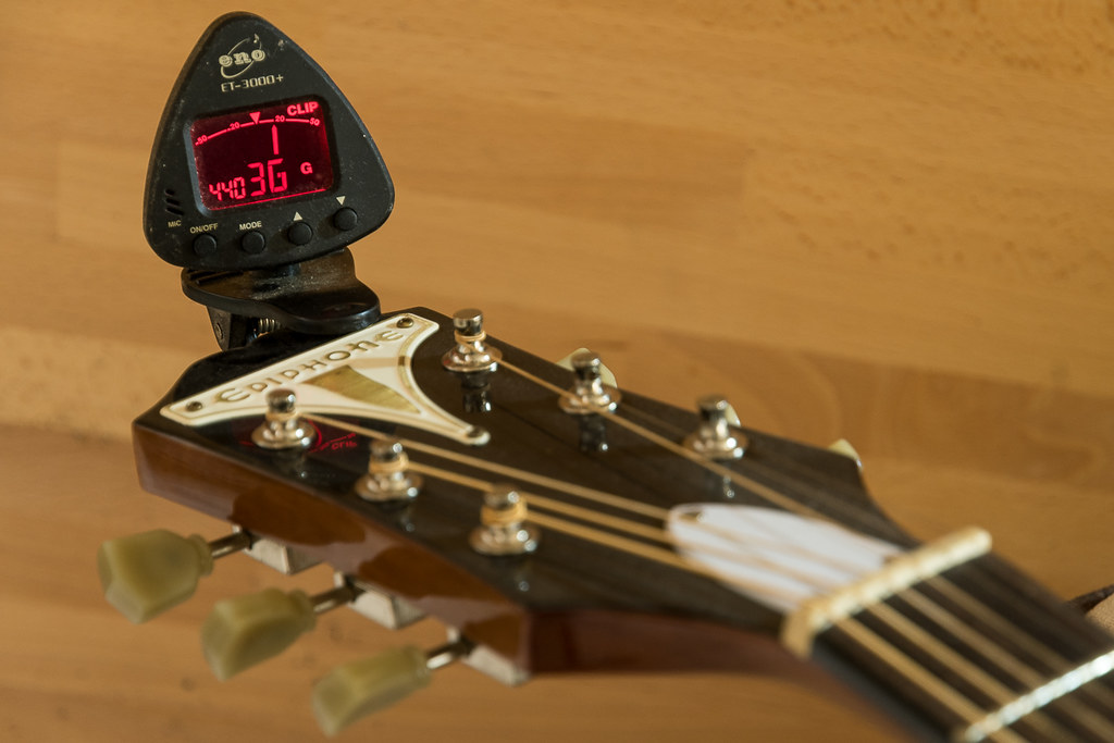
Sharp...
 Sharp (1 of 1) by Mark P, on Flickr
Guard...
 Guard (1 of 1) by Mark P, on Flickr
Aged...
 Aged (1 of 1) by Mark P, on Flickr
Sharp...
 Sharp (1 of 1) by Mark P, on Flickr
Guard...
 Guard (1 of 1) by Mark P, on Flickr
- Messages
- 671
- Name
- Nigel
- Edit My Images
- Yes
Like your aged shot but would of moved the bottle further to the left can cropped out the bit on the right so you didn't have any gaps in the wood  .
.
guard - like that, night light and back drop.
guard - like that, night light and back drop.
- Messages
- 9,075
- Name
- David
- Edit My Images
- Yes
Hi Mark ... welcome back, pleased to see you're all caught up.
Aged I like, good & sharp on the writing, liking the rustic wood BG ... Hmmm a touch of vignette is a thing I might have been tempted to try ... just a thought.
Sharp ... not so keen on that one ... unexciting BG, lots of dirt/dust on the equipment.
That shotgun, seen it before and like it, depicting the underside BG works a treat .... seemingly county shooting gear.
Aged I like, good & sharp on the writing, liking the rustic wood BG
Sharp ... not so keen on that one ... unexciting BG, lots of dirt/dust on the equipment.
That shotgun, seen it before and like it, depicting the underside
- Messages
- 3,413
- Name
- Mark
- Edit My Images
- Yes
Not enough length in the timber to allow that, and the gaps are "rustic" innit....and taLike your aged shot but would of moved the bottle further to the left can cropped out the bit on the right so you didn't have any gaps in the wood.
guard - like that, night light and back drop.
Thanks LeeGuard - good shot and some lovely lighting and detail.
Hi Mark ... welcome back, pleased to see you're all caught up.
Aged I like, good & sharp on the writing, liking the rustic wood BG... Hmmm a touch of vignette is a thing I might have been tempted to try ... just a thought.
Sharp ... not so keen on that one ... unexciting BG, lots of dirt/dust on the equipment.
That shotgun, seen it before and like it, depicting the undersideBG works a treat .... seemingly county shooting gear.
Thanks for the comments Dood, vignette is a good idea, wished Id thought of that!
Sharp is a tricky one, as the dust doesnt really notice to the eye, and I wanted to keep the background clean to show off the tuner..
Love the details in my lowly Beretta, just a shame I cant afford a "really" nice one....
Thanks ChrisGood catch up, lovely details in the shot gun photo.
Thank you Jon, I actually thought the Sharp shot was the best idea of the bunch, just maybe not as well excecuted as Id hoped for...Three shots that all show their subjects well, particularly like the use of DOF in Sharp to make the tuning gizmo stand out.
- Messages
- 4,338
- Name
- Martin
- Edit My Images
- Yes
I love the gun shot. The reason being that although the gun is not old I can imagine it is because the button and the colour of the jacket behind reminds me of an old Confederate uniform from US.
- Messages
- 13,760
- Edit My Images
- Yes
Blimey... I am miles behind on your posts !!
Aged - Nice idea, good angle and I am liking the rustic background, I bet that prop didn't last long after the shoot
Sharp - Ahhhh another techno-wiz idea, good thinking out of the box again and nice 'sharp' focus on the LCD display
Guard - Ooooo more weapons, I like the metalwork on these and glad to see it has not had tooooo much use, I guess you can only rob so many banks a year
- Messages
- 4,640
- Name
- Pete
- Edit My Images
- Yes
Mark
Love the detail on the metal work and trigger guard.
Nice background in the aged image.
Sharp is not doing it for me, I feel all the strings should be sharp, not just the tuning thingy which does not look sharp to me as it is dirty.
Pete
Love the detail on the metal work and trigger guard.
Nice background in the aged image.
Sharp is not doing it for me, I feel all the strings should be sharp, not just the tuning thingy which does not look sharp to me as it is dirty.
Pete
- Messages
- 1,566
- Edit My Images
- Yes
Great bit of catching up - all on theme for me
The Aged one - that beer sounds bloody lovely. Is it local to you Mark?
Sharp - i'm gonna guess that's a 'sharp' chord although I know nothing about music. Spot on though
Guard - love this. Great engraving detail
The Aged one - that beer sounds bloody lovely. Is it local to you Mark?
Sharp - i'm gonna guess that's a 'sharp' chord although I know nothing about music. Spot on though
Guard - love this. Great engraving detail
- Messages
- 4,562
- Name
- Mark Gameson
- Edit My Images
- Yes
Aged - Nice take on the theme I like the composition the background works really well with the subject
Sharp - I like that the DoF is just about right for me focusing your eye on the digital tuner.
Guarded - Very nice lovely details in the the engraving
Sharp - I like that the DoF is just about right for me focusing your eye on the digital tuner.
Guarded - Very nice lovely details in the the engraving
- Messages
- 9,095
- Name
- Mandy
- Edit My Images
- Yes
Age(ing) - fits the theme, but I feel there is a better composition to be had.
Sharp - fits the theme, and works for me, and good use of DOF.
Guard(ed) - as Mark said a nice lovely image with nice engraving, well done on the catch up.
Sharp - fits the theme, and works for me, and good use of DOF.
Guard(ed) - as Mark said a nice lovely image with nice engraving, well done on the catch up.
LC2
Negan
- Messages
- 10,451
- Name
- Tim
- Edit My Images
- Yes
Hi Mark,
Aged - Liking Aged for the textures you've captured in the wood vs the glass. Not certain the positioning of the bottle in the frame is right, it feels a bit tight at the top perhaps?
Sharp - Not knowing what the gauge is supposed to be showing, I'm assuming it's indicating the note being played is slightly off, hence sharp. Interesting image.
Guard - I like the way the image fades from bright to almost black in the shadows, it emphasises the guard.


