
You are using an out of date browser. It may not display this or other websites correctly.
You should upgrade or use an alternative browser.
You should upgrade or use an alternative browser.
weekly Jon P's TP 52 in 2016 Challenge - Living World and Spiky Added
- Thread starter Jon.P.73
- Start date
- Messages
- 1,612
- Name
- Steve
- Edit My Images
- Yes
Sorry for the late catch up.
Abandoned - Three interesting shots and can see why you struggled to choose 1. I like the boat in the first one although would like it slightly more in frame. As others have said the sky really adds to the feeling of abandoned in the third.
Camouflage - good idea doing the black on black, I wonder what it would have looked like as a minimalist image with just the phone. Good shot as it is though.
Dangerous - I prefer the first image, particularly like the sign about the gate needing to be closed at all times.
OP
- Messages
- 984
- Name
- Jon
- Edit My Images
- Yes
I prefer the full building shot here Jon.
The whole place looks lethal! (I'm sure it's not).
On another note, I bet it'll look grand when it's done.
Danger - I like the second one more but can see why you chose the first for the theme
Danger - I like both but the first one is my favourite as it leaves you wanting to see more. Loving the fact that there is a sign saying keep the gate closed at all times but its open.
Hi Jon, nicely on theme and I think I prefer the first one (cloud is distracting in the second). Good low POV works well - looking forward to the next theme!
Danger(ous) - well I rather like that lots of dangers to be seen in that image, well done for getting a good interesting shot.
two for me says it all, nice take")
I really like the second dangerous image. Great juxtaposition between the white picket fence which to me says home, safe haven, aspirational and then the house behind it which looks dangerous and uninviting!
Sorry for the late catch up.
Abandoned - Three interesting shots and can see why you struggled to choose 1. I like the boat in the first one although would like it slightly more in frame. As others have said the sky really adds to the feeling of abandoned in the third.
Camouflage - good idea doing the black on black, I wonder what it would have looked like as a minimalist image with just the phone. Good shot as it is though.
Dangerous - I prefer the first image, particularly like the sign about the gate needing to be closed at all times.
Thank you all for taking the time to stop by, look and comment
- I really need to catch up with my comments, hopefully over the weekend !
OP
- Messages
- 984
- Name
- Jon
- Edit My Images
- Yes
And week 8 "Topical"
Took a lot of head scratching and failed interpretations of what I wanted to portray
This came to me and hopefully it captures the theme !
 Week # 8 - Subject "Topical" by Jon Parry, on Flickr
Took a lot of head scratching and failed interpretations of what I wanted to portray
This came to me and hopefully it captures the theme !
Week # 8 - Subject "Topical" by Jon Parry, on Flickr
Last edited:
D
Deleted member 78683
Guest
Spot on theme with the EU flag Jon - works well. Nice thinking
- Messages
- 9,061
- Name
- Mandy
- Edit My Images
- Yes
Topical - nice take on the theme, my only crit is I'd like the coins to be in a neater circle.
OP
- Messages
- 984
- Name
- Jon
- Edit My Images
- Yes
Spot on theme with the EU flag Jon - works well. Nice thinking
Thank you Carl
I would have preferred if the coins would more on a circle than on an irregular octagon, but that's just my OCD. I like the idea, and the blue background works very well.
Cheers - yes Im guilty (again) of being too eager to get the shot and not look / compose it better - must remember - thank you !
Topical - nice take on the theme, my only crit is I'd like the coins to be in a neater circle.
Thank you and yep, you're right
Hi Jon I'm a bit ocd. about the symmetry too
He he there's a theme here

Thanks Susie and yes I thought they were "OK", but they're not are they !
")
The background is an ipad mini case which has given me the problem with the crop as its so small and even with content aware fill in PS didn't look great
Taking the above on-board I have just had a few re-shoots (not serious replacements, just a play) with the coins set (hopefully) more circular and aligned - the case was too small for a looser crop so had a hunt about and used one of the kids' school bags


I prefer the colouring on the first but not happy with the uneven lighting across the coins

Thanks again all


- Messages
- 1,557
- Name
- Lee
- Edit My Images
- Yes
And week 8 "Topical"
Took a lot of head scratching and failed interpretations of what I wanted to portray
This came to me and hopefully it captures the theme !
Liking this image for topical. Good lighting and sharpness
- Messages
- 13,393
- Edit My Images
- Yes
Nice one Jon
My OCD kicked in big time at the first image, coins not twisted straight and not in a circle either, so glad to see the edit, a nice idea this, and a good choice of background, like it
My OCD kicked in big time at the first image, coins not twisted straight and not in a circle either, so glad to see the edit, a nice idea this, and a good choice of background, like it
- Messages
- 4,155
- Name
- Paul
- Edit My Images
- Yes
Hi Jon, good first image - I like it. The texture of the background (and colour) works well and the lighting is solid bringing out the textures/surfaces and giving a nice shadow next to each coin. I don't mind the arrangement quite so much but perhaps that's because I can be a bit slapdash at the best of times!
Good shot - the second and third aren't quite as strong for me (third lighting is too harsh) as the texture to the backgrounds isn't as interesting for me.
Good shot - the second and third aren't quite as strong for me (third lighting is too harsh) as the texture to the backgrounds isn't as interesting for me.
OP
- Messages
- 984
- Name
- Jon
- Edit My Images
- Yes
Liking this image for topical. Good lighting and sharpness
Nice one Jon
My OCD kicked in big time at the first image, coins not twisted straight and not in a circle either, so glad to see the edit, a nice idea this, and a good choice of background, like it
Hi Jon, good first image - I like it. The texture of the background (and colour) works well and the lighting is solid bringing out the textures/surfaces and giving a nice shadow next to each coin. I don't mind the arrangement quite so much but perhaps that's because I can be a bit slapdash at the best of times!
Good shot - the second and third aren't quite as strong for me (third lighting is too harsh) as the texture to the backgrounds isn't as interesting for me.
Thanks all for taking the time to pop in, look and comment - much appreciate it and so glad I signed up - been a great experience so far on many levels, seeing others work and receiving crit on my own - really enjoying it !
- Messages
- 5,382
- Name
- Andrea
- Edit My Images
- Yes
Hi Jon, a quick catch-up from me as I haven't visited your thread since week 0. I'm still catching up with my themes but thanks for dropping into my thread and I'll try to keep up to date with yours in future!
Metal - I liked the rusty textures in the black railing/pole among your first set and the rusty nut of the second set, but agree that the watch is the right final choice. It's simple yet very effective, and the clear reflection and off-centre placement work well. Could be a catalogue shot!
Captive - I like your thinking behind the traffic shot and it would have been a good take on the theme, but your final choice is a cracker. So much to look at and your eye naturally travels through the scene to the lady in the corner of the window. Well seen, and B&W is a good choice
Miniature - great minds think alike I hadn't seen any other tilt and shift images for this theme when I posted mine, honest! I think the effect works really well with this scene, and the people especially add to the sense of scale. Love the path winding through the scene too, and the atmospheric mist is an added bonus.
Happy - all three images convey the theme of a very contented cat, but that last one is a cracker with her sprawled out so flat in that way that happy cats do. I've since noticed that you say you don't want that to be your entry as it's an old shot, so of the two taken specially for the theme I prefer the second, with the great eye contact
Abandoned - three strong images again, and I do like the rusty old boat, but the stand out one is the abandoned building. I like your dark processing, especially the moody sky that adds balance to the scene.
Camouflage - a good idea and the lighting is particularly effective in picking out the edges of the camera and phone.
Danger - two detailed images, and I agree that the closer shot of the warning signs and open gate is the most effective.
Topical - a very topical subject, and a good idea with the coins and the background colour I find arranging and lighting of indoor scenes a struggle so I sympathise with your frustrations over lighting and having a big enough background. I suppose if you could have the background of the first with the slightly neater circles of the latter two it would be perfect, but I think you've done a good job on all three and they definitely all meet the theme.
I'm glad I've finally caught up with you and will be following in future so should keep up to date
Metal - I liked the rusty textures in the black railing/pole among your first set and the rusty nut of the second set, but agree that the watch is the right final choice. It's simple yet very effective, and the clear reflection and off-centre placement work well. Could be a catalogue shot!
Captive - I like your thinking behind the traffic shot and it would have been a good take on the theme, but your final choice is a cracker. So much to look at and your eye naturally travels through the scene to the lady in the corner of the window. Well seen, and B&W is a good choice
Miniature - great minds think alike
I hadn't seen any other tilt and shift images for this theme when I posted mine, honest! I think the effect works really well with this scene, and the people especially add to the sense of scale. Love the path winding through the scene too, and the atmospheric mist is an added bonus.Happy - all three images convey the theme of a very contented cat, but that last one is a cracker with her sprawled out so flat in that way that happy cats do. I've since noticed that you say you don't want that to be your entry as it's an old shot, so of the two taken specially for the theme I prefer the second, with the great eye contact
Abandoned - three strong images again, and I do like the rusty old boat, but the stand out one is the abandoned building. I like your dark processing, especially the moody sky that adds balance to the scene.
Camouflage - a good idea and the lighting is particularly effective in picking out the edges of the camera and phone.
Danger - two detailed images, and I agree that the closer shot of the warning signs and open gate is the most effective.
Topical - a very topical subject, and a good idea with the coins and the background colour
I find arranging and lighting of indoor scenes a struggle so I sympathise with your frustrations over lighting and having a big enough background. I suppose if you could have the background of the first with the slightly neater circles of the latter two it would be perfect, but I think you've done a good job on all three and they definitely all meet the theme.I'm glad I've finally caught up with you and will be following in future so should keep up to date
- Messages
- 677
- Name
- Sheylara
- Edit My Images
- Yes
Hello Jon, a big catch up on commenting here!
Old - I like the ancient feel of the photo with the misty background. Very fitting! The edit makes a lot of difference and I like the result very much!
Metal - I like the pocket watch. Sharp picture and the reflection makes it quite striking. Nice history too!
And I really like that shot titled Fence. Nice composition, and beautiful dof with the barbed wire in standing out in the background even though it’s out of focus!
Captive - Loving the traffic one. It’s a really nice angle and I like the colours.
Miniature - I like it! The colours are gorgeous and the oof areas are dreamy. The buildings are cute and beautiful at the same time.
Happy - Cute cat! I like the reshoot better because the cat’s more dominant in the picture, although the first picture is better because you can see more of the fireplace, which works more for the theme. “Snoozing in the sun” is superb. I really like the fall of sunlight in the dark space. That would be my pick!
Abandoned - 3 good images. My favourite is the 2nd one. I don’t often see dof in shots like these so I really like it. Makes the ship stand out. And I just love the colours and rust on the ship.
Camouflage - That’s a unique idea, having three different objects being camouflaged together. I think it works well. I like how the viewer gets to figure out what each object is by the white outlines.
Dangerous - I think I marginally prefer the 2nd picture to the first because I always like the look of buildings against a blue sky. But 1st picture has more of a dangerous look.
Topical - I prefer the first one because I think it’s sharper and the colour tones work better for me. Nice idea for the theme!
Old - I like the ancient feel of the photo with the misty background. Very fitting! The edit makes a lot of difference and I like the result very much!
Metal - I like the pocket watch. Sharp picture and the reflection makes it quite striking. Nice history too!
And I really like that shot titled Fence. Nice composition, and beautiful dof with the barbed wire in standing out in the background even though it’s out of focus!
Captive - Loving the traffic one. It’s a really nice angle and I like the colours.
Miniature - I like it! The colours are gorgeous and the oof areas are dreamy. The buildings are cute and beautiful at the same time.
Happy - Cute cat! I like the reshoot better because the cat’s more dominant in the picture, although the first picture is better because you can see more of the fireplace, which works more for the theme. “Snoozing in the sun” is superb. I really like the fall of sunlight in the dark space. That would be my pick!
Abandoned - 3 good images. My favourite is the 2nd one. I don’t often see dof in shots like these so I really like it. Makes the ship stand out. And I just love the colours and rust on the ship.
Camouflage - That’s a unique idea, having three different objects being camouflaged together. I think it works well. I like how the viewer gets to figure out what each object is by the white outlines.
Dangerous - I think I marginally prefer the 2nd picture to the first because I always like the look of buildings against a blue sky.
But 1st picture has more of a dangerous look.Topical - I prefer the first one because I think it’s sharper and the colour tones work better for me. Nice idea for the theme!
OP
- Messages
- 984
- Name
- Jon
- Edit My Images
- Yes
The b/g in the first def works best imo, but i agree the coins work better in your reshoots, great idea though
Thank you
Hi Jon, a quick catch-up from me as I haven't visited your thread since week 0. I'm still catching up with my themes but thanks for dropping into my thread and I'll try to keep up to date with yours in future!
Metal - I liked the rusty textures in the black railing/pole among your first set and the rusty nut of the second set, but agree that the watch is the right final choice. It's simple yet very effective, and the clear reflection and off-centre placement work well. Could be a catalogue shot!
Captive - I like your thinking behind the traffic shot and it would have been a good take on the theme, but your final choice is a cracker. So much to look at and your eye naturally travels through the scene to the lady in the corner of the window. Well seen, and B&W is a good choice
Miniature - great minds think alike
Happy - all three images convey the theme of a very contented cat, but that last one is a cracker with her sprawled out so flat in that way that happy cats do. I've since noticed that you say you don't want that to be your entry as it's an old shot, so of the two taken specially for the theme I prefer the second, with the great eye contact
Abandoned - three strong images again, and I do like the rusty old boat, but the stand out one is the abandoned building. I like your dark processing, especially the moody sky that adds balance to the scene.
Camouflage - a good idea and the lighting is particularly effective in picking out the edges of the camera and phone.
Danger - two detailed images, and I agree that the closer shot of the warning signs and open gate is the most effective.
Topical - a very topical subject, and a good idea with the coins and the background colour
I'm glad I've finally caught up with you and will be following in future so should keep up to date
Wow, thank you for taking the time to go back and comment on them all - and your very detailed and kind feedback - very much appreciated
I like your idea of the coins for topical and if I had to choose I would go with the first one, I prefer the background and the overall look of the image, I can live with the uneven circle
Thank you
Topical. I like your thinking there Jon.
(Tip for getting things circular....put a glass on the BG, place the coins around it at equal spacing then lift the glass....voila!)
Thanks and realised on the re-shoot there was an easier and more accurate way than "by eye"!
Hello Jon, a big catch up on commenting here!
Old - I like the ancient feel of the photo with the misty background. Very fitting! The edit makes a lot of difference and I like the result very much!
Metal - I like the pocket watch. Sharp picture and the reflection makes it quite striking. Nice history too!
And I really like that shot titled Fence. Nice composition, and beautiful dof with the barbed wire in standing out in the background even though it’s out of focus!
Captive - Loving the traffic one. It’s a really nice angle and I like the colours.
Miniature - I like it! The colours are gorgeous and the oof areas are dreamy. The buildings are cute and beautiful at the same time.
Happy - Cute cat! I like the reshoot better because the cat’s more dominant in the picture, although the first picture is better because you can see more of the fireplace, which works more for the theme. “Snoozing in the sun” is superb. I really like the fall of sunlight in the dark space. That would be my pick!
Abandoned - 3 good images. My favourite is the 2nd one. I don’t often see dof in shots like these so I really like it. Makes the ship stand out. And I just love the colours and rust on the ship.
Camouflage - That’s a unique idea, having three different objects being camouflaged together. I think it works well. I like how the viewer gets to figure out what each object is by the white outlines.
Dangerous - I think I marginally prefer the 2nd picture to the first because I always like the look of buildings against a blue sky.
Topical - I prefer the first one because I think it’s sharper and the colour tones work better for me. Nice idea for the theme!
Wow, thank you also for taking the time to fully go back and comment on them all - very kind crit also
Thank you all so much
OP
- Messages
- 984
- Name
- Jon
- Edit My Images
- Yes
Week 9 - Living World
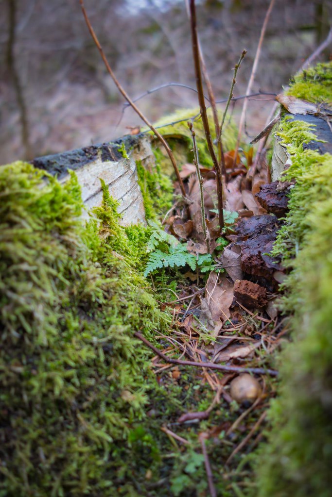 Week # 9 - Subject "The Living World" by Jon Parry, on Flickr
Came across this schopped down tree stump with moss, fungi and what looks like bracken growing in it
Week # 9 - Subject "The Living World" by Jon Parry, on FlickrCame across this schopped down tree stump with moss, fungi and what looks like bracken growing in it
Last edited:
OP
- Messages
- 984
- Name
- Jon
- Edit My Images
- Yes
and
Week 10 Spiky
 Week # 10 - Subject "Spiky" by Jon Parry, on Flickr
My youngest daughters school project was making and writing about an animal of her choice - handilly she chose Hedgehogs - meet Spine and Hedge
Week 10 Spiky
Week # 10 - Subject "Spiky" by Jon Parry, on FlickrMy youngest daughters school project was making and writing about an animal of her choice - handilly she chose Hedgehogs - meet Spine and Hedge
Last edited:
OP
- Messages
- 984
- Name
- Jon
- Edit My Images
- Yes
Thank you Tim - I took so many for Living world and just didn't end up liking them. The submission was something I came across, by chance, on a bike ride earlier today
He, he - I'm really impressed with the models (she's only 6) and shoehorning the mini cactus is was a bonus. Yep the vignette is deliberate as the plain BG was a little flat and lifeless without and thought it suited the rest of the PP
Thanks for taking the time to comment
He, he - I'm really impressed with the models (she's only 6) and shoehorning the mini cactus is was a bonus. Yep the vignette is deliberate as the plain BG was a little flat and lifeless without and thought it suited the rest of the PP
Thanks for taking the time to comment
D
Deleted member 78683
Guest
Hi Jon. Two excellent and very different shots. What an extraordinary variety of vegetation "living" off a dead tree trunk - nature is amazing. Nicely captured - love the vibrancy. With Spiky, I like the contrast between natural and artificial subjects -  the artist for her beautiful take on hedgehogs.
the artist for her beautiful take on hedgehogs.- Messages
- 13,393
- Edit My Images
- Yes
Hi Jon
Living world... erm sorry this just doesn't work for me, too haphazard bits poking up and lack of a main focal point/interest too
Spikey - Now they are great, a lot going on here, really like the hedgehog things and feel they do the theme perfectly well on their own, love the two different shades of spines
- Messages
- 4,155
- Name
- Paul
- Edit My Images
- Yes
Hi Jon - a couple of good shots there. A classic shallow DOF trough/gutter/pipe shot which really works. Good focus and only thought is the heavily OOF moss at the BR is slightly overpowering - I'd make look to crop slightly or even change the angle of shooting to make that less in there? Really good composition otherwise though - works a treat.
Spiky is brilliant and made me smile. Lovely POV and I like that the hedgehogs have spikes which match each of the pot and the cactus, helping bring it all together for me. Lighting works well enough but a cleverly chosen POV to avoid it being the centre of attention in any way... really well done!
Spiky is brilliant and made me smile. Lovely POV and I like that the hedgehogs have spikes which match each of the pot and the cactus, helping bring it all together for me. Lighting works well enough but a cleverly chosen POV to avoid it being the centre of attention in any way... really well done!
OP
- Messages
- 984
- Name
- Jon
- Edit My Images
- Yes
Hi Jon. Two excellent and very different shots. What an extraordinary variety of vegetation "living" off a dead tree trunk - nature is amazing. Nicely captured - love the vibrancy. With Spiky, I like the contrast between natural and artificial subjects -
Thank you and im sure she will be over the moon
Living World - Interesting shot illustrating how nature makes use of anything available.
Spiky - It certainly fits the theme and a good plug for 'save the hedgehog'
Thank you - Yes, it's partially what drew me too it after taking numerous shots of plant life, pondlife, fungi etc then this stump with loads going on in such a small space and thought "aha! that's the one" :
Hi Jon
Living world... erm sorry this just doesn't work for me, too haphazard bits poking up and lack of a main focal point/interest too
Spikey - Now they are great, a lot going on here, really like the hedgehog things and feel they do the theme perfectly well on their own, love the two different shades of spines
Thanks mate - no problem with the Living World - can't please everyone all the time and I'm happy with the odd one some of the time
- fully understand where you're coming from but as above it just came to me as a lot of life on something "dead" and I snapped (camera wise, not personally ) Thanks for the comment on the Hedgehogs, I tried various angles and by themselves, individually, close ups and just really liked this one - cheers for taking the time to comment
Hi Jon - a couple of good shots there. A classic shallow DOF trough/gutter/pipe shot which really works. Good focus and only thought is the heavily OOF moss at the BR is slightly overpowering - I'd make look to crop slightly or even change the angle of shooting to make that less in there? Really good composition otherwise though - works a treat.
Spiky is brilliant and made me smile. Lovely POV and I like that the hedgehogs have spikes which match each of the pot and the cactus, helping bring it all together for me. Lighting works well enough but a cleverly chosen POV to avoid it being the centre of attention in any way... really well done!
Thank you very much - The OOF moss may be partially me messing about in PP (OK it is me
) and may try a slightly different crop - cheers Spiky - glad you like it - hadn't noticed the similarity of the colouring until you pointed it out - well spotted : D ! Its been great as we had fun when she was making them, i like it as a fun image and she loves the photo so been a win win win process
Thanks all again for your comments
- Messages
- 7,412
- Name
- susie
- Edit My Images
- Yes
Hi Jon ....I like your choice for Living World, it's fascinating what manages to grow isn't it, I think it would take a slight crop just to give the fern and all that's growing more prominence.
Well done to your daughter for providing you with those super Spiky props ...I think they would work well as stand alone images ...you could take a few shots in the garden and make her a poster
Well done to your daughter for providing you with those super Spiky props ...I think they would work well as stand alone images ...you could take a few shots in the garden and make her a poster
- Messages
- 677
- Name
- Sheylara
- Edit My Images
- Yes
Living World - Nice job getting intimate with a load of weeds/moss and rubbish. The angle is really nice and the dof makes it pleasing to look at.
Spiky - Nice coincidence with your daughter's project, eh? It's a lovely photo with complementing earthy colours. Not too sure about the cactus for the theme, though. Compared to the hedgehogs, it looks like a ball of wool. 
The angle is really nice and the dof makes it pleasing to look at. Spiky - Nice coincidence with your daughter's project, eh?
It's a lovely photo with complementing earthy colours. Not too sure about the cactus for the theme, though. Compared to the hedgehogs, it looks like a ball of wool. - Messages
- 5,382
- Name
- Andrea
- Edit My Images
- Yes
Hi Jon, I like the variety of colours and textures on that old log. As you say, it's amazing how Nature is everywhere and vegetation can grow almost anywhere. Nice shallow DOF, too.
Spiky is a great take on the theme with three self-explanatory items, and the hedgehogs are particularly effective. Well done to your daughter and I'm sure she will love this photo in years to come! Nicely lit and exposed too, and the slight vignette works well on that plain background.
Spiky is a great take on the theme with three self-explanatory items, and the hedgehogs are particularly effective. Well done to your daughter and I'm sure she will love this photo in years to come! Nicely lit and exposed too, and the slight vignette works well on that plain background.
- Messages
- 1,557
- Name
- Lee
- Edit My Images
- Yes
Liking your Spiky image Jon, nicely framed.
- Messages
- 4,523
- Name
- Mark Gameson
- Edit My Images
- Yes
Spiky - Nice take on the theme I like the lighting