weekly KathG's 52 for 2017

The first pic works and the lighting is good can't really offer any crit on how to set up what you have as i don't have that much lighting just 2 speedlights,
the chair and the BG are both a little distracting to me
its a lovely pic of your granddaughter what more can you ask for (y)
 
MIneral - I agree, the black background works better.
Good sharp image and appears grounded.
Only suggestion would be a little more headroom, so that it has the same amount as the bottom, it feels a little tightly cropped.

Whole - I prefer #1 too, the lighting feels softer. I don't think I could cope with so many speedlights, it's bad enough with just the one!
 
That was my initial idea too and like you didn't have a globe ... even worse, not an atlas either. Well done. I envy you all the paraphernalia - I only have one speedlite and a softbox to play with but enough for me ... for now anyway. Compositionally, I prefer the first as it shows engagement with the atlas rather than with the camera. I think you could probably afford to tone down the lighting a touch to reveal more detail in the atlas itself. Regardless of all that, they're lovely portraits of your beautiful grandchildren and spot on theme.

Carl, thank you. The lights I have are only from Amazon, one of those set with stands and backgrounds. Have not been able to use the backgrounds as the creases are just about impossible to remove :)
I agree with toning down the lighting, I need to get rid of some furniture so I can set things up properly....LOL though as I live with my Son not sure he would be happy with that .

Love the idea for the theme Kath, they look like a lovely kids, grandchildren bring a lot of pleasure don't they. The first one definitely works better as a composition and for the lighting, I like that a lot. I often take photos of mine when they're just engaged in everyday things, I think they work better than ones that are too posed. I can't advise on lighting as I don't have any apart from daylight and ordinary desk lamps.

Thank you Susie. Would not be without my Granddaugter she can make me smile when no one else can . The young man is her boyfriend. Yes my favourite shots are those you capture when they are not aware.


The first pic works and the lighting is good can't really offer any crit on how to set up what you have as i don't have that much lighting just 2 speedlights,
the chair and the BG are both a little distracting to me
its a lovely pic of your granddaughter what more can you ask for (y)

Thank you Allan, I agree about the chair and the background. Thinking now it would have been better for her to have been sat on a rug maybe?

Cheers
Kath
 
The pose in the first photo looks more natural and relaxed. About the technique, everything has already been mentioned: aperture wide open and dimming the light down...
 
#2 for me. I was about to say for #1 I'd like some interaction, and there it is in #2 :)

They do, indeed, have the whole world in their hands.

Cheers.
 
Thanks everyone I truly appreciate your comments. Really glad I decided to join the challenge this year. Not sure why I have resisted for so long....it's not that scary.....LOL...:ty:
 
What a beautiful pair of models you have on hand and well done for getting your head around so much lighting equipment - I've just got my first speedlight, but nothing else to go with it yet. remote trigger next I think! I think maybe turning the chair around so your granddaughter's back was against it in the first shot would have made it less of a distraction.
 
Both work not sure which one to choose, maybe the second one for the clean uncluttered right hand side it shows the contrast of what's hapening well
 
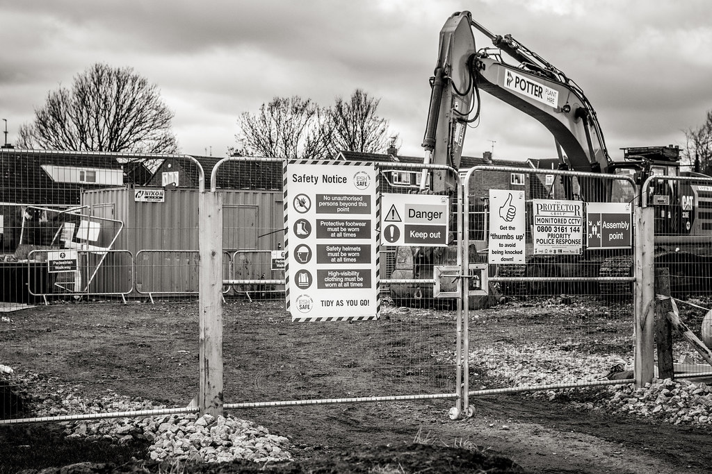
I prefer the second one, the composition is in my opinion better, with the fence separating the mess from the building site from the path. Also, the first shot feels a bit busy to me.
 
The first for me. Lighting looks better, the image sharper and a lot more detail to occupy the viewer.
 
Second one for me, I like the slightly oof stuff behind the fence and the angle of it. The first is a little busy with too much to look at. (y)
 
Week 08 Routine

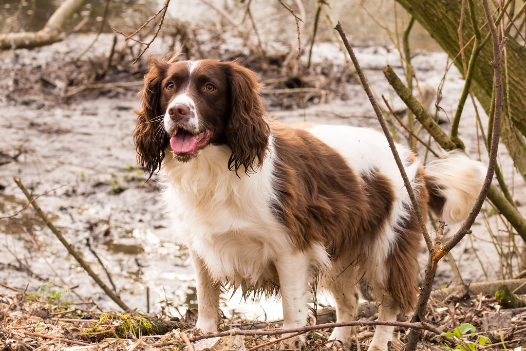
My Morning routine walking my pair of Springers.

Sorry late this week, I have been full of cold all week so have got behind. These two photos where taken a couple of weeks back so I hope they are ok.

untitled shoot-5108.jpg by Kath Garvey, on Flickr

untitled shoot-5092.jpg by Kath Garvey, on Flickr


PS....Thank you everyone for your commenting on my last theme. Your commets and CC are very welcome and appreciated.
 
Epic shots of your springers Kath, i love the expression in the first, but i would have preferred the space above the head as in the second..."a wet dog is a dog having fun" ..?

although some might see the nose not in focus, and so too the eyes, its still the image as a whole i enjoy.. (y)
 
Samuel, thank you. Yes when I look now I did crop a little to much off from the top. Also I agree the focus is not spot on, to be honest though catching them still enough to take photos of is a challenge in itself......LOL...:)
 
They both look very alert, as said above a bit close cropped in the first but he/she has obviously had a great time
 
I really like the first shop, really captures a little character, great shot.
 
beautiful springers ... loving #1 especially ... full of life.(y)
 
Thank you everyone for your kind comments about my girls.
Also sorry I have got behind again with last weeks theme. Sometime family life takes over . Hopefully I will catch up this week.
 
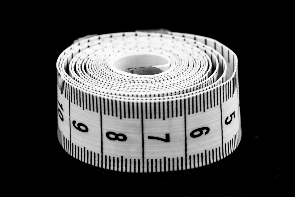
The first one works really well for me. The issue I had with the second was the focus, it appears to have focused on maybe just in front of the metal tab, this combined with the shallow DOF has resulted in 6,7 & 8 being a little soft. For me I would have preferred the 7 to be sharp.

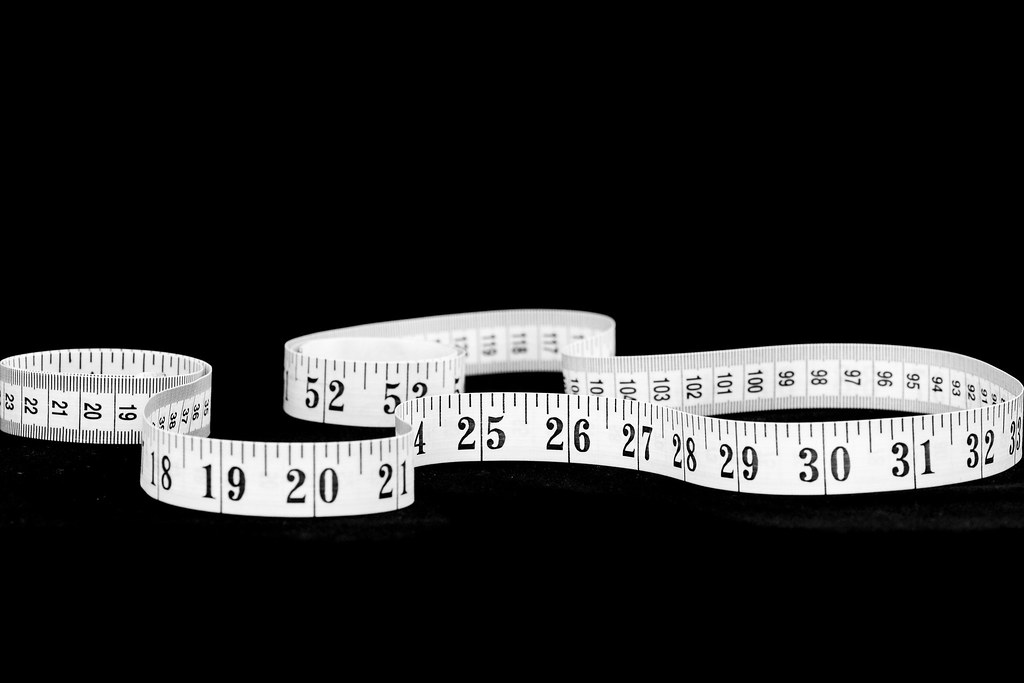
The first I like though, both composition and focus works well together with 25-26 being sharp (y)
 
Really like the first one, and congrats for thinking outside the box, as I dont thionk anyone else did anything like this.....
 
Back
Top