Wow... that is some catch up! I'll work through this in batches otherwise I'll be here all day...
")
Week 13- step: Good conversion in a style I like (high contrast). Nice freezing of the fountain. Only crit is the people who are walking are walking out of the frame. If it intended so as to create tension, then it's worked but I would find the scene more natural if the guy, in particular, was walking through the frame into some space on the right. Good capture though.
Week 14- Nature: Super catch of the horrible gull about to eat a poor little crab. I think your balance between land and water is interesting (being almost 50/50) - I might have been tempted to increase the amount of water a bit more. Placement is good although might feel more natural if the gull is further down in the frame? Exposure and saturation good for me.
Week 15- Action: That's a belter. You've really brought the colours to life in both the trails and the sky. Placement of the planes is a bit unconventional, with the cloud balancing the frame rather than bringing the planes further down so the trails represent the majority of the picture. It's a cracking take though and very well developed.
Week 16- Mono: Interesting scene with lots going on... almost too much as I'm not sure what I should be looking at! Definitely high intensity "street"... In full screen is looks quite grainy - not sure if that's the effect or a consequence of high ISO?
Week 17- Twisted: Really nice take. I find it really well balanced with the obvious weight of the wheel pulling the image down and the strength of the supporting members holding it back up. Nice cloud detail behind. Top notch shot for me, but... why is it twisted, other than the supports don't go perfectly to the corners?
Week 18- Fresh: Another busy street shot but I find this one easier to find focus. Not sure the plastic wrap at the bottom of frame is helping. I'd probably like to see more of the food visible, but it's a neat take.
Week 19- Shape (I loved the shapes in the bridge): I agree with you, it's a fascinating shape, all the way back to the supports on the embankment. Nice conversion, although you could perhaps have pushed the highlights a bit higher? Only crit is it looks a touch wonky, perhaps a smidge of CCW rotation? Good shot and a great eye to spot it.

")
")


 Russel square fountain
 Seagull eating a crab- Edited
 Red arrows 1
 Street photography in covent garden
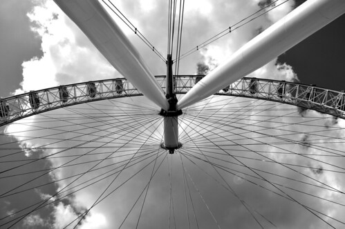 London eye
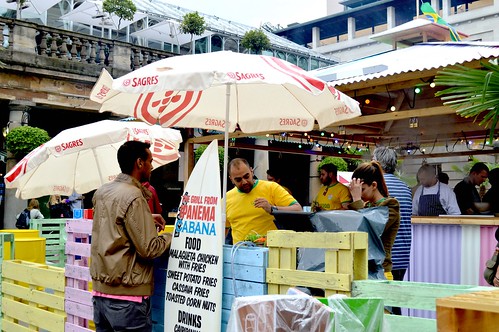 Street photography in covent garden
 Waterloo bridge
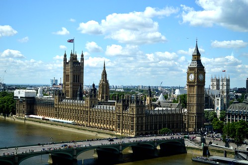 Houses of parliment from the london eye
 Looking stormy on sandbanks
 Rusty pole
 Stag at Arne
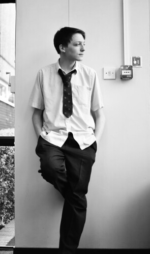 Scott portraits
 Neuville St-Vaast german cemetery
 Slow shutter chilli plant
 Street photography in covent garden
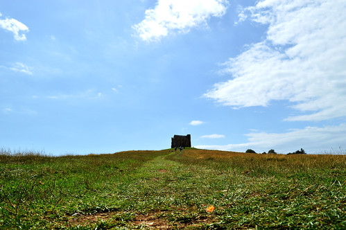 Edited castle on hill
 Archer from the tower of london
 Up shot of portland bill
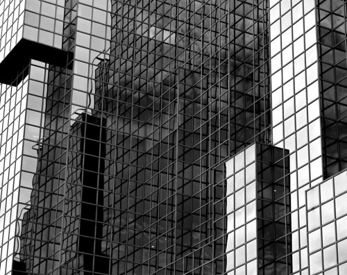 Square building B&W