You are using an out of date browser. It may not display this or other websites correctly.
You should upgrade or use an alternative browser.
You should upgrade or use an alternative browser.
Nostromo TP52 (2018) Week 51/2 : Party/Showcase
- Thread starter Nostromo
- Start date
- Messages
- 4,562
- Name
- Mark Gameson
- Edit My Images
- Yes
Juxtaposition nice take on the theme I quite like the layout you've used.
- Messages
- 4,637
- Name
- Pete
- Edit My Images
- Yes
Nice clean shot for Juxaposition, very simple idea that works well.
Pete
Pete
- Messages
- 199
- Name
- Walter
- Edit My Images
- Yes
Thick: i imagine the capture would be a hard shot to get right, but they look brillant with great
detail and colours. all good, would pick No 2 if i had to.
Abundance: Like No1 another good shot and nice textures.
Heavy: Very clever idea and well taken shot.
Wet: says photo no longer available!!
Juxtaposition: Again nice details.
Walter
detail and colours. all good, would pick No 2 if i had to.
Abundance: Like No1 another good shot and nice textures.
Heavy: Very clever idea and well taken shot.
Wet: says photo no longer available!!
Juxtaposition: Again nice details.
Walter
Last edited:
- Messages
- 5,919
- Name
- Dominic
- Edit My Images
- Yes
Wk 13- Oval
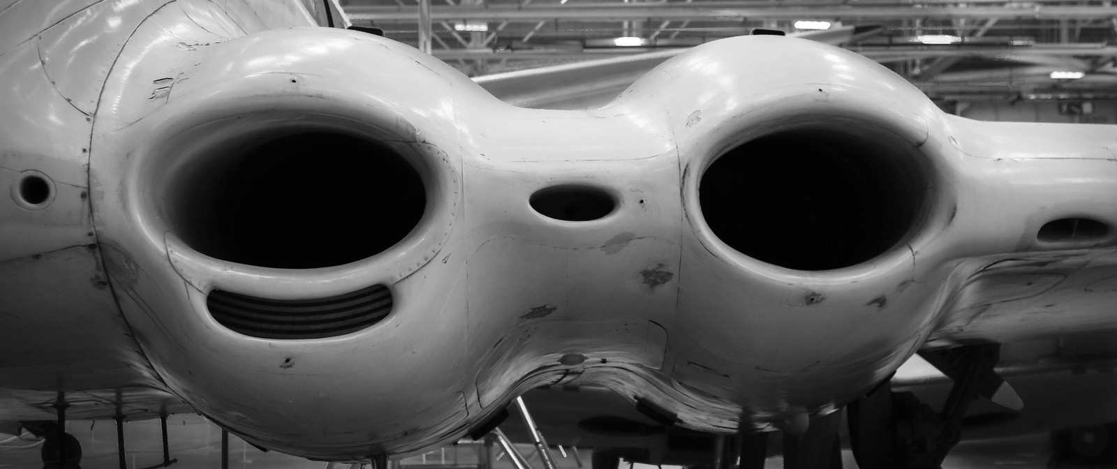
I took a trip to Cosford RAF museum on Friday and found a couple of items that fitted the theme for this week. I've gone with this one, i'm not sure what the plane was (i should have reads the information board).
 untitled-50.jpg by Dominic Rodgers, on Flickr
I took a trip to Cosford RAF museum on Friday and found a couple of items that fitted the theme for this week. I've gone with this one, i'm not sure what the plane was (i should have reads the information board).
 untitled-50.jpg by Dominic Rodgers, on Flickr
- Messages
- 4,562
- Name
- Mark Gameson
- Edit My Images
- Yes
Oval - Works well for the theme the mono conversion suits it
- Messages
- 199
- Name
- Walter
- Edit My Images
- Yes
Reminded me of ET, great shot and well captured.
Walter
Walter
- Messages
- 4,637
- Name
- Pete
- Edit My Images
- Yes
Looks like a Nimrod to me. Another fantastic old plane in use to fairly recently.
Cropped tight and good depth of focus, plenty of scuffy detail, works well in grey and white.
Pete
Cropped tight and good depth of focus, plenty of scuffy detail, works well in grey and white.
Pete
LC2
Negan
- Messages
- 10,447
- Name
- Tim
- Edit My Images
- Yes
As others have said, that's either a de Havilland Comet, or it's military counterpart, the Nimrod. The engine cowlings built into the wings are unmistakable.
Loving the way you've filled the frame like that, that really is a nice image B&W suits it.
@d00d, you unlikely to have seen any in use as they date from the 60's and the civilian versions had a habit of falling out of the sky. They did revolutionise air travel though.
Loving the way you've filled the frame like that, that really is a nice image
@d00d, you unlikely to have seen any in use as they date from the 60's and the civilian versions had a habit of falling out of the sky. They did revolutionise air travel though.
- Messages
- 616
- Name
- Ross
- Edit My Images
- Yes
Nice shot for Oval. Like the b+w conversion. Works well for the shot.
- Messages
- 5,919
- Name
- Dominic
- Edit My Images
- Yes
Wk 14- Straight
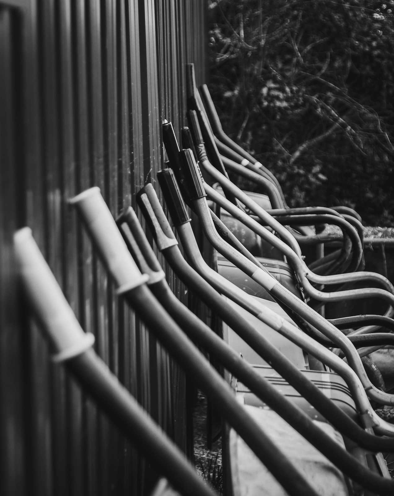
I'm quite happy with this, but i'm not 100% that it fits the theme, i'll let you all decide.
 untitled-1120.jpg by Dominic Rodgers, on Flickr
I'm quite happy with this, but i'm not 100% that it fits the theme, i'll let you all decide.
 untitled-1120.jpg by Dominic Rodgers, on Flickr
- Messages
- 4,637
- Name
- Pete
- Edit My Images
- Yes
Hi Dominic
It has straight lines in it, so fits the theme for me. Think the B&W works better than if it was in colour. I think the background vegitation is too obvious, a bit more blur might suit the Image better.
Pete
It has straight lines in it, so fits the theme for me. Think the B&W works better than if it was in colour. I think the background vegitation is too obvious, a bit more blur might suit the Image better.
Pete
- Messages
- 616
- Name
- Ross
- Edit My Images
- Yes
Fits the theme for me. Loads of straight bits in there. Nice one.
- Messages
- 9,095
- Name
- Mandy
- Edit My Images
- Yes
Oval - RAF Cosford what a great place to visit, i must go back again to visit after looking at my RAF Cosford book its the De Havilland Comet 1XB located in Hanger 1 XM823, its a great image for the theme those engines are massive so those ovals are pretty massive.
Straight - It does fit the theme just not sure that it is really working for me.
Straight - It does fit the theme just not sure that it is really working for me.
- Messages
- 1,075
- Name
- Georgina
- Edit My Images
- Yes
Hi Dom
Wet - Looks great on Flickr. Great contrast and reflection
Juxtaposition - Certainly a contrast and great detail
Oval - two for the price of one interesting overall shape and works well in B&W
Straight - another one that works well in B&W and they are definitely all lined up, well spotted
Wet - Looks great on Flickr. Great contrast and reflection
Juxtaposition - Certainly a contrast and great detail
Oval - two for the price of one
Straight - another one that works well in B&W and they are definitely all lined up, well spotted
- Messages
- 4,562
- Name
- Mark Gameson
- Edit My Images
- Yes
Straight - works for me plenty of interest with the different barrow lined up against the fence. THe B&W conversion works for me
- Messages
- 5,919
- Name
- Dominic
- Edit My Images
- Yes
Wk 15- unattractive
This is from a resent trip to Birmingham's custard quarter.
I have tried and tried again to get this flickr link to show, but it just won't.
 untitled-285 by Dominic Rodgers, on Flickr
This is from a resent trip to Birmingham's custard quarter.
I have tried and tried again to get this flickr link to show, but it just won't.
 untitled-285 by Dominic Rodgers, on Flickr
Last edited:
- Messages
- 5,919
- Name
- Dominic
- Edit My Images
- Yes
You're right, bright and colourful isn't really the way to go. As a photo it probably works (well in my opinionIt's well seen and does the job but as I have mentioned on some other threads I don't find these bright colourful photos very unattractive, probably just me, may be grungier processing?
- Messages
- 4,562
- Name
- Mark Gameson
- Edit My Images
- Yes
Good find for the theme Dominic works well I do agree maybe a grungier processing would make it more unattractive
I really want to get up to the custard factory and surrounding area as it's only just up the road
I really want to get up to the custard factory and surrounding area as it's only just up the road


 . Plenty of Ovals and really suits the mono, good photo.