weekly Reanimated 52 2014 - Massive update to darkness

Thanks all. Looks like I'm kicking off the year behind on comments already! I can only offer moving house and horrific work time as an excuse.

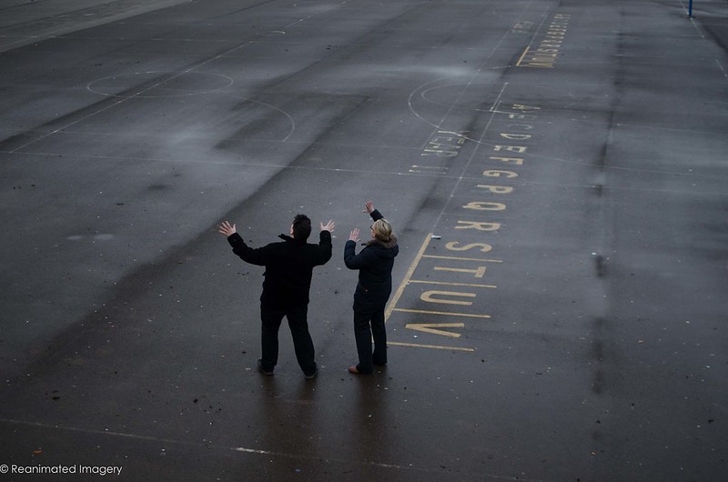
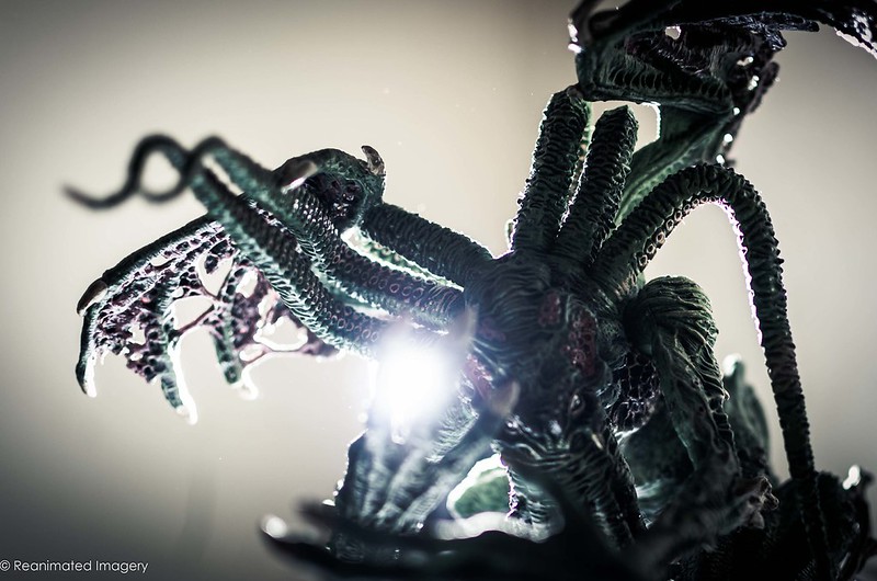
So, Play -one sketch to get the obvious idea out of my head:


Play
by ReanimatedImagery, on Flickr

Having got beyond that, the obvious response to Play presented itself:


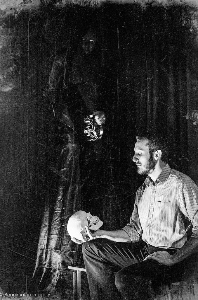
The Conscience of the King
by ReanimatedImagery, on Flickr

Will try and catch up on everyone's work at the weekend if packing permits.
 
#2 for me. Good idea for the theme but it's the pp you've given it which makes it stand out. Making it look old with scratches, etc. adds a reality and yet an unreality to it (not sure that makes sense when I write it but I know what I mean :rolleyes:).
 
#2 for me too please - the PP makes it look staged IYSWIM no crit here - nicely posed and styled.
 
2nd for me(y) , processing looks great , I would have no idea how to produce that :)
 
Following on where last year left off Tony. (y)
 
Hi Toni, great start to this years 52 (y)
You have a distinctive style about your photographs which is admirable.

The first play image, due to the subject matter, I'd like to have seen this in colour but apart from that (y)
 
I know your stuff is usually a little different but the second shot just blows me away.

Great processing as usual, I really like the way the lighting fades from the figure and skull through the crown and into the standing figures face, then pop for the eye.
 
Play 2. (y) Nice & clever.

Gerry
 
Play: PS composite is the winner....right up my street and very competently put together....There is nothing not to like about that....
Now just tell me all about how you did it..ha ha:) Good work and look forward to seeing more of this style
 
Play - great PP on the second photograph. The figure in the background is quite hidden in the darkness but all the more scarry for it.
 
Ppffttttt... Ya need to sort ya processing out ;)

#2. Just works. Cracking tonal range, the vintage look works well and what everyone else said... (y)

Cheers.
 
Hi Tony

#2 for me as well of your Play images......as I'm used to your imagination & execution is superb :clap: 
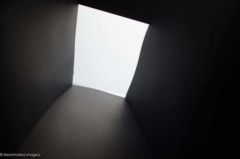
Have to say though the bright white spot which I presume is the ghostly figures eye's is just a touch bright ?
 
Jason asked how I did the shot before: I didn;t keep any set up shots from that one, but in case anyone was interested here's how this one was done.

First, I knew the basic concept: the idea of some massive beast too close for comfort. As per usual, I looked back to the horror tales of my misspent youth. So I shot the two people from a couple of different angles. As it turned out, the one from a window was best:


The Explorers
by ReanimatedImagery, on Flickr

Then I built my Sunken Temple:


Setup2
by ReanimatedImagery, on Flickr


Setup1
by ReanimatedImagery, on Flickr

No need for tricksy lighting, just built it with one end pointed towards the window and a bit of tracing paper to act as a diffuser and to make processing easier.

I then just shot into the model, matching the angles I got on the explorers:


The Interior
by ReanimatedImagery, on Flickr

I took a shot of a gribbly toy with some light coming from behind it:


The Beast
by ReanimatedImagery, on Flickr

And then it was just a matter of layering in photoshop. The card walls had an obsidian texture applied; the writing is a brush. The shadows are simply the people flipped round and stretched (a lot faster than painting them in on a flat surface). The last thing is a film grain texture to hep marry all the different elements together and a cold colour tone. The longest part of the process was building the damn card thing so it didn't fall over which took about 15 minutes. The editing took less than an hour and most of that was in figuring out which view of the model and which shot of the explorers worked best together.
 
Hi
Play - #1 looks a bit confused to me wiith no discernible point of interest. #2 is original idea and well handled. Good lighting and lots in the shot to hold interest. Top of the gowned figure just a bit dark i feel
Close - #1 - again simple idea but all looks a bit burred rather than some part being in focus. Line of tables and top right a bit messy. #2 has great impact and real depth to the shot. Your set up is really interesting and informative and good to see that someone else's models look precarious :). Again lots in the shot (shadows, scale, colour, writing, gritty feel) to maintain interest(y).
 
I like the closing case if only missing some steps of the lid closing inbetwen the fully open and closed.
 
Close:

Tony, Tony, Tony........I could learn alot from you......

Obviously number 2 for me :) Love everything about it.....The set up shots you've shown are so helpful and in the spirit of sharing. I would have loved to see the faces of any onlookers who saw your models on the explorer shoot :)

Really liking the writing on the wall and the peoples shadows. Just brilliant. If I had to crit one small thing then it would be perhaps consider using a simpler less cluttered Monster Model?

Good work mate and thanks again for sharing (y)
 
HI Tony

#1 for ...simply because I actually understand it ;) the mono works well & there's just enough ofan outline above the closed lid to show the action of it closing...if that makes any sort of sense ?

#2 I can't make out the monster so it's a bit lost on me I'm afraid ....:coat:
 
Close – #1 has too much movement between what I assume is two exposures. #2 though I really like. Great explanation and photos to how you created it as well. Super shot. It looks like it could come straight from the set of a movie
 
Cheers all. Nothing special from me this week, alas. In the process of moving house so no time for anything elaborate.


Mandlebrot Set
by ReanimatedImagery, on Flickr

Might fall behind with posting and even further behind with commenting as we move and will lose internet connection for a week. I'll try and keep up with the shots, though.
 
Lovely work Tony, the vivid colour is particularly appealing (y)
Could you share how you did this please?
 
Lovely work Tony, the vivid colour is particularly appealing (y)
Could you share how you did this please?
Pretty simple, Iain. A glass tumbler with a clear bottom - no text or anything. Some ripped up coloured tissue on the floor under the tumbler and some water in the tumbler with a couple of drops of fairy liquid in. The shot I've used was just from pouring the water in, but later I used some oil - you can see those weird-ass looking things on my Flickr.

The shot was taken with a 105mm macro lens open at 2.8 and lighting was a desk lamp - as you can see from the reflection. I also did a proof of concept shot at work using a 70-300mm Tamron on the macro setting and that worked just as well. I'll upload those when I get a chance.
 
Back
Top