
You are using an out of date browser. It may not display this or other websites correctly.
You should upgrade or use an alternative browser.
You should upgrade or use an alternative browser.
weekly Reanimated 52 2014 - Massive update to darkness
- Thread starter HWest
- Start date
blakester
Shine On Harvest Moon
- Messages
- 6,677
- Name
- Iain
- Edit My Images
- No
Pretty simple, Iain. A glass tumbler with a clear bottom - no text or anything. Some ripped up coloured tissue on the floor under the tumbler and some water in the tumbler with a couple of drops of fairy liquid in. The shot I've used was just from pouring the water in, but later I used some oil - you can see those weird-ass looking things on my Flickr.
The shot was taken with a 105mm macro lens open at 2.8 and lighting was a desk lamp - as you can see from the reflection. I also did a proof of concept shot at work using a 70-300mm Tamron on the macro setting and that worked just as well. I'll upload those when I get a chance.
Thanks Tony
")
Its as Jason mentioned above, the intensity/contrast of the bubbles which had me asking.
- Messages
- 6,502
- Name
- Peter
- Edit My Images
- Yes
Nice image. I like the positioning of the main bubble and the colours work nicely.
- Messages
- 8,398
- Name
- Lynne
- Edit My Images
- Yes
HI Tony
lovely bubble , simple but effective , great colors
only little niggle from me is the bright spot just above the bubble...& I wonder if it would be possible to clone out the lamp reflection in the bubble
lovely bubble , simple but effective , great colors
only little niggle from me is the bright spot just above the bubble...& I wonder if it would be possible to clone out the lamp reflection in the bubble
I'm back; house move has gone well and we now have fibre broadband which makes uploading pictures much quicker. So here comes the MASSIVE catchup.
First up, Smoke - only one for this as I was somewhat constrained for time.

Medium by ReanimatedImagery, on Flickr
Next, Mineral:
First, another one of my lamentable visual puns, for which I apologise.

Trio by ReanimatedImagery, on Flickr
Then, two variations on the same theme (and, indeed, using the same model).

Entombed by ReanimatedImagery, on Flickr

Gorgon by ReanimatedImagery, on Flickr
Ending was relatively simple - two versions.

The Sixth Sense by ReanimatedImagery, on Flickr

"It is my painful duty..." by ReanimatedImagery, on Flickr
First up, Smoke - only one for this as I was somewhat constrained for time.
Medium by ReanimatedImagery, on Flickr
Next, Mineral:
First, another one of my lamentable visual puns, for which I apologise.
Trio by ReanimatedImagery, on Flickr
Then, two variations on the same theme (and, indeed, using the same model).
Entombed by ReanimatedImagery, on Flickr
Gorgon by ReanimatedImagery, on Flickr
Ending was relatively simple - two versions.
The Sixth Sense by ReanimatedImagery, on Flickr
"It is my painful duty..." by ReanimatedImagery, on Flickr
- Messages
- 9,061
- Name
- Mandy
- Edit My Images
- Yes
welcome back and a great selection of images, i am glad that the move went well for you it can be such a stressful time.
Smoke - fits the theme very well great composition i like it well done.
Mineral - i have to pick the image entombed i love the composition of the image and the detail and the rough grainy feel to the image.
Ending - I find the first image simple but not exciting but fits the theme, the second image is nicely composed and processed but i dont feel and " ending from it " .
- Messages
- 1,417
- Name
- Judi
- Edit My Images
- Yes
bubbles ... i live your bubbles it does have a jewel look about it
Smoke...super composition one of the best smokes for me
Mineral....Entombed for me too great sky, she almost looks as if she's crying
Ending... effective, fits the theme I like the way you have used the dof
Smoke...super composition one of the best smokes for me
Mineral....Entombed for me too great sky, she almost looks as if she's crying
Ending... effective, fits the theme I like the way you have used the dof
D
Deleted member 68495
Guest
Picture of the letter is the best one for this theme I've seen. Only one crit, if that's tea in the cup it's very anaemic and I would have preferrred to see proper tea in it, but I pick at nits here, a lovely, evocative picture overall.
- Messages
- 13,393
- Edit My Images
- Yes
Welcome back Tony - glad the move went well ")
plenty to catch up on... but i'm tired so will be minimal from me
Like the smoke image, nice sharp smoke, really like the lighting on your models face !!!!
Also really liking your Ending idea, super detail and love the PP
Good catching up
plenty to catch up on... but i'm tired so will be minimal from me
Like the smoke image, nice sharp smoke, really like the lighting on your models face !!!!
Also really liking your Ending idea, super detail and love the PP
Good catching up
- Messages
- 6,502
- Name
- Peter
- Edit My Images
- Yes
Smoke – Good smoke shot. I’m not sure about the addition of the texture as I feel the strength is with the model’s face and the smoke.
Mineral – I quite like this one. The processing and the straight on pose gives it a certain feel. Nice.
Sense – I’m finding both these a bit noisy but realise that’s the idea. I feel it works better with #2 though which had some nice rim lighting around the subject to lift her away from the background
Ending – Again #2 for this theme. I like the dated look to this and top marks for the thinking behind the theme. A minor crit would be to crop above the vignette on the bottom but feel in this picture it isn’t totally out of place anyway
- Messages
- 4,915
- Name
- Alan
- Edit My Images
- Yes
Smoke - well handled - looks very sharp on my screen
Mineral - unusual comp but works OK
Sense - not getting either of them , sorry
Ending - like the lighting, details and shadow on #1 . #2 - excellent idea - like the sepia tone - the tea cup adds a bit of ordinary day to dayness to contrasting with the devastating news. Bottom of letter a bit bright. Is the letter real? What a terrible 'fill in the blanks, cross out the wrong bits' way to deal with next of kin.
Thanks all; yes the letter is the real deal. The same form was in use through the Second World War although with slightly different wording in the final paragraph. The version I used did, indeed, have the crossings out as they appear on my version.
Happysnapper79
Suspended / Banned
- Messages
- 710
- Name
- John
- Edit My Images
- Yes
Two great images for Ending but I think I prefer No2.
Well shot.
Well shot.
Blimey. It looks like, in my rush to update, I actually missed off the final version of sense:

Sense by ReanimatedImagery, on Flickr
Sense by ReanimatedImagery, on Flickr
- Messages
- 9,061
- Name
- Mandy
- Edit My Images
- Yes
Sense - great pp work fits the theme for me.
- Messages
- 7,412
- Name
- susie
- Edit My Images
- Yes
Certainly a great selection of images there and well done for catching up so well....
The stand out ones for me are smoke......I love the lighting on the models face, and the letter. I agree with Alan above, the placing of the cup and saucer is perfect to create a contrast with the news contained in the letter.
The stand out ones for me are smoke......I love the lighting on the models face, and the letter. I agree with Alan above, the placing of the cup and saucer is perfect to create a contrast with the news contained in the letter.
- Messages
- 8,398
- Name
- Lynne
- Edit My Images
- Yes
Hi Tony
.....Smoke....nicely on theme , mono I like & lovely lighting on both smoke & model
Mineral made me smile...such a dead pan expression...there seems to be something weird going on around the lower leaf area in the plant & just above the rock , almost like ghosting
Ending....like the simplicity of #1 & the emotion in#2....though I have to agree about the color of that tea")
Stirling work as always....and a least I actually understood some of your shots this time
.....Smoke....nicely on theme , mono I like & lovely lighting on both smoke & model
Mineral made me smile...such a dead pan expression...there seems to be something weird going on around the lower leaf area in the plant & just above the rock , almost like ghosting
Ending....like the simplicity of #1 & the emotion in#2....though I have to agree about the color of that tea
Stirling work as always....and a least I actually understood some of your shots this time
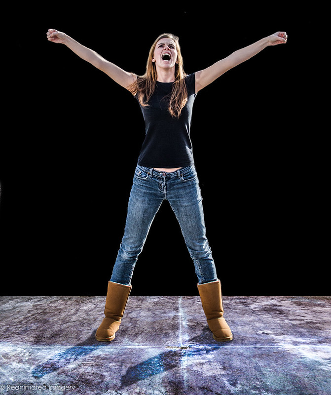
Flying visit between parent's evenings for Positive:

Contact by ReanimatedImagery, on Flickr
For anyone interested, here's the set up:
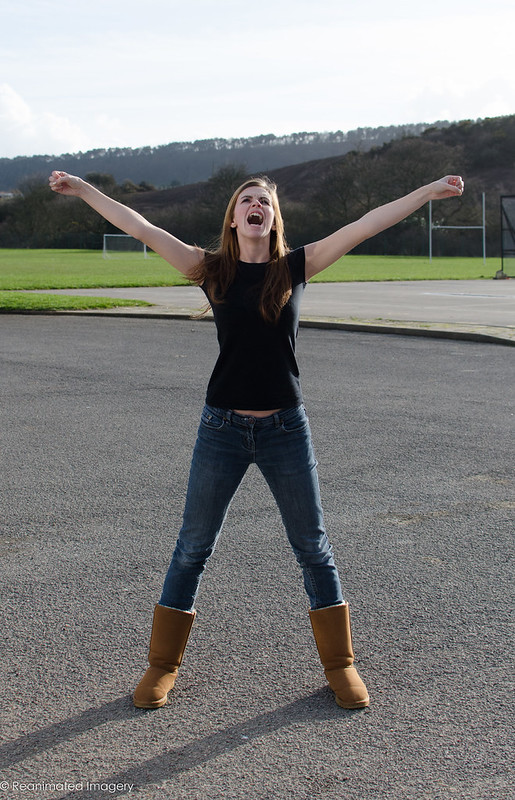
Positive Element by ReanimatedImagery, on Flickr
Put into PS and the background removed and a metal floor added:
Positive Figure by ReanimatedImagery, on Flickr
The figure is then printed and cut out and placed into the guts of a dismantled PC:
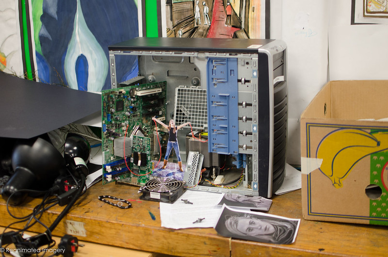
Setup by ReanimatedImagery, on Flickr
And then two lights to add some depth. Yellow and blue filters - Quality Street wrappers - to give some complimentary colour:
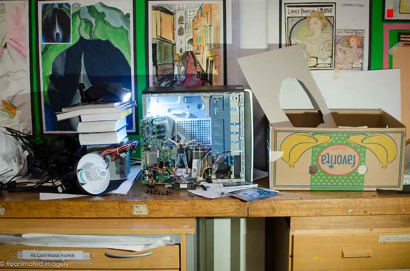
Setup with Lighting by ReanimatedImagery, on Flickr
Final shot put into photoshop and electicity added. Bob's your Uncle.
Contact by ReanimatedImagery, on Flickr
For anyone interested, here's the set up:
Positive Element by ReanimatedImagery, on Flickr
Put into PS and the background removed and a metal floor added:
Positive Figure by ReanimatedImagery, on Flickr
The figure is then printed and cut out and placed into the guts of a dismantled PC:
Setup by ReanimatedImagery, on Flickr
And then two lights to add some depth. Yellow and blue filters - Quality Street wrappers - to give some complimentary colour:
Setup with Lighting by ReanimatedImagery, on Flickr
Final shot put into photoshop and electicity added. Bob's your Uncle.
D
Deleted member 68495
Guest
Couldn't you save a step and cut out the figure without bothering to remove the background from the original picture of the model or do you need it to insert the metal floor?
It's easier to cut out if the background is replaced with black - it allows me to leave a tiny black edge which helps give the figure extra definition. The most important thing though, as you say, is the floor. I needed something to brace the figure with. Besides, removing the back ground with a layer mask only takes 5 minutes so it's not exactly onerous.
- Messages
- 13,393
- Edit My Images
- Yes
As always, really enjoy seeing these images you come up with Tony, and thanks again for sharing in detail how you have achieved it, I would never have guessed your model was a cut-out placed in the case
- Messages
- 9,061
- Name
- Mandy
- Edit My Images
- Yes
Very well thought out and extremely creative excellent work.

- Messages
- 4,915
- Name
- Alan
- Edit My Images
- Yes
Positive - that is a good image and well produced. Fascinating explanation of the the technique. And above and beyond the call of duty to wreck your computer for it.