weekly Robs 52 - 29 Skill

Messages
3,133
Edit My Images
No
Nothing special i didn't have much time but its a start and my aim is to simply use my camera more and try to always have one with me. Tried to do a 365 last year and failed after a couple of weeks. So i'm back with a less ambitious plan.

This was taken up Rivington in the gardens.

01-52-2014
by treboraj20, on Flickr
 
Last edited:
Nice lines there - a touch dark - it makes me want to know what is through the archway.
 
Hi, I like it, a bit dark and I would maybe crop the top more
the steps and the arch make a good subject, nice start
 
Thanks for the feedback, yes it looks a bit dark, should have spent longer in Lightroom really.

Can someone put up a link to the theme thread i was only able to know what i was doing going of everyone else's threads?
 
Right made the changes, +0.3ev and cropped the top a bit more.
 
Week 2- Play

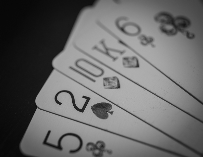
Thought i would play with some depth of field and get the "2" standing out, black and white conversion and some vignetting. I'm quite happy with it.


Lets Play-02-52-2014
by treboraj20, on Flickr
 
On theme and I like the composition. I quite like the b&w.

Did you PP the 2 black.

Crit, hmmm, I do feel you could have used some more interesting cards. No sure which though :thinking:

Cheers.
 
No all the numbers are black the only colour on the cards is the suit and the 10 & K.

Just for interest this is the original colour version.


02-colour
by treboraj20, on Flickr
 
Last edited:
Line - Lighting was a bit flat unfortunately but the image leads the eye through up to the arch at the top
Play - No problem with the mono but I actually prefer the original. Whilst some might say the WB is off, I actually think it compliments the roughly printed or faded suits on the cards giving it nice feel to the image.
 
Colour for me too (y) as Peter said above, it shows the old cards very well :)
 
Thanks for the feedback, choosing which photos work as B&W is harder than it first seems. :)
 
Good example for the Play theme. I think I prefer the 'antique' look of the colour version.
 
Hi Rob

sorry it's taken me a while to get here :crying:
Wk one....good detail in the stones & greenery but maybe still needs a little boost to really bring out the colors...or maybe mono it & go heavy on contrast :thinking:

Play....torn between the 2 shots , mono I like as it's a closer shot & the 2 really pops , the color version suits the slightly aged pp ...hmmm....it's a tie (y)
 
I think it works well (y) just found the corner? a little distracting in the background :)
 
Nice still life. Well composed and good detail.

Looks a tad under exposed.

I do like razor, though, and feel that is has plenty of interest to stand on it own.

Cheers.
 
Thanks for the comments. I need to make a light box or something. Im annoyed with the paper edges but its all i had to hand.
 
I do like this and the mono conversion suits it well. I'd be tempted just to bump up the exposure somewhat especially the top of the bristles of the brush.
 
Back
Top