
You are using an out of date browser. It may not display this or other websites correctly.
You should upgrade or use an alternative browser.
You should upgrade or use an alternative browser.
weekly SiblingChris' 52 in 2014 (Week 21 and 22 added)
- Thread starter siblingchris
- Start date
 Yep, common sense, sense of danger works well Chris
 - Messages
- 4,914
- Name
- Alan
- Edit My Images
- Yes
Agree with Lynne@blondie606
OP
- Messages
- 1,352
- Name
- Chris
- Edit My Images
- Yes
Now you see him...and all you could do is take a picture of his disappearance! Shame on you dog owner Chris...
The dog was nothing to do with me, just a happy coincidence!
OP
- Messages
- 1,352
- Name
- Chris
- Edit My Images
- Yes
Hi Chris
#1 for me ,the Dog showing common sense works greatNot sure but maybe could do with more space to the lhs & lose a little from the rhs ?
I agree.
In the edit I had the same thought, but I composed the shot working on rule of two thirds placing the subject to the left and therefore leaving no way to then crop it like that later. Problem is if I composed it differently there would have been a dirty great stinking modern pier building to the left taking over!
OP
- Messages
- 1,352
- Name
- Chris
- Edit My Images
- Yes
Hi, First pic is better than the second as you have got the sign blocking off the end of the coastline,
works for sense of danger and its a lovely dog
Thanks. Yeah I hadn't spotted that but I agree. It's a shame the sun hadn't come out for the first one like it did in the second, because I feel the light is much better and warmed the whole thing up a but.....I did try to cook it a bit in pp, but didn't like the result, so a slight gradient blue skylight filter effect was all I added
OP
- Messages
- 1,352
- Name
- Chris
- Edit My Images
- Yes
A good idea for the theme...I didn't know they still had that sinking mud at Weston !
Apparently! They also seem to have more sand...not sure if they added some when they rebuilt the pier?....
- Messages
- 13,393
- Edit My Images
- Yes
Hi Chris
Sense - For me it has to be the one with the dog, much more colour to the sign
Sense - For me it has to be the one with the dog, much more colour to the sign
- Messages
- 6,502
- Name
- Peter
- Edit My Images
- Yes
#1 for me as well although the light in #2 is slightly better. Blimey it's years since I've been to Weston.
OP
- Messages
- 1,352
- Name
- Chris
- Edit My Images
- Yes
Ok I've got my Ending shot in the bag, but first I'm just going back a couple of weeks and slotting in Mineral. At the time I was somewhat uninspired, but the bright sunny afternoon presented an opportunity to get something sorted
...before anyone says my highlights are blown, that was actually my intention on this shot to have the sun blazing and creating a bit of lens flare

Week 6 - Mineral by Sibling Chris, on Flickr
...before anyone says my highlights are blown, that was actually my intention on this shot to have the sun blazing and creating a bit of lens flare
Week 6 - Mineral by Sibling Chris, on Flickr
Last edited:
- Messages
- 8,398
- Name
- Lynne
- Edit My Images
- Yes
Hi Chris
blown highlights.....not sure why we get so hung up on these when looking at images with sky/sun in them....sometimes the sky really is THAT bright that it blows the clouds...we just take the pictures ! Nice slightly different pOV that works for me , focused ,sharp....like the flare on the side of the bottle") just not so sure on the bit to the top lhs of the bottle...the greeny streak coming in to the writing
just not so sure on the bit to the top lhs of the bottle...the greeny streak coming in to the writing 
blown highlights.....not sure why we get so hung up on these when looking at images with sky/sun in them....sometimes the sky really is THAT bright that it blows the clouds...we just take the pictures ! Nice slightly different pOV that works for me , focused ,sharp....like the flare on the side of the bottle
just not so sure on the bit to the top lhs of the bottle...the greeny streak coming in to the writing
OP
- Messages
- 1,352
- Name
- Chris
- Edit My Images
- Yes
Hi Chris
blown highlights.....not sure why we get so hung up on these when looking at images with sky/sun in them....sometimes the sky really is THAT bright that it blows the clouds...we just take the pictures ! Nice slightly different pOV that works for me , focused ,sharp....like the flare on the side of the bottle
Well that green just came out a little more as I pushed up the saturation a tad.... I think it must have just been the light coming through the label. I certainly didn't make it that way on purpose....if it wasn't green then what? And how would I change it?
I looked back across all the different shots I took for this and each one of them has the green flare before I even edit them. b&w seems about the only thing that successfully removes the green without other parts of the image starting to look unnatural, but I'd rather stick with the blue sky
Last edited:
- Messages
- 9,061
- Name
- Mandy
- Edit My Images
- Yes
A different point of view on the few bottles of Mineral water that have been used in this theme. I know you said it was your intention to have the sun shining through the bottle. But I have to be truthful and say that the blown section spoils the image for me  . But it does fit the theme and I do get what your trying to achieve just isn't for me.
. But it does fit the theme and I do get what your trying to achieve just isn't for me.
OP
- Messages
- 1,352
- Name
- Chris
- Edit My Images
- Yes
It's not actually clipped but cropped right along the edge. I had it slightly overhanging on a window sillMineral, has a very vibrant feel to it with The colours and lens flare. Pity about the clipped bottom.
Cheers.
")
Any lower and the sill would have been in the frame and that didn't really work either
Last edited:
- Messages
- 19,304
- Name
- Andy
- Edit My Images
- Yes
I
It's not actually clipped but cropped right along the edge. I had it slightly overhanging on a window sill
Any lower and the sill would have been in the frame and that didn't really work either
Fair point. I do sometimes struggle with clipped and cropped. Clipped = not good and cropped is purposeful
Cheers.
OP
- Messages
- 1,352
- Name
- Chris
- Edit My Images
- Yes
Fair point. I do sometimes struggle with clipped and cropped. Clipped = not good and cropped is purposeful
Cheers.
Yeah...granted your point is still the same. I get what you are saying
but not sure how to do much else unless I could have somehow suspended the bottle or held it from the side and come up with a composite?....
- Messages
- 13,393
- Edit My Images
- Yes
I like that Chris... I too like to see flare at times, and in this shot I think it goes very well
OP
- Messages
- 1,352
- Name
- Chris
- Edit My Images
- Yes
This one has been sat in camera for a while. I straggled greatly with the lighting on this, given that almost all lighting ended up with a really shiny area on the string somewhere or other.
So this is the best of them. I've been backward and forward over whether to rotate it and crop such that the shadow of the string goes straight into the top left corner, but couldn't really make my mind up over it, so left it as shot in the end.
it's the ball end of a bass guitar string by the way
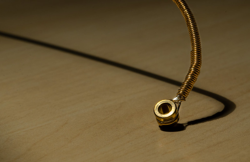
Week 8 - Ending by Sibling Chris, on Flickr
So this is the best of them. I've been backward and forward over whether to rotate it and crop such that the shadow of the string goes straight into the top left corner, but couldn't really make my mind up over it, so left it as shot in the end.
it's the ball end of a bass guitar string by the way
Week 8 - Ending by Sibling Chris, on Flickr
Last edited:
- Messages
- 646
- Name
- Michael
- Edit My Images
- Yes
Lighting can be a b****r with shiny objects so you've done well there. Might have worked better with a different BG. I agree that a crop with the shadow going out of the top LH corner as this will also lose the darkness towards the top of the BG.
D
Deleted member 68495
Guest
Sharp, crisp and well-lit. I like the the item and the shadow on the grained surface. There is nothing I can pick holes in with this photograph -- and believe me, as with everyone else's, I always try. Excellent
OP
- Messages
- 1,352
- Name
- Chris
- Edit My Images
- Yes
Mark ii
Slightly different crop, upped the contrast a bit too

Week 8 - Ending (2) by Sibling Chris, on Flickr
Slightly different crop, upped the contrast a bit too
Week 8 - Ending (2) by Sibling Chris, on Flickr
- Messages
- 9,061
- Name
- Mandy
- Edit My Images
- Yes
Good take on the theme well done I love the cropped version very nice.

- Messages
- 13,393
- Edit My Images
- Yes
Hi Chris
The crop for me too... really like the shadow, great lighting in the end and the background matches in well with the tones of the the metal - Nice One
The crop for me too... really like the shadow, great lighting in the end and the background matches in well with the tones of the the metal - Nice One
- Messages
- 1,458
- Name
- Elaine
- Edit My Images
- Yes
I like the way the shadow seems to fall at an impossible angle and the contrast between the dark shadow and shiny metal. Like the second crop best!
- Messages
- 4,914
- Name
- Alan
- Edit My Images
- Yes
Ending - good idea, on theme. Super focus and graduated lighting. good comp and b/g - all in all 
- Messages
- 8,398
- Name
- Lynne
- Edit My Images
- Yes
Hi Chris
Cropped version for me as well.....the detail on the copper coily thing is impressive as is the fact you have minimal highlights on such a shiny subject.....like it
Cropped version for me as well.....the detail on the copper coily thing is impressive as is the fact you have minimal highlights on such a shiny subject.....like it